Yep, you pull down from the right notch to see them.Any videos out there of a first look with how the status bar looks with bluetooth and location services turned on yet?
Got a tip for us?
Let us know
Become a MacRumors Supporter for $50/year with no ads, ability to filter front page stories, and private forums.
the idiocracy of the iPhone 8 bezel cutout design in all those dummies and mockups
- Thread starter Starfyre
- Start date
- Sort by reaction score
You are using an out of date browser. It may not display this or other websites correctly.
You should upgrade or use an alternative browser.
You should upgrade or use an alternative browser.
It's a dealbreaker for me. Looks ridiculous. I don't want the hardware encroaching on my screen.
Also, if you watch the keynote, it looks like there's a bar below the status icons - is that because there's not enough room to display all the icons?
cutout on the top looks ridiculous to me too. Can't believe Apple doesn't have another design that that.
The cutout will most definitely be there but it will be barely noticeable cause I'm pretty sure they'll have the status bar parts left and right of it with a black background, like in that Forbes article:

This would've made sense. And with OLED, it would've been truly black.
Apple dropped the ball on this one.
Looks like there won't be any room for battery percentage... then again they removed it from all Macbooks which I really didn't like.
Check his Everythingapplepro videos on YouTube, his leak videos shows how the status bar will work.
I simply cannot fathom how this design moved past the concept phase - this is very unbecoming of Apple. What disappoints me is how Apple has made absolutely no meaningful strides in design, whether that be hardware (with the exception of the MacBook), software, or UI design in general, for a very long time. I hate to make a Steve Jobs reference here, but since his departure, we've seen several examples of poor design choices - I've taken the liberty to list a few below.
1. Apple pencil charging (via Lightning port on an iPad)
2. Lightning port on the Magic Mouse 2 (on the bottom)
3. Text input on the Apple TV (although in all fairness, the whole Apple TV UI, remote and companion app are completely atrocious and unintuitive)
4. iOS 10 and 11 (I have dedicated entire threads to document these regressive releases - notifications, control center, overall UI - there's a lot in here casts doubt on Apple's UI design capabilities)
5. macOS - Anyone remember Launchpad? Again, I don't think anyone can point to a single innovative or meaningful feature to have been introduced since Snow Leopard.
Last edited:
Exactly, you just have to see other phones like, Xiaomi Mi Mix Mix 2 or the Galaxy family... with better solutions for an all display phone.
I can't imagine watching a video or a movie in the iPhone X with that cutout covering information from the screen.
Btw... can we consider that the iPhone has 5.8 REAL inches with that cutout????
#notformeApple.
I can't imagine watching a video or a movie in the iPhone X with that cutout covering information from the screen.
Btw... can we consider that the iPhone has 5.8 REAL inches with that cutout????
#notformeApple.
That is an iPhone X not iPhone 8!!!I am referring to all the mockups, leaks, and graphics for the iPhone 8 with the bezel cutout.
The top cutout display of the iPhone 8 mockups/leaks/dummys are ridiculous and make absolutely no sense except "being different". Looking at some of the mockups included on MacRumors News Posts (and are floating around elsewhere, people need to realize how this design makes absolutely no sense.
Looking at an image like this, which is the same in white in other dummy/dumb mockups.
Notice how the status bar contains the clock on the top left, and the signal, wifi, and battery on the upper right.
Where would bluetooth and other indicators go? What about LTE?
What happens if you have bluetooth on? Where does the bluetooth symbol go? t can't fit in the space around the camera/speaker cutout can it? Can it appear below the clock or the other icons? No, that area is for the home screen or apps. The only other option is to make the top bar scrollable? Which makes no sense and not useful for an indicator to be hidden unless scrolled to.
Manufacturing-wise, it seems like way too much trouble for apple to create such a cutout display that requires the software to behave exceptionally for a odd shaped display with the cutout.
If anything, it would make sense for Apple to take the "Infinity Edge" display approach that the Samsung Galaxy 8 Plus has taken where the screen is still rectangular, and eliminates bezels where possible (but maybe Samsung has a patent on it already?).
There is not enough reward for making such a custom-shaped display.
No one is going to copy that irregular, senseless display.
Unless those areas of the display get used for something else (maybe two big buttons) or a "touchbar-esque" interface where different shortcuts can be displayed or indicators for games that may make more sense. Though the status bar as we know it should stay in the rectangular section below the bezel cutout effectively making two "ears" that emerge out of the standard rectangular display.
No matter how you rationalize it, it is strange, silly, makes almost no sense... though it does make us "Think Different", though not for the wrong reasons. I wouldn't be surprised if the Apple announcement shows a brand new iPhone 8 that does not look anything like the mockup and maintains a rectangular display (maybe as a Tim Cook getting to think/say "ha leakers, I got you" sort of act.
Unless there is a different purpose of the bezel cutout, today's leaks make no sense and from a human factors standpoint, do not support even current needs of any display.

For me i personally prefer iPhone X because of LATEST Design similar to Samsung Galaxy S8 while iPhone 8 looks like a regular iPhone 6/6S which came 4 years ago. If you've bought iPhone 8 other young people will recognize it as iPhone 6. I dont understand why would they make an iPhone 8 similar design to iPhone 6 which is so 2012.
That is an iPhone X not iPhone 8!!!
For me i personally prefer iPhone X because of LATEST Design similar to Samsung Galaxy S8 while iPhone 8 looks like a regular iPhone 6/6S which came 4 years ago. If you've bought iPhone 8 other young people will recognize it as iPhone 6. I dont understand why would they make an iPhone 8 similar design to iPhone 6 which is so 2012.
The iPhone 8 has a glass back, not sure why people would think an iPhone 8 is a 6 - maybe if they were looking at the front of the phone, but from the back, they look different.
I simply cannot fathom how this design moved past the concept phase - this is very unbecoming of Apple. What disappoints me is how Apple has made absolutely no meaningful strides in design, whether that be hardware (with the exception of the MacBook), software, or UI design in general, for a very long time. I hate to make a Steve Jobs reference here, but since his departure, we've seen several examples of poor design choices - I've taken the liberty to list a few below.
1. Apple pencil charging (via Lightning port on an iPad)
2. Lightning port on the Magic Mouse 2 (on the bottom)
3. Text input on the Apple TV (although in all fairness, the whole Apple TV UI, remote and companion app are completely atrocious and unintuitive)
4. iOS 10 and 11 (I have dedicated entire threads to document these regressive releases - notifications, control center, overall UI - there's a lot in here casts doubt on Apple's UI design capabilities)
5. macOS - Anyone remember Launchpad? Again, I don't think anyone can point to a single innovative or meaningful feature to have been introduced since Snow Leopard.
1. Yes. The pencil sticking out of the iPad port is ridiculous and dangerous.
2. Yes. The lightning port being UNDER the mouse so that you can't use it while charging is ridiculous.
3. Yes. I use the Apple Remote app on my iPhone to do text input.
4. I think iOS 10 is pretty neat, but it's really showing its age. It's so locked-down and boring.
5. Yes. macOS really sucks. I love its Unix core, and the fact that all 3rd party apps follow their great design language, but the whole OS is really basic. No touchscreen support, no Virtual Reality support, no slick/modern design anymore.
And Windows is about to surpass them very soon. Windows 10 is already pretty damn good (very fast and stable and huge app library), but needs to become a bit prettier.
I've already decided months ago that my next computer will be a regular Windows PC. Microsoft are innovating constantly (holographics, touchscreens) and they're working on a new GUI design which blows away Apple. And I've recently been thinking that my next tablet and phone may be Android. I'm tired of Apple deciding that I can't have classic console emulators and other fun apps.
Are you referring to the Home screen or Apps?I also don't like the cutout, it ruined the edge to edge display. I like the looks of edge to edge display in s8+
[doublepost=1505297824][/doublepost]
Yes the top cutout on iPhone X is a deal breaker.
Because the Home screen won't be impacted by the notches. It'll just be an aesthetic turn-off for some. Which really shouldn't be a big deal.
In Apps though, it may impact. I'm waiting to see how much of the screen will be utilised for YouTube & my video Streaming Apps - don't want black borders all around the screen when viewing original aspect ratio. Nor do I want the notch to encroach when I don't want it to.
Edit...
Below video details the aspect ratio well, explaining how 16:9 content isn't too be messed with & sacrificed for cropped, full screen use.
Last edited:
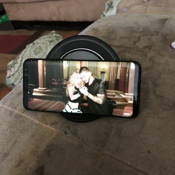
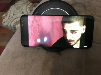
Are you referring to the Home screen or Apps?
Because the Home screen won't be impacted by the notches. It'll just be an aesthetic turn-off for some. Which really shouldn't be a big deal.
In Apps though, it may impact. I'm waiting to see how much of the screen will be utilised for YouTube & my video Streaming Apps - don't want black borders all around the screen when viewing original aspect ratio. Nor do I want the notch to encroach when I don't want it to.
Edit...
Below video details the aspect ratio well, explaining how 16:9 content isn't too be messed with & sacrificed for cropped, full screen use.
Yes i mean to say aesthetic wise, youtube on s8+ gives two options Fit to Screen & Crop to Fit. I really like Crop to Fit option and there's not much compromises and you can enjoy full screen. I have attached pics from YouTube, 1 is Fit to Screen and 2nd is Crop is Fit. I don't see these options in iphone 7 plus in YouTube, videos on iphone 7 plus is already Fit to Screen. Let's see how YouTube function on iphone x, its a software thing i guess on s8+ these two options. In all mobile/electronic things Apple is my first choice but get disappointed with that crazy notch.

Last edited:
I can only see 1 image.Yes i mean to say aesthetic wise, youtube on s8+ gives two options Fit to Screen & Crop to Fit. I really like Crop to Fit option and there's not much compromises and you can enjoy full screen. I have attached pics from YouTube, 1 is Fit to Screen and 2nd is Crop is Fit. I don't see these options in iphone 7 plus in YouTube, videos on iphone 7 plus is already Fit to Screen. Let's see how YouTube function on iphone x, its a software thing i guess on s8+ these two options. In all mobile/electronic things Apple is my first choice but get disappointed with that crazy notch.
View attachment 718168
2nd pic
Attached 2nd one, this site was not accepting 2nd image because of resolution.
I can only see 1 image.
Attached 2nd one, this site was not accepting 2nd image because of resolution.
Thanks. Is it possible for you to show that exact same frame in both modes? Or a link which shows it? Thanks.2nd pic
Attached 2nd one, this site was not accepting 2nd image because of resolution.
Thanks. Is it possible for you to show that exact same frame in both modes? Or a link which shows it? Thanks.
Yes sure i will pause the video and upload it.
[doublepost=1505541885][/doublepost]
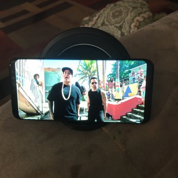
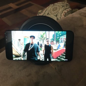
Thanks. Is it possible for you to show that exact same frame in both modes? Or a link which shows it? Thanks.
Pause the video at same 2:22 min location but little difference in image. Not sure why. Top one is Crop and bottom is Fit. What do you think about sizing/bars. What do you think the notch will be unfavorable to watch YouTube videos. Overall the built quality of apple is always better than others, iphone x will look fantastic because of the the front and back glass i never missed apple's launch iPhones and i am still considering buying even though the notch.
Thanks for that.Yes sure i will pause the video and upload it.
[doublepost=1505541885][/doublepost]View attachment 718181 View attachment 718180
Pause the video at same 2:22 min location but little difference in image. Not sure why. Top one is Crop and bottom is Fit. What do you think about sizing/bars. What do you think the notch will be unfavorable to watch YouTube videos. Overall the built quality of apple is always better than others, iphone x will look fantastic because of the the front and back glass i never missed apple's launch iPhones and i am still considering buying even though the notch.
It's interesting because the first one is showing more, width-wise, but the second is showing more, height-wise.
So therefore, I don't think either of those are the original aspect ratio.
Is there another video mode available that shows all of the width & height (you'll have black bars all around I presume)?
Register on MacRumors! This sidebar will go away, and you'll see fewer ads.

