But it's a very different product with a very different interface. On the Apple Watch the bezels are pretty big, so hiding them by blending them with the screen would be the smart thing to do. Also, the Watch isn't about content consumption and more for showing bits of information, so it's easier to implement a completely black interface on such a small screen with limited content. And finally, you wear the watch on your wrist and people see it all the time, so it needs to look good with the screen off. That's why a white bezel was never an option as the Watch would highlight the area where the screen is, while it needs to look like a watch.
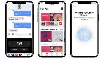
The iPhone on the other hand has a completely white interface and a different purpose. With the new iPhone I expect them to want to highlight how big the screen is, instead of hiding parts by blending it in with the bezels. It's a different product with a different goal. I think this makes a lot of sense (even though no status information is shown in this app):


