Become a MacRumors Supporter for $50/year with no ads, ability to filter front page stories, and private forums.

I like the concept of the new UI and evolving the iPod Touch and iPhone OS into a full blown one that can be used on a tablet. That could be Apple's answer to that thing some PCs do, where you don't have to boot the OS to run certain media apps. That saves power and runs a small OS in RAM instead of off the HDD.

It would also make it easier for Apple to give us a smartphone in the near future.

One thing about the mockup... it's great... let's just loose the cheezy iPod Touch body, and come up with a new one.
MBt_5_1_small.png
 
I might be missing the point here, but for the people making mockups of OSX running on iPod touch-inspired devices: What good is a touch-only interface for a fully-fledged computer...?
 
let's just loose the cheezy iPod Touch body

Fair enough:


--- --- ---

If Apple does go with a layered window interface they'll certainly need to include some sort of Expose feature to keep things organized. That and Spaces should make working on a small screen like this very comfortable. Honestly, the only reason I can think of for why Apple gave these two features Dock icons is that they'll be necessary for the Touch OS since it won't have a keyboard. The icons are even square!
 
Fair enough:


--- --- ---

If Apple does go with a layered window interface they'll certainly need to include some sort of Expose feature to keep things organized. That and Spaces should make working on a small screen like this very comfortable.

love it, i really like your ideas
 
One thing that an Apple tablet would have over the iPhone would be real text editing capabilities. I've tried to visualize an app like Pages mixed in with the style of my previous mockups, but I'm not that happy with it. For one thing, I've been trying to avoid Aqua interface elements entirely since they area also missing on the iPhone. To do it justice, even the smooth metal toolbar would need to be redone, and that would take time.

The important bit is that the keyboard and app could be fused like they would be on the iPhone when you enter full-screen editing. If you have a wireless keyboard, however, the touch keyboard would vanish. In that case you'd still have to reach out and touch the screen to use the menus, but the typing itself would at least be a whole lot smoother.

 
Fair enough:


--- --- ---

If Apple does go with a layered window interface they'll certainly need to include some sort of Expose feature to keep things organized. That and Spaces should make working on a small screen like this very comfortable. Honestly, the only reason I can think of for why Apple gave these two features Dock icons is that they'll be necessary for the Touch OS since it won't have a keyboard. The icons are even square!

Yes, and now we are off to a great start. This is how we should be creating what we expect Apple would do, then when our hopes are dashed upon the cold rocks of mediocrity on Apple's behave, we have a solid right to complain about Apple's lack of innovation.

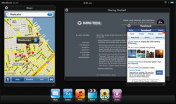
Thanks. Here's another, this one with Spaces. I figure that in this mode, the window frames can be dropped, since they are just wrappers anyway.


This is innovative thinking, and what it really means to bring together current technology with an innovative way of doing things.

macbooktouchyv0.jpg


Nothing great yet, didn't do any UI elements though.

Good. That bezel has returned but I can let that slide.

p.s. I know, I know. I talk a lot for someone that doesn't do any mockups. :rolleyes:
 
p.s. I know, I know. I talk a lot for someone that doesn't do any mockups. :rolleyes:

I've had all sorts of ideas about tablets floating around in the back of my head for some time now. The joy of open forum discussions like this is the feedback. If all we got was a war of flying mockups with no talk, there's no progress. Take the role Steve Jobs plays at Apple, he's not a developer, but I think we can be fairly certain his vision shapes a lot of the software that Apple puts out. You're the 'Jobs' of this thread! :D
 
I've had all sorts of ideas about tablets floating around in the back of my head for some time now. The joy of open forum discussions like this is the feedback. If all we got was a war of flying mockups with no talk, there's no progress. Take the role Steve Jobs plays at Apple, he's not a developer, but I think we can be fairly certain his vision shapes a lot of the software that Apple puts out. You're the 'Jobs' of this thread! :D

Thanks man.... that means a WHOLE lot. :D

I just had another thought when I looked at the UI mockups. I think the Mac Touch would be vertical, in part because it's based off of the iPhone, but also because it would be easier to view the apps running in the back ground, and it would be much easier to hold... like a clipboard.

Or am I just slow, and that was the main idea to begin with.
 
I just had another thought when I looked at the UI mockups. I think the Mac Touch would be vertical...

For mine at least, since the "cheezy" comment, all of them have been vertical. I figure this is the best style if the tablet is to be a document reader. If Apple comes through with a high resolution screen like I hope, I'll be taking a much more serious look at eBooks! Project Gutenberg and Google Books would look beautiful. Of course, Sony wouldn't be happy...

Landscape views would be necessary as well, and I hope the implimentation is more complete than on the iPhone. Getting the auto-rotate to work properly with windowed apps might take some work, but Apple should be up to the challenge.

--- --- ---

On a slightly different topic, in my mockups thus far I haven't shown the full suite of available applications or how you launch them. The Mac solution is to put in a full file browser (Finder) and let the user have a folder full of apps. Certainly the tablet would need some sort of Finder-lite, but then there's the issue of a Desktop and all sorts of folders and other nonsense. Building a new OS interface from the ground up means we get to take another look at the Finder/Desktop solution. One idea that might work (possibly even better than it does on the Mac) is Stacks. As Apple has taken to using them lately, these are just groups of files or applications that are stored compactly in the Dock. Some innovative people have already ported the idea to the iPhone/iPod touch, and it looks pretty nice.


Stacks to me mean something more in line with Apple's original "piles" patent and some of the 3D desktop metaphors I've seen recently. Rather than folders, since the tablet wouldn't really be holding that massive of a collection of files, piles might make more sense. And since certain file types will be handled specifically by library-based apps like the music player, movie player, and photo viewer, only the basic text/office documents will need to be kept sorted manually.
 
Okay, a double post...

Just to get it out of my system, I tried my hand at a Piles interface for the tablet. This might get unwieldy with larger collections, but at least its a start.


Apple's patent includes protocols for auto sorting the piles according to file type, date, etc, which would be handy. I've tried to mimic this in the mockup, with piles of Keynote files and Numbers documents. Users would also be able to adjust the cleanliness or messiness of the pile, to give each stack a unique appearance. Many of these ideas have been shown in the 3D desktop (link in previous post), but I'm not thinking that advanced (the tablet is purely 2D).

The question is how do you extend this to larger numbers of files (100s rather than 10s)?
 
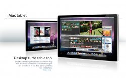
come on guys! it would be a mac tablet not a giant ipod! haha anyway heres mine. the iMac tablet.
 

Attachments

  • imactablet.jpg
    imactablet.jpg
    453.9 KB · Views: 420
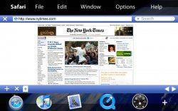
I have just made this, it's a concept UI based on the one of Anti-Microsoft, with special finger gestures like on the iphone, but more.. the thing i haven't figured out is, the blue bar on the bottom, should i use it for the safari controls , or for dock icons (I will need to then make it a little bigger, with the sfari controls coming up if you tick once)???
macbooktouchuiconceptug6.png

p.s: i know it isn't the right font, but i'm using gimp and i haven't found a way to put Myriad Pro Semi-Bold into it,, anyone suggestion?

Ouch! My eyes hurt.

Good, but I don't think royal blue is the color for a window that someone may be looking at for an extended period of time. I say that the blue bar could just go away, what's it needed for in the first place?

p.s. Or you could bring the dock back.
 
Ouch! My eyes hurt.

Good, but I don't think royal blue is the color for a window that someone may be looking at for an extended period of time. I say that the blue bar could just go away, what's it needed for in the first place?

p.s. Or you could bring the dock back.

is brownish/black a better color for the bar?
 
is brownish/black a better color for the bar?

I was thinking more like clear, ala Leopard. I am kinda drawn to the new OS, since it give Mac OS X a much needed refresh of the Aqua interface, so we could carry that out to the other products as well.

Maybe even make it a bit smaller, and make it come and go when the user taps the screen like in iPhoto's full screen mode.

little bit greyish??
 
Register on MacRumors! This sidebar will go away, and you'll see fewer ads.