Become a MacRumors Supporter for $50/year with no ads, ability to filter front page stories, and private forums.
Thanks, glad you like the first version.

Erm, the reason why the icons are 'artistically styled' :rolleyes: is because I didn't have a higher enough quality image(s) of each to create the size of icon I needed to get the look. If anyone can provide the original touch icons at 70x70 px plus, i'd be grateful. :)

R-Fly
 
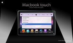
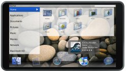
And finally, what the UI's menu layout could look and function like:

and, sorry about double posting in a short space of time.

R-Fly
 

Attachments

  • maacbooktouchconceptuifkx3.jpg
    maacbooktouchconceptuifkx3.jpg
    767.3 KB · Views: 369
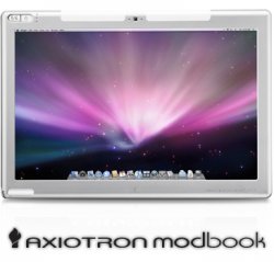
Everyone's so obsessed with a tablet/touch Mac, but has anyone on here bought or even considered a ModBook?
 

Attachments

  • mb_tall1207.jpg
    mb_tall1207.jpg
    64.9 KB · Views: 180
RazorianFly, that is just beautiful. If Apple did come with a Touch Leopard OS X it would be similar to this. However the icons look strange and clunky and what does Add Book mean? What will that feature do?
 
RazorianFly, that is just beautiful. If Apple did come with a Touch Leopard OS X it would be similar to this. However the icons look strange and clunky and what does Add Book mean? What will that feature do?

Add is short for address. So its an address book.

Everyone's so obsessed with a tablet/touch Mac, but has anyone on here bought or even considered a ModBook?

A we're talking about a real tablet mac.
 
Everyone's so obsessed with a tablet/touch Mac, but has anyone on here bought or even considered a ModBook?
first it's pretty expensive
second it's not even so nice
third the UI is totally the same.
fourth many people haven't seen anything about this modbook thing
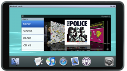
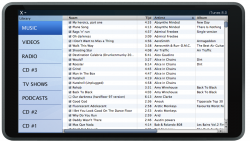
Re-designed for 'touch' this is iTunes on my concept of the 'Macbook touch':
Very nice! only the topmenubar should be used with something battery icon, wifi, bluetooth,...
and the big apple in the left menu in your new designed itunes, should go away, it doesn't do anything..

RazorianFly, that is just beautiful. If Apple did come with a Touch Leopard OS X it would be similar to this. However the icons look strange and clunky and what does Add Book mean? What will that feature do?
read some posts earlier about why the icons are so strange,, they are redesigned by the artist because he didn't have them in a high enough resolution..
 
read some posts earlier about why the icons are so strange,, they are redesigned by the artist because he didn't have them in a high enough resolution..

Well, the icons do not have to be iPod touch-ish at all. All though it will use a similar concept to the Touch/iPhone (table with icons and reflections) at least give it a more Mac-like feel. For example, combine the Music and Video with a iTunes logo instead inside the OS X Touch Aqua Round Square. If you want I might be able to help you get nice icons for this concept. Just tell me how big you want em to be.
 
Well, the icons do not have to be iPod touch-ish at all. All though it will use a similar concept to the Touch/iPhone (table with icons and reflections) at least give it a more Mac-like feel. For example, combine the Music and Video with a iTunes logo instead inside the OS X Touch Aqua Round Square. If you want I might be able to help you get nice icons for this concept. Just tell me how big you want em to be.

so you know i'm not the artist, but big icons in a 128 px format would be nice :D
 
Re-designed for 'touch' this is iTunes on my concept of the 'Macbook touch':

Would you mind if i make a mockup (probably worse than yours) base on your idea layout??

EDIT: sorry for the double post, i know will make it good with posting my third post in this second one:p
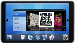
razorianfly i made one (look way down in attached thumbnails), based on your idea of layout and UI i made mine with some adjustments, new dock, and so on, i used the top menubar for time and name of computer, but it would also be handy for battery icon and wifi, bluetooth..
only still one problem.. the shadows of the app aren't so good, but i can't find out how to make them better than that in Gimp

a one with new icons is coming..

EDIT 2:
one with red background, it's nicer with red if you look at the menubar, with the other one, it looks almost exactly like the menubar..
macbooktabletconcept4rejk4.png


EDIT 3: a new one with aqua stripes background + more transparant dock, menubar and itunes..
macbooktabletconcept4aqos3.png
 

Attachments

  • macbook tablet concept 4 png.png
    macbook tablet concept 4 png.png
    351.8 KB · Views: 165
Would you mind if i make a mockup (probably worse than yours) base on your idea layout??

EDIT: sorry for the double post, i know will make it good with posting my third post in this second one:p
razorianfly i made one (look way down in attached thumbnails), based on your idea of layout and UI i made mine with some adjustments, new dock, and so on, i used the top menubar for time and name of computer, but it would also be handy for battery icon and wifi, bluetooth..
only still one problem.. the shadows of the app aren't so good, but i can't find out how to make them better than that in Gimp

a one with new icons is coming..

EDIT 2:
one with red background, it's nicer with red if you look at the menubar, with the other one, it looks almost exactly like the menubar..
macbooktabletconcept4rejk4.png


EDIT 3: a new one with aqua stripes background + more transparant dock, menubar and itunes..
macbooktabletconcept4aqos3.png

I like the red! Still have a beef with the word "Book" in something that doesn't fold.. Other than a few font issues I don't mind the look of those. I think the UI would have to be hideable if not toggled or something or else it would really limit space to view whatever you are working with.
 
I like the red! Still have a beef with the word "Book" in something that doesn't fold.. Other than a few font issues I don't mind the look of those. I think the UI would have to be hideable if not toggled or something or else it would really limit space to view whatever you are working with.

sorry for the font, that's a problem with Gimp, i don't know how to get it (it's probably not free) myriad pro semibold, and how to then put it in gimp...
I'm going to make a slightly different UI where it is made very easy to toggle between app's , but at this point, with this mockup, it is just that you press the app icon in the dock and it appears..
 
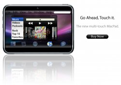
I haven't posted one in a while but here is my mock-up, based on all the concepts in this thread. I know what you'll all probably say: "Thats just a big iPhone!" But no, I think thats what it will look like, Yes, like a big iPhone running Touch OS X.

PS: (I'm sorry for the poor photoshop Job around the edges)

EDIT: New mock-up based on lofights interpretation. Enjoy.
 

Attachments

  • nearly-P.jpg
    nearly-P.jpg
    832.3 KB · Views: 182
  • MacPad-(Lofight).jpg
    MacPad-(Lofight).jpg
    337 KB · Views: 195
I haven't posted one in a while but here is my mock-up, based on all the concepts in this thread. I know what you'll all probably say: "Thats just a big iPhone!" But no, I think thats what it will look like, Yes, like a big iPhone running Touch OS X.

PS: (I'm sorry for the poor photoshop Job around the edges)

EDIT: New mock-up based on lofights interpretation. Enjoy.

I really like the second one, and yes! it has my idea of putting apps that aren't running more transparant :p
 
I really like the second one, and yes! it has my idea of putting apps that aren't running more transparant :p

Thanks!! I like how the second one turned out.

ADDITION!!:

I've made a new one. It has an Improved screen (now its true widescreen 16:9)
 

Attachments

  • MacPad-(Lofight)-II.jpg
    MacPad-(Lofight)-II.jpg
    382 KB · Views: 225
These last few ones were extremely cool! But could you guys do some more now based on those dual screen rumors??
We all know now that it exists and it simply wasn't ready for the macworld 2008 for a debut. But until they work out the bugs can you guys please come up with some wonderful new mockups to hold me over until apple is ready??
Thanks. :)

dual screen ?? i'm not quite sure what you mean..:confused:
 
I like the red! Still have a beef with the word "Book" in something that doesn't fold.. Other than a few font issues I don't mind the look of those. I think the UI would have to be hideable if not toggled or something or else it would really limit space to view whatever you are working with.

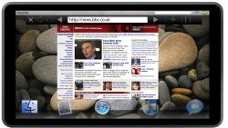
I followed your advice and this is what i have come up with... in the first you see it's now called mac touch and there is next to the X close symbol in the itunes menubar, also a O symbol. this O means you maximize the window and your app goes full screen (what you can see in the second mockup). I also placed 2 arrows on the sides of the screen, these are there to toggle between app's and if you press on of them longer, a list of all the further app's will be shown (coming in a next mockup).
In the second mockup you see a fullscreen itunes. the - symbol next to the X is ment for closing the fullscreen mode and going back to... the first mockup version.
 

Attachments

  • macbook tablet concept 4 aqua strepen + transparant dock,menubar,itunes png.png
    macbook tablet concept 4 aqua strepen + transparant dock,menubar,itunes png.png
    571.1 KB · Views: 109
  • mac touch tablet concept 5 png.png
    mac touch tablet concept 5 png.png
    286.2 KB · Views: 140
dual screen ?? i'm not quite sure what you mean..:confused:

This rumor is already on several sites but this is from brighthand.com.....

As usual this time of year, rumors of what new devices and services to be introduced by Apple at next week's Macworld show are become louder and louder. Last year, the iPhone was the oft-rumored and ultimately confirmed device. This year, what is supposedly a leaked transcript of Steve Jobs' keynote speech reveals the MacTouch.

According to this unconfirmed -- and somewhat dubious -- information, the MacTouch will be a dual-screen, laptop-like device that combines properties from Apple's MacBook and iPhone devices.

The MacTouch will supposedly contain such features as:

* Two 9-inch multi-touch-sensitive widescreens, both with a resolution of 1280 by 854 pixels
* A two-way folding/sliding, dual-screen, multi-position design with magnetic clasps
* Solid State Drive (SSD)
* The ability to run most existing Mac OS X apps when in dual screen mode; Second screen becomes the keyboard and touchpad
* iPhone-like dashboard when in single screen mode
* Multi-touch sensitive version of iPhoto
* Other features such as Bluetooth, 802.11b/g, USB 2.0, optical/analogue, audio in/out, built in speakers and microphone

This rumored information does not indicate when the MacTouch will be released, or what it will cost.

And here is a mockup making the rounds based on this new rumor.

mactouch-for-macworld-2008.jpg


I'm surprised you guys weren't totally all over this already with new dual screen mockups N wutnot. I'm sure you can do better than the example above. So guys get crackin!! :D
 
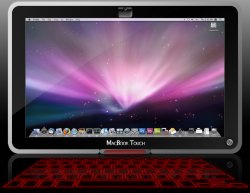
I know this might not be very realistic, but here is what i could come up with.
The isight camera swivels so it may be laying down or standing up. The laser keyboard also swivels for the same reasons.
 

Attachments

  • Macbook Touch Mock Up Smaller.jpg
    Macbook Touch Mock Up Smaller.jpg
    419.8 KB · Views: 191
Register on MacRumors! This sidebar will go away, and you'll see fewer ads.