
turbineseaplane
macrumors Penryn
Speaking of things we've lost
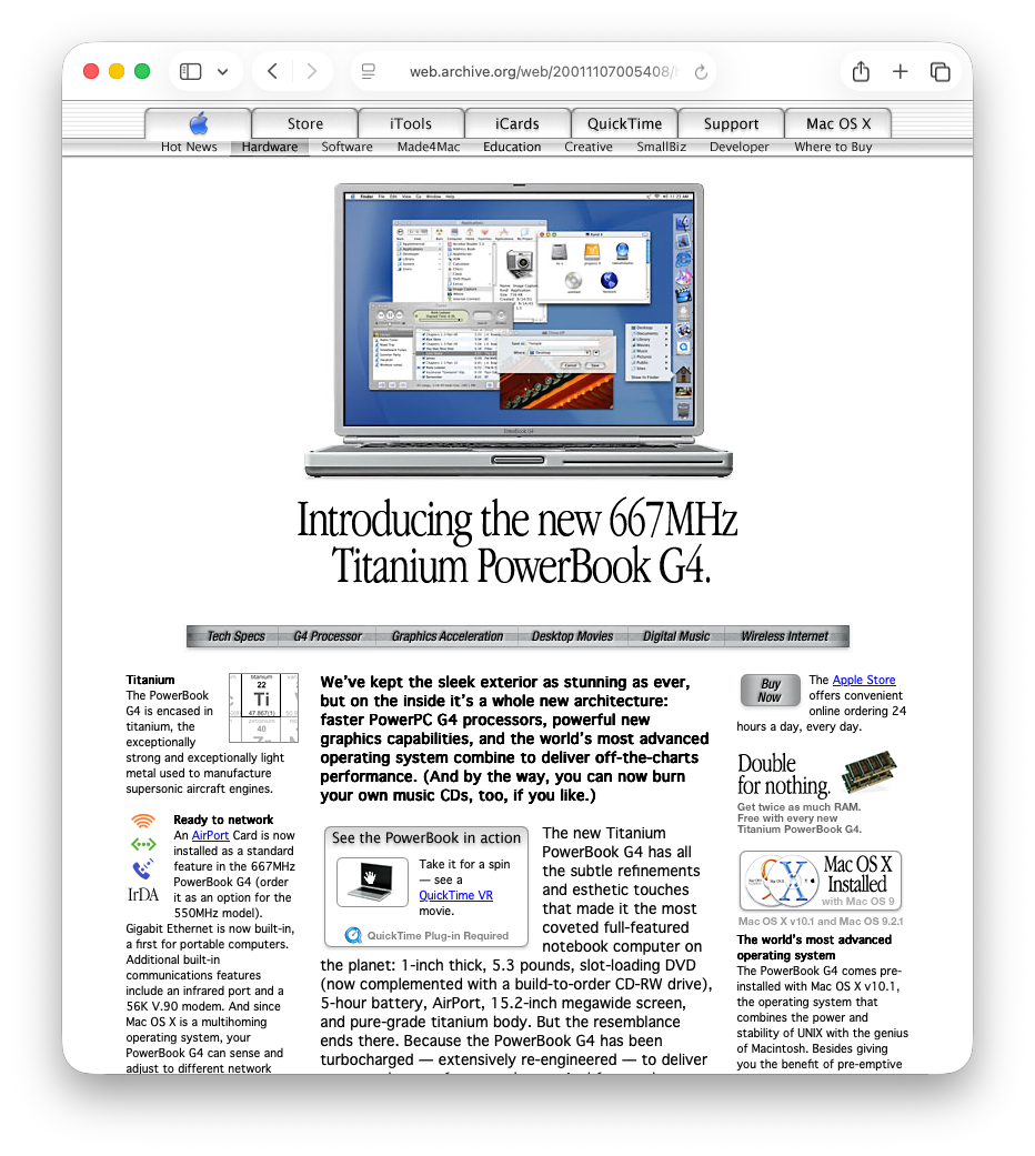
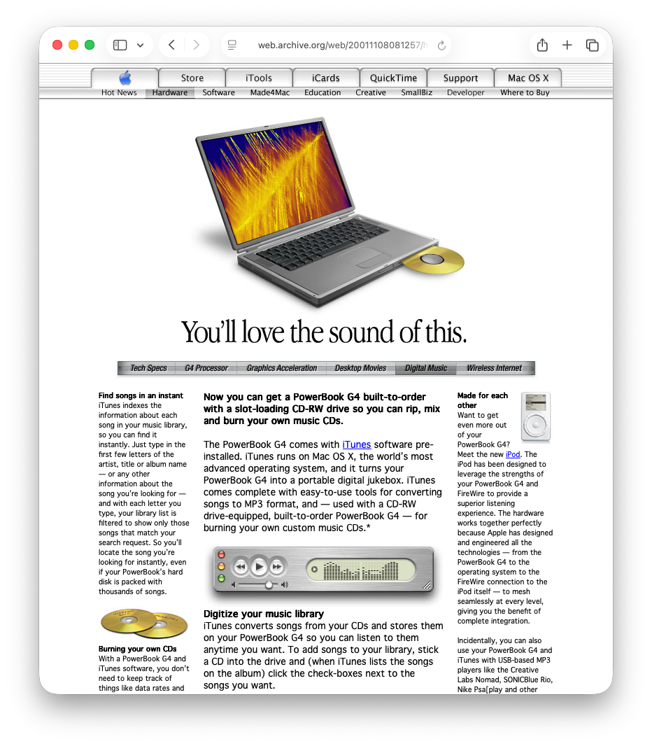
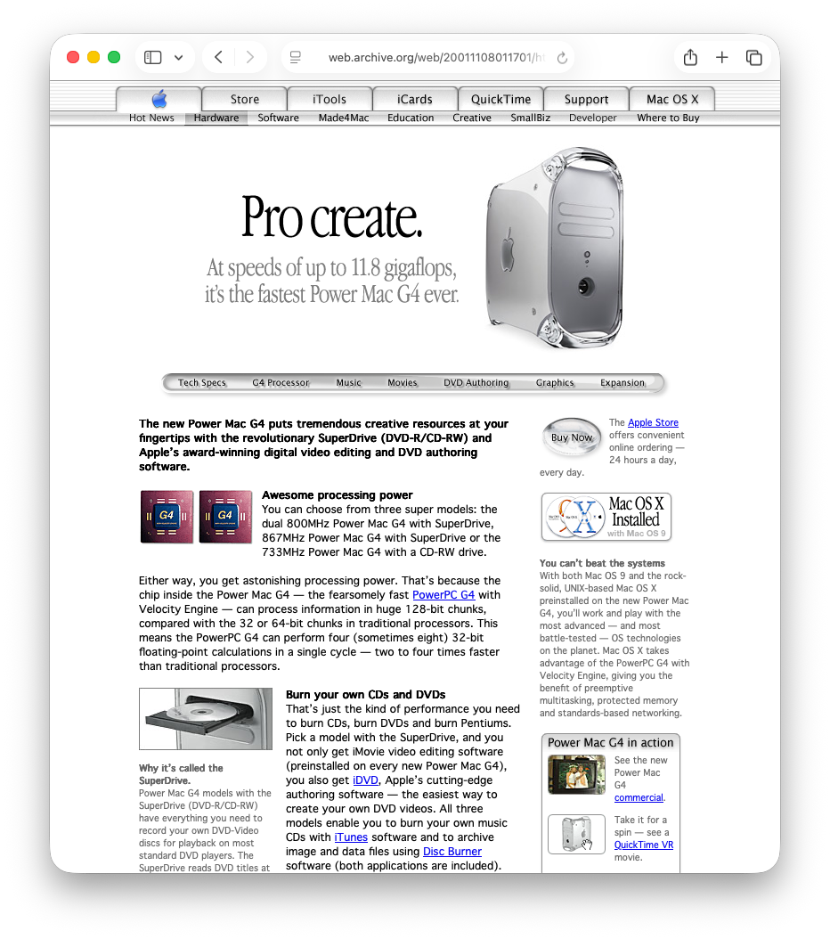
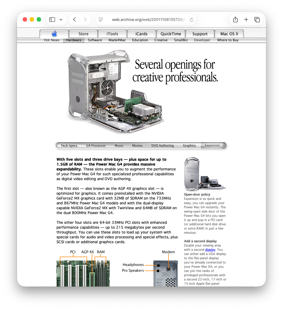


Having owned both a TiBook and a Quicksilver, I do get the nostalgia. The reality was a bit different, especially after 2010.Speaking of things we've lost
View attachment 2659025View attachment 2659026View attachment 2659027View attachment 2659028
for non-system apps you can still change the app icons to non-squircles by going to the app in the finder, selecting, getting the info pane; and then copy pasting an icon onto the app icon in the info pane
I was hoping for so many years that Apple would eventually just combine Launchpad and the desktop widgets that they introduced in Sonoma.I used and miss Dashboard. It was a nice place to have widgets.
I didn’t realize I’d started using LaunchPad as much as I had until Tahoe removed it. LaunchOS app does a pretty good job of providing similar functionality as LaunchPad with the benefit of additional settings/features.
This setting (Accessibility | Display) enables the little icons next to the Finder device/location in the title bar.


Agree with the entire post, but this right here, for me, gets to the heart of the matter.MacOS feels childish and lazy as opposed to austere and clean. The whole vibe of the OS just feels off, like a hodgepodge.
Dashboard was amazing -- just a super fast HUD that would quickly appear as needed. Layering like that is such an underutilized concept. The little strip they replaced it with is so constrained and dumbed down. Because it’s so narrow, I find myself having to scroll down to see things if there’s much in there. And because it shares its real estate with notifications (which is really weird), that just eats away even more at its available space. Not well thought out.I used and miss Dashboard. It was a nice place to have widgets.
Early OS X was gorgeous ☺️Aqua UI and skeuomorphism. I miss both
View attachment 2658983

Not a Mac OS one but I used to love Cover Flow on OG iPods and early iOS versions.Hey,
I've been a macOS user since the early days of the Mac OS X big cat era. MacOS has changed a lot since then, some for the better, some for the worse. Sometimes, for no reason at all, features go lost. What are the things "we"ve lost" that you are most sad or mad about. I'll give some (quaint) examples of mine:
• the colored finder sidebar (lost with Lion I think). I found it soooooo much easier when the folders in the sidebar had icons in full color. I mean: how nice is this: View attachment 2658833
• the little folder or file icons on top of the window chrome (like the little house icon next to "guest" in that previous image) that you could drag and drop as if it was the folder or file. Now you have to hover and wait for it to appear.
• No longer being able to drop a file or photo on the messages icon to send it to someone... was so handy and so Mac-like. Suddenly with an update it stopped working....
so... what are yours?
Wow, I mean I joined in the iPod era, then got my first Mac 2010 MacBook Pro 13 inch.Speaking of things we've lost
View attachment 2659025View attachment 2659026View attachment 2659027View attachment 2659028

the old "About This Mac" would show the OS's logo (the same one from the installer icon) like the Mojave desert for 10.14 or the Catalina cliffs for 10.15. they replaced it with the device icon in Ventura. I think until Mavericks or El Captain they just had the Apple logo in there ? I do not remember anymore as I wasn't looking there much.

But not really usable for paid employment until Jaguar. Not really fully functionable until Panther and not fully customizable until Panther/Tiger.Early OS X was gorgeous ☺️
I was working on Macs in print publications all through that time. I remember switching over to OS X, probably around... 2001? I remember it feeling super futuristic, especially when we started getting all that new translucent hardware. That first clear mouse with the laser instead of a roller ball underneath really blew my mind!But not really usable for paid employment until Jaguar. Not really fully functionable until Panther and not fully customizable until Panther/Tiger.
99 percent of my employment in the last 27 years has been with small, weekly newspapers. The paper I left in 2003 was still using OS9. I didn't get fully into OS X until mid-2004 at a new paper (one I stayed at for 14.5 years). Had to update the Mac and that's when I found out that labels weren't supported. I think they came back in Panther.I was working on Macs in print publications all through that time. I remember switching over to OS X, probably around... 2001? I remember it feeling super futuristic, especially when we started getting all that new translucent hardware. That first clear mouse with the laser instead of a roller ball underneath really blew my mind!

Four things immediately spring to mind…
1. Popup windows. This was an OS9 feature where you could move a Finder window to the bottom or side of your screen and the title bar would minimize and appear as a tab. Moving your mouse over the titlebar/tab popped the entire window up. When you were done and moved your mouse away, it sprang back to the side or bottom as the titlebar/tab again.
2. Minimizing windows in place.
3. Color labels. And I'm not talking about the dots. I mean, full length color labels for folders/files.
4. Minimum Finder window width. Since Lion, there is a minimum Finder window size and you need an Applescript to make a Finder window smaller. Move it and it springs back to the minimum size.
Those things I have whined about losing frequently.

Yaaaas. The simple colored circle/dot in Tahoe is flat out horrible for those that are colorblind. I'm not even that bad and even I can't tell the difference between red and green dots until I stop and look closely. I LOVED the full length pill colors. Glad they're getting a bit better in GG.3. Color labels. And I'm not talking about the dots. I mean, full length color labels for folders/files.
Yeah, Apple literally stole it from Cover Flow (the app’s name at the time) and did it so brazenly, they even kept the official name of the app it first appeared in! It was disgraceful.Not a Mac OS one but I used to love Cover Flow on OG iPods and early iOS versions.
I think it got removed due to a law suit from not paying licensing fees?
Either way, I do miss the old aesthetic of Cover Flow in music.
macOS not intelligently (use a damn ratio not a static default window size) scaling new windows to the size of the display has always been peak insufferable. Getting a 120x80 px window on a 27” display is just so grating. The scaling across the board could be fixed by using a percentage of the physical display with little effort but that tiny little bit of effort would take a user to the stars! How annoying it is to have to constantly resize everything 😡
- Long pressing icons and minimizing does the same thing
- Absolutely still exists: View attachment 2659061
- Sort of made a comeback in Goldengate? Adding the dot also changes the folder color View attachment 2659062
- Why on earth would you ever need a finder window smaller than this, not saying to argue I am simply confused as to why?View attachment 2659064
That was all Jobs. Even going back to the Bondi Blue iMac, he historically hated trays and felt them to be absolutely unnecessary. He had to fight with c-suite who wanted to cut costs as they were significantly cheaper than slot loaded drives but Jobs did not budge.However I did love the slot loading drive on the side of my first MacBook.
After reinstalling macOS, one of the first OCD things I do is resize my app windows to fit my Studio Display. And I’ve been using Magnet for years to center app windows (and generally manage app windows). Since Big Sur, the only app that doesn’t retain size and position is Disk Utility. It always opens up slightly different sized and different location. And Books sometimes I have to resize twice, change the view maximize/minimize then close and it finally saves the size/position. And I’ve noticed since Ventura probably that when I resize Finder I have to then do something like copy, make a duplicate, some sort of file action otherwise if I just open it up, resize, reposition, it just goes back to the previous size/position upon reopening. Lots or quirks like this.macOS not intelligently (use a damn ratio not a static default window size) scaling new windows to the size of the display has always been peak insufferable. Getting a 120x80 px window on a 27” display is just so grating. The scaling across the board could be fixed by using a percentage of the physical display with little effort but that tiny little bit of effort would take a user to the stars! How annoying it is to have to constantly resize everything 😡
Like WTH is this?! A UI for ants!?!? How they thought this would be even remotely acceptable I don’t even know.
View attachment 2659077

