It's better than nothing but still not nearly as useful as the full row highlight (which I still get as I do use XtraFinder). Plus this new folder coloring on Golden Gate doesn't seem to apply to custom folder icons.Sort of made a comeback in Goldengate? Adding the dot also changes the folder color

Got a tip for us?
Let us know
Become a MacRumors Supporter for $50/year with no ads, ability to filter front page stories, and private forums.
things we've lost
- Thread starter Contact_Feanor
- Start date
-
- Tags
- feature request feelings macos
- Sort by reaction score
You are using an out of date browser. It may not display this or other websites correctly.
You should upgrade or use an alternative browser.
You should upgrade or use an alternative browser.

and faux glass, which I’m sorry but conceptually runs against the childish fiverr glyphs, gives off serious Fisher Price vibes.
totally. now, if you enable the 'Show borders' accessibility option, it removes the glassification from the buttons (as you may know anyway). with this option on, Golden Gate looks pretty decent, in my view.

conmee
macrumors 65816
Didn’t they source those from Sony who charged a pretty penny for the slot loading drives? It’s little stuff like this that endeared me to early Mac, just like the floppy drive the Mac used. Instead of a big dumb mechanical eject button like all the PCs, the Mac floppy had the cool/elegant way of ejecting the floppy. Felt futuristic lol.That was all Jobs. Even going back to the Bondi Blue iMac, he historically hated trays and felt them to be absolutely unnecessary. He had to fight with c-suite who wanted to cut costs as they were significantly cheaper than slot loaded drives but Jobs did not budge.
A lot of the extra bits of quality found across all of Apple’s older hardware and software was all Jobs.

eyoungren
macrumors Nehalem
This is what I mean…Clicking outside the tab below will cause that tab/window to collapse to just the tab which sits at the bottom of the window. You could have multiples of these laid out across the bottom and sides. Clicking on the tab/window titlebar would open that window as shown in the picture.[*]Long pressing icons and minimizing does the same thing

Right. Which makes the window go to the application icon in the dock. I killed the dock a long time ago. I use an app launcher and CMD+TAB to switch between apps. I'm aware of how to bring a minimized window back via keyboard shortcuts, but I'd prefer to collapse to a titlebar in place with some windows.[*]Absolutely still exists: View attachment 2659061
This is what I am talking about. I suppose it's 'collapsing' a window.

The collapsed window can be moved anywhere on the screen. Double clicking the title bar opens it back up to full size.
I'm on Sonoma. On a 2009 Intel Mac Pro. OCLP does not support Tahoe and Golden Gate has no Intel code. I'm not getting there anytime soon.[*]Sort of made a comeback in Goldengate? Adding the dot also changes the folder color View attachment 2659062
Reasons.[*]Why on earth would you ever need a finder window smaller than this, not saying to argue I am simply confused as to why?View attachment 2659064
See my Finder windows below, on a work Mac I was using at the time (2018, late October a few days before the business was sold). All these windows were for shares on a PC server. All I needed to do was monitor them for files being moved in and out by an Applescript server. I wasn't actually working inside those Finder windows and being able to lay them out this way meant they didn't overlap. Which is now a problem.

Also, I'd appreciate being able to see more of my wallpaper. I leave certain frequently used Finder windows open all the time.
Last edited:
neuropsychguy
macrumors 68040
That's one reason I like Liquid Glass. It's closer to Aqua and that early OS X look than what we've had in a long time.Early OS X was gorgeous ☺️

Ben J.
macrumors 65816
They say that the owners of coverflow took back the rights to it, or Apple didn't want to pay the price.Not a Mac OS one but I used to love Cover Flow on OG iPods and early iOS versions.
I think it got removed due to a law suit from not paying licensing fees?
Either way, I do miss the old aesthetic of Cover Flow in music.
I loved it, though I didn't think of it as a 'itunes album browser' at the time, I used it in Finder. F.ex I had a folder in my dock with screenshots of a lot of audio plugins in subfolders like EQs, Dynamics, Reverbs etc. Very nice to browse thru to find the audio plugin I needed.
I now use folder fullscreen windows in 'gallery' view in Finder, but it's way less beautiful.
Last edited:

NC12
macrumors regular
Technically the current version is closest to what we head around lion and mountain lionthe old "About This Mac" would show the OS's logo (the same one from the installer icon) like the Mojave desert for 10.14 or the Catalina cliffs for 10.15. they replaced it with the device icon in Ventura. I think until Mavericks or El Captain they just had the Apple logo in there ? I do not remember anymore as I wasn't looking there much.
Couldn't agree more. What a piece of blob this 27 Golden Gate is. Running betas since Beta 5 and it's just bad. Actually so bad that I'm thinking about going back to Sequoia that was faster, less buggy, and had a much cleaner interface.I do miss the lovely 3D Dock! They also gutted TM but kept some parts to where it no longer makes sense, conceptually.
I also miss how tight and zippy their software felt. It now feels like there’s a sea of code behind any app that makes it behave like mud. It’s just a qualitative feel I don’t like. Little stutters. The iconography now feels like fiverr art. Just boring glyphs without much thought behind them. No cleverness or care. FaceTime is just the shape of a green camera. Messages, a green chat bubble. Phone, shocker, an old school phone. Home… a home. You cannot get more base than that. Emojis have more character and quality to them.
The ugly ash rounded borders and faux glass, which I’m sorry but conceptually runs against the childish fiverr glyphs, gives off serious Fisher Price vibes.
MacOS feels childish and lazy as opposed to austere and clean. The whole vibe of the OS just feels off, like a hodgepodge.
The constant bugs that are piling up, never getting fixed despite being just so obvious are becoming truly insufferable. We all expected a Snow Leopard pass on OS26, but we didn’t even get that! Just minor tweaks. Literally every bug in OS26 is still there. I really miss Jobs’ commitment to quality software. Something Cook gutted real quick and now it’s impossible to ignore the sad state it’s in.
This disaster looking blobs of Liquid Glass ovals and circles, squircles and buttons are just bad. And it looks bad everywhere. Mac, iPhone and iPad. So many times you can't see the control elements or buttons over the content. What a horrible design choice. Clean, fast design with easily recognizable control elements be damned. It's so out of place I cannot wait for Ternus to clean out the house. I hope he will...
It's like everything is designed by sloppy teenagers.
Also, what the heck is the jiggliness of the street lights? And how they overlap each other when stretched. See attached video.
The attention to detail in software at Apple started going down the toilet since Covid in 2000. Hardware is still the best. But software is started going in direction of fisher price iPad.

goldmac2006
macrumors 604
Launchpad is rly a commonly missed feature.I used and miss Dashboard. It was a nice place to have widgets.
I didn’t realize I’d started using LaunchPad as much as I had until Tahoe removed it. LaunchOS app does a pretty good job of providing similar functionality as LaunchPad with the benefit of additional settings/features.
I miss 32-bit compatibility for a few games and apps that have sentimental value. Would be cool to have an optional “32-bit subsystem for macOS” type of download.
I will miss Rosetta for mainly one little app. Not sure why it can’t just remain a sandboxed optional download in the future.
I miss iTunes. Everyone complained about bloat and other things at the time, but I believe a large amount of users would agree that the way in which Apple broke things up (especially Apple Music which in many ways is still inferior to iTunes) made things worse rather than better. Two non-music features that were cool was being able to archive iPhone app files so you could always have an older version on hand to load or revert to. Another feature was seeing all your pages of apps on your phone at one time and being able to drag and drop apps between pages and organize entire phone. It was so much more convenient (or efficient at least) than dragging things around with finger on the device.
Another one I would say is the tab organisation in safari. We ain’t have the compact version or regular version of tabs since Tahoe took it away.
GrumpyOldGuy52
macrumors 6502
I miss the Power Mac G3/G4 chassis. Those machines were an absolute joy to work on (I still have a small scar from opening a Gateway from the same time period). Sure, the Mac mini and the Mac Studio are interesting… but look at it. You could buy a base machine for relatively cheap and then upgrade—easily—as you had resources.
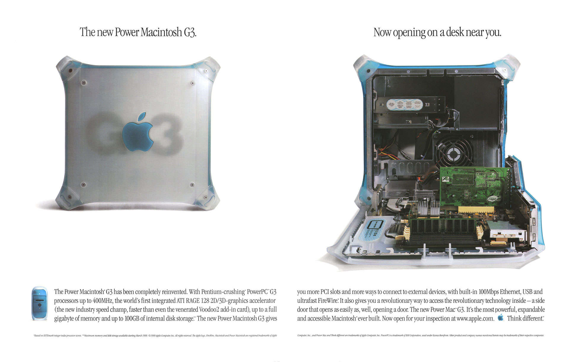

IvyKing
macrumors 6502a
I kept my 2019 MBP on Mojave until turning it over to my daughter just so I could keep using the RPNScientific calculator app. The MacOS calculator app has some of the features for RPNScientific, but missing a number of useful ones such as physical constants and 20 addressable memory slots.I miss 32-bit compatibility for a few games and apps that have sentimental value. Would be cool to have an optional “32-bit subsystem for macOS” type of download.
JamesMay82
macrumors 68000
iTunes and front row for me.
The current music app is fine but its now got loads of syncing bugs when I connect my phone like duplicating playlists etc
The current music app is fine but its now got loads of syncing bugs when I connect my phone like duplicating playlists etc

sleep/to/dream
macrumors demi-goddess
That's the most "Mac-like" thing I’ve ever heard, wowClassic MacOS 9 had Print-to-file print queues and Desktop print queue icons. You could drag a document onto the icon, and the file's app would launch and print it to that printer.
You could also drag a print job from one print queue to another. You can't do that in the "Print Centre" app.
It does seem like overall we've lost a lot of drag-and-dropability, which I always remembered as being a hallmark of OS X/Macs
sleep/to/dream
macrumors demi-goddess
I really think it would be good for Apple to revive the iTunes/Music store and bring back an iPod, given the recent popularity of dedicated music players and physical media. Many in gen Z are realizing how important it is to own copies of your music.
I’ve been buying a lot of music on Bandcamp, Apple could have easily gotten those sales if they had lossless music available for purchase, but no one is going to buy songs on iTunes when they could get DRM-free lossless for the same price.
I’m still subscribed to Apple Music as it’s my favorite way to discover music and my library is much larger than what I can afford to purchase. I don't think Apple would lose many Apple Music subscribers, in fact I think they would gain more as people will want their libraries to be integrated.
Simply showing a little badge next to purchased music the way they do with downloaded music now would give people that sense of ownership, and they would know what they'd still have access to if they unsubscribed.

Skylar.
Contributor
I miss the old layout of the settings app, before Ventura redid it. The new one being full of menus on top of menus feels so much less organized than it was before.

GregoryPeckEPA
macrumors 6502
Books resizes if you open and close it (not fully quit)., bouncing between two sizes indefinitely.And Books
Launch it fresh and resize the window, hit the red close traffic light and click on it in the Dock, it will launch again with a smaller window. Do that again and it will open with the larger window. It will continuously juggle these two window sizes.
The bug has been there since macOS 13 I believe. I’ve filed dozens of BRs to no avail. Infuriating to leave a core app broken.
Just another example of Cook’s lack of interest in spending any more than absolutely necessary on software. Bottom barely coding.
GregoryPeckEPA
macrumors 6502
I can’t stand those obnoxious wobble animations. They are so nonsensical and inappropriate. Especially on notifications. They extend the time for them to manifest and during that animation, are essentially unreadable (or feels like you’re drunk trying to stumble home). I recall someone way back in the jailbreak community created animations that made notifications fold into view, which made so much sense. I think Apple hired them.Couldn't agree more. What a piece of blob this 27 Golden Gate is. Running betas since Beta 5 and it's just bad. Actually so bad that I'm thinking about going back to Sequoia that was faster, less buggy, and had a much cleaner interface.
This disaster looking blobs of Liquid Glass ovals and circles, squircles and buttons are just bad. And it looks bad everywhere. Mac, iPhone and iPad. So many times you can't see the control elements or buttons over the content. What a horrible design choice. Clean, fast design with easily recognizable control elements be damned. It's so out of place I cannot wait for Ternus to clean out the house. I hope he will...
It's like everything is designed by sloppy teenagers.
Also, what the heck is the jiggliness of the street lights? And how they overlap each other when stretched. See attached video.
The attention to detail in software at Apple started going down the toilet since Covid in 2000. Hardware is still the best. But software is started going in direction of fisher price iPad.
View attachment 2659118
Everything wobbling in liquid glass (like moving tabs on navbars, etc.) are so pedestrian and add nothing but more grievances than make the OS feel “alive.”
Apple’s designers used to have really good understanding of thematics and accessibility. I guess those guys all left during COVID.
GregoryPeckEPA
macrumors 6502
Funny you mention that. I went back to Sequoia and I enable that setting because it adds a nice subtle box around all the UI buttons. I absolutely love how it looks!totally. now, if you enable the 'Show borders' accessibility option, it removes the glassification from the buttons (as you may know anyway). with this option on, Golden Gate looks pretty decent, in my view.

conmee
macrumors 65816
I stopped mentioning it since people probably got tired of me repeating during my “journey” from Intel to Apple Silicon, lol, but I kept my maxed out 2019 15” MBP with Core i9 32GB and Vega 20 4GB (sold the 2019 16” since it came with Catalina) when I bought my M5 Max. I currently have Mojave with a dozen or so 32-bit apps and games installed with Win 10 for Bootcamp and Parallels 18 for all my older OSes (Win7, WinXP, Win98, OS/2 2.11, PC-DOS 3.3), and also a Quadra+System 8 emulator, and MESS/MAME for my TI-99/4a and C64 systems (and for these I also have the actual physical systems set up on a separate desk). But it would be convenient to be able to run the 32-bit stuff in emulation on Apple Silicon. The M series is powerful enough to run the ancient 32-bit/16-bit stuff I’m interested in pretty quickly.I kept my 2019 MBP on Mojave until turning it over to my daughter just so I could keep using the RPNScientific calculator app. The MacOS calculator app has some of the features for RPNScientific, but missing a number of useful ones such as physical constants and 20 addressable memory slots.

Madonepro
macrumors 68000
Bring back the days when an OS install was customisable.Yeah I wouldn’t want Apple to keep 32-bit compatibility and Rosetta as part of the default macOS install, it just would be cool to have optional downloadable components (like Windows does with things like Windows Subsystem for Linux, Print to PDF, or Telnet, etc). In fact, Rosetta installs only if you launch an Intel app on Tahoe. And even if they made some generic virtual environment (maybe a subset of Parallels frameworks) that ran 32-bit code in a sandbox that would be good enough for me. I was able to run 32-bit apps in a Mojave VM on Sequoia on my 2019 16” Intel MBP but I couldn’t bring that VM over to my M5 Max.
I want macOS to continue to evolve and move forward and wouldn’t want it bogged down by lots of legacy code, but a couple optional components for virtualized 32-bit and Intel apps for example wouldn’t be a huge effort or overhead and wouldn’t impact any macOS user unless they specifically installed the optional features/components.
izzy0242mr
macrumors 6502a
This definitely is not gone—I use this feature daily, and have never had to do any Terminal command to make it work. I use it both on my Mac running Sequoia and my Mac running Golden Gate beta.• the little folder or file icons on top of the window chrome (like the little house icon next to "guest" in that previous image) that you could drag and drop as if it was the folder or file. Now you have to hover and wait for it to appear.
You don't need to hover; you do need to click and hold for a second before dragging though. If you click and immediately drag, it just moves the window around.
GregoryPeckEPA
macrumors 6502
TBF, the mini is kinda super well thought out because all the guts just slide out on a tray. The Studio is an abomination compared to say the MacPro 2013 that could be fully accessed in 5s flat. The fact you need to rip off the rubber ring (they could have cut holes) to reveal the screws notwithstanding. I used to de-dust my MP 13 weekly. I haven’t yet cracked my Studio but I know it’s just caked with dust in there (M1 purchased in 2022)!Sure, the Mac mini and the Mac Studio are interesting…
I don’t understand their drive to seal them as tightly as an iPhone. De-dusting preserves any PC far better than any other maintenance routine. Especially the fans.
GregoryPeckEPA
macrumors 6502
Actually I believe they took it out in 26 but can be returned using a defaults entry. May have been even earlier when they revamped the Settings to look more like iOS.This definitely is not gone—I use this feature daily, and have never had to do any Terminal command to make it work. I use it both on my Mac running Sequoia and my Mac running Golden Gate beta.
You don't need to hover; you do need to click and hold for a second before dragging though. If you click and immediately drag, it just moves the window around.