...but I want you to want what fits *me* personally.I've never understood why "fanboys" on both sides care who sues who/who copies who/etc. beyond the typical BS "rah rah! root for your team!" mentality.
At the end of the day, I could care less. I just want what *I* think fits *me* personally.
Can someone honestly explain why this "who wins over who" matters besides the BS "rah rah! Root for your team!" mentality?
I look over at what I own:
Samsung LCD TV --> Awesome Love it.
iMac --> Awesome love it.
XBox 360 --> Awesome love it.
Kindle --> Awesome love it.
iPhone 4 --> Awesome love it.
iPad (gen 3) --> Awesome Love it
PS3 --> Awesome love it.
Galaxy Nexus --> Awesome Love it.
Does it matter to me to the accusation that apple makes that the Nexus copies off of the iPhone? Nope... It's still a great device. Why should I (or any other consumer) care?
Please... fanboys... please explain.
w00master
Got a tip for us?
Let us know
Become a MacRumors Supporter for $50/year with no ads, ability to filter front page stories, and private forums.
UK Judge Rules Apple Must Publish Notices Acknowledging Samsung Did Not Copy iPad
- Thread starter MacRumors
- Start date
- Sort by reaction score
You are using an out of date browser. It may not display this or other websites correctly.
You should upgrade or use an alternative browser.
You should upgrade or use an alternative browser.
I bet you'd be able to upgrade the ram in them, at least.
You'll need an Apple certified drill used by an Apple Genius.
You need to re-examine your life if you love a company so much that you have to debase their competition. What kind of illogical question is this? You want someone to name a technological advancement that Samsung has made besides things that are fabricated ie things that require a process to make? You've just excluded every physical technology out there because every physical technology needs to be fabricated.Name one technological advancement Samsung has made aside from fabrication. Or is that all you got?
Before the iPad, tablets sucked.
After the iPad, everyone well... er... copied the iPad.
I think the iPad inspired a lot of the designers in the PC world, and only a few went so far as to "copy" the design.
That said, I owned a lot of pre-iPad tablet computers, as we'll as UMPCs (the old ultra-portables) ... they were really cool toys. But that's really just about it... they were part of the evolution. Never really worked when I needed them too, always missing something ... etc.
I think the closest thing to an iPhone on level of 'actually works right' device I owned were the Sony Clié units, if anyone else here remembers those. They were a Palm OS device that actually worked, usually
I think Apple ripped off Android with notifications...I also think Android ripped of WebOS for those same notifications...and I think that was Apple's justification for doing so.
I'm sorry, but Android had the sliding drawer notifications with custom messages, views, and icons way before WebOS was even unveiled. Do you really know what you're talking about?!?!?!?!?!?!?!?
Really? Do you work for HP's legal team now, too?They'll both get sued over it, and they both deserve to be.
Are you expecting anyone to say that Apple isn't copying anyone with iWork?!?
I thought they looked "as alike" or "more alike" than the Samsung icons.
Certainly there is a huge possibility set of how to design icons. So given this...
Apple does copy the color schemes of blue, green and orange for the icons, as used by Novell, Corel and imitated by MS.
Apple uses the quill, first seen in WordPerfect.
The bar chart from Lotus 1-2-3.
The wood and podium from presentations.
Never mind that they are designed as three separate apps and they don't need to be (i.e. remember Microsoft Works).
So I'm just saying, you can stretch Apple just as much as you can stretch Samsung.
Ahhh, I see. Sorry that it went over my head. LOL. Totally agree with you.
w00master
You'll need an Apple certified drill used by an Apple Genius.
"They call me a genius for a reason, sir. Stand back. I'm doing technology work". *drill noises*
"That'll be $499 plus tax".
I can't understand this; is it even a valid sentence that can be passed? I could understand Apple being made to pay for legal fees, make some kind of formal apology, but otherwise news sources are going to report this anyway so it makes no sense.
It's also very arbitrary; of course Samsung are copying Apple, any tablet device company would be foolish not to. In this case the similarity simply isn't enough to infringe upon the iPad, but there are definitely similarities there.
The ruling is just nonsensical.
It's also very arbitrary; of course Samsung are copying Apple, any tablet device company would be foolish not to. In this case the similarity simply isn't enough to infringe upon the iPad, but there are definitely similarities there.
The ruling is just nonsensical.
http://9to5google.com/2012/05/05/2007s-pre-m3-version-of-android-the-google-sooner/
I don't think I need to point out the changes...
Please, point them because those screenshot shows that basically Android has had the same foundation from the beginning
Ahhh, I see. Sorry that it went over my head. LOL. Totally agree with you.
w00master
w00master, we have no love for a company so it's hard for us to notice the details like others do.
For one, there is no way we could think Samsung blatently copied the green phone from Apple... We just don't love Apple enough to think that way.
----------
Are you expecting anyone to say that Apple isn't copying anyone with iWork?!?
Iconoclysm, so where is your proof that Android copied WebOS' notification by using a time machine to go to the future?
Since Corning claim they came up with the glass in 2006 is it not possible they might have actually tried to sell it to a range of mobile makers, it just so happened that apple had a phone coming out around that time so bought it, other also bought into it for there future releases.
Meaning Corning actually sold it and marketed it to phone companies apple didn't go to them
There is no evidence for that, but there is evidence to back up the idea that it's because of Jobs' initiative that Gorilla Glass was introduced to the market.
...but I want you to want what fits *me* personally.
Actually there is a reason to care. Particually if a judge rules that something is infringing and you can;t by a iPhone 5 or a GS3 because some judge puts an import ban on the thing because, for example any tablet with a pixel density of 330ppi is infringing some panel patent.
What iconoclast apparently prefers is that the full extent of the law is imposed on a company that made their glass to shiny, or put a rounded curve more than 1 inch from the top, but less than 2 inches from the top, or that put a button in the center bottom, or a camera 1/3 the way from the left.
And he definitely wants us to **** over those sneaky, copycat Korean's because those soul-less bastards don't care about creating new things, they just want to copy copy copy copy copy copy copy copy copy and then laugh at the white man as they drown their soul-less careers in soju...
Well **** that racist ****. Like woomaster said, I want the best tech out there and whoever makes it, I'm happy to pay em.
It's also very arbitrary; of course Samsung are copying Apple, any tablet device company would be foolish not to. In this case the similarity simply isn't enough to infringe upon the iPad, but there are definitely similarities there.
.
But thats just it.
Samsung may have taken cues from Apple.
But Apple took it's fair share of Cues from everyone else as well. Apple is no saint for taking technologies other people have, and makign it their own
The difference is.
Who's been suing who with no end? Historically what happened when a company copied another company, the holder of the patent would attempt first to enter into a license agreement in which to profit from the other company.
Somewhere, Steve Jobs threw that out the window and went on a litigation tyrade to completely squash any competitors instead of brokering license agreements.
Apple has done it enough, and pushed so much with it, that a lot of organizations are sick of them. Both Apple and Samsung have had court cases recently completely tossed because of it. In a recent ruling in California, Apple sued (I believe motorolla) for a few hundred different patents. Moto retaliated with litigations of their own attempting to get apple to broker licence agreement. Apple refused to budge or negotiate. Finally the judge told them both to pick a couple patents to sue over. Finally the jduge thrrew the case out completely cause neither side could actually come up with any real damages.
Iconoclysm, so where is your proof that Android copied WebOS' notification by using a time machine to go to the future?
He works for Microsoft, remember? He's owned prototypes of phones from every manufacturer including five touch screen phones before the iPhone. What a badass! He's practically omniscient. Trust him when he implies Google sent corporate spies to Palm and stole their notification idea all the way in 2007.
You need to re-examine your life if you love a company so much that you have to debase their competition. What kind of illogical question is this? You want someone to name a technological advancement that Samsung has made besides things that are fabricated ie things that require a process to make? You've just excluded every physical technology out there because every physical technology needs to be fabricated.
What if I love ALL companies that Samsung competes with so much that I debase just Samsung? Would that change anything? So I can't be a fanboy of one company...can I be a fanboy of all of them? Maybe you should re-examine your approach if you immediately assume anyone who dislikes Samsung sucks on Apple's ****.
Oh, and you didn't answer the question because you don't seem possess reading comprehension.
I can't understand this; is it even a valid sentence that can be passed? I could understand Apple being made to pay for legal fees, make some kind of formal apology, but otherwise news sources are going to report this anyway so it makes no sense.
It's also very arbitrary; of course Samsung are copying Apple, any tablet device company would be foolish not to. In this case the similarity simply isn't enough to infringe upon the iPad, but there are definitely similarities there.
The ruling is just nonsensical.
Yes. It's a valid sentence. And if Apple doesn't win an appeal - they can be forced to issue statements as dictated by the courts - just like any company would have to change labeling or take out a full page ad at their expense to "apologize."
You may not like it - but it's valid.
Please, point them because those screenshot shows that basically Android has had the same foundation from the beginning
Come on really? The Android phone depicted in the video and photos are completely different from what it is post-iPhone.
The other examples are just enforcing that using something what was there before - and Gorilla Glass was - is not an enforcable protected design choice.
I never claimed it was an enforceable protected design choice, quite the contrary, so there is no point in bringing that up. It's beating a dead horse.
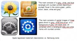
Those icons, for instance, they may not be exact copies - they don't have rounded edges, they are slight shades different. But when you define them with words, it's impossible to not realize you're describing the same thing.
Actually, the descriptions that Apple listed in their icon trademark applications point out that the details are often quite different:

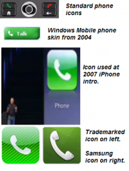
As for the green phone icon, what you have to realize is that Apple chose it to LOOK LIKE the Send icon that had been used on phones for years. It was so common, that they couldn't even trademark the first one they showed off... they had to throw in background stripes in their trademark application:

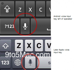
Likewise, when it came time to add microphone icons, Apple ... just like other companies... used familiar looks:


As for the packaging, styles come and go. Apple's interior setup looks like a clone of the Prada's packaging which came out before the iPhone did:

What if I love ALL companies that Samsung competes with so much that I debase just Samsung? Would that change anything? So I can't be a fanboy of one company...can I be a fanboy of all of them? Maybe you should re-examine your approach if you immediately assume anyone who dislikes Samsung sucks on Apple's ****.
Oh, and you didn't answer the question.
Maybe you hate just Samsung, but you've sure proven that you don't know what the hell you're talking about. How could anyone with any experience in this industry forget that the Palm Pre came out well after Android?
Come on really? That video and those pictures are completely different from what Android phones are today.
That pictures, launcher, etc are not different from what the G1 was.
Froyo is very different from ICS, are the changes also because they had copied the iPhone?
Having someone answer my question is me getting owned?
Sorry buddy.
Ownage. Exhibit 2.
Those icons, for instance, they may not be exact copies - they don't have rounded edges, they are slight shades different. But when you define them with words, it's impossible to not realize you're describing the same thing. If you're trying to disprove this it's very easy to leave conventional wisdom behind and make statements like "They look nothing alike".
Actually, the descriptions that Apple listed in their icon trademark applications point out that the details are often quite different:
View attachment 348735
As for the green phone icon, what you have to realize is that Apple chose it to LOOK LIKE the Send icon that had been used on phones for years. It was so common, that they couldn't even trademark the first one they showed off... they had to throw in background stripes in their trademark application:
View attachment 348736
Likewise, when it came time to add microphone icons, Apple ... just like other companies... used familiar looks:
View attachment 348742
View attachment 348743
As for the packaging, styles come and go. Apple's interior setup looks like a clone of the Prada's packaging which came out before the iPhone did:
View attachment 348739
What if I love ALL companies that Samsung competes with so much that I debase just Samsung? Would that change anything? So I can't be a fanboy of one company...can I be a fanboy of all of them? Maybe you should re-examine your approach if you immediately assume anyone who dislikes Samsung sucks on Apple's ****.
Oh, and you didn't answer the question because you don't seem possess reading comprehension.
Either way, you just sound biased.
Register on MacRumors! This sidebar will go away, and you'll see fewer ads.

