Got a tip for us?
Let us know
Become a MacRumors Supporter for $50/year with no ads, ability to filter front page stories, and private forums.
Wave-Themed OS X Banner Goes Up at Moscone West for WWDC 2013
- Thread starter MacRumors
- Start date
- Sort by reaction score
You are using an out of date browser. It may not display this or other websites correctly.
You should upgrade or use an alternative browser.
You should upgrade or use an alternative browser.

Despite being about a quarter German, I only speak as much of it as you get by default by speaking English, so I'm sure that's correct. Amusingly, though, "no-ya" and "noi-yeh" come out sounding pretty much the same in my head. Maybe it's because years of Romaji have me reflexively read the former as having Japanese-y pronunciation?I think it's closer to "noi-yeh" phonetically. But I lost my 'consummate kraut' status a generation ago.")
Glad you liked it. I spent a disturbing amount of time staring at samples of super-light, royalty-free fonts I could embed before I finally found Lane. Actually, I prefer a couple of its upper-case glyphs to Helvetica Neue ultralight's.Thank you for the suggestion - just downloaded it. You rock.
my gut is telling me clark little took that photo. Love the look.
Os x liquid
os x fluid
os x splash?
Those are my guesses.
OS X Sea Lion!
edit: treed
It is not an X...it is part of the safety markings while moving the display into place.
Ala similar X markings with tape on large glass sheets
Ala similar X markings with tape on large glass sheets
Because it's gorgeous?Im a graphic designer, I know all about the font. Why do people care that its being used?
The font could have been developed in 1850 for all I care--it's a really beautiful font, so I'm usually happy to see it in use. That's all that matters. (I say usually, because you can of course abuse any font, particularly an ultra-light one.)
Helvetica was developed in the '50s, and it still looks great when used in iOS, as does Avenir, from 1988. Both of which I would argue look better than Droid Sans, despite its being only 6 years old, and probably last year's Roboto as well.
Point being age has nothing to do with the quality of a font--just whether it looks good or not.
Not to say that I'm hoping Ive switches the interface of OSX to Helvetica Neue ultralight, of course--that would be attractive, maybe, but a usability nightmare for people with less-than-perfect eyesight.
Last edited:
So it is done.
LOL, I was liking Sea Lion until your mockup showed me what it would actually look like.
2003? Even that was getting to the party late.
They could have been using it in their "1984" Ad.
I dont think it ever was as popular as it was in the early 2000s, combing heavy and ultra light words with no spacing was the cool thing to do and appeared on every webpage and techno poster made, it was like the only font ever used for a few years.
then why are people acting like its some secret message? Going crazy over an extremely popular font is weird.Because it's gorgeous?
The font could have been developed in 1850 for all I care--it's a really beautiful font, so I'm usually happy to see it in use. That's all that matters. (I say usually, because you can of course abuse any font, particularly an ultra-light one.)


My money is on 10.9 "Sea Lion". Then maybe a continuation down the sea creature/mammal idea for the next little while.
My God, Apple is so unoriginal now. Not only does it stench of Microsoft, the X makes the picture look like it was meant to be crossed out.
I cringed pretty hard at your stupidity.
As a designer (and forgetting this is going up at an Apple conference): that is beautiful.
As a sea lion: i don't speak english.
I'm loving this thread. A nice throw back to days before iOS, when OS X was front page and everyone had a great time discussing the beta's.
There were some really interesting features that never made GM, such as "Answering Machine" in iChat. Leaving a video away message, friends leaving one in return. Would have been great for the deaf. I wonder if 10.9 will introduce such features aside from iOS integration (which I don't mind, I'd just prefer more OS X focus).
Yeah... this is a good thread. Don't get this in the iOS topics that more often than not are inundated with Fandroid drivel.
Post of the year!
[url=http://cdn.macrumors.com/im/macrumorsthreadlogodarkd.png]Image[/url]
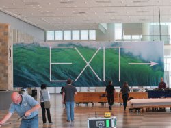
9to5Mac has posted a new photograph showing a wave-themed banner with an X in the middle, similar to the iOS 7 banner that was revealed earlier today. The spartan and minimalistic banners are significant change from the style used in previous years, particularly the OS X banner below.
[url=http://cdn.macrumors.com/article-new/2013/06/xbannerbig.jpg]Image[/url]Click image for full sizeThe X appears to use the Helvetica Neue Ultra Light font, an extremely thin variant of Helvetica and the same font as the iOS 7 banner.
Article Link: Wave-Themed OS X Banner Goes Up at Moscone West for WWDC 2013
as a grandma: DO NOT PUT YOUR iPhone HERE
Register on MacRumors! This sidebar will go away, and you'll see fewer ads.