What if?
Haha.... as much as I'm pining for a new Mac Pro, this made me chuckle.

Last edited:
What if?
You don't like it?
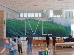
Maps for OS X?
(the banner looks like a satellite map view)
A font is the entire family. Take Helvetica Nue for example. Helvetica Neue is the font where Helvetica Neue ultra light is the typeface.
Like when listening to music and you like a specific song on an album, you say great song, not great album.
Maybe they will name it after oceans: OS X Pacific, OS X Atlantic
It will be. We're on yearly release cycles. IIRC Mountain Lion was announced at WWDC and was on the App Store a couple of hours later.
My God, Apple is so unoriginal now. Not only does it stench of Microsoft, the X makes the picture look like it was meant to be crossed out.
. I'm just excited here, don't what I'm talking about Go read it at 6 points on a retina display and get back to me.You don't like it?
Looks like we're definitely getting an OSX 10.9 preview.
If you get that excited by two thin lines, you musty be fascinated by the Roadway.I dont think it ever was as popular as it was in the early 2000s, combing heavy and ultra light words with no spacing was the cool thing to do and appeared on every webpage and techno poster made, it was like the only font ever used for a few years.
then why are people acting like its some secret message? Going crazy over an extremely popular font is weird.
It is not an X...it is part of the safety markings while moving the display into place.
Ala similar X markings with tape on large glass sheets