Become a MacRumors Supporter for $50/year with no ads, ability to filter front page stories, and private forums.
And we wouldn’t need Dark Mode if UI’s went back to a more balanced appearance. Often too much minimalist dark space is just as bad as too much minimalist white space. Dark mode is a bandaid for bad UI, not a fix or even improvement. How Apple doesn’t recognize this is mind boggling. 😵‍💫
There’s more to it. I think dark mode is also supposed to help those sensitive to PWM and temporal dithering.
 
Last edited:
  • Like
Reactions: cyb3rdud3
And we wouldn’t need Dark Mode if UI’s went back to a more balanced appearance. Often too much minimalist dark space is just as bad as too much minimalist white space. Dark mode is a bandaid for bad UI, not a fix or even improvement. How Apple doesn’t recognize this is mind boggling. 😵‍💫
Ahem, no. There is no way that the same UI works under all circumstances on current multifunctional devices. Heck airplane controls, and Saab in the car had that for many decades to ease the eyes and improve visibility. And there are also proven benefits to improved sleep and one’s health.
 
Ahem, no. There is no way that the same UI works under all circumstances on current multifunctional devices. Heck airplane controls, and Saab in the car had that for many decades to ease the eyes and improve visibility. And there are also proven benefits to improved sleep and one’s health.
Um yes. Design the interface upront for the application, be it dark or lighter. I take no issue with a darker interface if the application it’s used for calls for it. But offering a dark mode as an across-the-board option to the default mode screams that your default interface is too bright. Remember, dark mode came out after interfaces went too-much-white.
 
Last edited:
Um yes. Design the interface upront for the application, be it dark or lighter. I take no issue with a darker interface if the application it’s used for calls for it. But offering a dark mode as an across-the-board option to the default mode screams that your default interface is too bright. Remember, dark mode came out after interfaces went too-much-white.
No just after that. The brightness of screens nowadays is way more than it was. It helps being able to see it under direct light situations and sunshine. Very different conditions than when using it at night time. Having the technology and ability to manage it all is great for our health and eyes. Blaming the need on using too much whitespace is nothing more than a tenuous link.
 
No just after that. The brightness of screens nowadays is way more than it was. It helps being able to see it under direct light situations and sunshine. Very different conditions than when using it at night time. Having the technology and ability to manage it all is great for our health and eyes. Blaming the need on using too much whitespace is nothing more than a tenuous link.
Lol we can just stop. Screen brightness and the design of the interface on that screen are two very different things.
 
Lol we can just stop. Screen brightness and the design of the interface on that screen are two very different things.
Sure, but the point is that you need a different experience when in direct sunlight, be it on a mobile device, on a TV, on a desk that is by a window, compared to in the evening by incandescent lighting where you may get more reflections etc. The technology to deal with light/dark modes, in combination with changes for colour temperature, is great. Not something that a tweak with one size fits all for all circumstances and use cases UI design can even begin to compete with. Blaming it on white space is far too simplistic and not considering all the challenges.
 
And we wouldn’t need Dark Mode if UI’s went back to a more balanced appearance. Often too much minimalist dark space is just as bad as too much minimalist white space. Dark mode is a bandaid for bad UI, not a fix or even improvement. How Apple doesn’t recognize this is mind boggling. 😵‍💫
In general, I find dark mode of many things is very much not to my taste.

And if you do switch from an app in dark mode to one which is not, the jump can be horrible.

I find the gentle changes to screen brightness/colour my MBP applies are satisfactory for my purposes. The changes my phone applies are actually confusing. Icons can look very different in dark mode and my brain/eyes are usually looking for the non-dark mode variants.
 
  • Like
Reactions: ghanwani
And we wouldn’t need Dark Mode if UI’s went back to a more balanced appearance. Often too much minimalist dark space is just as bad as too much minimalist white space. Dark mode is a bandaid for bad UI, not a fix or even improvement. How Apple doesn’t recognize this is mind boggling. 😵‍💫

Although I enjoy dark mode, I do not understand why people are screaming about dark mode implementation. Up until like 2015 no one demanded dark mode, suddenly everyone's eyes are burning from the white screen.

My only assumption is that we stare at a screen today way more than we used to pre-2015 and its starting to affect us.

Microsoft.com in all of its glory from 1999:

1732361807299.jpeg
 
Although I enjoy dark mode, I do not understand why people are screaming about dark mode implementation.

My biggest criticism about dark mode implementation is that it carries over the worst of the worst of Light mode. Dark Mode as Apple and Microsoft have implemented them is like being asked if you'd prefer a broken right ankle or broken left ankle. Neither option is as good as it could (and used to) be.

Light Mode and Dark Mode are still hampered with too much monochromatic minimalism which results in certain challenges that my eyes/brain take issue with. Take MacOS Mail or Finder apps for example - every pane (top menu, side bar, file/email list, preview pane) are the same color and the outer borders are defined by the faintest of lines of the same weight as lines that separate the app panes. The Finder and Mail apps of around the time of High Sierra felt much, much easier to quickly comprehend and work within, where the various panes were shaded differently than each other, helping with focusing on the main window in the center (brightest pane) while the side and menu panes were shaded darker and differently.

At work we're stuck with Windows 11, and each app's frame/border no longer has a strong border but instead is framed in the faintest 1-pixel border, where so very often it's hard to differentiate between apps without stopping and focusing and taking time to recognize the slide bars and where each app begins and ends compared to the next nearby (or overlapped) app.

There are times Dark Mode in Windows 11 is harder to differentiate between apps than in Light mode, yet Light Mode is so obnoxiously bright that I feel forced to select Dark Mode not because it's better but because it's less worse than Light Mode.

Again, before we had a Dark mode, we had a balanced design that wasn't one way (Light) or another (Dark). There's no way someone can contend that, when considering overall usability across all apps, that an all-Light or all-Dark theme is better than a balanced design somewhere in the middle, and which is focused on usability first and foremost. Regardless of screen brightness advances, we wouldn't need a Dark Mode if Light Mode hadn't gotten so extreme. Really think about it.
 
Last edited:
  • Like
Reactions: ghanwani
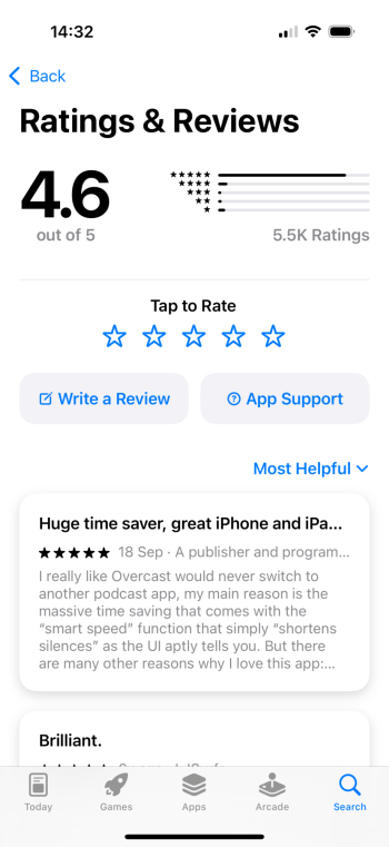
This is a screenshot from a few minutes ago Sorted by Most Recent. Keep scrolling down and there are LOTS of 1 and 2 star Reviews. I dont fully trust we’re always being presented the full story with App reviews. Some Apple apps had a lot of scathing reviews then suddenly got less horrible a week later. That shift doesn’t occur that quick on its own.

View attachment 2454897

App Reviews are absolutely not the full story. As someone with an app in the App Store under my name, and previously having managed several apps in the store for the company there's a few things that crop up.

1 - you're viewing on an iPad. So you're seeing iPad reviews
2 - the reviews you're seeing are from your geographical region, not world wide
3 - most important one - people who are unhappy write reviews, whilst people who are happy simply press 5 stars and move on. This is why you see a lot more 1 star reviews compared to 5 star when the ratings don't seem to match.

Also, I'm going to call you out on this - you're saying theres LOTS of 1 and 2 star reviews, but in your screenshot theres 2 5 star reviews and you've just so happened to crop out the number of 5 star reviews Overcast has there. Mind showing us that 5 star review for some transparency and balance?

I'd be quite interested in your opinion on my own apps UI, since I have overwhelmingly positive feedback. App Store Link. Free to download, with subscriptions (don't subscribe if you're not a motorsport fan - it won't be useful). iPhone version is a proper UI. iPad app is a WIP UI that isn't optimized.
 
App Reviews are absolutely not the full story. As someone with an app in the App Store under my name, and previously
I'd be quite interested in your opinion on my own apps UI, since I have overwhelmingly positive feedback. App Store Link. Free to download, with subscriptions (don't subscribe if you're not a motorsport fan - it won't be useful). iPhone version is a proper UI. iPad app is a WIP UI that isn't optimized.

I'll definitely check it out! Though something tells me yours will be pretty good.
 
Although I enjoy dark mode, I do not understand why people are screaming about dark mode implementation. Up until like 2015 no one demanded dark mode, suddenly everyone's eyes are burning from the white screen.

My only assumption is that we stare at a screen today way more than we used to pre-2015 and its starting to affect us.

Microsoft.com in all of its glory from 1999:

View attachment 2454953
It is simple - that’s for sure.

Something else for design that is looked over is not just the front end design of a website but the authoring environment.

Some of those are catastrophic, extremely slow and clunky. I’m experimenting with a CMS at the moment and trying to see how it can be developed to be much faster for the author.
 
If the CMS is enforcing design decisions then it's not a very good CMS. It's a content management system, not a design management system :)
 
If the CMS is enforcing design decisions then it's not a very good CMS. It's a content management system, not a design management system :)
I presume he means the design/ui/ux of the CMS rather than the design of the system showing the content later.
 
I presume he means the design/ui/ux of the CMS rather than the design of the system showing the content later.
That’s right, the design and UX of the CMS authoring experience itself.

It can be changed however you want but as always you want to stay as close to standard with your development (components and templates) as possible in order to make upgrades very smooth.

Even so you’ve still got scope to make things easier for your authors.
 
This is a screenshot from a few minutes ago Sorted by Most Recent. Keep scrolling down and there are LOTS of 1 and 2 star Reviews. I dont fully trust we’re always being presented the full story with App reviews. Some Apple apps had a lot of scathing reviews then suddenly got less horrible a week later. That shift doesn’t occur that quick on its own.

View attachment 2454897
I requested balance be provided regarding this screenshot, as you used it as an example of people NOT being happy with the Overcast UI, to fit your narrative that it is a failure. You said there are "LOTS" or 1 and 2 star reviews and you cropped out the 5 star ranking here. Since you quoted my post and cut out the bit where I asked for clarification be provided for balance, I'll do it here.

Out of 5,500 ratings, Overcast sits 4.6 out of 5, with what looks like a 90% of the ratings being 5 stars. Upon scrolling down the written reviews in the first 10 of them, I can see 2 1 star reviews. The rest are 4 and 5.

I stand by my original comment - people dramatically disagree with your opinion on the Overcast UI, and the stats here prove it - despite your crop of the 5 star reviews.
 

Attachments

  • IMG_0986.png
    IMG_0986.png
    339.1 KB · Views: 51
  • Like
Reactions: decafjava
If the CMS is enforcing design decisions then it's not a very good CMS. It's a content management system, not a design management system :)
By the way, it’s actually a good thing to use the CMS to enforce design decisions.

That’s how you ensure your authors stay on brand and don’t do bad things. Everyone would have, moving and flashing items if they could get away with it, same as auto play video and sound. (Nooo!)
 
I think we're just misunderstanding each other :)

My earlier post was from the perspective of the developer/designer: if the CMS is forcing the developer to do things a certain way then it's not very flexible. You're coming from a perspective of making sure that the editors don't go crazy with it, and that of course is a good thing.
 
  • Like
Reactions: avro707
I complained 7 years ago when so much of website design seemed to lemmingly follow Apple's flat, minimalistic approach of 10 years ago to the point of being seemingly blind to certain downsides that could only be explained as designers or product managers or marketing "geniuses" seeking a "shock and awe look at THIS" experience instead of an improved experience for the customer. (iOS, cough, cough)

After Jony got his mitts in the software pie, Apple undid decades of refinement for the sake of novelty. And if Apple does it, then by golly the entire design world should follow.... The "novelty" aspect is confirmed as we're seeing Apple slowly and unapologetically backtracking away from the worst errors in hardware & OS, even if it took 10 years.

But so much website design still seems more about invention and novelty than "is this a better user experience than before, and/or does it solve a known problem or exploit a new opportunity rooted in customer usage patterns?"

I stumbled upon this video and recognized how Steve captures well where Jony & Apple went so wrong 10 years ago, which inadvertently inspired so much bad web design.

Great design isn't a new solution that's not directly tied in some way to customer use...or, more coherently: a new solution is most likely to be truly great if it's more about how a customer uses things than about how a designer can design things.

 
Last edited:
Are we really going down the "Steve wouldn't have had this" route?

It's an easy argument to make. The dead guy we idolise would've agreed with me. It's a brilliant one because it's impossible to disprove. Unfortunately, it's also impossible to prove. It's nonsensical.

We're now at the point where Steve is this mythical legend that would've agreed with any opinion any of us held.

PS. - Any comments regarding your misrepresentation of the Overcast feedback?
So we're supposed to ignore awfully insightful, sage advice because a guy is dead? Nice way to (not) learn from the greybeards that came before us and gathered wisdom we're still gathering.

Question - do you agree or disagree with his sentiments starting at the timestamp of the video I posted? :)

It's those sentiments that made Apple the leader it became back then.

I just went to the Apple Apps app and pulled up Overcast (now 4.5 out of 5 not 4.6) and here's what I see for the most recent 10 reviews. Not exactly a ringing endorsement. The 10 most recent scores average to 2.9, with the same # of 1's and 2's as 4's and 5's. If you look to the next 10, they paint a similar picture.

Here's what I see, with titles, to see if you see the same thing, assuming you check today/soon. If you don't see the same thing, then once again, Apple's ratings are awfully suspect.

1 4 stars "The best but please stop downloading..."
2 5 stars "The only podcast app I use. Excel..."
3 5 stars No title
4 1 star "He's failing the basics"
5 1 star "Incomplete and buggy since the..."
6 4 stars "Possibles Sonos/Airplay Issue?"
7 1 star "Broke without even having an up..."
8 1 star "Updates broke a good app"
9 2 stars "New version is worse"
10 5 stars "Awesome app!"

When I look at reviews at Apple or Amazon or anywhere, I look both at the top reviews presented to me and most recent reviews and learn from both. After all, how much of their 4.5 or 4.6 rating came from ratings prior to their most recent update. Overcast's update is a failure overall IMHO if there are that many recent ones and twos, regardless of the fours and fives. At least they’ve fixed some bugs to make it more tolerable than at launch but I’d still prefer the old app if I could have it. Not enough functional improvement after all that new paint and furniture rearranging.

I haven't fully trusted Apple's reviews on any of their platforms ever since their 2-star averages for certain Apple apps on the app store in the iOS7 phase suddenly disappeared. App ratings are undoubtedly skewed in their favor. I notice too now, at least on my iPhone, the stars are colored such that you really have to look close to see the dark stars indicating the vote vs. the dark grey stars indicating non-vote (i.e., a vote of 2 has 2 dark black stars and 3 dark grey stars). At quick glance, they all look like 5 stars.

Nice interface usability Apple. I bet Steve wouldn't have done that, lol.
 
Last edited:
So we're supposed to ignore awfully insightful, sage advice because a guy is dead? Nice way to (not) learn from the greybeards that came before us and gathered wisdom we're still gathering.

Question - do you agree or disagree with his sentiments starting at the timestamp of the video I posted? :)
Like everything in this thread, that's not the correct question. The actual question is whether or not your statements align with whats in that video - which I do not think they do. Yes, I agree with the video. No, I still think you're wrong. Like many in the Apple community, it's a great argument to make. Since Steve has died it's super easy for anyone to say "Steve would never have done this".
I just went to the Apple Apps app and pulled up Overcast (now 4.5 out of 5 not 4.6)
I already explained this in the thread, but you have ignored this point.

The star rating is dependant on your geographical location, and your device. The rating you saw on your iPad was for reviews submitted on an iPad, in the country you live. The rating you see on your iPhone is for views on your iPhone, in the country you live. My app, for example, shows 4.9 stars on the iPhone in the UK. But when you take into account every review in every region and every device type, it's a 4.6. You, as a user, cannot see that information - that is private to the developer. You can only see the public reviews.

and here's what I see for the most recent 10 reviews. Not exactly a ringing endorsement. The 10 most recent scores average to 2.9, with the same # of 1's and 2's as 4's and 5's. If you look to the next 10, they paint a similar picture.
I explained this as well. Written reviews are far more likely to have a more critical rating, as people tend to write things when they're unhappy, whilst happy users will tap 5 stars and move on. This is why there is a disconnect between the written review ratings and the actual numbers.

Additionally, you seem willing to use statistic to back up your point - but don't like it when they don't agree with you. "The 10 most recent scores average to 2.9". This is incorrect. The 10 most recent written reviews average to that. The average of all the scores is....4.5. Which is spectacularly high. I'm sorry the facts don't align with your view, but you do not get to discount the evidence because you do not like it.

I haven't fully trusted Apple's reviews on any of their platforms ever since their 2-star averages for certain Apple apps on the app store in the iOS7 phase suddenly disappeared. App ratings are undoubtedly skewed in their favor.
No, you literally just don't understand it - despite me explaining it to you. You literally do not understand how the ratings work, so now think there is a conspiracy. When an app is updated to a new version the developer has the ability to wipe all ratings (not just low ones). Apples apps all were complete rebuilds in the iOS7 era.
I notice too now, at least on my iPhone, the stars are colored such that you really have to look close to see the dark stars indicating the vote vs. the dark grey stars indicating non-vote (i.e., a vote of 2 has 2 dark black stars and 3 dark grey stars). At quick glance, they all look like 5 stars.

Nice interface usability Apple. I bet Steve wouldn't have done that, lol.
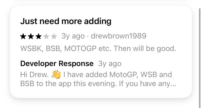
What user interface are you looking at? Attached is an image of what the App Store looks like. If you honestly think those light grey stars look like black then you should see a medical professional - you have an unattended medical issue, for which you should seek advice. Like - not being rude/sarcastic - the inability to recognise contrast is symptom of medical conditions such as cataracts and Parkinson's. I worked on a VR application to help doctors diagnose this in a previous job. If you are not trolling, you should seek assistance.
 

Attachments

  • IMG_1195.jpeg
    IMG_1195.jpeg
    193.1 KB · Views: 29
Like everything in this thread, that's not the correct question. The actual question is whether or not your statements align with whats in that video - which I do not think they do. Yes, I agree with the video. No, I still think you're wrong. Like many in the Apple community, it's a great argument to make. Since Steve has died it's super easy for anyone to say "Steve would never have done this".

I already explained this in the thread, but you have ignored this point.

The star rating is dependant on your geographical location, and your device. The rating you saw on your iPad was for reviews submitted on an iPad, in the country you live. The rating you see on your iPhone is for views on your iPhone, in the country you live. My app, for example, shows 4.9 stars on the iPhone in the UK. But when you take into account every review in every region and every device type, it's a 4.6. You, as a user, cannot see that information - that is private to the developer. You can only see the public reviews.


I explained this as well. Written reviews are far more likely to have a more critical rating, as people tend to write things when they're unhappy, whilst happy users will tap 5 stars and move on. This is why there is a disconnect between the written review ratings and the actual numbers.

Additionally, you seem willing to use statistic to back up your point - but don't like it when they don't agree with you. "The 10 most recent scores average to 2.9". This is incorrect. The 10 most recent written reviews average to that. The average of all the scores is....4.5. Which is spectacularly high. I'm sorry the facts don't align with your view, but you do not get to discount the evidence because you do not like it.


No, you literally just don't understand it - despite me explaining it to you. You literally do not understand how the ratings work, so now think there is a conspiracy. When an app is updated to a new version the developer has the ability to wipe all ratings (not just low ones). Apples apps all were complete rebuilds in the iOS7 era.

What user interface are you looking at? Attached is an image of what the App Store looks like. If you honestly think those light grey stars look like black then you should see a medical professional - you have an unattended medical issue, for which you should seek advice. Like - not being rude/sarcastic - the inability to recognise contrast is symptom of medical conditions such as cataracts and Parkinson's. I worked on a VR application to help doctors diagnose this in a previous job. If you are not trolling, you should seek assistance.
Here’s a screenshot from my iPhone:

IMG_4271.jpeg


On a small iPhone screen the colors blend in together too closely. Could be from my settings which fix the iOS shortcomings (increase contrast, bold, button shapes, etc.). :)

And here’s a Christmas gift. You’re right on all accounts above. I’m not wrong, but you’re right. :)
 
The difference is pretty obvious between the shades. I’d suggest someone needs to see an optician if that’s too close to each other.

And I get a different top ten ;) yes I can see those two outliers when I scroll down, but I have to scroll down and the rest is nothing like those two.
 
  • Haha
Reactions: Tozovac
Register on MacRumors! This sidebar will go away, and you'll see fewer ads.