Become a MacRumors Supporter for $50/year with no ads, ability to filter front page stories, and private forums.
Here’s a screenshot from my iPhone:

View attachment 2464559

On a small iPhone screen the colors blend in together too closely. Could be from my settings which fix the iOS shortcomings (increase contrast, bold, button shapes, etc.). :)

And here’s a Christmas gift. You’re right on all accounts above. I’m not wrong, but you’re right. :)
Two points

- This is clearly fine. You should see a medical professional.
- Secondly, and most importantly - you edited the UI preferences via the accessibility settings. You have contact, links and font weight adjusted. When you make manual edits to a UI, you can no longer complain about how the UI looks.

You've created a conspiracy theory about how reviews are presented by misunderstanding them and adjusting your settings.

Side note: Before you screenshotted the iPad reviews, now you're on the iPhone reviews. This is why the reviews are different.
 
  • Wow
Reactions: decafjava
I was just on a site which, when you click a link to another page, uses JavaScript to replace the page contents with that of the new page. This means that the Back button doesn't take you back to the previous page, and the second page doesn't go into the browser history.

Someone actually deliberately went to the effort of making the website behave badly. Why?!

cut&paste?

I do bespoke; but I'm guessing the vast majority aren't interested in doing the same 🤷‍♂️
 
This thread reminds me of a book I got back in 2000. 😄

book.jpg
 
This thread reminds me of a book I got back in 2000. 😄

Ha ha! I've said it often, web/iPhone-type interface designers learned to crawl in the 90's, then were able to refine things to unimaginable success in the 00's, only to have all that refined learning be thrown out the window of sake of a breathtaking & controversial but arguably completely unnecessary complete retooling of the iPhone interface around 2013 that spawned worldwide copycat forced minimalism in most every aspect of consumer hardware design and electronic interfaces, and which prompted this thread in the first place.

Imagining there was another book on the shelf titled "Touchscreen Electronic Communication Devices User Interfaces that Suck," it's sad to reflect how all the fine work from Apple engineers, designers, and a certain visionary leader (who will go unnamed lest the usual suspects try to derail things with another "not another what would Jeve Stobs do?" retort...name changed to avoid said derailment), which was developed and refined to amazing ground-breaking lengths in the 00's, was completely 180-degrees reinvented around 2013 (led by a hardware engineer, ironically, and a bunch of yes-men, apparently, who was longer tempered and reigned in by said Jeve Stobs, undoubtedly), but which we're still thankfully crawling away from.

FYI after writing this post, I just bought "Run-on Sentences that Suck" from Amazon.
 
Last edited:
grey colored font on a white background
Discord's light mode was horrible for this, at least back when I used Discord. I don't like dark mode during traditionally waking hours, but their light mode was so horrendous that I had to use dark mode.
around 2013
Facebook released React in 2013, and that's when websites started going to ****. Coincidence!? More seriously, these web frameworks by Google and Facebook and whoever else are way too complex and unwieldy for 99.99% of websites, but everyone hops on the bandwagon and uses them even when they're objectively the wrong choice. Or "native" apps just being Electron wrappers with a whole separate (probably out of date) Chromium browser instead of leaving it as a website.

Someone upthread mentioned MacRumors as one of the few websites that retains the older design sensibilities. I think that's why I like it so much compared to competitor sites. It loads super fast, back/forward buttons work properly, and it's not inundated with "modern" web nonsense.
 
  • Like
Reactions: MBAir2010
Someone upthread mentioned MacRumors as one of the few websites that retains the older design sensibilities. I think that's why I like it so much compared to competitor sites. It loads super fast, back/forward buttons work properly, and it's not inundated with "modern" web nonsense.
and this website still runs perfect on Snow Leopard OSX using SnowLion browser.
even to a Banq 2k monitor.
 
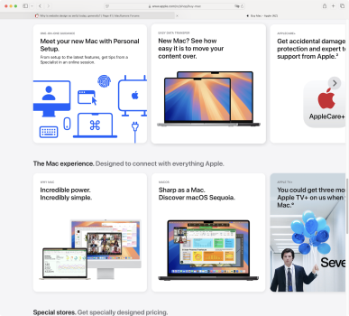
"Get accidental damage protection and expert t support from Apple."
"You could get three mo Apple TV+ on us when Mac."

And, not pictured:
"St"
"Shop one on one with a online."
"Shop refurbished Appl products backed by a o year warranty."

I get that it's "modern design", but I'm sure that just a few years ago if you went to the boss with "let's make text run off the edge of the page" then you'd probably get looked at like you were crazy.

Screenshot 2025-01-23 at 8.43.37 pm.png
 
It is pretty clear together with indicators on how it works. Just a standard overflow that finally breaks away from the constraints of paper. Nice to see and stop the screen reforming all the time. I'm sure it will change again in the future.
 
  • Like
Reactions: headlessmike
"Get accidental damage protection and expert t support from Apple."
"You could get three mo Apple TV+ on us when Mac."

And, not pictured:
"St"
"Shop one on one with a online."
"Shop refurbished Appl products backed by a o year warranty."

I get that it's "modern design", but I'm sure that just a few years ago if you went to the boss with "let's make text run off the edge of the page" then you'd probably get looked at like you were crazy.

View attachment 2475022
Imagine a physical book.

The publisher puts the title on the dust jacket spine, but there isn't enough space so part of it ends up on the back of the book.

The publisher puts the title, author, and an image on the front cover, but there isn't enough space, so it continues on the inside flap of the dust jacket.

Unless done as an expression itself, for example, for a book on modern website design, it would simply look like incompetence.
 
  • Like
Reactions: Tozovac
Imagine a physical book.

The publisher puts the title on the dust jacket spine, but there isn't enough space so part of it ends up on the back of the book.

The publisher puts the title, author, and an image on the front cover, but there isn't enough space, so it continues on the inside flap of the dust jacket.

Unless done as an expression itself, for example, for a book on modern website design, it would simply look like incompetence.
But isn't that the point, it isn't a book!

Apple News and Magazines have been doing this for ages. Why constrain yourself online to paper and book type approaches?
 
  • Like
Reactions: headlessmike
I for one really like the update they've made to the store. The one thing that bugs me the most with modern websites, MacRumors included, is how the contents take up a narrow space in the center of a large window. On sites like Wikipedia I have modified the settings to remove the large blank spaces, so I'm glad to see Apple using both axes of the two-dimensional space that a web page offers.

This looks good to me:
Screenshot 2025-01-23 at 10.33.56 AM.png

This does not:
Screenshot 2025-01-23 at 10.33.47 AM.png
 
But isn't that the point, it isn't a book!

Apple News and Magazines have been doing this for ages. Why constrain yourself online to paper and book type approaches?
Books have been around for centuries and certain practices have become standard because they work.

The balance between physical form, what needs to be printed, and the resulting layout is appreciated. (Even then, many books do make mistakes.)

This falling off the screen/out of the box approach is, in my view, terrible. Some of us use layout as part of our way of remembering things. I can often remember where on the page something appeared even years later and, if I were searching through, that would be a significant factor. Truncation screws that up.

Not something I choose to do - it is simply how my brain works.
 
  • Like
Reactions: ghanwani
Books have been around for centuries and certain practices have become standard because they work.
Agreed, the practices work very well for books!
The balance between physical form, what needs to be printed, and the resulting layout is appreciated. (Even then, many books do make mistakes.)

This falling off the screen/out of the box approach is, in my view, terrible. Some of us use layout as part of our way of remembering things. I can often remember where on the page something appeared even years later and, if I were searching through, that would be a significant factor. Truncation screws that up.

Not something I choose to do - it is simply how my brain works.
Yes I can see that, however it isn't how your brain works, it is how it is trained. I would advise to not do that as it is a great hack to insert fake information and a brilliant attack factor. Also one of the greatest thing one can do is not remember so much, remembering a layout is futile and doesn't add value at all, especially when your eyes can see it. Not even computers work in that way anymore, although I'm sure there are still some screen scrapers around that work in that way.
 
  • Like
Reactions: headlessmike
Books have been around for centuries and certain practices have become standard because they work.

The balance between physical form, what needs to be printed, and the resulting layout is appreciated. (Even then, many books do make mistakes.)

This falling off the screen/out of the box approach is, in my view, terrible. Some of us use layout as part of our way of remembering things. I can often remember where on the page something appeared even years later and, if I were searching through, that would be a significant factor. Truncation screws that up.

Not something I choose to do - it is simply how my brain works.
With that reasoning even web pages that scroll vertically are wrong with the content falling off of the screen. But you've become used to it so you don't even realize anymore that this is weird compared to books. Unless you think a book still looks like this:
1737625617558.png
 
  • Love
Reactions: cyb3rdud3
Yes I can see that, however it isn't how your brain works, it is how it is trained.
Depending on what you mean by "trained".

I was doing this before I could read. I'd remember where on a page an image was, then (as I started to learn to read) a letter, or a simple word.
 
Remember the Apple Mighty Mouse? Man, I absolutely hated that tiny trackball! 🤣

Now we have the touch surface on the Magic Mouse, which I also dislike. But regarding Apple's site, unfortunately that appears to copy the UI in the Music and TV media stores. I really don't like it, but I think they're designing for touch interfaces now instead of mice.
 
Register on MacRumors! This sidebar will go away, and you'll see fewer ads.