Got a tip for us?
Let us know
Become a MacRumors Supporter for $50/year with no ads, ability to filter front page stories, and private forums.
Will Apple's Tablet Actually Be Called the iPad? New Trademarks Filed This Week
- Thread starter MacRumors
- Start date
- Sort by reaction score
You are using an out of date browser. It may not display this or other websites correctly.
You should upgrade or use an alternative browser.
You should upgrade or use an alternative browser.
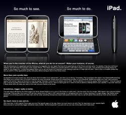
The ad looks like a painter's palette, so I thought: iPalette.
I think they are going to prop color up as a major breakthrough feature of the product. ( versus grayscale alternatives with some overlapping competitors. )
A palette is a secondary artifact ( to the canvas or main creation tableau ). I would expect Apple's device to be front and center; not secondary.
I think this was an intended move by Appl. In effect Apple grouped all their competitors by tricking them into calling their devices Slate PCs.
If Apple ships a non-clamshell device that covers many of the things can do with a more mainstream PC, it too with be a "slate pc". Large screens which aren't enclosed in a clamshell are a slate. It really isn't a trick in so far as it is still descriptive.
Slate was important, if primarily a leak, to get folks off of the "It's going to be a Mac OS X device" track. A laptop with a touch screen. I doubt it is going to be a "laptop PC" device in the classic sense. Getting people off of 'tablet' ( which didn't really break free of laptop design constraints ) was important to set expectations.
iPad sounds a lot smoother than iSlate.
Don't like slates is a very good name at all, might get slated by the critics!
Apple is just probably reserving a mess of names so the other guys can't come out with "their" me too product with an Apple like name. 
Last thing we need is an iPad from Psystar!
Although a Psystar tablet would be called, iPander...
Last thing we need is an iPad from Psystar!
Although a Psystar tablet would be called, iPander...
Horrible, sounds like an Apple branded feminine hygine product.
If they make a larger screen version I hope they don't call it Max-iPad.
I think they are going to prop color up as a major breakthrough feature of the product. ( versus grayscale alternatives with some overlapping competitors. )
A palette is a secondary artifact ( to the canvas or main creation tableau ). I would expect Apple's device to be front and center; not secondary.
I would think a Palette is primary... It holds what you need to create! Paints, brushes, tools, etc. A canvas is the real secondary artifact... One could use a canvas, one could also use paper, one could use wood, one could use a cement wall, one could use... With multiple options at the creator's dispense, a piece of canvas can be thought of as secondary...
Im going for the white i think.

Yeah, the red one with the black Apple logo reminds me of what Bono and U2 would come up with....
Like a Project RED... PERIOD! 'nuff said...
see, now someone had to put that image up there and bring out the "sick" in me!
Horrible, sounds like an Apple branded feminine hygine product.
and? What is wrong with diversifying?
This is not the name. From a purely marketing point of view, iPad is a terrible decision. The product differentiation between the iPod and the new product is lost in the naming scheme and if I know one thing about Apple it is that they do not have stupid or careless business personal. A name like iBook would make a lot more sense and it also conveys better Apple's idea about the device. It is a personal computer much like the MacBook but not really. But as much as I would like to have guessed the name, I highly doubt it.
They pretty much have to stick with an iName for brand recognition especially if it's a giant iPhone, but I think iPad is a disaster - too close to the iPod.
iSlate sorta sucked, but it's a start. Best bet though is iP____, to keep in line with iPhone and iPod, so it'll probably be iPad.
iSlate sorta sucked, but it's a start. Best bet though is iP____, to keep in line with iPhone and iPod, so it'll probably be iPad.
Who cares what they call it, it's just a name. They could call the iturd and people would still buy it.
iBook would make a lot more sense and it also conveys better Apple's idea about the device.
You mean like the iBook?
sorry if this has already been said but is it a coincidence that iPad is pretty much an acronym for IP Application Development?
That's a ModBook. Some company converted MacBooks into tablet computers.
Personally, I like iTouch. Just imagine the marketing possibilities:
Touch. Work. (cloud-based iWork)
Touch. Knowledge. (eBooks and textbooks)
Touch. The web.
Touch. Fun. (iPhone OS 4-based gaming, but with significantly upgraded graphics, memory and CPU)
Touch. Music. (cloud-based iTunes library and browser-based store)
Touch. Life. (cloud-based iLife)
Now you can have it all, and take it with you, with the new Apple iTouch!
Just Apple Touch sounds better.
a mod book
Register on MacRumors! This sidebar will go away, and you'll see fewer ads.


