Become a MacRumors Supporter for $50/year with no ads, ability to filter front page stories, and private forums.
So are the pink and yellow it, or as I absorbed from a previous post and the video...does the logo evolve as things progress into something more/less craptacular?

Also...if this is the logo, just how lame is the mascot going to be??

The Turin games and the upcoming Beijing games have decent mascots with Neve and Gliz from Turin and Beijing's cute little Fuwa.
 

Attachments

  • Website-Olympics-2.jpg
    Website-Olympics-2.jpg
    124.9 KB · Views: 272
I think its a logo you would see in niche areas. But this is the Olympics where demographics(no source to back it up, just guessing) are older and more conservative. The logo should also identify what London has to offer to the world as they sponsor the olympics not lets get the attention and needs of the youth. I feel the the creative brief in making this logo was more of how to attract young audience than telling the world what London is on the logo. I just think its very wierd and why is there more emphasis on the numbers (2014), when the time comes everyone will think ok this logo is all about the year? is it y14k or something?

PS.

Fuwa, where can I get a set, those things are awesome.
 
we should have a mcrumors contest for a replacement logo.

the press is catching up on the overwhelmingly negative reactions, after the initial line-toting coverage.
it's going to be fun how soon the celebrities that spouted the reharsed BS will backpedal that they "never really liked it".
 
Just to be fair about this, I have a question.

Do new Olympic logos and/or mascots usually get a bad first reaction?
 
Just to be fair about this, I have a question.

Do new Olympic logos and/or mascots usually get a bad first reaction?

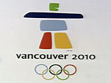
Just for comparision here are the past marks and past mascots from the Beiijing 2008 Site. Actually it looks like the marks list only has the Winter Games at present...Olympics.Org has a summary of each games, so if you start at Torino and navigate back, you can catch all the past logos and mascots there as well.
 
Actually I have just thought about it and something like this will be a 'design by comittee' project so we can't really blame the designer for this pile of crap. He/she will have had to adhere to all the wishes of stupid idiots with no concept of aesthetics. Basically the designer becomes a puppet with all the suits wanting there bit in the logo.

Suits "Do this, do that"

Designer "but it will look crap"

Suit 1 "I dont care, I want it to look like a child arranged some paper cuttings in the shape of John Travolta and then stuck them on some paper... oh and it needs to say London 2012. Oh and it needs to be pink because my neice likes pink"

Suit 2 "I want some yellow in there!"

Suit 1 "Ok so put some yellow in it too. Yellow and pink are good together right?"

Designer "er well, not re..."

Suit 3 "It also needs to have the olympics logo in it"

Designer "So you want a logo within a logo?"

Suit 3 "Yep"

Designer "You do realise that when you downsize the logo you arent going to be able to read the word London or see the olympics logo very well?"

Suit 4 "Well thats your job to sort it out. But the Olympics logo needs to be small, and London needs to be in Comic Sans"


Sorry Im bored :D

Totally right. This thing is horrid, as is most stuff that comes out of a committee design process...my mom is a graphic designer working with a committee right now. She's the third one they've hired as the last two got frustrated and gave up. I've heard all about the process...especially the meetings where everyone likes it...except one person who wants some heinous addition or change, then it's back to the drawing board. :rolleyes:
 
I actually have an oppurtunity to go and see a talk by the head of the design agency who did this in a couple of weeks. I think it might be interesting to see what's said about it...

I think you should make a strong card cutout of it Lau, throw it at his head aka ninja star style, and see what he thinks then. :p

Sorry, I can't think up anything sensible in response to the deformity that is the 'logo'...

When I look at it, all I can think are two things: 'Fun House' & 'Saved by the Bell' lol
 
Damn, that looks like the logo from a really bad community college in 1993. Like they tried to copy fresh prince of bel air something.

"Yo kids, our olympic image of peace and competition is fresh yo! Hella fresh! DAAAWWWWG!".... "TO THE EXTREME!!!!"

then again most olympic logos end up sucking pretty hard. It's amazing the olympic rings are as nice as they are quite frankly.
 
I feel a bit sheepish saying this especially since I started another thread (my mistake) about this logo and said essentially the same things as everyone here.

BUT sorry about the pink 'but'.

after veiwing the video posted earlier that also got a bollocking, I have to be honest and say that now I've seen the concept, I think it's quite clever and works well, as an overall package. By the time it's released everyone will easily see the 2012. And the colours are a part of the retro branding.

As a logo by itself I still agree it's absolutely laughable, but as a part of a complete design package and theme, it works well.

At least it's not a cliche like those Miro type logos you always see from Spain. I don't think that this design will substantially change.
 
There's also a support the logo petition!!

I just had a look at the scrap the logo petition - over 21,000 signatures. There is also a support the logo petition - 8 signatures.

Says it all really!!!!!!!!
 
I think if about half the people hated it and half liked it that the olympic committee would not be happy. But my guess is that the sheer weight of opposition changes the equation. It's bad if a lot of people don't like it, but nearly everyone really hates it, then ironically that can be a good sign.
 
Register on MacRumors! This sidebar will go away, and you'll see fewer ads.