Finally some news about 10.9.
10.9 Kitty Litter with Facebook Home. I'm calling it now

Finally some news about 10.9.
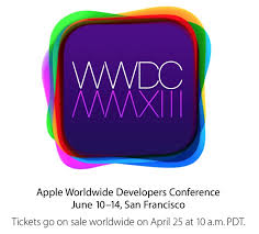
I believe the typeface on the iPhone 5 box is Myriad Pro Light. The typeface on the WWDC poster is Helvetica Neue UltraLight.
WWDC in the year 2600 will be even cooler in design.
If I did this correctly:
WWDC
MMDC
Just a straight flip.
Over $1500 for a ticket? Do they give out freebies like google to make it worthy to buy? If not, what's the point?

This graphic obviously means that the next iPhone will have a color screen, rather than monochrome.
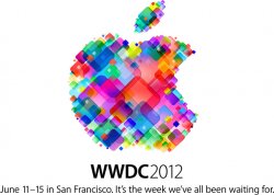
Last year's invitation was an Apple logo formed by coloured squares. That symbolised pixels and we got the Retina MBP.
What about previous years? To get an understanding of what to expect, it would be a great idea to look back at invitations from the past.
Highly reliable KGI Securities analyst Ming-Chi Kuo predicted in January that Apple would "do away with the non-Retina MacBook Pro line in 2013, moving to an all-Retina lineup at cheaper price points than the current Retina models," and even make a few tweaks to the design of the Retina MacBook Pros. This move would make sense: By removing the non-Retina models and lowering the price of the higher-end laptops, Apple can focus on selling fewer computers, which ought to help boost sales for the Retina MacBook Pro.
Kuo, who had correctly predicted Apple's entire product pipeline in 2012, also said Apple will release a new MacBook Air at WWDC 2013, but there will be no Retina display as it is still too difficult to match such a high-density screen to a computer as thin as the MacBook Air. He did say, however, that the 2013 MacBook Air will most notably be powered by Intel's next-gen Haswell chips, and its form factor could see another reduction in relative thickness.
Well, it is now next year, which means were fully expecting a new Mac Pro to release within a few months -- just in time for WWDC. In fact, we're surprised the computer's release date hasn't arrived sooner, considering how Apple told its European distributors in January that it would halt sales of the computer by March 1 to comply with a new regulatory guideline that went into effect that day.
I believe I have the most accurate guess we will see.The iPhone has had a color screen since the 3GS.
But they announced rMBP and updates to other Macs there last year.
Keeping my fingers crossed. Also hope 10.9 refocuses on power and stability and takes a breather from engineering focus on iOS integration and much needed refocus on Finder, OpenGL 4.0+, networking protocols and wireless ac, perhaps even allowing users more options in OS X tweaking.
minor thing - its also got the exact right radius on the square of each color to be an app icon. So far we have:
- Colorful
- Different font
- App Icons
iOS 7 UI is what I'm betting on here.
Invitation 2011 Apple Logo with icons going up - iCloud unvield
Invitation 2012 Apple Logo with many different colored squares disordered - rMPB
It seems that we can expect something exciting this year, because the logo is completly different from what we have seen.
....while reviewing the keynotes and saw Steve, tears came into my eyes. I miss his so much.
Something to consider.
We all know OS 10.8.4 has references to 802.11ac in it. Since 10.9 will only be previewed and a beta given to developers in June and not released until August/Sept. there has to be some device with 802.11ac released before or during WWDC2013 unless Apple doesn't release 10.8.4 until after WWDC2013 which I find unlikely.