Got a tip for us?
Let us know
Become a MacRumors Supporter for $50/year with no ads, ability to filter front page stories, and private forums.
Apple Community Envisions Better Ways to Activate Control Center on iPhone X
- Thread starter MacRumors
- Start date
- Sort by reaction score
You are using an out of date browser. It may not display this or other websites correctly.
You should upgrade or use an alternative browser.
You should upgrade or use an alternative browser.
I'm annoyed that I can't fully turn off wifi and bluetooth from control center. Just disengage any connections.
This!swiping left to right on the homebar switches to the previous app, why not swipe right to left on homebar for control center?
I get that. But the reason why you have to hard press to activate app closures is because if you swipe up without doing that, it will think you want to go home and that's what it will do. So that is a way of differentiating these 2 commands.
I get that. Swiping up on the app preview inside the app switcher could detect the context and close the app, not take you home.
I'm sure they're gonna fix this in ios 12. This and the empty space at the bottom of the keyboard. They have to, it's just stupid how both these things are right now. Other than that, i LOVE the new phone!
Oh and I hope they can make it so that we can close apps just by swiping up again in the future, without having to hold down on them first to activate these weird red close buttons.
Oh and I hope they can make it so that we can close apps just by swiping up again in the future, without having to hold down on them first to activate these weird red close buttons.
Change the swipe up action from control center to that of the home action will only serve to confuse, irritate, and cause fear amongst the population. People don't like change and they don't want it. They want their home button and they want their headphone jack. Yet Apple forces people to pay more than a thousand dollars for neither of those features. The iPhone X will be a flop as the population is rejecting Apple's attempt to erode established and fundamental principles of mobile device usage.
Personally, I'm against hidden UI elements in general. If it can't be seen, for a large percentage of people, it doesn't exist. How are they supposed to know the secret swipes that are required to use any of these hidden features? Maybe they'll discover them by accident, but maybe not. It just seems like a poor idea to make any features completely hidden from the user by default.
ONCE UPON A TIME Apple engineers (including Steve Jobs) were thinking hard and strong how to provide the best user experience. From all the million choices they chose what they deemed to be the most practical, most intuitive, most easy to use solutions. That's what we, the loyal Apple customers, then got. And everybody was happy.
MEANWHILE Microsoft, and everyone else, were building stuff that had a million ways to customize it. And thus everyone did. Every Non-Apple Desktop was different, with different plugins, different ways to do things, and different library version that often crashed or went missing. It has always been a mess, it is a mess, and it will always be a mess.
Now Apple is becoming like everyone else.
BRAVO.
R.I.P. Apple and **** you Steve Jobs for dying.
Some 3D Touch gesture would be appreciated, as opposed to having absolutely nothing in the current version of iOS on this device. I would be fine if we could make our own selections on how the device behaves for such things, somewhat like we can do in other launchers on Android.
The 3D Touch gesture aspect of iOS is extremely polarizing for some people, as was enabling right mouse click functionality within MacOS long ago. Some people don’t use or want that feature, but, it shouldn’t take away from users who do enjoy the extra layer of interaction with our devices.
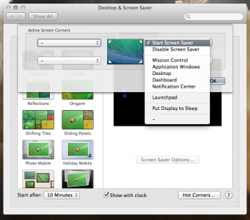
Even OS X is also locked down, but we can at least select some of our own shortcuts in the system like hot corners.

Why not add a shortcut section on iOS, similar to how we have a accessability shortcuts?

Giving users a choice would resolve a lot of this animosity, and I personally feel that a few more choices (for various things) within iOS would go a long way to make it more widely enjoyed. Ship the devices the way you want to make them Apple, but alllow users to have a little more configurable UI and UX options!
The 3D Touch gesture aspect of iOS is extremely polarizing for some people, as was enabling right mouse click functionality within MacOS long ago. Some people don’t use or want that feature, but, it shouldn’t take away from users who do enjoy the extra layer of interaction with our devices.
Even OS X is also locked down, but we can at least select some of our own shortcuts in the system like hot corners.

Why not add a shortcut section on iOS, similar to how we have a accessability shortcuts?

Giving users a choice would resolve a lot of this animosity, and I personally feel that a few more choices (for various things) within iOS would go a long way to make it more widely enjoyed. Ship the devices the way you want to make them Apple, but alllow users to have a little more configurable UI and UX options!
The 3D Touch side gesture has always felt unnatural to me, both on the 6s and 7+, but that’s just me.
I like the idea of 3D touching the home bar though.
I like the idea of 3D touching the home bar though.
No. A 3D Touch swipe from the edge would be a horrid idea for invoking control center.
I don't want to have to open control centre 5 times because I didn't press hard enough or in the right place. This idea is just so terrible.
The problem with putting it in the app switcher is how do you access it from the lock screen?To me the most logical place to put it would be to put it on the far right of the home screens just like bringing widgets on the left but add it to the right? Or to put it within the app switcher.
Swipe up from the right or swipe down from the right ear. Make it user selectable as an option.
Swiping down from ear is my biggest gripe about the X UI. I’m sure in a few more weeks I’ll just be used to it .
Swiping down from ear is my biggest gripe about the X UI. I’m sure in a few more weeks I’ll just be used to it .
Ive and Cook aren't fool proof and can make terrible decisions.These days, just about everyone is better at design than Ive & Cook.
Anyone else have a problem with the camera app?
It’s looks exactly like the old one plopped onto the iPhone X screen, seems very out of place. I think they should take all the controls from the top and put them on the bottom and push the veiewfinder up to the notch, maybe put some setting in the notch spaces.
Just something to really utilize the sceeen space cause right now it looks wasted in the camera
People refer back to when the iPhone first came out and how it was so intuitive that it didn’t need a manual, but remember we didn’t even have copy and paste back then.
It doesn't create space on the left and right it sits it's ugly "ahem, bottom" down in the middle.Stop looking at the notch. Look at the space it creates. Two tabs at the top of the screen. One for notifications. The other for a control center.
It doesn't create space on the left and right it sits it's ugly "ahem, bottom" down in the middle.
That's because you are looking at it as a notch hanging into the screen.
Look at screen itself, with the trapped ear corners as TABS and then you'll stop seeing the notch "hanging down in the middle"
Yep. Swipe up and to the left for CC, or swipe up and to the right for MT.Why not add it to the multi taking page like iPads???
Register on MacRumors! This sidebar will go away, and you'll see fewer ads.

