It's the default map what would you expect. Average consumers which is the majority of the users don't really care. Although the Apple map has improved significantly from initial release. Some users even the more advance don't really care that much anymore. I only open google map when I really need to do the street view of unfamiliar places. Other than that when I look something around me I only use the map to get an idea where is the location most of the time.
Got a tip for us?
Let us know
Become a MacRumors Supporter for $50/year with no ads, ability to filter front page stories, and private forums.
Apple Maps Now Used Three Times More Than Google Maps on iPhone
- Thread starter MacRumors
- Start date
- Sort by reaction score
You are using an out of date browser. It may not display this or other websites correctly.
You should upgrade or use an alternative browser.
You should upgrade or use an alternative browser.

Having owned the iPhone's since the beginning, I can definitely say that Apple maps was a huge improvement. Google was the stock map app on the iPhone and it was not very good. Now that they aren't the stock app, they have really improved. But I am fine with Apple maps. It works, it's integrated, it meets my needs.
Yes, terrible.Yet the search function is still abysmal.
Google gets to scrape every web page on the planet looking for addresses and phone numbers. Apple does not.
The last thing we needed was yet another closed people-places-things database, but that's what Apple did. So don't expect it to get a lot better.
Agreed, I use both depending on the location. Have found Apple Maps better and more up-to-date some times.Yup, I've been increasingly using Apple Maps. Google Maps I still use for Street View.
When you force an app to be the default maps application, that tends to happen. Apple Maps is not on par with Google, but leads because your average user just uses the default.
Stupid comparison. Kinda like saying Safari is the leading browser on the platform. No kidding, it is and always will be the only default browser for every single link you click on.
Stupid comparison. Kinda like saying Safari is the leading browser on the platform. No kidding, it is and always will be the only default browser for every single link you click on.
Enough said about Siri and Google Now... it just seems that Google Now is far more accurate than Apple Siri...the same seach inquiry was done at sametime, look at the result


Not only Google now gives me actually direction, it also tell me when it open. While Apple siri complete failed to give me direction.
Not only Google now gives me actually direction, it also tell me when it open. While Apple siri complete failed to give me direction.
Google created Apple Maps by refusing to offer the real time driving direction functionality unless Apple gave them excessive user data. So Apple did their own thing, and Google has now lost dominance AND also the anonymous user data they used to get from iOS.
Google seems to be fading on all fronts these days... almost as if someone really smart went to total war with them, perhaps even 'thermonuclear' - a reaction that begins at the molecular level, and chain reacts from there. A term simps often misinterprete to only mean nuclear carpet bombing. Too funny, the skeleton of Steve Jobs must be grinning.
I haven't felt the need to use Street View since Apple Maps debuted their superior driving mode. I guess I can easily abstract obvious location cues from obvious map renderings. Faster, easier to see while on the go, and leaves my attention free for the tunes and general enjoyment of life. This might indicate a more evolved human intelligence than your typical crude 'need to have Street View picture' type.
Google created Apple Maps by refusing to offer the real time driving direction functionality unless Apple gave them excessive user data. So Apple did their own thing, and Google has now lost dominance AND also the anonymous user data they used to get from iOS.
Google seems to be fading on all fronts these days... almost as if someone really smart went to total war with them, perhaps even 'thermonuclear' - a reaction that begins at the molecular level, and chain reacts from there. A term simps often misinterprete to only mean nuclear carpet bombing. Too funny, the skeleton of Steve Jobs must be grinning.
I haven't felt the need to use Street View since Apple Maps debuted their superior driving mode. I guess I can easily abstract obvious location cues from obvious map renderings. Faster, easier to see while on the go, and leaves my attention free for the tunes and general enjoyment of life. This might indicate a more evolved human intelligence than your typical crude 'need to have Street View picture' type.
There are far more Android users than iOS users... Almost all PC users use Google Maps.. And I just posted how Siri failed to give direction...
Google is not fading from all front... It is Apple now fading from all front... Google now integration and cross platform Google service is really great for people use multiple platforms (iOS, Android, Windows and Mac).
It also shows Apple's wisdom is ultimate deciding to go with their own maps app, rather than capitulate to Google's demands. For a service used so extensively, it's better to have full control than let it be maintained by a third party, where they can easily play punk.When you force an app to be the default maps application, that tends to happen. Apple Maps is not on par with Google, but leads because your average user just uses the default.
Stupid comparison. Kinda like saying Safari is the leading browser on the platform. No kidding, it is and always will be the only default browser for every single link you click on.
I have no qualms with using Apple's own services even if there are technically superior alternatives out there so long as Apple's offerings are "good enough". Continue to strengthen the Apple ecosystem while weakening that of the competition's, in what little way I can.
Well some of the users here never had any problem since day one, maybe you can privately ask them to borrow their phones for some days and find out if it's you or your phone that is doing wrongEnough said about Siri and Google Now... it just seems that Google Now is far more accurate than Apple Siri...the same seach inquiry was done at sametime, look at the result
Not only Google now gives me actually direction, it also tell me when it open. While Apple siri complete failed to give me direction.
My father in law refers to Safari as "Internet Explorer" and to Maps as "Google Maps". Pretty sure most people either:
A - Assume it's Google Maps.
or
B - Don't care at all who made it.
My wife and I each have Google Maps installed, but use it much more rarely. We have only used it once - two years ago Apple Maps took us to the wrong place. We swapped to Google Maps, which took us to a different, even wronger place (Apple Maps had us about a mile from our destination - just a case of incorrect numbers. Google Maps took us to the next town over - about five miles away. We called and got directions from the venue at that point.)
If its any use like mine then it goes something like this. find something in safari, click on the address and damn useless apple maps launches. Bring up task manager, kill it, copy the address and open it in google maps. I guess they count that in their research
Its no different than when IE became the dominant browser because it was bundled w/ Windows. People use what is easiest to access. I'm no different here. I use Maps most of the time because its there, and honestly, a map is a map. If I need solid driving directions I go to Waze only because its crowd sourced and better possibility of escaping the worst traffic scenario.
When people say that the interface for Apple Maps is so much better, and Google looks horrible, I wonder what am I missing? Or, what are they talking about? To me, Apple Maps have always seemed barren and more difficult to get a quick read from.
So, like someone else wrote, I will "check in" with Apple Maps every month to see if there is a reason to switch, and there never is.
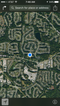
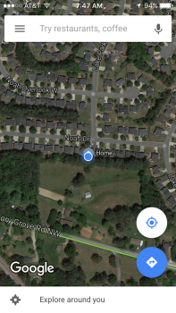
This morning, I took screenshots of what I use most commonly: where am I, and directions. The location button with Apple tells me almost nothing useful... It's like saying I am on planet earth; is too far out with no way UI data for me to look at. Google shows me an identifiable, navigable landscape with easy to match streets; it's the "satellite" view of the view out my window.
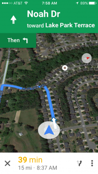
And then, when I activate navigation, Apple Maps becomes an unidentifiable wasteland... The map looks like a desert. Google maps can remain in the satellite view, while giving me the street & map information that is so valuable, like congestion and alternative routes with time differences.
If there is away to run Apple Maps navigation in satellite picture mode, I haven't found it. And, I've looked. So, if it's there, I still fight the UI of Apple Maps, and I will continue to rely on Google Maps.
So, like someone else wrote, I will "check in" with Apple Maps every month to see if there is a reason to switch, and there never is.
This morning, I took screenshots of what I use most commonly: where am I, and directions. The location button with Apple tells me almost nothing useful... It's like saying I am on planet earth; is too far out with no way UI data for me to look at. Google shows me an identifiable, navigable landscape with easy to match streets; it's the "satellite" view of the view out my window.
And then, when I activate navigation, Apple Maps becomes an unidentifiable wasteland... The map looks like a desert. Google maps can remain in the satellite view, while giving me the street & map information that is so valuable, like congestion and alternative routes with time differences.
If there is away to run Apple Maps navigation in satellite picture mode, I haven't found it. And, I've looked. So, if it's there, I still fight the UI of Apple Maps, and I will continue to rely on Google Maps.
Attachments

Well some of the users here never had any problem since day one, maybe you can privately ask them to borrow their phones for some days and find out if it's you or your phone that is doing wrong
WOW... Just WOW...maybe you should show me your wisdoms on how to get this correctly... Same sentence same not so perfect English ... Google Now picks up while Apple Maps failed completely... Maybe Apple should improve Siri?
Although after I physically enter Apple Maps and manually paste the address from Google Maps. Apple Maps did give me same direction as Google Maps, but estimate was different. Google Maps tells me 17 minutes while Apple Maps tells me 25 minutes
Pardon me, there is a misunderstanding. I wrote this against some of the usual pundits that denied any inconvenience with the usual phrase "mine works perfectly" followed by the usual "you're ........... it wrong". Again please accept my excuses if I made you feel uncomfortably, that was not my purposeWOW... Just WOW...maybe you should show me your wisdoms on how to get this correctly... Same sentence same not so perfect English ... Google Now picks up while Apple Maps failed completely... Maybe Apple should improve Siri?
Although after I physically enter Apple Maps and manually paste the address from Google Maps. Apple Maps did give me same direction as Google Maps, but estimate was different. Google Maps tells me 17 minutes while Apple Maps tells me 25 minutes


Above is the comparison of Apple Maps vs. Google Maps for the district of Tseung Kwan O, home to 400K people in Hong Kong, captured on 8 December 2015. On Apple Maps, you can see a road floating on the sea. Actually, that part of the sea was reclaimed more than ten years ago (!). Google Maps, on the contrary, is showing the real shape of land, and correct roads information with much better traffic information.
Its not hard when you cant change the default mapping service and 95% of people will just click maps.
I use google maps as it still has more POIs, street view and better transit.
I use Waze for car navigation.
I use google maps as it still has more POIs, street view and better transit.
I use Waze for car navigation.
If you are in the US Apple Maps is probably a bit better. In Europe Apple maps is a horror. No search function whatsoever (unless you type exactly what you need) and many places are just not there. I like the navi better than googles, but now that I'm used to googles navi it's google all the way for me. Haven't touches Apple Maps for months.
Register on MacRumors! This sidebar will go away, and you'll see fewer ads.