Become a MacRumors Supporter for $50/year with no ads, ability to filter front page stories, and private forums.
View > View Options should do it
I read in Apple Discussions that there now are only 5 options. Title, Artist, Genre, Year, Rating. Is this true?

[EDIT] I just saw that "They're all still there in Songs view, I believe. That is the view most like before. And the Cmd-J View Options window shows everything as before. Couldn't live without sorting by Date Added."
 
First complaint: The gradient on the 'now playing' bar seems too...'steep' and not very..."Apple".

Edit with more thoughts: It does feel like a non-Apple app...maybe its a new design direction they are taking. It just feels a lot 'bolder' and 'darker' than other apps - certainly nowhere near as clean and refined as some Apple built apps, and there are a few inconsistencies such as one of the bars being a completely different gradient when you switch to store pages - it looks a little out of place...almost like a mistake.

I would assume they wanted the store to have a different feel than the rest, not that it was a mistake lol, I doubt you using it for a while could tell you more about it than the developers.
 
You can disable using a custom colour in preferences.

Thanks I didn't know that. I actually like the custom colours because it makes the app feel more alive and current somehow. I've only encountered on one grey album that the text becomes hard to read so it's no biggie.
 
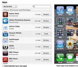
Is this new - the Remove buttons in the Apps view for your iOS devices?
 

Attachments

  • Screen Shot 2012-11-29 at 19.25.17.jpg
    Screen Shot 2012-11-29 at 19.25.17.jpg
    97.6 KB · Views: 92
I like the new look A LOT. It's great. I've always stuck to the list view because the other viewing options seemed less than ideal. But now the new album and artist viewing options are great!
 
Finder os x 10.9

Is it just me or does anyone else think apple will redesign the finder in 10.9 based on the iTunes 11 interface. I think that would look pretty slick.
 
Jony I've killed cover flow last minute, when he started his UI responsibilities.

Cover flow was quite hideous and useless. Glad I've is now managing the UI.

:)

I never used cover flow either, I was just surprised that they actually remove it. It seemed like one of those useless features that would be around forever.
 
And I thought the old iTunes icon was ****ing ugly. :O Jesus Apple, what's wrong with you?

Also, the interface, when you actually use it, looks really ****ing clunky, like the buttons just seem too processed and not a part of iTunes, but lazily overlaid by some themer that think's gaudy and distracting is beautiful. It's sad when MY themes are better than Apple's pro ****. :O
 
Itunes 11 TAKES TIME TO RECOGNIZE DEVICES!!!

ITUNES 11 TAKES TIME TO RECOGNIZE DEVICES ALREADY TRIED IN A MACBOOK PRO MID 2012 MACBOOK AIR EARLY 2011 AND IMAC MID 2011 ALL OF THEM WITH OS X MOUNTAIN LION and devices tried Ipad Mini Iphone 4s Iphone 5 Ipod classic and 4 generation and Ipod Nano :mad::mad::mad::mad::mad::mad:
 
Were you expecting otherwise? That's pretty obvious.

Yes. yes I was. Because PowerPC is a precious thing that Apple should honour until the day the company dies.


And don't tell me a Quad 2.5GHz G5 can't handle iTunes 11...that is a load of crap. The thing is still a beast of a computer. Apple is simply too lazy to code for 6-year old hardware that they don't sell anymore, so they drop support.
 
Song count gone?

Is there a way to see the number of songs, artists, and size of our library?
 
once you enable the side bar / status bar / etc.. and make it look a bit more like the old client.. i like it!

only complaint so far.. no artwork in the bottom left anymore... BOO!
 
Jonny is an idiot for getting rid of Cover Flow. That was my most used interface and I loved browsing my collection like that. Now I'll have to look for another program for media that is better than Itunes and has something like coverflow. Any suggestions?
 
so without reading 11 pages worth of posts, has anyone else noticed how pixilated the iTunes icon is when Command Tab switching apps? I'm not even on a large or retina display. nice oversight Apple!

It's perfect clear on my Retina MacBook Pro!

I really love this new iTunes, and the new mini player :)
But if people don't like the new look they can have the old by enable it.. But i think that you need to give it a chance! :p
 
Register on MacRumors! This sidebar will go away, and you'll see fewer ads.