Hopefully 8.4 fixes what I've been experiencing with Music since I updated my iPhone 6 Plus to 8.3. I use Music pretty much every day because I use public transportation to get everywhere on the island. I refuse to use apps like Pandora, Spotify and iTunes Match because I don't have unlimited data. I just put a ton of music on my phone and always shuffle it. I'm too lazy to make playlists. I'm also notorious for force closing all my apps when I'm done with them or when I'm putting my phone in my pocket. Music always would start with the song I was listening to when I would reopen the app. Now with 8.3 it "forgets" where I was and I have to start everything all over. So now I'm trying to make a conscious effort to not close Music when closing through all my other apps. I don't want to listen to the same song every single time I open the app. Anyone else experience anything similar?
Got a tip for us?
Let us know
Become a MacRumors Supporter for $50/year with no ads, ability to filter front page stories, and private forums.
Apple Seeds First iOS 8.4 Beta to Developers With Revamped Music App
- Thread starter MacRumors
- Start date
- Sort by reaction score
You are using an out of date browser. It may not display this or other websites correctly.
You should upgrade or use an alternative browser.
You should upgrade or use an alternative browser.
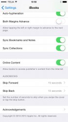
Great news: Audiobooks have (finally) been moved to iBooks.
The have also added a cool new "fast-forward/rewind" feature:
https://www.dropbox.com/s/4au7hehzxmyoetc/Audiobooks.mov?dl=0
I've been waiting for this ever since iOS 5 beta 1 "broke" audiobook playback...
Unfortunately, it still doesn't display chapter names in m4b files (just "Track 6"), but still, we no longer have to scrub through 21 hours of audio!
Can you answer me a few more questions regarding the new audiobooks section in ibooks?
1. Is it now possible to choose sorting by author? In the last iOS Versions the sorting is by title of the audiobook and that doesn't work for me because I have audio dramas with more than 100 episodes and I need a sorting by author.
2. Are the audiobooks synced via iTunes or are they now stored together with the eBooks in the iBooks App on the Mac? I think it's more logical to have them together with the eBooks but the iBooks App for Mac has much room for improvement.
Really happy with this music app redesign. But can we have support for more formats like FLAC and a revamped video player because being limited to mkv and mp4 is really depressing.
It's Apple don't ask for revamped software! They'll take away mp4.
Just get rid of the damned "album view" in landscape mode!
Couldn't believe it when I first spotted that screen...
----------
It's iTunes that really needs a make-over. It's grown to be a Windows-worthy mess!
They started a recoding with iTunes 11...
The new music app design would of really excited me back in the iTunes golden days. Spotify have arrived and conquered, and I'm not looking back...
..Until Apple release their service!
..Until Apple release their service!
any changes to the lock screen when music is playing?
Nope, same with Control Centre, maybe in future Beta's?
Nope, same with Control Centre, maybe in future Beta's?
Maybe they'll save that for iOS 9.
----------
I hope it's going to be A public beta soon.
Probably when the list of known issues is reduced.
From the video, the iPad UI for the music looks more optimized for the screen size. Plus, I'm excited for Up Next coming to iOS finally.
Last edited:
Am I the only one who's feeling flat minded about the design? The music app design since iOS 7 has always been a disappointment imho.. it's all so white and empty, now it feels like even more emptiness with submenus and a streaming service implemented.
I was actually really hoping for something like the Beats ui..
I was actually really hoping for something like the Beats ui..
any changes to the lock screen when music is playing?
Nope
Attachments

Am I the only one who's feeling flat minded about the design? The music app design since iOS 7 has always been a disappointment imho.. it's all so white and empty, now it feels like even more emptiness with submenus and a streaming service implemented.
I was actually really hoping for something like the Beats ui..
Agreed. It just looks like it has no personality at all. Even iTunes Radio which always looked decent has been flattened further and made into a simple grid layout and it looks just super boring and bland.
I was hoping of a more Spotify or Beats-esque design too. Some excitement would be nice! It's music not some fancy art gallery... It doesn't have to be all white and white space.
For sure - at least someone else agrees, I thought I may have been the only one
This

Not this

This worries me. Apple has understood what music listeners want less and less with each iteration, and this is no exception.
Three simple requests:
1) Allow me to sort my albums within an artist ALPHABETICALLY, instead of by year released exclusively. Generation Y does not care what year a track/album came out, they just know the name of the album it was on (at most). Generation X doesn't always remember an album's release year either.
2) Allow me to choose whether albums are expanded (so I can see the songs inside the album by default), or collapsed (so I can quickly get to an album I want to listen to).
3) Allow me to select the average size per track line on song selection pages. The amount of space occupied per track has increased significantly over the years - a few more and we might only be able to see three tracks ("each with glorious high-res album art") per page.
Is this too much to ask, Apple?
Last edited:
I do not think the Beats features will be implemented until after WWDC 15. This seems to just be laying the groundwork for what is to come.
The features were cool from what I heard, useful and smart. But I can live without some if they change up that damn UI, at least just for the streaming tab. As you put it though maybe it's just the ground work.. looks a little patchy and uneven though if you ask me.
Coverflow with 'Up Next" functionality would've been awesome!
screenshot is kinda misleading... all the other pages look nearly the same as present version.
----------
chronologically = the order of release dates... no? or do you mean the order in which you bought them..??
----------
This worries me. Apple has understood what music listeners want less and less with each iteration, and this is no exception.
Three simple requests:
1) Allow me to sort my albums within an artist CHRONOLOGICALLY, instead of by year released exclusively. Generation Y does not care what year a track/album came out, they just know the name of the album it was on (at most). Generation X doesn't always remember an album's release year either.
chronologically = the order of release dates... no? or do you mean the order in which you bought them..??
playpack slider in lock screen
Can anybody make a screenshot please how the playpack slider on lockscreen looks like? until iOS7 it was quite useful but until then to tiny. Hope that Apple has fixed that. Every time I want to slide forward I need to open the app directly or using the buttons on my headset.
Edit: post #338 shows the answer
iOS 8.4 follows hot on the heels of iOS 8.3, which introduced new diversified emoji, a revamped emoji picker...
Emoticons! Rah! Rah! What a great reason for an update...! Not.
Vomit.
Emoji are lame. They are actually harming people's ability to communicate.
Sad. <-- see.
Aye it's not like emoticons were around in the MSN Messenger days lol :cryingwithlaughterface: :cryingwithlaughterface: :cryingwithlaughterface:
Register on MacRumors! This sidebar will go away, and you'll see fewer ads.