Got a tip for us?
Let us know
Become a MacRumors Supporter for $50/year with no ads, ability to filter front page stories, and private forums.
Apple Seeds First iOS 8.4 Beta to Developers With Revamped Music App
- Thread starter MacRumors
- Start date
- Sort by reaction score
You are using an out of date browser. It may not display this or other websites correctly.
You should upgrade or use an alternative browser.
You should upgrade or use an alternative browser.
Can some do a video recording with QuickTime of their iPhone using the music app instead of screenshots?
A new music app is much needed but was that all that was new in 8.4?
For now.
Here are a few.
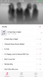
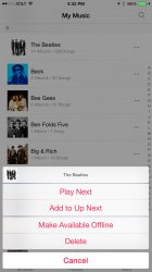
One thing I noticed, in the 2nd -3rd pic with the Beatles album. When viewing the songs, the band photo is at the top and when your scroll down to see more songs, the list raises higher and the art begins to blur.
One thing I noticed, in the 2nd -3rd pic with the Beatles album. When viewing the songs, the band photo is at the top and when your scroll down to see more songs, the list raises higher and the art begins to blur.
Attachments

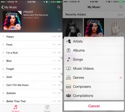
so now it's "my music" "playlists" and "radio" to pick from before u can finally listen to something. I swear to god if it still does not remember where I was after leaving the app for a while and jumps back to that main screen every time, I am gonna throw something out of the window.
(looks a lot like the Google Music app with more blurr and ugly pink)
(looks a lot like the Google Music app with more blurr and ugly pink)
Some shots found online.
Phew, I thought they removed the album cover window, seems its just under the music tab. Viewing the album art is the whole point of a nice looking music app.
Didn’t addresses the broken music app where songs were tagged incorrectly and some albums were missing album covers.
Last edited:
Here are a few
Wow it looks beautiful! I can't wait to get my download going!!

The feature they need to add to this music player is crossfade. I don't understand how we are on ios 8 and don't have crossfade by my iPod nano had it years ago.
The 'now playing' screen is so bad... Why all that blank ugly space, jesus!
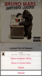
It's a Plus screenshot. If you have a 6 it'll probably look a bit better. The Album art is actually the same size, they just got rid of the bar at the top.
I wish they'd just copy the UI of the Remote now playing screen.
Here are a few.
One thing I noticed, in the 2nd -3rd pic with the Beatles album. When viewing the songs, the band photo is at the top and when your scroll down to see more songs, the list raises higher and the art begins to blur.
How are the albums sorted, by year still?
For once I am really excited for a iOS release. I really dislike the current Music app and I'm using a 3rd party one, but it hasn't been updated in a while.
Are they serious??? We now need two taps to change from Songs to Album/Artist/etc. ??
Are they kidding?
I think it makes sense because you probably have a preference for how you browse your music (whether it's by album, artist or genre) and do it that way 90%+ of the time. Now that is your default view and saves the navigation buttons for different types of content.
This is what I normally get... the iPad Air seed is much quicker
That's the speed I'm SUPPOSED to get, but my house is old and the wiring is old as well, so I don't even think it is possible to get more than ~1 MB/sec until we get everything totally re-wired.
It's a Plus screenshot. If you have a 6 it'll probably look a bit better. The Album art is actually the same size, they just got rid of the bar at the top.
I wish they'd just copy the UI of the Remote now playing screen.
Right? The Remote app UI is gorgeous!
I think it makes sense because you probably have a preference for how you browse your music (whether it's by album, artist or genre) and do it that way 90%+ of the time. Now that is your default view and saves the navigation buttons for different types of content.
The bottom row is empty though, they aren't using it for anything. I switch my views quite regularly and this is a major disappointment.
They could have gone the way of custom bottom row (similar to how it is now) and/or a scrollable bottom row.
No public beta? Or not yet perhaps.
Never-mind didn't see the part about registered developers.
not yet, well, at least not for me
so now it's "my music" "playlists" and "radio" to pick from before u can finally listen to something. I swear to god if it still does not remember where I was after leaving the app for a while and jumps back to that main screen every time, I am gonna throw something out of the window.
(looks a lot like the Google Music app with more blurr and ugly pink)
Jony Ive insists it's fuchsia, not pink. (or was it cerise?)
How are the albums sorted, by year still?
At least on mine they are sorted by newest listed first.
[url=http://cdn.macrumors.com/im/macrumorsthreadlogodarkd.png]Image[/url]
Apple today seeded the first beta of iOS 8.4 to registered developers for testing purposes, just five days after releasing iOS 8.3 to the public. The beta, build 12H4074d, is available for download from the iOS Developer Center, alongside the Xcode 6.4 beta.
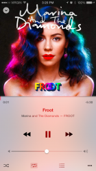
iOS 8.4 introduces a newly-revamped Music app, which includes a new design that shows pictures of artists in the Artists view and offers personalized playlists. It also offers a new MiniPlayer, a redesigned look for "Now Playing," global search capabilities that make it easier to search from anywhere within the Music app, and a streamlined design for iTunes Radio to improve music discovery.According to today's release notes, there are quite a few known issues with the new Music app in the iOS 8.4 beta, so users should be aware of the possible bugs before downloading the update. For example, using Siri to control iTunes Radio does not work, nor does AirPlay streaming. Station sharing for iTunes Radio is not available, it's not possible to start a station from a song in Now Playing, and the Music app may quit unexpectedly when deleting a playlist or rotating the device to landscape orientation, among other issues.
The new Music app in iOS 8.4iOS 8.4 follows hot on the heels of iOS 8.3, which introduced new diversified emoji, a revamped emoji picker, Wireless CarPlay, and more. iOS 8.4 and the new Music app come ahead of Apple's new streaming music service, rumored to be debuting in June at the Worldwide Developers Conference. Apple's upcoming streaming music service, said to be similar to its existing Beats music service with a rename and a focus on exclusive content, may be integrated into this new Music app
Article Link: Apple Seeds First iOS 8.4 Beta to Developers With Revamped Music App
Good. One of the great problems I've had with "New" iOS sincec Forstall was fired was the Music App went from as good as the click wheel to pile of trash. Hopefully it ceases to be a pile of trash.
Please please please make this the end of cover flow.
I use Cover Flow on rare occasions but don't particularly care for it, but I do know some people that swear by it.
And there is still a variation of it on Yosemite on the Mac too for browsing files in the Finder.
Register on MacRumors! This sidebar will go away, and you'll see fewer ads.