Become a MacRumors Supporter for $50/year with no ads, ability to filter front page stories, and private forums.
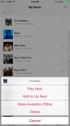
Also, now at the bottom of the screen, just above "My Music Playlists Radio" there is a now playing bar. Tapping it will bring up the current track, album art, and other controls such as shuffle, up next, make available offline and delete .

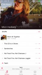
The playing now bar stays right there even when moving back and forth between albums, playlists, and radio
 

Attachments

  • IMG_0677.jpg
    IMG_0677.jpg
    299.6 KB · Views: 521
Unfortunately, the flow is still:
Artist -> Albums w/songs showing

instead of how it used to be (prior to iOS7?):
Artist -> Albums -> Songs

For people like me that actually like listening to albums, this is really annoying. I don't want (a) to have to scroll through a list of songs to get to an older album and (b) the next album to just start playing right after the album I wanted to listen to.

I don't understand the value of showing all the songs along with the albums. It's basically flattening the hierarchy and making it harder to navigate. If someone can point out the value of the Albums w/songs display, maybe I can learn to like it a bit better, but right now I find it really annoying since I have to scroll around so much more just to play an album.
 
Wow, this change is big enough I'm surprised it's not part of iOS 9.

Is iOS 8 going to become like Mac OS 10? Same major version number forever? :)

Maybe Apple wanted the iPhone 4s, iPad 2 and original iPad mini to get the revamped music app with Beats integration before they get cut off.
 
Unfortunately, the flow is still:
Artist -> Albums w/songs showing

instead of how it used to be (prior to iOS7?):
Artist -> Albums -> Songs

For people like me that actually like listening to albums, this is really annoying. I don't want (a) to have to scroll through a list of songs to get to an older album and (b) the next album to just start playing right after the album I wanted to listen to.

I don't understand the value of showing all the songs along with the albums. It's basically flattening the hierarchy and making it harder to navigate. If someone can point out the value of the Albums w/songs display, maybe I can learn to like it a bit better, but right now I find it really annoying since I have to scroll around so much more just to play an album.

Report it. The good thing about this beta is that they will be paying closer attention to the music app. Hopefully someone takes notice!
 
Unfortunately, the flow is still:
Artist -> Albums w/songs showing

instead of how it used to be (prior to iOS7?):
Artist -> Albums -> Songs

For people like me that actually like listening to albums, this is really annoying. I don't want (a) to have to scroll through a list of songs to get to an older album and (b) the next album to just start playing right after the album I wanted to listen to.

I don't understand the value of showing all the songs along with the albums. It's basically flattening the hierarchy and making it harder to navigate. If someone can point out the value of the Albums w/songs display, maybe I can learn to like it a bit better, but right now I find it really annoying since I have to scroll around so much more just to play an album.


I agree! I actually most of the time listening to full albums.
 
Maybe Apple wanted the iPhone 4s, iPad 2 and original iPad mini to get the revamped music app with Beats integration before they get cut off.
Good point! Although, I suspect that most of those devices probably won't be updated or traded in for a newer one. Nice move Apple.
 
Unfortunately, the flow is still:
Artist -> Albums w/songs showing

instead of how it used to be (prior to iOS7?):
Artist -> Albums -> Songs

For people like me that actually like listening to albums, this is really annoying. I don't want (a) to have to scroll through a list of songs to get to an older album and (b) the next album to just start playing right after the album I wanted to listen to.

I don't understand the value of showing all the songs along with the albums. It's basically flattening the hierarchy and making it harder to navigate. If someone can point out the value of the Albums w/songs display, maybe I can learn to like it a bit better, but right now I find it really annoying since I have to scroll around so much more just to play an album.

This and several other fatal flaws are the reason I stopped using their Music app altogether. I'm currently using Beats Music as my only music player.

iOS 7 dramatically f'd up everything associated with grouping and sorting at the OS level. How can they not allow you to browse albums without the clutter of songs? At least they could provide a toggle to collapse the view.
 
"Make Available Offline" is... interesting wording. Lol.
 

Attachments

  • img_0650.jpg
    img_0650.jpg
    155.1 KB · Views: 198
  • img_0652.jpg
    img_0652.jpg
    119.9 KB · Views: 210
  • IMG_0672.jpg
    IMG_0672.jpg
    236.9 KB · Views: 204
Report it. The good thing about this beta is that they will be paying closer attention to the music app. Hopefully someone takes notice!

I'd be a lot more willing to open Radars of they just provided Me Too button.
 
I will spam their feedback until they finally fix the annoying issue where the music app does not remember the last position and keeps jumping back to the damn letter "A"! unless it has been fixed in this beta lol so let me know. thx!
 
Register on MacRumors! This sidebar will go away, and you'll see fewer ads.