Only downside is, Apple doesn't think so since their newfound obsession with blinding white everything.me too :/
And I really expect dark mode come to all stock apps in iOS 9. This bright Music app is so bad!
Got a tip for us?
Let us know
Become a MacRumors Supporter for $50/year with no ads, ability to filter front page stories, and private forums.
Apple Seeds First iOS 8.4 Beta to Developers With Revamped Music App
- Thread starter MacRumors
- Start date
- Sort by reaction score
You are using an out of date browser. It may not display this or other websites correctly.
You should upgrade or use an alternative browser.
You should upgrade or use an alternative browser.
To me it still looks several steps behind the likes of Spotify and Rdio, or even Beats, is it just me?
Wow, I kinda feel left out since I only use Spotify for music. Haven't launched the Music app in 2 years. 
To me it still looks several steps behind the likes of Spotify and Rdio, or even Beats, is it just me?
I agree.
Wow, I kinda feel left out since I only use Spotify for music. Haven't launched the Music app in 2 years.
Same here. It's actually been well over 3 years since I signed up for Spotify Premium, and haven't had to use the Music app (or really iTunes on the desktop) since then. Until Apple can provide a streaming service where you can pick what you want to listen to, I'll continue with Spotify.
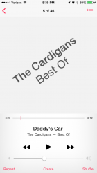
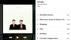
Here's 3 quick screen shots I just took...
THANKS
Is the status text color grayish there??
I couldn't agree more. This is a bad design flaw. I can't believe they still haven't fixed this.Unfortunately, the flow is still:
Artist -> Albums w/songs showing
instead of how it used to be (prior to iOS7?):
Artist -> Albums -> Songs
For people like me that actually like listening to albums, this is really annoying. I don't want (a) to have to scroll through a list of songs to get to an older album and (b) the next album to just start playing right after the album I wanted to listen to.
Also, I wish they'd bring back access to the chapters in audiobooks. This used to work in the old music app, but was dropped for no good reason. Finding a playback position in a 10-hour audiobook using the scrub bar is a huge pain.
Whilst I'd agree,
I'd like an easier way to search albums, it's hardly a major hassle the way it is, artist - album, pull down for search box, 1 sec later album found.
I'd like an easier way to search albums, it's hardly a major hassle the way it is, artist - album, pull down for search box, 1 sec later album found.
Just yesterday I had some music playing in iTunes while I got some work done, and was using the Up Next feature to prioritize songs but without disrupting the shuffle order. In doing so, I wondered if the feature would ever come to iOS, and, alas, here it is. Small world. Thanks,  .
.
 .
.OK, so if we don't get the long lost Artist->Albums view back, do we at least get per-album Play buttons next to the existing per-album Shuffle buttons so we can play just the one damn album instead of creating an implicit playlist of all the following songs by the current artist? (I know the clumsy, multistep workaround to achieve the desired effect.) They should make Jony do a video explaining why this is good design and show him navigating an artist with 20 albums including albums with dozens of tracks. I can just hear the voiceover and imagine the pensive facial expressions.
To me it still looks several steps behind the likes of Spotify and Rdio, or even Beats, is it just me?
That's how I feel too. Photos and Music look the same to me, just white, with a lot of negative space. To me it looks like a complete lack of design. iOS 7 is flat but still very pretty. Photos on my Mac is not pretty in any conceivable way. And this youtube video of Music isn't pretty either. But as long as it works well, I'll live
Hopefully the AirPlay button comes back to the lock screen!!!!!!!!!!!!!!!!
The most important thing I hope apple introduces is end of syncing idevices to computer...just imagine, you create a playlist on ur Mac and it seemlsly appears on all your apple device automatically...
Please please please apple, make it so we don't have to sync our devices...
Please please please apple, make it so we don't have to sync our devices...
Does anyone know if you can change the sort order? I hate the fact that the music is sorted with the newest at the top. Sometimes I want to listen to an artist from start to finish and it would be nice if it went from older albums to newer albums (or at least be user configurable).
Just get rid of the damned "album view" in landscape mode!
Seriously. Whose idea was this? This passed a board room meeting?
Using jsmith189's screenshot, here's a comparison of Beats playlist/album page with iOS's music. There are many similarities. And I really like the things Music is doing. I like that there are tabs on the bottom. Getting to another place in Beats means go back and back and back to get to home. And I like that the song lengths are shown. A lot of the options I don't ever use are buried in a ... button too.


Is the playing screen like the Remote app? I can't check screenshots nor video right now. Thanks in advance!
It should be! Unfortunately it's not!
Unfortunately, the flow is still:
Artist -> Albums w/songs showing
instead of how it used to be (prior to iOS7?):
Artist -> Albums -> Songs
For people like me that actually like listening to albums, this is really annoying. I don't want (a) to have to scroll through a list of songs to get to an older album and (b) the next album to just start playing right after the album I wanted to listen to.
I don't understand the value of showing all the songs along with the albums. It's basically flattening the hierarchy and making it harder to navigate. If someone can point out the value of the Albums w/songs display, maybe I can learn to like it a bit better, but right now I find it really annoying since I have to scroll around so much more just to play an album.
You can tap on an album in the artist view to only show that album.

You can tap on an album in the artist view to only show that album.
What does pressing the ellipsis by the album name do when:
1. Viewing albums by an Artist?
2. Viewing the single album?
If it gives you a Play/Shuffle menu, that would be an improvement over prior versions. It would need to have even more options to make it better than simply adding per-album Play buttons next to the existing per-album Shuffle buttons.
Of course, this exploded design doesn't help the scrolling problem of 20 albums by an artist, some with dozens of tracks.
For the love of all that is holy, please add a toggle within the app to only view offline tracks instead of forcing me to go back to Settings > iTunes.
Hey beta testers, can someone file a suggestion regarding that? Lord knows I've done it multiple times on the website.
Hey beta testers, can someone file a suggestion regarding that? Lord knows I've done it multiple times on the website.
Register on MacRumors! This sidebar will go away, and you'll see fewer ads.


