Become a MacRumors Supporter for $50/year with no ads, ability to filter front page stories, and private forums.

The dots were never that useful anyway. While in our app we support the uber-clean look of iOS 7 as well, most people prefer something like this:

iPhone-4-Inch-Screenshot-37.png
 
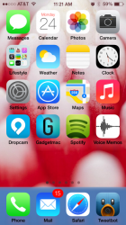
My god why did they change the dock transparency?!? It's now static blue! My eyes!

NVM had to restart and it's back to normal.
 

Attachments

  • photo-2.PNG
    photo-2.PNG
    298.4 KB · Views: 189
“It took me four years to paint like Raphael, but a lifetime to paint like a child.”
― Pablo Picasso

“Every child is an artist. The problem is how to remain an artist once he grows up.”
― Pablo Picasso

Um, I don't know if I would equate Ive with Picasso. Don't misunderstand, I appreciate Ive as an industrial designer very much. However, icons aren't painted, and Picasso's points were in relation to humanity becoming less in touch with their childlike imagination as they grow older. In this instance, even my friends at Pixar and Cupertino agree, the icons in iOS 7 have much to be desired. They also didn't like the animations.

I absolutely love the new additions such as blocking numbers/emails/texts, et al but the more I have used the OS, the more I do not like the design. The graphic presentation of open Safari windows is awful and for those who aren't as tech savvy (such as older adults), it is confusing. In simplifying iOS, they made it more difficult to navigate. More contrast, lessen the white/brightness (even at 25%, which saves battery power, it is still too bright), and add some nuance to what appears to be very simple design.
 
Last edited:
- Beta 2 is also available for iPad 2, 3rd generation, 4th generation and iPad mini
- The Voice Memos app is present
- The lock screen album art has been fixed on iPhone 4 and 4S
- The new male and female Siri voices are available in English
- New smoother experience in the Messages app - less stutter when sending messages
- Improvements have been made to the speed of accessing Siri
- Improvements to the boot up of device
- After updating, you are asked to confirm iCloud details
- After updating, you are asked to confirm iMessage and FaceTime details. An explaination of these services is also given
- After updating, you have the option to set a passcode, from this setup screen
- The Clock app icon in 'Control Center' does not have a black background on it anymore. It is just a transparent shape
 
PS - anyone installed this on their iPad yet? I want to install it on my iPad 3 but pretty concerned about how sluggish it might be :confused:
 
That isn't true. I've a golden/orange/yellow wallpaper and folders aren't blue, just like the dock isn't.

Correct. A glitch on my phone; I reset the wallpaper with the same hideous wallpaper and the blue was gone in both the dock and folders.

Looks like they're using not only adaptive color technology, but adaptive general taste tech, too. If you pick a butt-ugly wallpaper, it adjusts the OS to be more butt-ugly as well.

Fantastic input. Thanks!
 
My dock now has that bar at the top of it too

So to give you the evidence it isn't true what you're saying:

51ev03.png

My dock now has a white bar at the top of it also...not very spaced and looks bad, doesn't separate anything. Not sure if this was meant to be there...will be posting iPad Mini screenshots soooooon!

UPDATE: Restarted and fixed the line...perhaps will work with the blue everyone was seeing!
 
Last edited:
Please tell me that is the default wallpaper. Or any other for that matter. ANY wallpaper looks awfully better than the one on beta 1! iOS7 looks near perfect without it.

Go !
 
nope i restored mine on iOS6. restored to a fresh iOS7 again and my iPhone 5 still drains within hours and gets super hot. and yes i have literally everything i could think of turned off

I think its a certain app or having a alot of apps open at a time. I only seem to have the issue intermitently I noticed it today and closed a bunch of apps and now its not sucking the power or really hot. Bad news is I didn't realize it for so long I'm down to 17% without at charger. :(
 
My dock now has a white bar at the top of it also...not very spaced and looks bad, doesn't separate anything. Not sure if this was meant to be there...will be posting iPad Mini screenshots soooooon!

another bug. I saw this too and it looked really strange. Restarted iPhone and it's gone :)
 
My god why did they change the dock transparency?!? It's now static blue! My eyes!

As others have snidely stated, this "isn't true" -- despite yourself and myself showing evidence that is occurs.

Trying re-setting the wallpaper and see if the dock takes on a hue that matches the wallpaper.
 
Register on MacRumors! This sidebar will go away, and you'll see fewer ads.