No kidding. Under Steve you won't have gotten Control Center either. Screw that. iOS 7 is a huge upgrade over 6. It's not even in the same ball park how much more functional it is and the frosted theme is killer in actual use. Pictures do NOT do it justice.People who haven't even tried iOS 7 complaining about it == hilarious.
Keep it up folks.
Got a tip for us?
Let us know
Become a MacRumors Supporter for $50/year with no ads, ability to filter front page stories, and private forums.
Apple Seeds iOS 7 Beta 2 to Developers with iPad and iPad Mini Support
- Thread starter MacRumors
- Start date
- Sort by reaction score
You are using an out of date browser. It may not display this or other websites correctly.
You should upgrade or use an alternative browser.
You should upgrade or use an alternative browser.
You know it is a beta, right?
I thought beta was a developer code word for early access to 100% functional software, and the only reason they're not releasing it now is because they want to give true fans like me a treat for buying their stuff.
People who haven't even tried iOS 7 complaining about it == hilarious.
Keep it up folks.
You should check my profile and all my messages before saying something as stupid as you just did.
I find it just as hilarious to read people loving iOS7 without even trying it.
Think before you write, or at least do your research.
Upgrading to beta 2, there's a few iOS 7 style dialogs to set up the new version. Kind of strange to have these dialogs at all, an update should just be immediate, and should certainly not require me to answer dialogs before I can use it.
But these dialogs also have what is about the only issue I have with the new iOS7 UX: Buttons that aren't. Instead of a button for "continue", you get just the text "Continue" in blue; sort of like the hyperlinks from 1999.
I don't understand the reasoning behind this.
- It's not pretty
- It doesn't "highlight just the content" - I'd say it confuses the content with the controls, for no good reason.
- It's not easier to use (hunting for buttons that look just like the text)
Safari looks like a mess for the same reason - all the controls are just text so you end up with a jumble of text instead of a clean separation of controls vs. content.
Until these non apple apps post an update in the store that says that it includes support for iOS 7 they are likely to be buggy, crash etc. that's why this whole preview exists. So developers can update their stuff to be ready before the new iOS version goes public.
You have it backwards. The purpose of beta releases is so Apple can find their bugs and fix them both in the new features and so existing apps don't break. As the releases progress, there will be fewer and fewer apps that have problems with ios 7.
Sure there will be an occasional app that will hit some edge case and break but that will not be the norm. How many apps break is actually a good gauge of how far along the OS is and how close to release it is.
God, this is going to make so many people go blind! The fonts are so thin and hard to see.
Yup. I hope so
It's also the buttons replaced with just text, as in Messages and Mail. In iOS 6, the buttons in apps are much more distinguishable. Example, Mail.
The only time Picasso ever painted like Rapheal was in his dreams. The two don't even belong in the same sentence. Talk about stuff that looks like it was done by a two year old.
You know, you just proved his point.
Problem is that Safari's icon is a compass. Makes no sense. It's not Netscape Navigator, you don't surf the net with a compass therefore 'to navigate' doesn't make any sense either. Not to mention, there is already a compass app.Most everyone agrees that it needed a refresh, just not everyone agrees that this looks any good:
Image
God, this is going to make so many people go blind! The fonts are so thin and hard to see.
You can make the fonts more bold the settings app
Downloading it right now for my iPad Mini. I'll report back my thoughts after messing around with it for a bit!
I've seen this mentioned a few times (complaints about "feminine colors"). Are you just talking about the default wallpaper?
Thank you for asking (and for not just bashing my opinion before asking)!
I have no problem with the "simple", "flat", "clean" design direction that Apple is taking. I think it could look very nice and updated. I applaud this aspect of their decisions.
My concern is more about color choices, some of the app icon image designs, and some other various UI choices as they exist now.
To be fair, I am not a developer, and have not used iOS 7 in person. I'm basing my opinion on the screenshots provided by others.
My concern for iOS 7 app icon color choices is specifically about the pinks, purples, and other super-bright pastel colors (but mostly the pinks and purples and reddish-oranges) that are in the following App icons: iTunes Store, Music, Game Center, Podcasts, and to a lesser degree: Photos, Reminders, Passbook, Newsstand, and Contacts.
I don't care for the purple in the iOS 6 Podcasts app either, but would be more okay with it if it were closer to the dark muted (low saturation) purple found in the new WWDC2013 app icon background color. Anything closer to black or dark blue would be preferable to midrange, bright, or pastel purple. Anything pink would be better if changed closer to black or dark muted (low saturation) red.
I would prefer the bright orangeish-yellow pastel colors to either be dark and muted or to become the midrange of either orange or yellow, but not both (without the pastel).
I would prefer the bright orangish-red pastel colors to either be dark and muted or the midrange of either red or orange, but not both (without the pastel)
The gradients between pink, red, and orangeish-red (found on the Music App) appear like the visual equivelant in music performance of three consecutive notes on a Chromatic Scale played simultaneously, the result of which is often unsettling (because it is in-fact an offset, neither the same nor different enough to become harmonious), like three musicians who can't decide which note to play together. I would prefer they pick either red or orange, but not both, and to make it a solid color without the gradient between two very similar (yet different) colors. Either a red only gradient, an orange only gradient, or a solid color with no gradient at all. I don't know why they don't just continue to use the orange found in the previous Music app. It was more pleasing than this orangish-red gradient mix they are using now.
My concern for the iOS 7 text and button UI color choices is specifically about the pinks and purples and other super-bright pastel colors (but mostly the pinks and purples) found inside the App UIs for Music, Game Center, and possibly other App UIs I have not yet seen.
My concern for iOS 7 app icon image design (not based on color choice) is specifically about Safari, Game Center, Photos, Newsstand, and to a lesser degree Contacts and Settings.
I tend to prefer monochromatic mixtures of blues and greens with some careful uses of yellow, some oranges, and browns. all with various uses of saturation, and I'm more tolerant of the use of pastels in these shades. I don't like reds, pinks, and purples, in most shades (between orangish yellow and purplish-blue), and am personally just trying to be tolerant of them when they are bright, heavily-saturated, or pastel (even though I don't like it). I usually prefer those colors to be dark, muted (low saturation) closer to black or gray or very deep muted orange, red, or blue, and definitely not pink or purple.
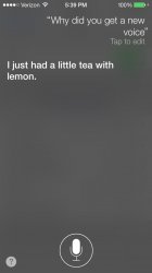
A few things I would like to see would be UI changes to the Notification Center, allowing more direct bullet-point information to be viewable on-screen with less scrolling, and less Sentence/Paragraph based text to read to find relevant information I'm seeking. I'm not interested in reading full, natural, human-like sentences to find information quickly. Bullet-points are far more useful. I would request the same thing for written Siri responses within Siri/Spotlight. Long text sentences don't allow one to find and select information quickly, though I do like full, natural human-like audio responses from Siri. Also, I would like to add the music repeat/shuffle icons to the Command Center/Lock screens. I don't like typing in a long password to unlock my phone just to enable/disable the music repeat button.
I realize this may just be my opinion, but I'm sure there are probably other men out there who may agree with at least parts of my opinion.
Again, I have not used iOS 7 in person, but believe these color choices present in iOS 7 will continue to bother me after changing the wallpaper to something more preferable.
I have had a few icons in iOS 6 that I tolerate because I like the UI in the app. I have also had a few apps (both icons and UIs) that I just have to tolerate altogether. Life will go on, but what is a forum for if not to share ideas and opinions. This one is mine.
If you have other specific questions, I would be happy to answer.
I hope my response has addressed your question adequately.
Thanks.
Last edited:
I thought beta was a developer code word for early access to 100% functional software, and the only reason they're not releasing it now is because they want to give true fans like me a treat for buying their stuff.
You thought wrong.
The 100% functional version will be the Golden Master (GM) release. (hopefully)
Does anybody know how to correct the wallpaper from "over-sizing" and zooming in on it? Or is this just a bug in the beta? 
Also, since iOS 7 I can no longer go to music, artist, and listen to all songs from that artist. The only way I can is through Siri...sigh
Also, since iOS 7 I can no longer go to music, artist, and listen to all songs from that artist. The only way I can is through Siri...sigh
Upgrading to beta 2, there's a few iOS 7 style dialogs to set up the new version. Kind of strange to have these dialogs at all, an update should just be immediate, and should certainly not require me to answer dialogs before I can use it.
But these dialogs also have what is about the only issue I have with the new iOS7 UX: Buttons that aren't. Instead of a button for "continue", you get just the text "Continue" in blue; sort of like the hyperlinks from 1999.
I don't understand the reasoning behind this.
- It's not pretty
- It doesn't "highlight just the content" - I'd say it confuses the content with the controls, for no good reason.
- It's not easier to use (hunting for buttons that look just like the text)
Safari looks like a mess for the same reason - all the controls are just text so you end up with a jumble of text instead of a clean separation of controls vs. content.
Exactly. This was the point I mentioned earlier regarding text as the only indicator where a button once served a purpose. It's not about skeuomorphism but providing context for users to identify various aspects. Floating text in vibrant colors should not replace selection indicators. This is a principle aspect in GUI design.
Imagine MacRumors in Safari, what if all button boxes were removed and only the text existed? It may seem cleaner, but it would become a web page with text floating in various places. It needs definition to support its purpose, otherwise it becomes a hyperlink.
Does anybody know how to correct the wallpaper from "over-sizing" and zooming in on it? Or is this just a bug in the beta?
Also, since iOS 7 I can no longer go to music, artist, and listen to all songs from that artist. The only way I can is through Siri...sigh
I have not used iOS 7 yet, and may not have the right answer, but my quick guess/assumption (based on what I've read) would be that this could be a "feature" to allow the Paralax view to function well as you rotate/pivot your iOS device.
It might depend on the size/dimensions of the image you are using. Is it one of the wallpapers that came with iOS 7 or your own? Does this happen with some of your other images?
Also, I pretty much always listen to music in the Artist view, and hope I can continue to do this when iOS 7 is released. This would be very frustrating if it is not possible. I know....FWP.
This is something I can agree with. I think text "buttons" are terrible.Upgrading to beta 2, there's a few iOS 7 style dialogs to set up the new version. Kind of strange to have these dialogs at all, an update should just be immediate, and should certainly not require me to answer dialogs before I can use it.
But these dialogs also have what is about the only issue I have with the new iOS7 UX: Buttons that aren't. Instead of a button for "continue", you get just the text "Continue" in blue; sort of like the hyperlinks from 1999.
I don't understand the reasoning behind this.
- It's not pretty
- It doesn't "highlight just the content" - I'd say it confuses the content with the controls, for no good reason.
- It's not easier to use (hunting for buttons that look just like the text)
Safari looks like a mess for the same reason - all the controls are just text so you end up with a jumble of text instead of a clean separation of controls vs. content.
I have not used iOS 7 yet, and may not have the right answer, but my quick guess/assumption (based on what I've read) would be that this could be a "feature" to allow the Paralax view to function well as you rotate/pivot your iOS device.
It might depend on the size/dimensions of the image you are using. Is it one of the wallpapers that came with iOS 7 or your own? Does this happen with some of your other images?
Its while using photos I've taken or previous wallpapers that I have downloaded through a wallpaper app.
Here is a before iOS7 and and after.


I''l grant you that those paintings are pretty normal looking for Picasso, but "Raphael Like?", not even close.
iOS 7 beta 2 working better on iPhone 4
Hello everyone! I've been a reader since 2002 but never opened an account for the forums until today.
I've been using iOS 7 beta since day one on my old iPhone 4 and I got to deal with a lot of issues. I thought iOS 7 wasn't going to work on these "older" devices at all, but since I installed beta 2 OTA, Apple proved me wrong.
I had issues with several animations, Safari was almost useless (I couldn't jump smoothly from (tab) card to card, the camera was also sluggish and I didn't take more than 5 pictures in the last two weeks, and overall, my iPhone "felt" really slow and old. Everything bad is -almost- gone with beta 2
Leaving the aesthetic judgement besides (well as a designer I have to admit the icons really seem unfinished), iOS 7 beta 2 is a huge improvement over iOS 6. I'm sure now everything will get better enough through each beta that we will be proud of Apple again. Just take the betas for what they are, beta software, and you'll do ok with it. I'm just having issues with Skype so far and it seems weird to me that some apps still call the former keyboard. Just let Apple iron out the inconsistencies and enjoy their development cycle. It's nice to see that things get better every couple of weeks.
The only time Picasso ever painted like Rapheal was in his dreams. The two don't even belong in the same sentence. Talk about stuff that looks like it was done by a two year old.
Picasso in his early years, before trying to paint like a child http://www.artgalleryabc.com/picasso/picasso-early-works
It is pretty difficult to picture the mind of a genius, especially if you are not.
Problem is that Safari's icon is a compass. Makes no sense. It's not Netscape Navigator, you don't surf the net with a compass therefore 'to navigate' doesn't make any sense either. Not to mention, there is already a compass app.
"Petty" = you, and crap you spew
I thought beta was a developer code word for early access to 100% functional software, and the only reason they're not releasing it now is because they want to give true fans like me a treat for buying their stuff.
HA! lol... Really? You thought 'beta' meant 100% functional software? Oh, that's good. Your world is really tiny, huh?
Lol...
Ya, so software is written by a relatively small group of programmers, in order to produce a product that will run on a MASSIVE number of devices, and support a MASSIVE number of apps, written by an equally large number of developers. So, in order to GET the OS to 100%, they release 'beta' versions for two reasons - (1) to give devs an opportunity to code their apps to work well with the new OS, and (2) to give devs a chance to test the OS on a scale MUCH larger than the original programmer pool, so they can report bugs and defects so they can be fixed before a public release.
Not your fault for not knowing this. It's only been the standard, no-Shiite way that products have been developed since the beginning of the industrial revolution. Since you don't read and all, of course you wouldn't know.
----------
Thank you for asking (and for not just bashing my opinion before asking)!
I have no problem with the "simple", "flat", "clean" design direction that Apple is taking. I think it could look very nice and updated. I applaud this aspect of their decisions.
My concern is more about color choices, some of the app icon image designs, and some other various UI choices as they exist now.
To be fair, I am not a developer, and have not used iOS 7 in person. I'm basing my opinion on the screenshots provided by others.
My concern for iOS 7 app icon color choices is specifically about the pinks, purples, and other super-bright pastel colors (but mostly the pinks and purples and reddish-oranges) that are in the following App icons: iTunes Store, Music, Game Center, Podcasts, and to a lesser degree: Photos, Reminders, Passbook, Newsstand, and Contacts.
I don't care for the purple in the iOS 6 Podcasts app either, but would be more okay with it if it were closer to the dark muted (low saturation) purple found in the new WWDC2013 app icon background color. Anything closer to black or dark blue would be preferable to midrange, bright, or pastel purple. Anything pink would be better if changed closer to black or dark muted (low saturation) red.
I would prefer the bright orangeish-yellow pastel colors to either be dark and muted or to become the midrange of either orange or yellow, but not both (without the pastel).
I would prefer the bright orangish-red pastel colors to either be dark and muted or the midrange of either red or orange, but not both (without the pastel)
The gradients between pink, red, and orangeish-red (found on the Music App) appear like the visual equivelant in music performance of three consecutive notes on a Chromatic Scale played simultaneously, the result of which is often unsettling (because it is in-fact an offset, neither the same nor different enough to become harmonious), like three musicians who can't decide which note to play together. I would prefer they pick either red or orange, but not both, and to make it a solid color without the gradient between two very similar (yet different) colors. Either a red only gradient, an orange only gradient, or a solid color with no gradient at all. I don't know why they don't just continue to use the orange found in the previous Music app. It was more pleasing than this orangish-red gradient mix they are using now.
My concern for the iOS 7 text and button UI color choices is specifically about the pinks and purples and other super-bright pastel colors (but mostly the pinks and purples) found inside the App UIs for Music, Game Center, and possibly other App UIs I have not yet seen.
My concern for iOS 7 app icon image design (not based on color choice) is specifically about Safari, Game Center, Photos, Newsstand, and to a lesser degree Contacts and Settings.
I tend to prefer monochromatic mixtures of blues and greens with some careful uses of yellow, some oranges, and browns. all with various uses of saturation, and I'm more tolerant of the use of pastels in these shades. I don't like reds, pinks, and purples, in most shades (between orangish yellow and purplish-blue), and am personally just trying to be tolerant of them when they are bright, heavily-saturated, or pastel (even though I don't like it). I usually prefer those colors to be dark, muted (low saturation) closer to black or gray or very deep muted orange, red, or blue, and definitely not pink or purple.
A few things I would like to see would be UI changes to the Notification Center, allowing more direct bullet-point information to be viewable on-screen with less scrolling, and less Sentence/Paragraph based text to read to find relevant information I'm seeking. I'm not interested in reading full, natural, human-like sentences to find information quickly. Bullet-points are far more useful. I would request the same thing for written Siri responses within Siri/Spotlight. Long text sentences don't allow one to find and select information quickly, though I do like full, natural human-like audio responses from Siri. Also, I would like to add the music repeat/shuffle icons to the Command Center/Lock screens. I don't like typing in a long password to unlock my phone just to enable/disable the music repeat button.
I realize this may just be my opinion, but I'm sure there are probably other men out there who may agree with at least parts of my opinion.
Again, I have not used iOS 7 in person, but believe these color choices present in iOS 7 will continue to bother me after changing the wallpaper to something more preferable.
I have had a few icons in iOS 6 that I tolerate because I like the UI in the app. I have also had a few apps (both icons and UIs) that I just have to tolerate altogether. Life will go on, but what is a forum for if not to share ideas and opinions. This one is mine.
If you have other specific questions, I would be happy to answer.
I hope my response has addressed your question adequately.
Thanks.
wow. Lots of words to express petty thoughts. Ugh.
Register on MacRumors! This sidebar will go away, and you'll see fewer ads.