Settings > General > Accessibility > Parallax > OffI put it on my ipad. The 3d effect with the wallpaper was promoted in the keynote as a cool new feature. But it is just making me dizzy. Is there a way to disable it (apart from going back to ios 6)?
Got a tip for us?
Let us know
Become a MacRumors Supporter for $50/year with no ads, ability to filter front page stories, and private forums.
Apple Seeds iOS 7 Beta 2 to Developers with iPad and iPad Mini Support
- Thread starter MacRumors
- Start date
- Sort by reaction score
You are using an out of date browser. It may not display this or other websites correctly.
You should upgrade or use an alternative browser.
You should upgrade or use an alternative browser.
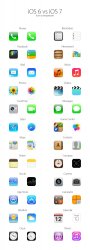
The amateurish icons and unreadable font are even worse on the iPad than on the iPhone. And the Vista grass wallpaper is not helping. I begin to feel cold...
I was afraid I might hear this.
Yup crashes for me
On my iPhone 5 weather does not crash when deleting a city.

If you complain without arguments, but just giving your own subjective thoughts , as it has been since beta release (for 80% or the cases), then better don't complain!. So complain all you want but have an objective reason. And if you believe you can do better, go to Apple and present your work, im pretty sure they are looking for a brilliant mind as yours.
Not sure whether u realized that I am not the person complaining or not.
So Apple determined that the best way to fight the competition from Samsung is by redesigning the icons? Really?
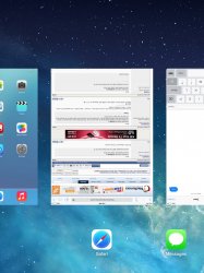
If you want to see precise timestamps for each message drag left on the message field... pretty solid!!!
Image
Very nice find! I love features like this that are hidden until you need it, but it just makes sense and is memorable. It takes so much more thought and consideration to than just showing the user everything all the time.
Safari now spazzes when looking at websites.
Yes, like macrumors.com. Cannot even use it on iPhone now, grr.
I installed beta 2 on my iphone 5 no developer account. no issues at all.
i had went back to 6.1.4 a couple days ago because it was a bit glitchy for my main device. so today instead of downloading beta 2 ipsw I just installed from beta 1 and then ota updated. no brick!
i had went back to 6.1.4 a couple days ago because it was a bit glitchy for my main device. so today instead of downloading beta 2 ipsw I just installed from beta 1 and then ota updated. no brick!
Waiting for the President to deliver the State of the Icon address.
Agreed, because that's the most important thing in a new OS, especially when the OS begins to look at and treat icons very differently than previously.
Yes, but only ones secure in their sexuality.
Darn, I was hoping I'd get some feedback from some of the developers on here.
Apple never stops innovating, AAPL never stops falling
That's because Apple is a great company and Apple's investors are idiots.
Can we please stop fighting about app icons for a phone? This has become incredibly blown out of proportion... IT'S A SQUARE PICTURE ON A SCREEN. That's it! I can't believe people are saying things like "Oh my god I'm switching to Android because of the new icons." Seriously? Grow up.
Which would be ironic because android's icons are just as unattractive.
Seriously, in a showdown between the current iOS 6 icons and the new designs, I personally haven't been able to find anyone who thinks the new ones look better. This move seems to have been made to satisfy the complaints of teenage android fans who hate iOS, and have no plans of ever using iOS for religious reasons. The worst part is, even they're not happy.
Attachments
My download time is etimated at 17 hours, wifi is much faster anyone else have long estimated time?
Sexist much? The color palette and who picked it likely has zilch to do with gender or sexual proclivity of the designers or the audience.
They wanted a radical redesign that was a total change from the previous versions. Thus they picked a totally different color palette.
Jony Ive wanted something different, which is why he went to his marketing people, to find out what marketing people thought was "new" and "fresh", and what his target audience would like to see.
I'm sorry you haven't been paying attention, but almost every Apple add for the last 5+ years has been aimed at women and their teenage daughters.
You clearly aren't familiar with the longstanding trend for all corporations to refocus all their marketing efforts towards women. Even some products that are designed with men in mind are marketed and advertised directly to the wives and girlfriends of those men. It's really kind of creepy (like someone is talking about you while you're standing right next to them, yet they fail to acknowledge your presence or opinion in their discussion and decisions about you. It encourages women to buy products for their men based solely on the promised benefits to themselves without ever factoring the man's opinion into the equation. It's very disrespectful to men.)
Calling me a sexist for acknowledging, understanding, and pointing out this ongoing trend and the actions of specific companies is neither correct, nor negates the correctness of my claim.
Apple is too smart to pick a color palette randomly or at a whim. They know what they are doing, and their choice of color palettes is designed to appeal more to younger female audiences who like social networking, music, photos, and casual gaming. It is also why their iPod lineup has a lot of bright pastel colors for the last few years, with only the options of black, silver, or white for most men to choose from. (How many men do you see purchasing these bright pastel colored iPods?! Not many. A lot of women do buy them though.)
I never said men and women were unequal. They aren't. They are equal in value. But I do believe they are very different.
Stating that men and women are very different in interests/preferences should be common sense.
Men aren't "wrong" because they think and act differently than women.
Women aren't "wrong" because they think and act differently than men.
We are not the same, but we are equal.
That does not make me a sexist for acknowledging this basic human truth!
Last edited:
My download time is etimated at 17 hours, wifi is much faster anyone else have long estimated time?
Click to download again an you might get a faster mirror. IF that catches up then cancel the 17h job
Which would be ironic because android's icons are just as unattractive.
Seriously, in a showdown between the current iOS 6 icons and the new designs, I personally haven't been able to find anyone who thinks the new ones look better. This move seems to have been made to satisfy the complaints of teenage android fans who hate iOS, and have no plans of ever using iOS for religious reasons. The worst part is, even they're not happy.
Taken in isolation the icons aren't so bad, in fact some of them are really well designed. They also have a 1970s feel to them with the design and colour scheme which is kind of cool. The problem comes when they throw them all together. And the music, itunes store and app store icons just plain suck.
The more I see iOS7, the more it disgusts me. Steve would have never approved. I fear the day iOS7 will be the only option... I will remain with iOS6, the last iOS - product of Steve & Forstall's taste/imagination/perfection - Steve's envisionment of how a mobile/smartphone OS should be.
Do NOT restore a backup. Then, you won't have problems. Neither have I on my (GSM) iPhone 5.
It seems like that's a bug that could be fixed... I mean it was the same with iOS6, don't restore from backup or you end up with 8 hour battery life...
The more I see iOS7, the more it disgusts me. Steve would have never approved. I fear the day iOS7 will be the only option... I will remain with iOS6, the last iOS - product of Steve & Forstall's taste/imagination/perfection - Steve's envisionment of how a mobile/smartphone OS should be.
Ahh, the myriad innovations of drop shadows and highlights. Truly the two Photoshop filters that best symbolize the spirit of the free thinking mind.
The more I see iOS7, the more it disgusts me. Steve would have never approved. I fear the day iOS7 will be the only option... I will remain with iOS6, the last iOS - product of Steve & Forstall's taste/imagination/perfection - Steve's envisionment of how a mobile/smartphone OS should be.
People who haven't even tried iOS 7 complaining about it == hilarious.
Keep it up folks.
This couldn't have come at a better time! The bugs and amount of broken things was getting long in the tooth... I hope this fixes a lot.
You know it is a beta, right?
Register on MacRumors! This sidebar will go away, and you'll see fewer ads.