No but you will get the improved battery icon. /sIf I select the 12GB install instead of 4GB, will I get more features and bug fixes?
Got a tip for us?
Let us know
Become a MacRumors Supporter for $50/year with no ads, ability to filter front page stories, and private forums.
Apple Seeds Third Beta of macOS Big Sur to Developers
- Thread starter MacRumors
- Start date
- Sort by reaction score
You are using an out of date browser. It may not display this or other websites correctly.
You should upgrade or use an alternative browser.
You should upgrade or use an alternative browser.

CMD+R - go into recovery and then go to utilities and security startup disk. Enable boot from removable media. Then restart and hold the Option (Alt) key and choose the bottle USB disk...
BTW it worked perfectly and I now have Beta 3 installed...
Believe me, I tried everything. I wasted about 4 hours with apple support team, Even they couldn't do it. In the end I had to go back to Mojave and then install Catalina.
Beta 3 won't install for me. I downloaded it and walked away. I came back and saw a message that I had to quite all apps. No apps were running so I waited a long time. Still nothing so I had to force quit the installer and rebooted. It found the update and installed again. Machine rebooted a couple times and I'm still on beta 2 and it shows an update is available. Not sure what to do. Download it again I guess?
Beta 3 won't install for me. I downloaded it and walked away. I came back and saw a message that I had to quite all apps. No apps were running so I waited a long time. Still nothing so I had to force quit the installer and rebooted. It found the update and installed again. Machine rebooted a couple times and I'm still on beta 2 and it shows an update is available. Not sure what to do. Download it again I guess?
I had the same issue twice, I just did a fresh install.
How do you do that?I had the same issue twice, I just did a fresh install.
It's in the release notesBeta 3 won't install for me. I downloaded it and walked away. I came back and saw a message that I had to quite all apps. No apps were running so I waited a long time. Still nothing so I had to force quit the installer and rebooted. It found the update and installed again. Machine rebooted a couple times and I'm still on beta 2 and it shows an update is available. Not sure what to do. Download it again I guess?
- Your Mac might restart but isn't updated to a newer version of macOS Big Sur 11 Beta. (65298753)
Workaround: Create a bootable installer using the createinstallmedia command.
They changed the version string from 10.16 to 11.0.More than 12 GB!! Any explanation for that??🤔🤔
It's in the release notes
- Your Mac might restart but isn't updated to a newer version of macOS Big Sur 11 Beta. (65298753)
Workaround: Create a bootable installer using the createinstallmedia command.
OK thanks. Will I have to erase my disk or can I just boot off the media and try an install? I have a time machine backup, it'll just be a bit of a pain to restore.
and notifications icon on system changed. red dot on the left to the right side.
Based on your screenshots, it's a bug, it's been clipped to be the same height as other icons.- In the Music app, the "Play" icon is new. Not sure if I'm a fan of it. It is also inconsistent with the Podcasts app which uses the old one. Seems more like a bug (hopefully)
The real "Play" icon can be found in SF Symbols, which was invented especially for consistency across first-party and third-party apps.
Did the full 12GB install of this latest beta and it appears to have fixed a few of the issues I had before. It for sure is getting better as the first two betas were nigh unusable for me. I still may have to do a full on fresh install of Big Sur once it goes final just to be sure it will perform at its best. Needless to say there's no doubt my hard drive is the main bottleneck here as it's not an SSD. Perhaps I should look into if it's even possible to install one in a 2015 iMac...But that's another problem for another day. As it is, this beta is a step up from the other two and it should continue to get a bit more refined as the new releases come and go. It's certainly starting to take form and I like where Apple is going with it!
Beta 3 won't install for me. I downloaded it and walked away. I came back and saw a message that I had to quite all apps. No apps were running so I waited a long time. Still nothing so I had to force quit the installer and rebooted. It found the update and installed again. Machine rebooted a couple times and I'm still on beta 2 and it shows an update is available. Not sure what to do. Download it again I guess?
- When updating to macOS Big Sur 11 Beta 3, you might be offered an unexpectedly large download rather than an incremental software update. (65753086)
Workaround: Under the "Another update is available" text, click the "More info…" link. This will reveal the incremental update where you can click the Install Now button.
Really good release
Feels more snappy
Text alignment in menu bar is still off if there is a check in the menu (to see this click on any application that has the word "Window" and you will see the misalignment), and the roundrects are still in the menubar. Besides those two things I'm liking it.
[automerge]1595477187[/automerge]
Running prl_client_app in terminal gives me this
Jul 22 23:03:39 pdfm-bootstrap[1980] <Error>: inittool[1978]: Fatal: this is not OS X
So it should be an easy fix on their side
Last edited:
Really good release
Feels more snappy
Text alignment in menu bar is still off if there is a check in the menu (to see this click on any application that has the word "Window" and you will see the misalignment), and the roundrects are still in the menubar. Besides those two things I'm liking it.
[automerge]1595477187[/automerge]
Running prl_client_app in terminal gives me this
Jul 22 23:03:39 pdfm-bootstrap[1980] <Error>: inittool[1978]: Fatal: this is not OS X
So it should be an easy fix on their side
Anyone having issues changing keyboard backlight levels on the Touch Bar models? Basically my keyboard backlight can be completely off, or on the dimmest setting no matter what I change the brightness level to.
I have the same.Anyone having issues changing keyboard backlight levels on the Touch Bar models? Basically my keyboard backlight can be completely off, or on the dimmest setting no matter what I change the brightness level to.
I also have the message service battery with battery health being at 95%
It's definitely the buggiest beta out of all 3 for me.
[automerge]1595478578[/automerge]
New issues:
- The menu bar says that battery service is recommended (battery capacity is at 93%). I saw another person on reddit having the same issue, so I assume it's a bug.
I had the same.
Do a restart and a PRam reset. It will fix the battery.
Last edited:
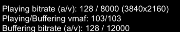
You weren't in beta 2?I'm getting 4k Netflix on safari now...
- Music app has the iOS 14 icon. To be honest, in the context of the bundle of media apps (Music, Podcasts and TV), I think that the new icon makes more sense and looks more in line with the other icons. Furthermore, it makes sense for the pink accent colour of the app. I liked the previous icon more, but I can see why Apple might have wanted to change it
- Battery icon is changed
- Notifications icon is updated and is no longer a low resolution one
- There's a separator after the sidebar
- The results box in the Music app now appears properly (and the app doesn't crash when having input larger than the size of the search field)
- In the Music app, right clicking on an item within the “Browse” and “Listen Now” content areas no longer opens the contextual menu at a random location. I believe the issue started occurring in Catalina, but it is resolved now.
- In the Music app, the "Play" icon is new. Not sure if I'm a fan of it. It is also inconsistent with the Podcasts app which uses the old one. Seems more like a bug (hopefully)
- The dialog box when choosing a profile picture in "Users & Groups" has been redesigned, before the text was going out of the selection
- Safari no longer crashes when I try to select a background image from the file dialog
- Spotlight seems to have been fixed
- Both the date and time appear in the menu bar. I think it was just the time before, but might be wrong about this one.
- Some of the highlighted controls across the system weren't rendering properly in the previous betas, this seems to have been fixed as well
- AirPods are no longer showing twice under "Sound" in the menu bar
- New sounds when making screenshots and moving files
New issues:
- The menu bar says that battery service is recommended (battery capacity is at 93%). I saw another person on reddit having the same issue, so I assume it's a bug.
- Sidecar seems slightly broken. I'm getting lots of empty space on top of the screen and also very awkward extension of the sidebar (highlighted with a white circle)
The "Add Tab" button in Safari shows recently closed tabs again when you long click on it, like in Catalina and earlier.
I'm really torn on the Big Sur interface changes. On the one hand, I appreciate that Apple is giving macOS some attention, and a much needed overhaul. The basic interface elements haven't changed that much since OS X first came out - items have been refined, and in some cases flattened, but nothing major.
On the other hand, the changes are a bit jarring, and I'm finding myself not liking it. My biggest issue is that there is a lack of contrast across the entire system. Specifically, items in application toolbars blend into the background of the toolbar. It's common for toolbar items that are not applicable to a given task to be greyed out, and a similar thing happens in Big Sur, but the difference b/w "active" and "inactive" toolbar items is significantly more subtle than in Catalina and prior. In addition, many of the new app icons look really bizarre with a faux shadow effect that looks very amateurish.
There have been some refinements to the interface b/w the various betas, so I'm hopeful Apple will continue to work on it - but they really have a long ways to go.
This. I used to appreciate the fact that window title bars and the menu bar were grey, and a direct contrast to everything around them because it was easier to quickly find and drag content around when doing graphics work.My biggest issue is that there is a lack of contrast across the entire system. Specifically, items in application toolbars blend into the background of the toolbar. It's common for toolbar items that are not applicable to a given task to be greyed out, and a similar thing happens in Big Sur, but the difference b/w "active" and "inactive" toolbar items is significantly more subtle than in Catalina and prior.
if there ia an option to reduce the sheer amount of white space (not dark mode) then fine.
I'm really torn on the Big Sur interface changes. On the one hand, I appreciate that Apple is giving macOS some attention, and a much needed overhaul. The basic interface elements haven't changed that much since OS X first came out - items have been refined, and in some cases flattened, but nothing major.
On the other hand, the changes are a bit jarring, and I'm finding myself not liking it. My biggest issue is that there is a lack of contrast across the entire system. Specifically, items in application toolbars blend into the background of the toolbar. It's common for toolbar items that are not applicable to a given task to be greyed out, and a similar thing happens in Big Sur, but the difference b/w "active" and "inactive" toolbar items is significantly more subtle than in Catalina and prior. In addition, many of the new app icons look really bizarre with a faux shadow effect that looks very amateurish.
There have been some refinements to the interface b/w the various betas, so I'm hopeful Apple will continue to work on it - but they really have a long ways to go.
I have grown to like the new icons. My only issue is the small writing on the letter for Mail. Why? It bugs me that it's unreadable and it's subtle yet very obvious. 😀
I also really don't understand the greyed out part. It's clear as day IMO, there is still a huge difference. And the toolbar icons can get messy I guess depending on the wallpaper but using the default Big Sur (nature) wallpaper it works well both in dark and light mode.
I think we are going to see some more refinement. I think this is a good update, but I hope most people are going to be satisfied when the GM comes out. It's been working for me as of now.
While I love the direction overall, the lack of contrast is a massive issue. It's hard to discern between active and inactive windows and controls.
Active vs inactive Music window:


Active vs inactive controls:


Here's a fun one, is repeat one active or inactive?

Active vs inactive Music window:
Active vs inactive controls:
Here's a fun one, is repeat one active or inactive?
Anyone having issues changing keyboard backlight levels on the Touch Bar models? Basically my keyboard backlight can be completely off, or on the dimmest setting no matter what I change the brightness level to.
The same on MacBook 12”
Register on MacRumors! This sidebar will go away, and you'll see fewer ads.