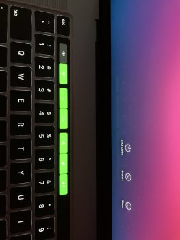
Why is no one talking about these ugly bright white lines in the notes app. Only on dark mode, it looks absolutely fine on light mode.

Got a tip for us?
Let us know
Become a MacRumors Supporter for $50/year with no ads, ability to filter front page stories, and private forums.
Apple Seeds Third Beta of macOS Big Sur to Developers
- Thread starter MacRumors
- Start date
- Sort by reaction score
You are using an out of date browser. It may not display this or other websites correctly.
You should upgrade or use an alternative browser.
You should upgrade or use an alternative browser.
I hope you’re all actually reporting these things back to Apple

Not been on this yet. However The Catalina rollout was not a great experience last year, so here’s hoping that Big Sur comes out a little later than iOS. I’d be happy if they prioritised getting it working for the new ARM Macs and then made it available to intel Macs after their launch. Stability with such a big update is very important.
[automerge]1595489620[/automerge]
Many things will be too garish, too extreme until they re adjust in subsequent releases.
[automerge]1595489620[/automerge]
I think that Big Sur is shaping up to be the equivalent of iOS 7, UX wise.New battery icon but still outdated! OMG, what is happening with Apple's design team. They sometime nail it perfectly, and sometimes are completely missing it.
Many things will be too garish, too extreme until they re adjust in subsequent releases.
Last edited:
While I love the direction overall, the lack of contrast is a massive issue. It's hard to discern between active and inactive windows and controls.
Active vs inactive Music window:
View attachment 936599View attachment 936600
Active vs inactive controls:
View attachment 936601
View attachment 936602
Here's a fun one, is repeat one active or inactive?
View attachment 936603
Submit that feedback friendsI'm really torn on the Big Sur interface changes. On the one hand, I appreciate that Apple is giving macOS some attention, and a much needed overhaul. The basic interface elements haven't changed that much since OS X first came out - items have been refined, and in some cases flattened, but nothing major.
On the other hand, the changes are a bit jarring, and I'm finding myself not liking it. My biggest issue is that there is a lack of contrast across the entire system. Specifically, items in application toolbars blend into the background of the toolbar. It's common for toolbar items that are not applicable to a given task to be greyed out, and a similar thing happens in Big Sur, but the difference b/w "active" and "inactive" toolbar items is significantly more subtle than in Catalina and prior. In addition, many of the new app icons look really bizarre with a faux shadow effect that looks very amateurish.
There have been some refinements to the interface b/w the various betas, so I'm hopeful Apple will continue to work on it - but they really have a long ways to go.
Why is no one talking about these ugly bright white lines in the notes app. Only on dark mode, it looks absolutely fine on light mode.View attachment 936604
That's called a bug
Hoping for a public beta...
Mac OS betas are notoriously brutal. Even public betas. Just know that before continuing.
If any wants to create installer a 16gb Pen drive Minimum is required. Name it Untitled. Then Type the following into terminal
sudo /Applications/Install\ macOS\ Big\ Sur\ Beta.app/Contents/Resources/createinstallmedia --volume /Volumes/Untitled
Do this before installing as it will delete the installer after upgrade.
sudo /Applications/Install\ macOS\ Big\ Sur\ Beta.app/Contents/Resources/createinstallmedia --volume /Volumes/Untitled
Do this before installing as it will delete the installer after upgrade.
I actually like the shadows on those icons....Have they still got the awful dirty looking shadow drop on the FaceTime and Messages icon?
If any wants to create installer a 16gb Pen drive Minimum is required. Name it Untitled. Then Type the following into terminal
sudo /Applications/Install\ macOS\ Big\ Sur\ Beta.app/Contents/Resources/createinstallmedia --volume /Volumes/Untitled
Do this before installing as it will delete the installer after upgrade.
Thanks. I made a thread on this at https://forums.macrumors.com/threads/make-a-bootable-big-sur-usb-installer.2242337/
Sorry, but do you really know what you're doing? Those betas are meant for developers - remember Apple filesystem bugs? Deleted folders, lost files, destroyed whatever .. And it seems you're using an early beta in a production environment with a NAS - not knowing what bugs are inside ...? It may make brake you're whole business in a minute.Okay, things are looking like they are regressing - just had the dreaded unable to find the share when connecting to a NAS volume - had to do the usual of killing the sharingd.
Sorry, but do you really know what you're doing? Those betas are meant for developers - remember Apple filesystem bugs? Deleted folders, lost files, destroyed whatever .. And it seems you're using an early beta in a production environment with a NAS - not knowing what bugs are inside ...? It may make brake you're whole business in a minute.
I know more about what I'm doing that you it would seem...
I know so much about what I'm going to know that Beta 1 & 2 didn't have any NAS connection issues but Beta 3 does - rather like I also know that Catalina has the same issues and always has done.
Therefore it would be logical to assume that this could be considered a regression, as it was working previously, and now broken.
I also think it's safe to assume that the version of sharingd that is in Catalina has now found it's way into Big Sur - not confirmed but this is an assumption I'm making based on the current modus operandi
How do you know I'm using an early beta in production, I might be but then again I may not be - who knows?
No it will update, no need to erase your disk...OK thanks. Will I have to erase my disk or can I just boot off the media and try an install? I have a time machine backup, it'll just be a bit of a pain to restore.
Normally you have a NAS in a production environment. And of course I'm just guessing - and of course you could the producer ... But at the first glance it sounds like you're one of the guys who just installs the new system for fun and not to test its own apps against it - for the people needing your apps for production.How do you know I'm using an early beta in production, I might be but then again I may not be - who knows?
It's on the network so that means that any machine I have on the same network will be able to connect to the NAS as it's network attached - be it the test machine I have for Big Sur, or a production machine with Mojave on it because Catalina was too risky - and this is firewall from the dev/dirty lan to the production LAN - so it's secure with IP helper ensuring that mDNS is presented across VLANs - standard practice.
In all honesty, I'm using Big Sur for more things daily as I've found it to be more reliable than Shatalina, Crapalina whatever you want to call it - aka the worst OS for enterprise customers that Apple have ever released
I work as an IT professional & company director, my company provides support to lots of various technologies - I install it not just for fun, but to also get a head-start so that when it is released we are already aware of the issues that will be present, and to also assist with reporting any issues to vendors to make them aware in the hopes that they will release a better system.
And for my remark about Crapalina being the worst OS for enterprise customers is from the number of calls we have taken for apple devices since it's launch - we have had more for 10.15.x than we did for 10.12, 10.13 and 10.14 combined.
I thought we were also talking about bugs 🤔That's called a bug
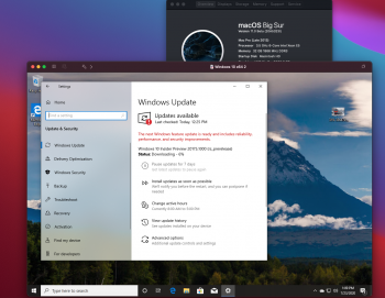
Virtual Machines, with this Beta both Fusion and Parallels don't work however there is a Beta VMware Fusion Available and I was able to create a virtual machine and get it running in that. Note This is also beta software, nor did I try running games etc just wanted to try to install new windows machine. Its available, Here
https://vmwarefusion.github.io
Good luck At he moment trying to import existing machine. Also as its in Beta IT"s FREEEEE!!!!!!
https://vmwarefusion.github.io
Good luck At he moment trying to import existing machine. Also as its in Beta IT"s FREEEEE!!!!!!
Attachments
Last edited:
- When updating to macOS Big Sur 11 Beta 3, you might be offered an unexpectedly large download rather than an incremental software update. (65753086)
Workaround: Under the "Another update is available" text, click the "More info…" link. This will reveal the incremental update where you can click the Install Now button.
Here is the complete paragraph of information from Apple in their "Feedback Assistant" about installing Beta 3 and issues. It may be of some help. Please read it all before trying anything of the multiple options. When I updated I saw the 3rd option on my iMac about the very large download so took it and the update went fine. I hope this helps.
Installer and Software Update
Known Issues
- You might be unable to update macOS Big Sur 11 Beta 3, if Secure Boot is set to No Security. (63434409)
- Your Mac might restart but isn't updated to a newer version of macOS Big Sur 11 Beta. (65298753)
Workaround: Create a bootable installer using the createinstallmedia command. - When updating to macOS Big Sur 11 Beta 3, you might be offered an unexpectedly large download rather than an incremental software update. (65753086)
Workaround: Under the "Another update is available" text, click the "More info…" link. This will reveal the incremental update where you can click the Install Now button. - You might need to adjust Energy Saver settings so your Mac doesn't go to sleep while preparing to install macOS Big Sur 11 beta. (63166401)
- APFS containers with non-default allocation block sizes aren't currently supported for installation. (64312561)
- If macOS Big Sur 11 beta is installed into the same APFS container as previous versions of macOS Catalina 10.15, system software updates can no longer be installed on the previous versions of macOS. (64411484)
Workaround: Update the previous version of macOS Catalina to 10.15.6.
I haven't seen anything about Mail.app
Is there anything new?
Any bug fixes?
I'm particularly interested to know if anything's been done about a bug that's been around since at least 2015.
Notifications for new mail arrive sometimes up to 30 minutes late. 🤔
Enquiring minds need to know...
Is there anything new?
Any bug fixes?
I'm particularly interested to know if anything's been done about a bug that's been around since at least 2015.
Notifications for new mail arrive sometimes up to 30 minutes late. 🤔
Enquiring minds need to know...
Ye, I don't like this bit either.While I love the direction overall, the lack of contrast is a massive issue. It's hard to discern between active and inactive windows and controls.
Active vs inactive Music window:
View attachment 936599View attachment 936600
Active vs inactive controls:
View attachment 936601
View attachment 936602
Here's a fun one, is repeat one active or inactive?
View attachment 936603
Register on MacRumors! This sidebar will go away, and you'll see fewer ads.