Become a MacRumors Supporter for $50/year with no ads, ability to filter front page stories, and private forums.
Hey trolls, Fandroids, WinMoDroids, sensationalist reactionaries and other technology luddites:


How does it feel to know that we all knew you were coming many months ago, and we already knew your unimaginative, pre-scripted "meme" phrases, sentences and tedious "scene" anti-Apple art were going to be as dull and uninspired as your opinions - which are based on NOTHING, since you don't yet have a copy of iOS 7 in your hands, and are therefore just saying something LOUD to get everyone to look at you so you can carry on and perform your tedious, stale rant plays?

Do you feel like the centre of attention? Great! Now go offline, and focus that energy on something useful... unless you think Apple are going to un-announce iOS 7 because of your tantrums?

Have a nice evening :)

Too much hatred in so little space. And the trolls and fanatics are the others, oh, the irony
 
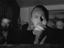
Mr. Ive, you've done your fans proud.
 

Attachments

  • cMT0v.gif
    cMT0v.gif
    210.3 KB · Views: 73
I think I'll wait for iOS 7.2 when the hideous icons get a complete makeover.

Something really bizarre as well, no visual clue on the camera shutter. That just looks wrong. Siri still has a mic visual clue, why no camera visual clue on the white circle?

The functionality looks good, much better in fact. But visually it's a head on smash between Metro phone and Android. I imagine that's due to the time constraints. None of this would have started until after Steve Forestall got the boot, so it's a rush job.

I can see this being heavily refined to be a little easier on the eye over the next couple of years. Control centre in particular, it's a proper rushed mess visually.

Agreed - I think we can expect HUGE refinements over the next couple years. They really had very little time between Forstall leaving and pushing iOS 7 out.
 
I think Jony got flat UI design right. Physically flat design - like the MacBook, iMac, iPhone, etc - are not totally flat. They are influenced by light, by their environment. Flat design like Metro isn't influenced by anything, and so looks just kinda boring.

Using a flat, translucent GUI, Jony has created a flat UI that is influenced by its environment. It took me a few hours, but after looking at it now, it looks absolutely beautiful. People are just too used to iOS 6 and Android interfaces, that such a radical departure will take a little time to sink in.
 
iOS 7 looks amazing. Being a miserable sod I could say that some of the useful bits are basically long standing jailbreak tweaks finally added to the OS but the unified look and feel is sheer Ive, all Apple.

Can't believe that people are seriously saying this is 'Android-like'. Doesn't look like the team behind the overhaul took a blind bit of notice of that OS.
 
Last edited:
Hey trolls, Fandroids, WinMoDroids, sensationalist reactionaries and other technology luddites:


How does it feel to know that we all knew you were coming many months ago, and we already knew your unimaginative, pre-scripted "meme" phrases, sentences and tedious "scene" anti-Apple art were going to be as dull and uninspired as your opinions - which are based on NOTHING, since you don't yet have a copy of iOS 7 in your hands, and are therefore just saying something LOUD to get everyone to look at you so you can carry on and perform your tedious, stale rant plays?

Do you feel like the centre of attention? Great! Now go offline, and focus that energy on something useful... unless you think Apple are going to un-announce iOS 7 because of your tantrums?

Have a nice evening :)

Its outright ridiculous and seems to get worse every 6 months.

Almost makes want to avoid MR altogether immediately after Apple announcements.
 
It would have been nice to have "one more thing, our server won't go down when you try and download the beta"

I am getting rather bored now!
 
Am digging the cleaner and simplistic look.
Though cant deny it does resemble some appearances from wp8..which I think has the best UI design.

If they were going this route I wish they'd made the icons look more square, a tad bigger, and remove the icon names. Seems redundant having an icon clearly identify what it is yet have it's name underneath. I know some are not so easy to identify, but on the control center they have nameless icons... So why not on the home screen.
 
it's funny how iOS 7 with its interface and fond really looks like Yahoo's new interface

have a look at Yahoo Weather

:eek:

Well, Yahoo DOES currently power the stock weather app in iOS. If anything, Apple must have loved it and are now using it in the stock weather app, still powered by Yahoo.

But I know you meant system-wide as well. I just wanted to point that fun fact for some who may have forgotten.
 
Another gaming issue - I delete an app and lose my save games. Someone, anyone, who has played games on their phone at Apple (seriously is there anyone) should know this sucks. It is unacceptable that to make space for my shiny new 2 Gb game I need to lose the save games for several other games. It is unacceptable, yet it continues to persist. It makes me sad and I have to use a bunch of third party software to extract my save games so that I can get back to it later. How about...fixing that.

Agreed. This functionality has been lacking since my iPhone 3G and is sorely needed given the smallish flash sizes in devices vs the burgeoning size of iOS games.

Whenever a new iOS comes out, I look for them to correct 2 things that have bothered me since the start: 1) Individual app/game data backup (as noted above) and, 2) getting rid of stock apps (such as the literal Stocks app, ironically). Looking at iOS 7, it looks different and that might do it for some, but it's still missing many essential enhancements.
 
How I am supposed to ever guess that was for the calendar app?
Besides, when you have to guess what an icon might be for, your icon design is already flawed. There must be no doubt ever in anyones mind. Icons need to be crystal clear, not in appearance but in meaning.
 
Its outright ridiculous and seems to get worse every 6 months.

Almost makes want to avoid MR altogether immediately after Apple announcements.

I hope the moderators eventually move the Apple/Android arguments into a silo (i.e. separate forum), so that people who want to talk about iOS/iPhone/iPad can do so without dealing with the trolls and paid shills.
 
Wherefrom should I know it's a date? It could be a temperature or a message count or something else. Up until now the Calender icons in OSX and iOS hat a familiarity, which made it easier to connect and identify them. Not anymore. This is a change for the worse.
You're just reaching to make an argument.
 
The lock screen is beautiful, the parallax is beautiful! in fact, its all beautiful! except... These new icons :S especially safari, are horrible!
am I alone in this?

Nope. Even Ive's 9 year old daughter (who designed it) wanted a week or two more to finish it up before the keynote.
 
Quite a lot of spiteful assumptions from a fanboy.

Have you ever considered that some people here are Apple fans and are just severely disappointed with the direction iOS is heading? Oh, of course not, your brain doesn't have the capacity to acknowledge opinions different from your own. Carry on with your *gasp* shiny new Apple products. Ohhhhhh, ahhhhhhh, pretty colors. :rolleyes:

It seems silly to piss all over a design you haven't even looked at in person yet. Until you've used it, I can't see the justification for all the vitriol here. The comments about copying are also pathetic and hilarious. Design trends tend to span entire industries. Car manufacturers have moved away from the 1970s boxy look...smartphone OS's are moving toward a flat, clean look. So what?

Apple was unquestionably a major leader in a smartphone revolution that changed the tech industry. Now the innovation has slowed down (due to the maturation of the products), but they're doing their best to refine the experience every year. Some of that will be "keeping up with the Joneses". Blah blah, so what. The same is true of MS and Google. It's all incremental now, but only Apple seems to be the target of all this misplaced vitriol. I think there are some deeper reasons for that. And in many cases it has a lot to do with those "assumptions" I made.
 
I want to know what this will look like on the black iPhones. The iPhone during the demo was white and they only show the white iPhone on Apple's website. I wonder why.

My guess....make your iphone background dark and with the transparency of the new iOS it will help blend it with the black. Obviously the white looks stunning, but I don't think the black will be far off.
 
Register on MacRumors! This sidebar will go away, and you'll see fewer ads.