Got a tip for us?
Let us know
Become a MacRumors Supporter for $50/year with no ads, ability to filter front page stories, and private forums.
Apple Unveils iOS 7 with Major Design Overhaul, Multitasking and Control Center
- Thread starter MacRumors
- Start date
- Sort by reaction score
You are using an out of date browser. It may not display this or other websites correctly.
You should upgrade or use an alternative browser.
You should upgrade or use an alternative browser.
Spotlight
Spotlight is actually still available in iOS 7. Pulling down from a home page (not from the very top) reveals a search bar for Spotlight!")
Spotlight is actually still available in iOS 7. Pulling down from a home page (not from the very top) reveals a search bar for Spotlight!
Two things regarding iMessage that I would've liked to see:
1) The ability to remove yourself from a group message somehow. Some people just don't know when to shut up.
2) If I delete a conversation on my iPhone, I would like it to be deleted on my iPad and Mac too. It's kind of annoying having to go on all 3 individually and delete the unwanted conversation. If they can do it with notifications, it could probably be done in Messages too.
Let's play, "Count the 'original' Apple updates"! Here's how to play: You simply watch the video, and count as many Apple "original ideas" that Android has already released months/years before this, and post them in the comment section!
#1 Preview of currently running apps with the app icon AND screenshots of the apps (Android already did it).
#2 The ability to swipe away currently running apps (Android already did it).
#3 Notifications in the lock screen (Android already did it).
#4 Bigger, yet thinner text to look more sleek (Android already did it).
#5 A control center for things like wifi,bluetooth, ect, all with the drag of a finger (Android already did it).
#6 Full-screen web browsing...even though iOS 7 doesn't even let you use literally the whole screen (Android already did it...and you can use the ENTIRE full-screen).
#7 A slide to unlock screen that doesn't actually show a bar to slide, but is invisible in order to look sleeker (Android already did it).
#8 Transparent screens. (Android already did it with the options of using apps that change the launcher...something that Apple still won't allow).
#9 Automatic Updates (Android already did it...YEARS ago).
#10 Photo date tagging (Android already did it).
#11 Automatically organizing photos based on date taken (Android already did it).
#12 Air Drop...Really? Bluetooth does the same thing without using up your data plan. (Bluetooth already did it).
#13 The ability to see web browser bookmarks in screenshot form (Android already did it).
#14 The ability to swipe through different internet tabs (Android already did it).
#15 iTunes Radio...Pandora did this ages ago. (Android already did it with Google Music All Access...AND you can listen to any full song you want (combination of Pandora and Spotify))
If this was a drinking game, we'd all be passed out by now lol
How long did it take you to come up with that list? These functions are present in most if not all mobile operating systems.. It's not about who does it first, it's about who does it better. And I dare you to say that Android does everything the best.
Problems?
It's the first beta I understand
Just got it on my iPhone 5...
The internet is EXTREMELY slow with this first beta. It's crazy.
It's the first beta I understand
Just got it on my iPhone 5...
The internet is EXTREMELY slow with this first beta. It's crazy.
I don't want a bigger iPhone screen myself, but this should look wonderful on an iPad.
Love your sig.
I used to think the iPhone screen was ok, but honestly I think my eyes are just getting worse. I totally understand all the benefits of the iPhone's current size. I'd like to see them offer choices, not force one size on all their customers. Once I started playing with other phones I changed my tune and now I really enjoy larger screens. With 4 different screen sizes now running iOS, I don't think there would be too much harm in adding one more to the mix, a slightly larger iPhone, somewhere around the 5 inch mark.
As for my sig... I'm just glad you get it!
Not really, just pointing out how:
1. Android fans find the need to watch a 2 hour Apple presentation, log into MacRumors and make disparaging remarks.
2. Apple fans don't even bother watching Google/Samsung presentations, because they don't know they exist, let alone logging into Android websites to troll.
*In short:
1. Android fans care about Apple, and they care about Android.
2. Apple fans care about Apple, but not Android.
In short, https://forums.macrumors.com/showthread.php?p=16996521#post16996521
I like the redesign. It looks clean while staying away for the superflat look ala metro which was my concern. Although nothing new the translucency of the OS looks nice. I really hate the safari icon through it needs to be changed. The new OS meshes much nicer with todays Apple's design aesthetic.
Love it! This is a step in the right direction for Apple and in the future.
I'm so glad I didn't wander off to another mobile platform.
Well done Apple!
I'm so glad I didn't wander off to another mobile platform.
Well done Apple!
It has been a significant amount of time and I still do not like, nor will I ever like the "new" iTunes logo in my dock. I don't think any amount of time will help with this undefined, unrefined, blah iOS 7 look either.
My main issue is not with the introduction of features that should have been introduced yonks ago, but more with the way they introduced it.
I watched this keynote from the start, but wasn't always sure. At some points it felt like a stream of the nearby Scientology gathering was broadcast instead. The way the speakers introduced pretty minor improvements made me think they actually cured cancer (this was amplified by the odd "woo woo" shouts made by the audience (why do Americans do this? I tried it whilst watching it and my flat mate just looked at me funny)).
Most stuff was pretty underwhelming but we are made to think world peace will ensue once we download this thing.
"We now added moving clouds to the weather app. It's truly astonishing. And look, when i press the + it adds an event to the calendar. Amazing! This is what we do here at Apple"... *Crowd goes wild: " Woooooo Woooooo..."*.
It's all very strange and very cringeworthy.
Last edited:
Ridiculous. iOS has lost its elegance. It's like a kod's toy. Popping up folders, silly effects, gradients (?!)
Ripped off from WP, Android and WebOS.
Ripped off from WP, Android and WebOS.
Love that they added AirDrop and I loved Craig's comment about going around the room and bumping your phones together...priceless.
Isn't airdrop just apple for Wi-Fi direct? If so android has that too so you can Tao phones (often much faster than seeing up airdrop) or share over Wi-Fi direct.
You don't and it's not a great icon. The pages icon is easily understandable, even if you see it for the very first time and you've never used a computer before. And it's because of skeuomorphism. Not functional skeuomorphism but semiotically skeuomorphism. The look of an tear-off calendar is important for understanding this icon.Really? How would you know what the current safari icon is for until you used it?
Should a Calendar App Look Like a Calendar?
Yes off course! It should. Why are you even asking? It just should not limit it's functionality to mimic real world constraints. A calendar app should not work like a calendar, but at least it should look like one.
Apple's new Weather app reminds me of Yahoo's and their Photos/Moments reminds me of Flickr. Huh.
I also was hoping for just one feature, but I don't think it happened.
Overall I am excited to try it out when it's released. My little sister said "now that's an iOS update" when I showed her. LOL.
I also was hoping for just one feature, but I don't think it happened.
Overall I am excited to try it out when it's released. My little sister said "now that's an iOS update" when I showed her. LOL.
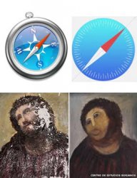
Oh dear, that Safari icon!
Everything is fine but what's with those half baked icons?
I mean, look at that Safari icon! It's like the guys who were designing it went for a coffee break and never came back.
Everything is fine but what's with those half baked icons?
I mean, look at that Safari icon! It's like the guys who were designing it went for a coffee break and never came back.
Wait a minute...you're calling the OLD UI childish and gay?
Compared to this one???
The new UI looks like My Little Pony vomited on the screen. Have a man stare at that color scheme for 5 minutes and he'll start complaining about menstrual cramps.
It's trash.
I can't tell since my retinas are burning. Maybe if they had used a color scheme that was...I don't know...NOT radioactive.
Agreed on the poor color scheme. Font choice, layout and design otherwise is actually pretty good. A ripoff of Windows, but good. I have to say, I really quite like my Nokia. I had thought about returning it, but now I think I'll be keeping it.

This is a design that I would expect from Apple. It's beautiful.
I like every part of it, BUT the home screen icons need more work, I know it's flat and all, but many of them look half-baked. I think there should be more details in the icons.
I like every part of it, BUT the home screen icons need more work, I know it's flat and all, but many of them look half-baked. I think there should be more details in the icons.
Was that the first Apple Keynote you watched? I've been laughing at OSX presentations for years. Tabs in Finder! WOOOW! Sold! I have to have that OS SO BAD! ... Sorry guys, don't get me wrong, I'm in an all Apple household (aside from my Gaming PC), but the way Apple presents some of these features is so unbelievable silly... I mean come on, finder tabs is a major new feature? Or having a dock on 2 displays?! And how people cheer for those features...My main issue is not with the introduction of features that should have been introduced yonks ago, but more with the way they introduced it.
I watched this keynote from the start, but wasn't always sure. At some points it felt like a stream of the nearby Scientology gathering was broadcast instead. The way the speakers introduced pretty minor improvements made me think they actually cured cancer (this was amplified by the odd "woo woo" shouts made by the audience (why do Americans do this? I tried it whilst watching it and my flat mate just looked at me funny)).
Most stuff was pretty underwhelming but we are made to think world peace will ensue once we download this thing.
"We now added moving clouds to the weather app. It's truly astonishing. And look, when i press the + it adds an event to the calendar. Amazing! This is what we do here at Apple"... *Crowd goes wild: " Woooooo Woooooo..."*.
It's all very strange and very cringeworthy.
Well anyway, I like the additions they're making to iOS, lots of it is basically copied from the jailbreak community and Android, but I don't see it as a bad thing. Better copy something very well, than try to invent something new, very poorly...
For me it's just the way Apple presents these features, I really don't like. Because they always make it look like they invented the ****. And its the best thing that ever happened, to anyone, ever!
Like back during the OSX Lion keynote, where they showed one of the major new features, you can now drag and drop files onto the dock and the corresponding app comes up and you can drop files right into that app... I just thought, really? Windows has been doing that since... I don't know, 95? Don't get me wrong, its a good feature, but going on stage, telling the world how innovative and great your new OS is, and then showing that, as one of the major new features, is just silly...
I'm not sure what to make of the new iOS design yet, I don't hate it, but don't love it either... But I don't care all to much about the design. The new features are mostly great, not really gamechangers, since the competition already has most of them, but iOS feels like it arrived in 2013 and isn't stuck in '09 anymore.
Two things, I haven't read or heard anything about, I'm really really missing, are a Keyboard API and the ability to change default apps like browser or mail.
What did Tim mean when he said "they would open up more"? I for one was really hoping for these two changes.
Register on MacRumors! This sidebar will go away, and you'll see fewer ads.