If dated is just another way of saying that the design has been around for a few years then it’s still change for the sake of change. Skeuomorphism actually has a function to allow the user to better understand how to interact with a touch os, that’s why things like 3D Touch failed miserably, there was no indication of where it exists due to everything being a full flat UI with lack of any means of conveying interaction with the user.It wasn’t for “no reason”. They needed a redesign because skeuomorphism was *incredibly* dated for the 2010s. Remember that we didn’t get the current, flat look until 2013.
Now I’m not saying that the redesign they went with is better or worse than the pre-iOS 7 design as that’s purely subjective. But it was much more modern (at the time).
Now I believe it’s time for a new redesign as the overly flat style is now also dated. This is a step on the right direction assuming that it’s going to be applied system-wide and isn’t just a design choice for these 2 specific apps.
Got a tip for us?
Let us know
Become a MacRumors Supporter for $50/year with no ads, ability to filter front page stories, and private forums.
Apple's Revamped Apple Music for Artists Icon Leads to Speculation About iOS 15 Design Plans
- Thread starter MacRumors
- Start date
- Sort by reaction score
You are using an out of date browser. It may not display this or other websites correctly.
You should upgrade or use an alternative browser.
You should upgrade or use an alternative browser.
I still have some apps where the developers never updated their icons for the flat design. Maybe they’ll look more like they belong again 
they had found it many moons ago, just haven't used it in a while.Nice, Apple found the bevel & emboss tool!
i like the music icon. imho they went too flat with their iconography, and i guess they are trying to balance it out a bit. not crazy about the app store icon — too much going on there, but we'll live)
There is also no indication where long-press exists or right-click in macOS. 🤷If dated is just another way of saying that the design has been around for a few years then it’s still change for the sake of change. Skeuomorphism actually has a function to allow the user to better understand how to interact with a touch os, that’s why things like 3D Touch failed miserably, there was no indication of where it exists due to everything being a full flat UI with lack of any means of conveying interaction with the user.
Yes, hence the tagline for WWDC21 - "Glow & Behold".
It's the new UI. Can't wait. The super flat UI is a bit boring honestly.
It's the new UI. Can't wait. The super flat UI is a bit boring honestly.
Yes, exactly. It was purely a hardware limitation restricting 3D Touch to iPhones which mean that they had to make it consistent between iPads & iPhones somehow.There is also no indication where long-press exists or right-click in macOS. 🤷
Keep trying to be Spotify. Except first you need innovation.
Apple yesterday updated its Apple Music for Artists app with some minor bug fixes and improvements, but also one other notable change -- a new icon.
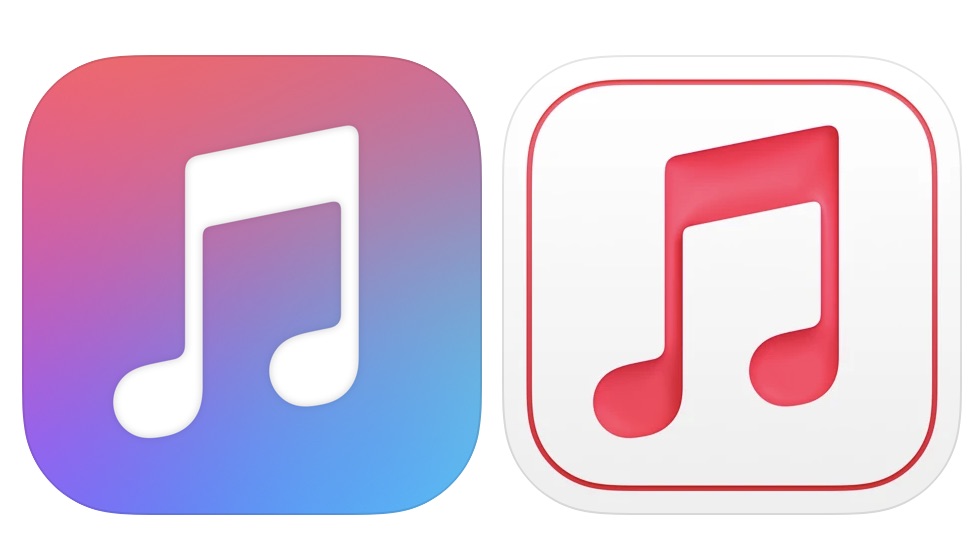
New icon on the right
The Apple Music for Artists app now features a simpler, streamlined icon with a pinkish red music logo rather than the multicolored logo that was used before. The icon also has an embossed look that makes it stand out from other Apple icons.
Apple Music for Artists is an app that lets artists know how their music is performing across Apple Music, iTunes, and Shazam, so it's an app with a limited audience and the new icon may seem inconsequential, but it is similar to another app icon change that Apple introduced last year.
App Store Connect in October was updated with a refreshed icon that's similar to the Apple Music for Artists icon, which means Apple has now updated two app icons with this new design.

App Store Connect with old icon on left, new icon on right
Over on Reddit, users are speculating that the icon changes could perhaps be indicative of more sweeping design changes set to be introduced in iOS 15.
Apple in macOS Big Sur refreshed many of its icons and streamlined their design, so there is a chance that something similar could happen in iOS 15. That said, these could just be one-off updates for Apple's behind the scenes apps for developers and musicians, and not a sign of something to come.
We don't know much at all about iOS 15 at this point, but we could perhaps see some details leaking out as the software's launch date approaches. Apple is expected to debut iOS 15, iPadOS 15, watchOS 8, tvOS 15, and macOS 12 at its keynote event that will be held on June 7.
Article Link: Apple's Revamped Apple Music for Artists Icon Leads to Speculation About iOS 15 Design Plans

This.After Big Sur I’ve felt this was inevitable, my best guess is this has all been in service to the eventual 3D aesthetics of their AR OS.
Completely agree, especially as the standard apple app icon designs use bright saturated colours, often on white backgrounds - safari, calendar, notes, reminders etc.I wish they would finally make DARK MODE versions of the icons. I hate how the UI is dark and pretty but many icons just burn my retina because they are as bright as day.
Yes Apple, give me more depth and shadows. Don't overuse the white too much though. Be more creative and use all the space you have in that little square.
Yes, and I'm sure they're going to add the ability to have dark/light icons too. People just need to calm down a bit. It's early days, these are leaks; we'll all know at WWDC21.Why not just use dark mode?
Last major change was iOS 7. iOS 15 may bring a new design. Might have been iOS 14 but it is possible the pandemic derailed these plans too.
I thought boring, lifeless, low effort flat design is gonna stay forever. But, nice things do happen after all.
Thank you, Apple.
Thank you, Apple.
I hope it's not just a wall of white icons with colored bits. And if it is, hopefully these icons will offer a dark mode.
Can we just get Aqua back?!
Brushed aluminum and all?!

Brushed aluminum and all?!
The UI design introduced in Yosemite is still my favourite. I find the "Everything in a Squircle" design of Big Sur too boring and regimented, MacOS (in my opinion) lost of lot of character with that move. I wish there was a way you could revert back to the old icon set.
Is this the Big Sur design? Did the predictions about the big sur icon design coming to iPhone are becoming true?
I'm thinking the new app icons must change with light & dark theme of the OS. Otherwise those very white looking icons will burn my retinas in dark mode.
I imagine the colours would be flipped as these aren’t for general consumers. The App Store will be the same colour but with that indented 3dish look.
Register on MacRumors! This sidebar will go away, and you'll see fewer ads.