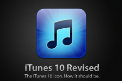
Dang. The iTunes 10 icon is UGLY

Attachments

  • itunes_10_revised_by_mattiasekstrom-d2xspoy.png
    itunes_10_revised_by_mattiasekstrom-d2xspoy.png
    376.9 KB · Views: 201
Almost no one's mentioned it but the new icon is in the same style as the dashboard icon.

It's the same size to the pixel and has the same round bezel thing.

Which in itself is quite odd because if they were trying to unify things that way, they certainly didn't do it with the new QT logo. And it also explain why it looks 'old', considering well, it IS old.


As far as user made icons go I'm liking this one the best:
@Krafty

Sig is awesome! I like your Flickr stuff, too.

BTW...

Screen%20shot%202010-09-02%20at%209.05.00%20AM.png

Not that I plan to change it though.
 
At first I was like, "Hey, the new icon is ugly." Then I clicked it on start-up and it opened iTunes in two bounces as opposed to seven or eight. I love the new icon!

If you Flip the traffic lights you can get one bounce!
defaults write com.apple.iTunes full-window -1
and if you want to change back
defaults write com.apple.iTunes full-window -0
 
wow, flipping the traffic lights really does get you one bounce.

I tried editing the sidebar icons and they don’t change even if they are edited in the Resources folder.
 
It really is ugly. I've tried to copy/paste new icons over the new iTunes one and it won't paste. Am I doing something wrong? wtf. :(
 
I changed it for a bit but it's actually growing on me. It's only an icon after all. Better than the quicktime x icon imo anyway!
 
Grey/Graphite iTunes 10 icon

Okay, here's the thing. I'm not great at photoshop, so it looks kinda bad at 512x512. But in your dock, you won't even know.

content


PSD ICNS PNG

Released under no license, Apple can have all the credit. :D
 
I like the electric blue, but otherwise I am not too fond. Of course it is a change, which is probably why I dislike it. I am sure it will grow on me.
 
really choppy looking at that size but surely fine in the dock. Why didn't you just put in a black and white adjustment layer and mess with the settings?
 
I've put the old one back on. I don't mind the new look of the app, but the new icon was really really ugly.
 
Ok...so I have updated my second Mac with iTunes 10. I do have to say the icon is growing on me. It definitely stands out compared to the last rendition.
 
Not just the icon

The whole thing is cruelly ugly. Holy bland, batman. New confusing icons for everything. Color conveys tons of animation. This reminds me why I feel bad for colorblind people - because this SUCKS.
 
I made a quick edit to the new icon to just take out the insane shine effect, which really killed it.

Here, I thought it was just the exact opposite. The "shine" is the only part I liked. I'd prefer a white music note, though since most of my current dock icons are highlighted with white symbols or letters, maybe something like this:
 

Attachments

  • iTunesWhite.png
    iTunesWhite.png
    149.9 KB · Views: 128
To Be honest I like the new icon but maybe it's because I enjoy having some change in my programs. The old one was nice and all, yeah, but it was just that, OLD. They changed around the look of the program and wanted to give the icon a facelift as well, I don't see the big deal. Then again, I have been using a custom one anyway.

The way I see it, some people are blowing this out of proportion. Refusing to download the new version because of an icon and such. Really people, it's on a mac, how hard is it to change? It would take me 5 seconds to change it back to the old one if I wanted to, just do that instead of complaining?
 
Register on MacRumors! This sidebar will go away, and you'll see fewer ads.
Back
Top