Got a tip for us?
Let us know
Become a MacRumors Supporter for $50/year with no ads, ability to filter front page stories, and private forums.
Description and Mockup of Apple's Flatter iOS 7
- Thread starter MacRumors
- Start date
- Sort by reaction score
You are using an out of date browser. It may not display this or other websites correctly.
You should upgrade or use an alternative browser.
You should upgrade or use an alternative browser.
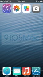
check out this leaks from a chinese site.
http://ifans.pixnet.net/blog/post/29911244
Did I just see Notifications and Widgets in the settings?
I have no artistic skill. If I was a witness to a crime and police asked me to personally draw a picture of the a suspect I saw, they wouldn't go around looking for someone exactly like my terrible drawing.
This is a guy with no graphic design skill trying to show what he saw. It is not a design or an attempt to make something that actually looks good. It's like a child drawing a person with crayons.
Use the image to get a sense of the colour scheme and shapes, but nothing more.
This is a guy with no graphic design skill trying to show what he saw. It is not a design or an attempt to make something that actually looks good. It's like a child drawing a person with crayons.
Use the image to get a sense of the colour scheme and shapes, but nothing more.
No way iOS 7 will look like that. If so I should get a job at apple as a designer because I can design like that. I hope it doesn't look like that...
Wow that guy has terrible Photoshop skills
I hate to be a jerk but, yeah you should probably uninstall Photoshop, mysterious terrible artist.
iOS7 must be awesome because that mock has to be nothing more than to fake people out and get people talking.
If it does actually look like that then Apple really has lost their direction
If it looks like that then there will be a major drop in apple stock
Here's hoping that this is just a misunderstanding of the leaks. "Dropping skeuomorphism" and going "flatter" doesn't mean papier-mache icons.
The icons look like ****, and that half desaturated look isn't a good one, but I don't even care about that. the dock MUST be 3D, seriously it looks like **** any other way.
----------
Those gradients look SO ****ing Windows 8 Metro, actually they look even worse, atleast Microsoft isn't afraid of a little damn color.
----------
Those gradients look SO ****ing Windows 8 Metro, actually they look even worse, atleast Microsoft isn't afraid of a little damn color.
Blah blah, blah blah blah, blah BLAH, blah.
Let's get some facts before the jury deliberates.
We will learn so much in a few hours. Some will love what they see, many will criticize, and after it's out, it will all go away....remember the cries after the iTunes icon was revealed....we lived.
Let's get some facts before the jury deliberates.
We will learn so much in a few hours. Some will love what they see, many will criticize, and after it's out, it will all go away....remember the cries after the iTunes icon was revealed....we lived.
Attachments
I have to say, in general (and as I think a pundit or two have commented) this is probably the most leak free (so far) of any announcement since the original iPhone. Rather looking forward to watching it live and spoiler free!
Did I just see Notifications and Widgets in the settings?
Indeed you did... and I note there's an 'Edit' button at the top too?
I'm not sure I like what I'm seeing but I'll withhold my judgement until the keynote
This was a mockup of an alleged early version of the software. I wouldn't hold too much on the final result really looking like this.
Isn't this just slashgear regurgitating what 9 to 5 mac created?
What made u say that? They look really polished.
Fakes can be polished
Isn't this just slashgear regurgitating what 9 to 5 mac created?
This ^
I hope this is what ios7 looks like. After all the hype and anticipation to know what Ive has come up with its this.
It would be hilarious to see them come out and describe it at the keynote. "Beautifully redesigned Game Center icon." "We made the typeface thinner and lighter than ever"
It would be hilarious to see them come out and describe it at the keynote. "Beautifully redesigned Game Center icon." "We made the typeface thinner and lighter than ever"
Register on MacRumors! This sidebar will go away, and you'll see fewer ads.