Got a tip for us?
Let us know
Become a MacRumors Supporter for $50/year with no ads, ability to filter front page stories, and private forums.
Description and Mockup of Apple's Flatter iOS 7
- Thread starter MacRumors
- Start date
- Sort by reaction score
You are using an out of date browser. It may not display this or other websites correctly.
You should upgrade or use an alternative browser.
You should upgrade or use an alternative browser.
Widgets are a terribly niche gimmick.
They're not happening. People don't even use them in OS X, what makes you think they'll be useful in iOS?
I don't think anyone is talking about putting OS X-style widgets on iOS. Rather, custom widgets that can be added to Notification Center, and possibly the home screen. Something that is already very popular on jailbreaked iPhones!!
And besides, am I the only one who actually finds widgets (on OS X) really useful? Especially the "web clip" feature. I love having snippets of data from certain websites available with a single button-press. I use Dashboard many times every day as part of my workflow and will be very disappointed if it is removed from 10.9 without a good replacement!
(On the other hand, I practically *never* use Notification Center on OS X)
Lol so some new icons and a line instead of a nicer looking dock is all that's changing? Great innovation guys :/ If they plan on going this minimalistic I'd rather they keep the old icons which look way better.
They need to put these icons completely in the background and only called up when needed. Widgets etc is the way forward.
Hopefully this is completely wrong.
Unfortunately you're wrong. Sorry
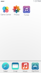
And why would Gamecenter icon have 4 circles? What does 4 cirkels mean
The GameCenter icon has 4 squares in iOS 4/5/6...
If this is it, I've got a product for them. ITurd. Kitty litter coated cat turds, it'll fit right into their current product roadmap.
They need a product, not this crap of packaging old products in new wrapping paper.
They need a product, not this crap of packaging old products in new wrapping paper.
I would take that image with a very large serving of salt.
This made me Lol.
The twitter avatar is straight out of 2002.
I'm certainly no graphic designer but yeah, this guy isn't the most talented individual behind the wheel of Photoshop. Hopefully these are really, really, REALLY rough designs of what the face-lift will actually look like.
When in Black mode, the keyboard is black with gray letters. In white mode, gray keys with white letters a little like Android.
So no one is saying anything about that line? A little like Android? Well here is the start of Android vs. Apple in the next courthouse battle royale..
Keith
SO, I'm guessing that you are either a Windows 8 fan (because you like change, as Microsoft finally departs from the Windows 9X/XP/Vista/7 days) or REALLY hate OS X (because it's been pretty much the same for the past decade)??? Whichever one depends on the one that you use, so make your choice and let us know.
There's nothing wrong with the existing icons in general, what we're bored of is the aged interface and how we interact with the software.
New color.
Looks a bit better. Still think they're way off though.
I hope this mockup is just a terrible attempt at a mockup. If the real iOS7 looks like that, I'm gonna cry. That looks just plain awful.
The mock-up looks like ****. I'm sure our Jony would have done a better job. I'm hoping Apple will surprise me today.
what album is your avatar from?
And, yet, somehow you'll survive. I mean, seriously - how often do you go in Settings?
I turn wifi on and off at least 10 times a day. I am always in the settings app with bluetooth my car as well. I have a jailbroken phone so that is how I survive this massive oversight by Apple. Its not 2008 anymore...
How did you find out who this guy is ?
His profile is linked in the 9to5 Mac source article.
He apparently only did the white version, so disregard my post.
Register on MacRumors! This sidebar will go away, and you'll see fewer ads.