Become a MacRumors Supporter for $50/year with no ads, ability to filter front page stories, and private forums.

Do you think the screen on iPad Pro is too yellowish?

  • Yes, it's warmer than older generations of iOS devices, and I don't like it.

  • Yes, but I like the warmer screen.

  • No, the screen is perfect.


Results are only viewable after voting.

Yughred

macrumors newbie
Original poster
Jul 16, 2017
5
7
I bought an iPad Pro 12.9 inch from an Apple Store, the screen was warmer than my old iPhone 6s or iPad Air (with true tone and night shift off of course), making the display look less colourful and dimmer than what I expected (although warm display is good for eyes). I expected highly on iPad Pro's display, as Apple claim it to have features like P3 wide gamuts, 120Hz refresh rate, support for HDR... The yellow tint and low contrast (compared to oled) definitely make the colours look less compelling (one major reason I chose iPad Pro over Surface Pro). I went to the Apple Store for an exchange. Apple's service was unparalleled. They provided two exchanges in a row (the first exchanged one looked worse than the original one). I compared all the three machines side by side with one displayed in store, I found that all the three were somehow yellow tinted compared to the one displayed in store, which had perfect white color (but still less cool and clean than my iPhone 6s). At last I decided to live with it as I bet all the machines from this batch probably all have the same problem. The staff claimed this is just how it is, I decided to believe in them this time, as I noticed that this problem occurs in all iPhone/iPad model after the adoption of P3 display. I guess this is just one feature of P3.

After some research, I learned that Apple has lowered the white balance level to industry standard 6500K, instead of the 7000-8000K of previous generations. I think this is probably why it looks warmer and definitely not defects. I hope I learned this beforehand so that I wouldn't need to go thought such a hassle.
 
  • Like
Reactions: bhodinut
After some research, I learned that Apple has lowered the white balance level to industry standard 6500K, instead of the 7000-8000K of previous generations. I think this is probably why it looks warmer and definitely not defects. I hope I learned this beforehand so that I wouldn't need to go thought such a hassle.

This is good information. Where did you learn of this? I think this would make sense is some situations, but ultimately I think every display will vary, which also the adhesive plays a role as well for certain yellow banding, but not in all cases.
 
Last edited:
The higher kelvin temperature is known to cause eye fatigue and eye strain on digital screens.

Some spectacle manufacturers have developed lenses to filter out the blue spectrum coming from display screens to reduce this effect.

I can see apple moving to this warmer kelvin to help. I prefer the warmer screen for daily tasks as i dont need a color correct screen for what i use this tablet for.

For other people who need their screen color corrected for their use, i can see their frustration with a warmer screen.
 
I always disliked the blue. I modify my Television and all Monitors to have a Yellowish Tint to avoid the headaches from having to stare at a screen all day.
 
I always disliked the blue. I modify my Television and all Monitors to have a Yellowish Tint to avoid the headaches from having to stare at a screen all day.
I think it depends on what you do. But options should be made available for those who need brighter screen. There are many ways to make screen yellowish, such as turning on True Tone or Night Shift. But when these two are turned off, people expect the display to show the "perfect" white. Of course this depends on what perfect means, Apple now shifts their definition of perfect white to 6500K.
 
I just panicked when I read this. I turned off Tru-Tone and then pumped up the brightness to see if it looked like it used to. It was just as white/bright as my first gen Pro 12.9. It actually hurt my eyes! I turned auto brightness and tru tone right back on. It’s a tiny bit yellow but much easier on the eyes.
 
  • Like
Reactions: Legendts
D6500K is the industry standard for film and TV production. All reference monitors used by industry professionals are calibrated to that white point. Many apple products are used in video production and so it would make sense to have them closer to that white point from the get-go. A cooler color temperature is more appealing for image "pop" and "vibrancy", but moves away from accuracy.

I'm not an industry professional, but I have my TVs and displays ISF calibrated to match the industry standards. So I like the screen at D6500K as it is more accustom to what I am used to color saturation and grayscale-wise.
 
I think it depends on what you do. But options should be made available for those who need brighter screen. There are many ways to make screen yellowish, such as turning on True Tone or Night Shift. But when these two are turned off, people expect the display to show the "perfect" white. Of course this depends on what perfect means, Apple now shifts their definition of perfect white to 6500K.
And they have done so according to industry standards.
 
At first i thought it was too warm but since I've gotten used to it, i like it. Turning off tru-tone makes it look too blue now, but i could go either way, but for now i use TT.
 
Apple now shifts their definition of perfect white to 6500K.

@Yughred. But again, you haven't specified how you know this when you were asked before. Is it possible, perhaps. But you're making a claim without what supporting evidence? Until then, it's nothing more than speculation at best.
 
  • Like
Reactions: Legendts
@Yughred. But again, you haven't specified how you know this when you were asked before. Is it possible, perhaps. But you're making a claim without what supporting evidence? Until then, it's nothing more than speculation at best.
You are right. I don't have any concrete evidence yet, as Displaymate still hasn't released any test result on iPad Pro 2017. I got this conclusion because I saw numerous people blamed the display of iPhone 7 for being much warmer than their iPhone 6s. Combined with my experience this time, I surmised that Apple did make some changes to converge its color temperature to the industry standard, which is 6500K (this is true, you can google D65).
 
You are right. I don't have any concrete evidence yet, as Displaymate still hasn't released any test result on iPad Pro 2017
Notebookcheck have tested Ipad pro 12.9 second gen and they confirm the shift
The new Ipad pro has a white point of 6,734 K compared to the first gen at 7,164 K and Ipad Air 2 at 7,355 K; Iphone 7 also has a white point of 6,800 K according to Displaymate so they are definitely more yellow than older Ipads
 
  • Like
Reactions: aypues and Legendts
My 2017 12.9" iPP has always satisfied me but did have shadowing in corners sorta like a vignette. Like said, didn't bother me but after yesterday's s/w update, just noticed how beautiful the screen is this morning. Screen is one even color. I did turn the warm news towards cooler in Setting but that was much earlier than the update.
 
The higher kelvin temperature is known to cause eye fatigue and eye strain on digital screens.

Some spectacle manufacturers have developed lenses to filter out the blue spectrum coming from display screens to reduce this effect.

I can see apple moving to this warmer kelvin to help. I prefer the warmer screen for daily tasks as i dont need a color correct screen for what i use this tablet for.

For other people who need their screen color corrected for their use, i can see their frustration with a warmer screen.

I have several pairs with these lenses and they work great. I don't tend to use night-shift or true-tone when wearing them as the screens tend to look a little too pink otherwise.
 
Im sick of apple displays every one in store is perfect but my iphone 7 plus and ipad pro 10.5 are horrible yellow and uneven brightness im sick of getting repaired and always being worse
 
I bought an iPad Pro 12.9 inch from an Apple Store, the screen was warmer than my old iPhone 6s or iPad Air (with true tone and night shift off of course), making the display look less colourful and dimmer than what I expected (although warm display is good for eyes). I expected highly on iPad Pro's display, as Apple claim it to have features like P3 wide gamuts, 120Hz refresh rate, support for HDR... The yellow tint and low contrast (compared to oled) definitely make the colours look less compelling (one major reason I chose iPad Pro over Surface Pro). I went to the Apple Store for an exchange. Apple's service was unparalleled. They provided two exchanges in a row (the first exchanged one looked worse than the original one). I compared all the three machines side by side with one displayed in store, I found that all the three were somehow yellow tinted compared to the one displayed in store, which had perfect white color (but still less cool and clean than my iPhone 6s). At last I decided to live with it as I bet all the machines from this batch probably all have the same problem. The staff claimed this is just how it is, I decided to believe in them this time, as I noticed that this problem occurs in all iPhone/iPad model after the adoption of P3 display. I guess this is just one feature of P3.

After some research, I learned that Apple has lowered the white balance level to industry standard 6500K, instead of the 7000-8000K of previous generations. I think this is probably why it looks warmer and definitely not defects. I hope I learned this beforehand so that I wouldn't need to go thought such a hassle.
Interesting. You are correct, for true colors a screen should be calibrated at 6500k. Yet in showrooms, manufacturers often calibrate
their tv screens to reflect more blue light, because it sells more... yet the brighter blue light oriented screens do not render films as they were intended, colors are distorted. 6400k is the standard. Ironically, after migrating from an earlier iPad, I thought that the new iPad Pro was too yellow... Was there something wrong??? I "preferred" my old blue light iPad, just like consumers prefer blue light TVs in showrooms as opposed to properly calibrated screens... After a few days, I am used to my screen, and it is perfect.... I feel confident that it will better render correct colors.
 
I have several pairs with these lenses and they work great. I don't tend to use night-shift or true-tone when wearing them as the screens tend to look a little too pink otherwise.
I have blue light filtered lenses as well. I swear by them. In fact the blue light is believed to be harmful for the eyes. Especially in blue eyed people like myself. The blue light can cause macular degeneration so you could go blind in your life time. With all of the screen exposure these days it's highly excellerated.
 
apple have adjusted the screens or be more natural. "perfect white" in the real world is roughly 6500K because that's roughly (from memory) the colour the sun puts out and thus that is what is reflected off white surfaces and seen by your eyes.

previous models were less accurate, not more accurate or "better".
 
I have blue light filtered lenses as well. I swear by them. In fact the blue light is believed to be harmful for the eyes. Especially in blue eyed people like myself. The blue light can cause macular degeneration so you could go blind in your life time. With all of the screen exposure these days it's highly excellerated.

My wife is an optician so I get to be the test-driver for a number of things ... my price is about 6 pairs of Oakley and Ted Baker frames with blue-filtered lenses :)

Edit: And a pair of Oakley sunnies for each day of the week!
 
  • Like
Reactions: upandown
Interesting. You are correct, for true colors a screen should be calibrated at 6500k. Yet in showrooms, manufacturers often calibrate
their tv screens to reflect more blue light, because it sells more... yet the brighter blue light oriented screens do not render films as they were intended, colors are distorted. 6400k is the standard. Ironically, after migrating from an earlier iPad, I thought that the new iPad Pro was too yellow... Was there something wrong??? I "preferred" my old blue light iPad, just like consumers prefer blue light TVs in showrooms as opposed to properly calibrated screens... After a few days, I am used to my screen, and it is perfect.... I feel confident that it will better render correct colors.

I agree with you, I had the same feeling at first that my 10.5 was bad and too yellow vs. my air 2... After a while I got used to it and actually prefer this tint. When I go back to my air 2 it feels like it is too blue and painfull to watch.

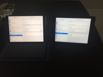
Here is a pic of my 10.5 on the left vs. the air 2 on the right. Auto brightness and true tone off. It does not show on the picture but the 10.5 is much more "luminous".
 

Attachments

  • IMG_2808.JPG
    IMG_2808.JPG
    937.9 KB · Views: 872
I'm also a new 2017 iPad Pro 12.9 owner. I've been quite disappointed with my display from the beginning. I would've returned it immediately but I unfortunately dinged it on the third day. Even with TrueTone turned off, movies, photos and streaming content all have a distinctly yellow green tint to anyone with a trained eye. Watching a film on Netflix and viewing the same film side-by-side on my old Pioneer Kuro one can see a distinct yellow tint and severely crushed blacks and slightly blown out whites compared to the perfectly balanced colors on the venerable Kuro. Sure, the Kuro is king, but I expect a so-called pro quality screen to be at least be factory calibrated. Not only that, my iPad Pro's screen is uneven and goes slightly magenta in one corner. Not even mentioning the still narrow viewing angle. I upgraded from an iPad one! While brighter and clearer, I have really soured on my purchase. Surprising that I haven't read much more about this issue except on this forum.

As for the 6500K color temperature, that should still provide a very bluish white and not account for the yellow cast. I really wish Apple would, or allow a third-party developer to create a simple screen calibration utility like they have on the macOS. Until then it cannot be called a serious 'pro' device. Even as an entertainment device it is not rendering creative content The way it was intended. Sure, most users may not spot the issue unless it is pointed out to them but it is somewhat misleading on a device displaying the pro moniker. I'm saying this as a long time loyal Apple fan.
 
Last edited:
  • Like
Reactions: aypues
is this also the case with the 10.5" iPad Pro ? Have the white balance on the 10.5" iPad Pro also been adjusted to 6500K ? I actually preferred the bluish whites that Apple devices have.
 
Register on MacRumors! This sidebar will go away, and you'll see fewer ads.