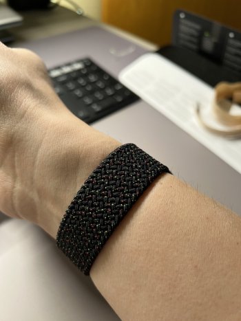
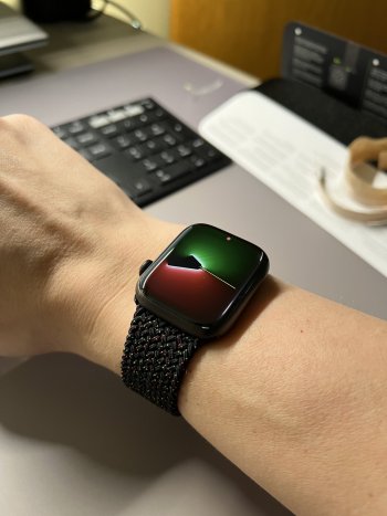
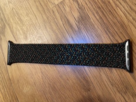
Just ordered it in the app. It looks so good.Damn, still no photos of the new unity braid?!
Got a tip for us?
Let us know
Become a MacRumors Supporter for $50/year with no ads, ability to filter front page stories, and private forums.
Every Apple Watch band Apple released. Ever.
- Thread starter choreographics
- Start date
- Sort by reaction score
You are using an out of date browser. It may not display this or other websites correctly.
You should upgrade or use an alternative browser.
You should upgrade or use an alternative browser.
Should arrive tomorrow. Just received the UPS mailDamn, still no photos of the new unity braid?!
I know it’s silly but I really feel left out as someone who mostly gets orders via Deliver-It for the last year and don’t get tracking until late the night before.Should arrive tomorrow. Just received the UPS mail
Jelly! Mine doesn’t ship til maybe March 😭Should arrive tomorrow. Just received the UPS mail
I know it’s silly but I really feel left out as someone who mostly gets orders via Deliver-It for the last year and don’t get tracking until late the night before.
Apple just sent me my shipping notice for Unity Solo and it will be here tomorrow 2/1/22 via Deliver-IT
Yep I had a non-specific DI url that didn’t load anything and now it’s scheduled for 8pm woo. Usually they come in the morning.Apple just sent me my shipping notice for Unity Solo and it will be here tomorrow 2/1/22 via Deliver-IT
Don’t think I’ve had such a late time quoted from them but alas every USPS shipment the last few years has said “by 9pm”
🎉☄️🪐🛸
Thanks, looks amazing! Was eagerly awaiting to see the first pic. Ordered & done..Received the unity band today. I‘m loving it 🥰
Last edited:
That green in the Unity looks a little disappointing. Gotta see it in person.
Mine arrived today. What a beauty, but a stinker too. Can’t remember that my other braided solo loop had this odeur. And none of the fake ones from Ali express had this either. It has to spend the frosty night on the balcony.
Edit: my black light experiment.
Edit: my black light experiment.
Attachments
Last edited:
Def has that strong Apple smell. Edit lost the green here under my pseudo-blacklight but you get the effect.

Preserving the green at the expense of the black yarn:

Preserving the green at the expense of the black yarn:
I think ultimately it’s meant to read more as twinkly stars than the perfect rich green of the sport band.That green in the Unity looks a little disappointing. Gotta see it in person.
I also think this is why the green and yellow are so similar in color, it creates an atmospheric perspective of stars + slightly further away stars behind the cool red ‘planets.’
Yellow recalls the Volt Nike shade and Green is like a more saturated Lime Blast.
Last edited:
Is the main colour more like a black or charcoal?I think ultimately it’s meant to read more as twinkly stars than the perfect rich green of the sport band.
I also think this is why the green and yellow are so similar in color, it creates an atmospheric perspective of stars + slightly further away stars behind the cool red ‘planets.’
Yellow recalls the Volt Nike shade and Green is like a more saturated Lime Blast.
New Unity band on S7 Ti 45mm, in all its stinky glory. But really, why does it stink? Hahah! Its like the painting of the metal or something gave it some weird funky smell lol.

The design is “inspired by Afrofuturism” so I get it. I just wish the green was a bit richer. In context of the design and direction of this year’s theme, it works.I think ultimately it’s meant to read more as twinkly stars than the perfect rich green of the sport band.
I also think this is why the green and yellow are so similar in color, it creates an atmospheric perspective of stars + slightly further away stars behind the cool red ‘planets.’
Yellow recalls the Volt Nike shade and Green is like a more saturated Lime Blast.
It’s jarring to look from the box art, where the yellow is more yellow and distinguishable from the green, and then to the band where the yellow is so green, but I trust it was the right call. More pix soon! The smell is already fading.The design is “inspired by Afrofuturism” so I get it. I just wish the green was a bit richer. In context of the design and direction of this year’s theme, it works.
My local store is out of 7s and 8s. If stock isn’t replenished by Wednesday, I’ll just order online. I got caught slipping this morning and they sold out of my size(s).
I just realized there was more than green and red dots. The yellow is def more faint!It’s jarring to look from the box art, where the yellow is more yellow and distinguishable from the green, and then to the band where the yellow is so green, but I trust it was the right call. More pix soon! The smell is already fading.
Is the main colour more like a black or charcoal?
Edited for fleck color accuracy. The black is not this blue.

I thought I was done and the sun, it pulled me back in. The red is so pink 💖, it’s a dead ringer for Hibiscus just like Pride20…and that flower does have a connection to Africa and the diaspora, right?
“Pink” edit

“Black” edit

“Pink” edit
“Black” edit
I can also report the fecund factory odor has dissipated entirely 🤭
Register on MacRumors! This sidebar will go away, and you'll see fewer ads.


