Haha. Coming in IOS 27!“Built from the ground for Liquid Glass, which will be coming later next year.”
It's so sad how Apple is going backwards. It really took them putting out a Dev Beta to realize their liquid interface is hard as hell to read.
Haha. Coming in IOS 27!“Built from the ground for Liquid Glass, which will be coming later next year.”
ah so its you the toxic anti-apple personality from threads posing here on MRBeta 1 -> Liquid Glass
Beta 2 -> Somewhat Liquid Glass
Beta 3 -> Glass, Kinda
Beta 4 -> Kinda
Yeah basically the only (minor) visual change introduced by iOS 26 is now almost completely gone and the new iOS looks the same as any iOS since 7. And that’s not a good thing as iOS looks hideous.iOS 26 beta 3 completely nerfs Liquid Glass. It looks so much cheaper now and feels like Apple is backtracking on their original vision.
Nah it looks awful. I for one ant a redesign, and a major one, not just the pathetic small tweak iOS 26 is going to be.I wish they'd just give up on the redesign and continue with minor tweaks to the current iOS 18 interface.
Seriously, who asked for this? iOS looks fine as it is today.
oh wow that really is drastic. looks nothing like glass indeed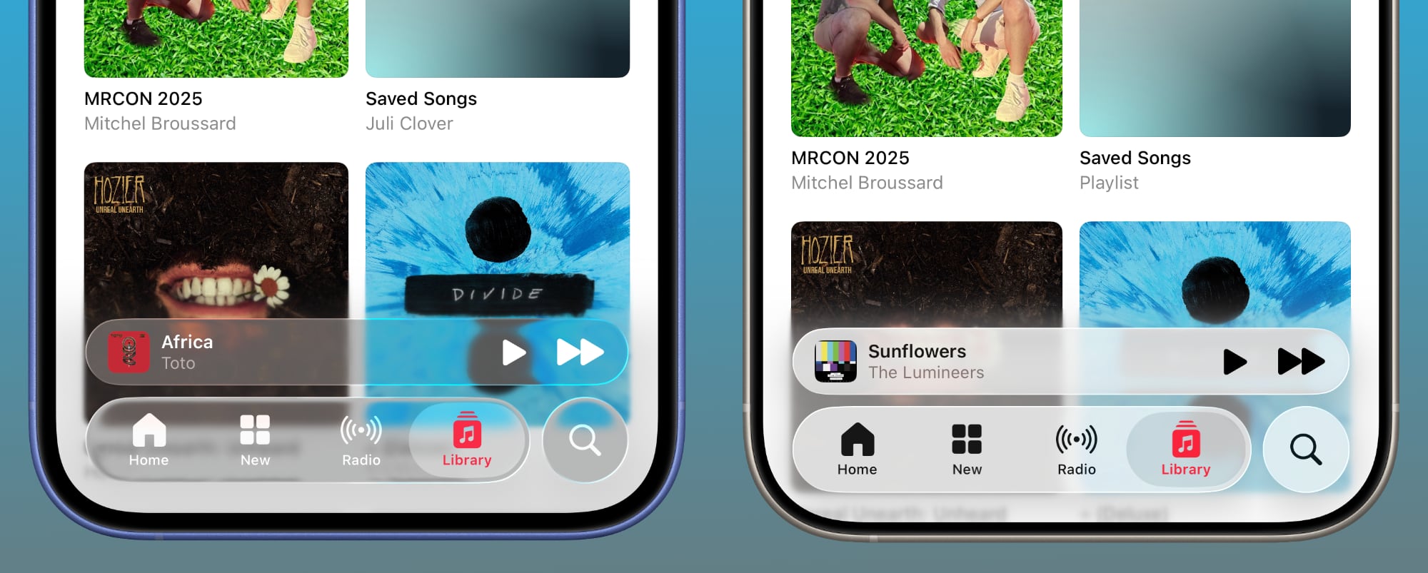
Man what a shame this looks nothing like liquid glass. I actually loved the change, it looked so refreshing. More white & boring again…
one app?oh wow that really is drastic. looks nothing like glass indeed
If Beta 3 is truly backtracking (and not just field-testing a different variant) then it’s concerning. The engineers and creatives clearly know what they’re doing, but leadership might be losing its nerve?I'm increasingly getting the feeling Apple doesn't know what the hell it's doing with this redesign
I see no change . In music app like you . Glass is still there in beta 3. Did you try in front of a dark background ?oh wow that really is drastic. looks nothing like glass indeed
that wasnt me, you tagged the wrong personI see no change . In music app like you . Glass is still there in beta 3. Did you try in front of a dark background ?
Hmm. My glass isn’t nearly this opaque in Beta 3. Still looks pretty glassy to me
Man what a shame this looks nothing like liquid glass. I actually loved the change, it looked so refreshing. More white & boring again…
During the pre-OS X days, third-party programmers figured out how to "theme" the Mac's OS, giving users options like changing the colors of window controls, the design of window title/grab bars, the shapes of the window control buttons in the upper left corner of most windows, etc. This went on for a few years, but Apple eventually "cracked down" on this since they claimed it allowed people to sully the unique design of the Mac OS as Apple had planned it, supposedly making it unrecognizable as a Mac operating system.The lack of consistency is killing me. Last year they were all about customization. Give people the tools to play around with the glass effects since you are all about customization now.
iOS 26 beta 3 completely nerfs Liquid Glass. It looks so much cheaper now and feels like Apple is backtracking on their original vision.
Strange. I just updated to beta 3 and I still have the glassy look. iPhone 16 plus.
Me tooStrange. I just updated to beta 3 and I still have the glassy look. iPhone 16 plus.
DittoStrange. I just updated to beta 3 and I still have the glassy look. iPhone 16 plus.
If a cosmetic rather than a functional change is the “main selling point” for going from iOS 18 to 26, then Apple has a problem.firstly apple ruined the new Siri and AI with not being ready, and now the whole change of iOS 26 liquid glass has been backtracked, just like the photos app they ruined, what can they actually do thats right now days. its annoying me now days. liquid glass was the main selling point and they have backtracked on that, iOS 26 is now iOS 18.7
My 13 mini went from satisfyingly glassy to frosted. Maybe it’s device/processor dependent? Or screen size-dependent?Ditto
Bravo. Well done, sir or maam or hdyjshgdg.Can't innovate anymore my GLASS!
I prefer translucent objects to opaque. The most legible combination is going to be black on completely opaque white. Everything else is a compromise to some degree.So, you prefer UI elements less readable?
I think you’re on to something.16 Pro and mine is still as glassy as before. Maybe older devices lost the glass?


