Got a tip for us?
Let us know
Become a MacRumors Supporter for $50/year with no ads, ability to filter front page stories, and private forums.
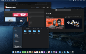
First Look: macOS Big Sur With Redesign, Safari Updates, New Messages App and More
- Thread starter MacRumors
- Start date
- Sort by reaction score
You are using an out of date browser. It may not display this or other websites correctly.
You should upgrade or use an alternative browser.
You should upgrade or use an alternative browser.
Noted there's still dark mode. Thank you. I wonder how it looks like.
Attachments
You're probably thinking WebP.I could be wrong, but I'm pretty sure I saw something about macOS getting support for WebM recently.
I don’t want using my actual Mac so I will set up some hackintosh since Intel still supported. OpenCore 0.6.0 seems ok to play with Big Sur.
Can anyone confirm is Safari Top Sites is still present or has it been removed? I would hold off on upgrading if it is honestly...
Ugh, I really, really like those and go into Develop \ Empty Caches just to have current website images. Vivaldi's work well and allow individual image updates on a right click - but I really don't want to loose this on Safari. Hopefully they bring it back before release.
The software isn't being QA tested near enough though, imagine with the C-19 work from home situation, et cetera. I think they either need to allow more employees to test (or developers to change code) or they need to go to a 2-year cycle and make more modest changes annually that correspond with iOS compatibility.
It works surprisingly well for first beta, especially given the fact how much of a change this release is. As software grows, it becomes more complex, so finding and fixing bugs becomes harder. Furthermore, in the Apple's case, they have to both focus on improving current software and working on new product. Throwing more testers or developers wouldn't necessarily mean better products - quite the opposite, can often lead to more issues. When it comes to the 2-year cycle, I think currently it is something similar to that. For example, Catalina was a relatively small update to Mojave. Same goes with iOS - iOS 12 was more like a maintenance update, then iOS 13 came with lots of changes and iOS 14 is again more or less a maintenance update with some nice tweaks. What is more, you have to consider that people have different setups and needs. What doesn't work for some will work perfectly fine for others. Not to mention that on the forums you will almost see only the people who are having issues which is just a small percentage of all people who are using the platforms. For example, I had never thought iOS 13 was a bad release and I don't remember experiencing issues with it (apart from some iCloud-related bugs). And yet people were complaining about how bad it is all the time. It is just wrong that people have this perception that any software can be bug-free.
I like a lot of what I'm seeing, except the icons. They look really odd - like out of place. The shadow effect is awful. I thought this nonsense left with Forestall.
Well, I'm about to upgrade my SSD on my 2015 rMBP15, and I'm going to upgrade from High Sierra to Mojave. So that's where I'm gonna go for now ha haLike it or not, you're stuck with it. Where you gonna go? haha

Wait, you boot your Mac every morning? How’s life in the 90’s? I boot my Macs once every couple of months, and just sleep/wake them the rest of the time.
Yep. Power off for the day, power it on the next time I need it. Just a habit and don’t care for it to sleep forever.
Either that or it's just a simple representation of the Dock.View attachment 927305
It is a screenshot from MacOS 11 / Big Sur maybe some day for iPad Pro ore something look in the red circle the icon there looks like the iPad pro
Wait, you boot your Mac every morning? How’s life in the 90’s? I boot my Macs once every couple of months, and just sleep/wake them the rest of the time.
At my office the i.t. Staff installed something or another on my windows machine which shuts it down every friday night and reboots it at some regular interval (it tries to reboot it, but whatever they are doing usually doesn’t work, so I come in in the morning to a bunch of “are you sure you want to quit?” Dialog boxes).
Windows is just a joy.
[automerge]1593049429[/automerge]
It stands for “belgium sucks,” right?Wow, I hadn’t noticed the unfortunate initials for the new OS.
(at amd, the sdk I wrote to do circuit classification - where you look at the transistor-level circuits and reverse engineer the logic - used bs_ in front of every class name. My boss thought “hah hah. ********. that’s just maier being maier. He’s such a rebel.”). It actually stood for Belgium sucks. Guess where my boss was from?
I dunno since when MacOS no longer show disk drive by default, but it can be show manually with extra steps. My fresh Mojave Install also doesn’t show any disk on desktop unless I’m digging some Finder preferences to make them show up.
High Sierra shows all my drives after my upgrade from Sierra.
But thanks for answering that as I'm just beginning to set up a Mojave SSD now, so now I know what to do if they disappear. I'm used to very cluttered desktops, so I'm hoping Mojave will at least also help with that too.
There is an option in the Accessibility preferences to reduce transparency.
Are there options to increase contrast, use bold font, and ensure showing button shapes?
Can you make the top toolbar font black?
I’m sure they are placeholders. Probably drawn by the engineers instead of designers. This happens every time apple does a major re-design of the ui. Each beta various icons get replaced.That battery icon and some of the new app icons like messages look horrendous and out of place like they were copied from an early 2000's version of OS X.
"We don’t waste time thinking, ‘But it should be one [interface!]’ How do you make these [operating systems] merge together?’ What a waste of energy that would be.” --- Phil Schiller 2014
It certainly seems like they've merged the two and are heading to a confluence. Nevermind that I hate this idea.
It certainly seems like they've merged the two and are heading to a confluence. Nevermind that I hate this idea.
Good stuff. I skipped Catalina (my first major OSX release I've skipped in 12 years), but I think I may bite on this one assuming reviews are positive and there are minimal issues.
Dark mode looks better, default light UI are too bright for my taste.
It’s weird going back to light mode even now in Catalina. Don’t know how we put up with it for so long!
Hi all,
The seduction of transparency. Does Big Sur still have a setting in Accessibility to "Reduce Transparently"?
The seduction of transparency. Does Big Sur still have a setting in Accessibility to "Reduce Transparently"?
Register on MacRumors! This sidebar will go away, and you'll see fewer ads.