Got a tip for us?
Let us know
Become a MacRumors Supporter for $50/year with no ads, ability to filter front page stories, and private forums.
First Look: macOS Big Sur With Redesign, Safari Updates, New Messages App and More
- Thread starter MacRumors
- Start date
- Sort by reaction score
You are using an out of date browser. It may not display this or other websites correctly.
You should upgrade or use an alternative browser.
You should upgrade or use an alternative browser.
My first thought: are they going to be able to do this all without tons of bugs, instability and rough edges? Because they sure didn’t manage that with Catalina very well.
[automerge]1593056131[/automerge]
[automerge]1593056131[/automerge]
You shut down every night?Not so sure about the start up chime. I used to like it, but have gotten used to it not making sounds. Since I use my Mac at work and arrive a little late, people always hear when I turned on my Mac.

Hi all,
The seduction of transparency. Does Big Sur still have a setting in Accessibility to "Reduce Transparently"?
Reduce transparency
Reduce transparency + high contrast
[automerge]1593059359[/automerge]
Big Sur beta 1 is already faster and more stable than 10.5.5.My first thought: are they going to be able to do this all without tons of bugs, instability and rough edges? Because they sure didn’t manage that with Catalina very well.
Reduce transparency + high contrast
[automerge]1593059359[/automerge]
Big Sur beta 1 is already faster and more stable than 10.5.5.
Reduce transparency + high contrast seems better. More readable albeit a bit classic.
But will iTunes work, including artwork?
If you referring good old iTunes 12, RetroActive projects seems no longer have newer commit since April, so probably compatibility cannot guaranteed right now.
Has anyone who has had issues with Catalina and SMB shares (e.g. on NAS’s), where you can’t connect from the finder sidebar without restarting finder, tried to see if it’s resolved in the beta? I’d install it in a second if that was the case.
iTunes still works as before.But will iTunes work, including artwork?
iTunes still works as before.
I had question, are Music.app and iTunes using same library? Or should I maintain two separate library? I heard Music.app had different library (not using classic XML)
I haven’t touch OS beyond Mojave, so probably I prefer stay on my curated iTunes Library if possible if in case I need upgrading my OS.
Why somebody who loves the Mac can love either iOS or Android is beyond my knowledge. Maybe the answer is that they are not Mac users actually, but iOS users who joined the Mac after iOS. And this brings a very positive question: where did Mac users go? It's positive, because there must be a future in computing.
I love the Mac and I love iOS, and I loved the Mac first. But I love them for different workflows and purposes.Why somebody who loves the Mac can love either iOS or Android is beyond my knowledge. Maybe the answer is that they are not Mac users actually, but iOS users who joined the Mac after iOS. And this brings a very positive question: where did Mac users go? It's positive, because there must be a future in computing.
Then why do you want the Mac to look like iOS? If their purposes and workflows are different, their look should be different, because in Apple, looks follows function.I love the Mac and I love iOS, and I loved the Mac first. But I love them for different workflows and purposes.
Then why do you want the Mac to look like iOS? If their purposes and workflows are different, their look should be different, because in Apple, looks follows function.
I never said i want the mac to look like ios.
So far I haven’t seen anything too objectionable in Big Sur (though the icons are clearly placeholders), but since I haven’t used it I don’t know if it interferes with usage or not - most of the changes seem to be merely cosmetic.
My 2012 Mac mini will never see Big Slur 🙁

macOS 11 Big Sur on Unsupported Macs Thread
This thread will be used to discuss advancements in getting macOS 11.0 Big Sur running on unsupported Macs. --- Compatibility List: --- FAQ: Q: What does unsupported mean for my old Mac? A: Three problems: Apple locks you out from running the stock installer of Big Sur and as...
 forums.macrumors.com
iTunes and Music use different libraries. To sync Music with your iTunes library, hit option and select your iTunes/iTunes Library.itl file (not the xml, that’s a backup that doesn’t contain things like date added).I had question, are Music.app and iTunes using same library? Or should I maintain two separate library? I heard Music.app had different library (not using classic XML)
Of course if you do upgrade your library will automatically be converted to a Music library (with your old db still intact)
My Mid-2012 MacBook Pro Retina is still very fast and works great (I got it fully loaded back in 2012). I never wanted to upgrade because of ports, MagSafe, and the keyboard. But, Big Sur won't work with it. Is there some technical reason why or is Apple just pushing us to upgrade?
Since you seem to know what’s what, where does Catalina stash the videos library file?iTunes and Music use different libraries. To sync Music with your iTunes library, hit option and select your iTunes/iTunes Library.itl file (not the xml, that’s a backup that doesn’t contain things like date added).
Of course if you do upgrade your library will automatically be converted to a Music library (with your old db still intact)
Then why do you want the Mac to look like iOS? If their purposes and workflows are different, their look should be different, because in Apple, looks follows function.
Seriously? iOS has always looked like the Mac. iOS was always and still is, unmistakably Mac in design. Sometimes the icons might vary but it was Mac. I think the issue here is that we expected the UI to flow from the Mac to the iPad/iPhone and not vice versa. With the popularity and adoption rate of last year's new iOS design, it was time to take the Mac in that direction. Catalina was a misfire like Leopard (or if you will, like Windows Vista). MS already had what would become Windows 7 in development and Snow Leopard had already been in development at Apple and when Snow Leopard was released in Beta, it was rock-solid. From what I've read, Big Sur is already more stable in Beta 1 than Catalina was for several releases (some would say, ever) and this was the case with Snow Leopard and Windows 7 - both were pretty polished by the time they were released. Same story with Sierra and High Sierra - Mojave was like a breath of fresh air because both of those former releases were sketchy IMHO. Mojave was wonderful right out of the gate in Beta.
I for one welcome our new rounded-corner overlords...
Movies/TV/TV Library ?Since you seem to know what’s what, where does Catalina stash the videos library file?
No thanks. That's what you (and some others) need.
Apple engineers only seem to test MacOS using a 12 inch MacBook as the only display. Below are examples of working with applications and Finder windows on a MacBook Pro laptop screen, then connecting a 30 inch, 2560x1600 monitor as the main display. Things look even stupider when connecting to a 38 inch, 3840x1600 ultrawide monitor.
1. Finder windows that were in the top left corner or the center of the laptop screen now open in the bottom left corner of the monitor.
2. Applications such as Photos, News, Stocks which I put in the center of the laptop screen now open in the bottom left corner of the monitor.
3. Documents from applications such as Keynote and Omnigraffle which filled the laptop screen now open in the bottom left corner of the monitor.
4. DMG disk image files for various downloaded applications frequently open in the in the bottom left corner of the monitor by default.
5. Some applications such as Dictionary, Font Book keep opening windows in the bottom left corner of the monitor no matter how many times I move the window.
Apparently, Apple engineers think that everyone should position their monitor so they are always looking directly at the bottom left corner of the screen. I have never seen an operating system handle window positioning as STUPIDLY as MacOS.
I don't know who approved this design, but I'd really like to introduce this person to a team of doctors to let them check for a so far undescribed form of functional blindness.
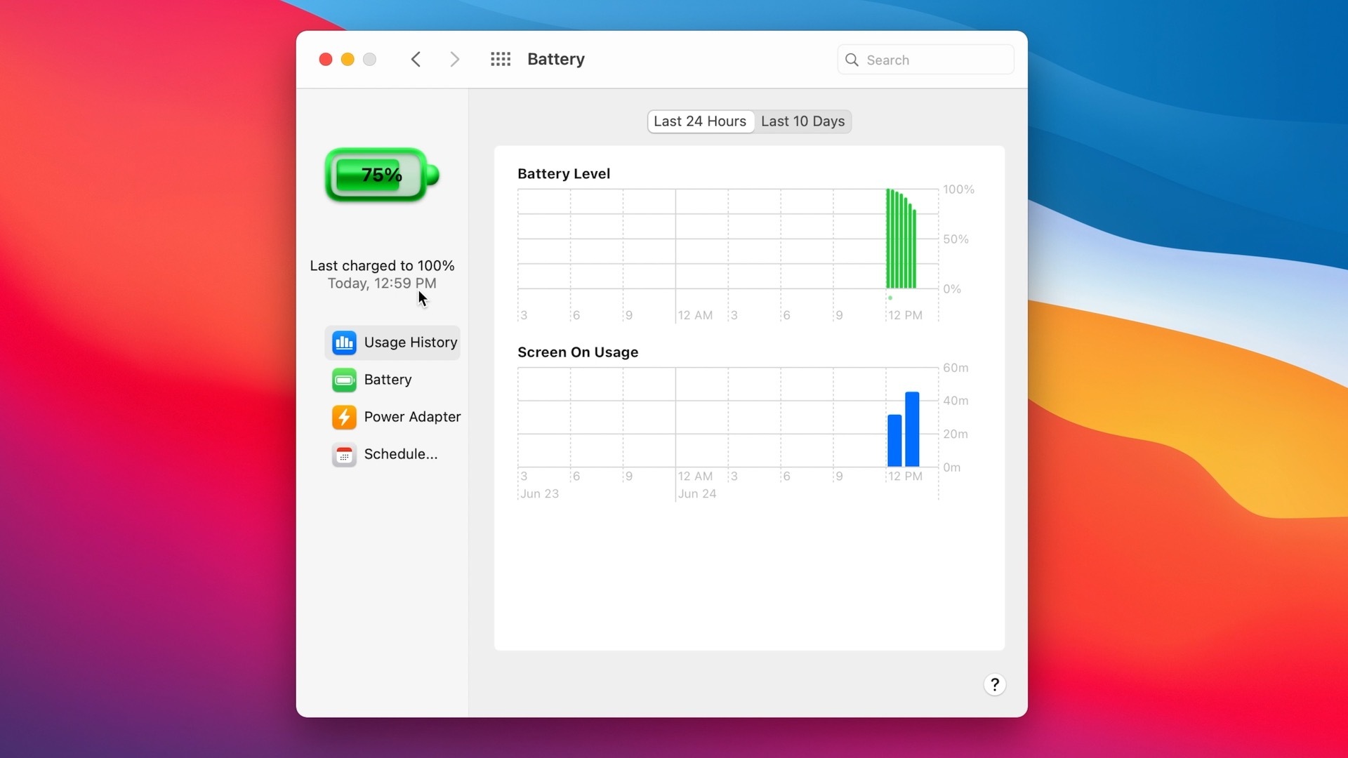
Seriously, who thought it was a good idea to combine the overall flatness of the UI with this giant, green, plastic looking Fisher Price-designed battery icon? Your eyes get drawn to it like it's a huge, green booger hanging out of the nose of the person you are talking to.
The design is controversial but I personally really like the more playful, colorful approach + the rounded corners.
me too. After using iOS since 2008 I always felt that OS X fell a little short in terms of design.
sliders and options feel so outdated in OS X.
Not a fan of all this unnecessary 3D shadow mumbo jumbo. It's too chiclet-y. Like we're back to iPhone OS. All the 3D rounded edges clashes with iOS's flatter design.The shadows look on FaceTime and Messages app icons look dopey.
The foremost window is difficult to separate from the background windows. The only thing that separate them is a drop shadow that seems to extend pretty far from the edges.
Will give it a few betas but might have to clean install and revert back to Catalina if things don't improve.
Register on MacRumors! This sidebar will go away, and you'll see fewer ads.