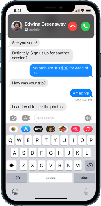
To me it looks like an ergonomic nightmare? When I'm holding my iPhone 11 Pro my thumb doesn't reach the top of the screen - so why move all these widgets to a part of the screen I can't interact with? I like them in the middle of screen where my thumb reaches.
Example, right now a call comes in - boom I can use my thumb to hit the green button at the bottom of the screen. Why move that way the hell up the screen (in the example).
Example, right now a call comes in - boom I can use my thumb to hit the green button at the bottom of the screen. Why move that way the hell up the screen (in the example).
Last edited:


