Got a tip for us?
Let us know
Become a MacRumors Supporter for $50/year with no ads, ability to filter front page stories, and private forums.
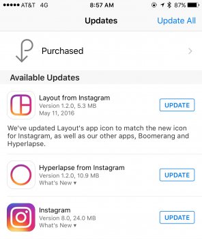
Instagram Updated With Brand New Icon and Flat Design
- Thread starter MacRumors
- Start date
- Sort by reaction score
You are using an out of date browser. It may not display this or other websites correctly.
You should upgrade or use an alternative browser.
You should upgrade or use an alternative browser.

bushido
Suspended
they want people to focus on bitching about that ugly icon while sneaking in their new filter algo
Jayderek
macrumors 6502
That's not the point. The whole concept of a brand is to have its logo be recognizable anywhere, by anyone, at any time. Look at Pepsi's logo. Do you think they need to put "pepsi" underneath to say it's Pepsi?
Other iconic logos include:
Twitter's bird
Apple's apple!
Starbucks
Adidas
NBC's peacock
etc...
Instagram took that away with their new logo. They are now generic.
all logos that have been changed at various times. So?
d28z28
Suspended
So I updated the app and I got the new icon but NOT the UI - anyone else? No idea how else to "update" it to get the new UI.
Last edited:
BJMRamage
macrumors 68030
oh that App icon is hideous. it reminds me of a printer's logos where the owner said "we print full color, let's add a rainbow to the logo to make sure people understand" no, that's not how great design works. I am not saying they needed to simply flatten the old app icon. that would have worked but the progress and forward-thinking would be minimal. yes, a new app icon/design is fine but don't simply add a gradient because you cannot flush out an idea or color scheme to work properly.
Michaelgtrusa
macrumors 604
S.B.G
Moderator emeritus
The icon doesn't bother me but I'm not overly thrilled with the new flat white look. But, I'll get used to it and carry on.
mookie89
macrumors newbie
I don't know, I kind of like the new Instagram look. The icon maybe is a little too gradient heavy, and it's certainly as minimal as they could have gone with the representation of a camera without becoming abstract. I do like the purely black and white interface. That seems to be a trend lately, something the new Music app is rumored to adopt as well…curious to see if they have a similar style.
_mdavenport
macrumors 6502
It has ads now. No thanks.
Don't use it then, they are not a non-profit organisation right?
baller1308
macrumors 65816

tennisproha
macrumors 68020
Hah, yeah seriously, it's not even close.Can I have some of what the designers were taking when they chose to make and approve that icon?
The old icon was iconic. Should have been flattened to this:
View attachment 630908
Your rendering is quite good. How'd you do it?
It has ads now. No thanks.
I can't remember the last time I saw an ad tbh
OtherJesus
macrumors 6502
Glad I saw this before I updated.
I give it a few hours before the Internet backlash forces them to call a big wig boardroom meeting to change the icon.
I give it a few hours before the Internet backlash forces them to call a big wig boardroom meeting to change the icon.
Can I have some of what the designers were taking when they chose to make and approve that icon?
The old icon was iconic. Should have been flattened to this:
View attachment 630908
I have never used Instagram, but that's exceptionally good work. Too bad they didn't turn to you in the first place.
Richardgm
macrumors 6502a
Every app is losing its character thanks to iOS 7.Another beautiful app ruined by this boring flat iOS 7 design trend ... What a shame
Old one is much nicer.
[doublepost=1462986230][/doublepost]
[doublepost=1462986396][/doublepost]
If only. iOS and the Mac had some really lovely icons now we get crap like this. Unfortunately I can't see it happening for quite a while.
[doublepost=1462986230][/doublepost]
That's equally nasty.The outline of the camera is fine... but that color scheme, yikes.
edit - Why didn't they use this version? So much better! For whatever reason their twitter image uses this one.

[doublepost=1462986396][/doublepost]
I can't ****ing wait until this flat theme trend ends. It's horrifying.
If only. iOS and the Mac had some really lovely icons now we get crap like this. Unfortunately I can't see it happening for quite a while.