When I saw the new app I thought "oh great it probably sucks". I'm pleasantly surprised though! I like the new icon and the interface is working well so far.
Got a tip for us?
Let us know
Become a MacRumors Supporter for $50/year with no ads, ability to filter front page stories, and private forums.
Instagram Updated With Brand New Icon and Flat Design
- Thread starter MacRumors
- Start date
- Sort by reaction score
You are using an out of date browser. It may not display this or other websites correctly.
You should upgrade or use an alternative browser.
You should upgrade or use an alternative browser.
Haha yuuup, this was to be expected. Yet another redesign that moves towards all-white UI, flatness and genericness. "Clean design" y'all. Surprised they didn't go for a white background in the app icon though. Then they really would've been like the rest of the trendy kids.
This is what you get when you clamor for a flat design. You get disappointed because "flat" design isn't as great as it seems for a lot of uses. The only really good flat designs are the ones that started that way. Anything non-flat that moves toward flat design feels like regression because "going flat" is regression by definition.
You all didn't learn your lesson from iOS 7. You ask for a flat design to replace one you're mildly content with, and then they give you what you think is bland, generic, and unoriginal. Then you regret it.
I disagree. Flat design can be good or bad or anywhere in between. The problem here isn't flat design, but rather that this icon is fairly bad design, and that it replaced a particular non-flat design that people very much liked.

Flattening had to have been one of Tim's requirements, in order that icons would properly work on the uber diminutive screen that is the ignoble Apple Watch.
My icon disappeared after the update…
Changed my wallpaper and found it…
Attachments
How the new Instagram icon was made. https://twitter.com/UltraLinx/status/730414715642482688/photo/1

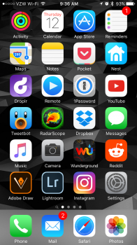
I don't like the new icon, I quite liked the Polaroid camera look and felt it was a recognisable logo. The new version looks like a couple of other camera apps I have. Dull, but hey it's only an icon.
Still on the old UI with app update after deleting and reinstalling. Anyone else having issues with this still?
Same. Old UI on my 6s
Same. Old UI on my 6s
Maybe it's the 6s? My 6s has the old UI and my iPad Air 2 has the new.
this icon doesn't even look like it belongs with iOS 7. Not a single iOS 7 icon is flat with a rainbow texture thrown into it like it was made in paint using a PowerPoint color scheme. iOS 7 is more 2 colors with shades unlike the new Instagram app.Another beautiful app ruined by this boring flat iOS 7 design trend ... What a shame
this icon doesn't even look like it belongs with iOS 7. Not a single iOS 7 icon is flat with a rainbow texture thrown into it like it was made in paint using a PowerPoint color scheme. iOS 7 is more 2 colors with shades unlike the new Instagram app.
Actually doesn't the color gradient somewhat remind you of what Apple is doing with it's Pages/Numbers/Garageband/etc. apps? Seems like it does, to me.
But I think that Instagram should at least have filled in the top half of the camera with white, to make some kind of recognizable assemblance to differentiate itself from all the other camera apps.
Hey guys, I updated Instagram on my iPhone and it's got the new icon, but when I open it, there is no new layout. However I updated the app on my iPad Air and it's got the new icon and the new layout.
Can't seem to work out how to get the new layout on my iPhone? I deleted the app, reinstalled, signed out and signed in, still the same?
Can't seem to work out how to get the new layout on my iPhone? I deleted the app, reinstalled, signed out and signed in, still the same?
Yet I still have to use safari for instagram on my ipad pro instead of a proper ipad instagram app....
Register on MacRumors! This sidebar will go away, and you'll see fewer ads.