This reminds me of the high-profile leaker hypocrisy. Some years ago, a site I used to work on, leaked some stuff mere hours before it was publicly announced and we were called out by Jason Schreier, who built his career solely on leaking others’ stuff, including a massive Fallout 4 script leak. For this, I can’t stand how people like Schreier and Gruman downplay others.Prosser? Lost me right there. Tomorrow: “Gurman says iOS 19 to not feature major changes.”
Got a tip for us?
Let us know
Become a MacRumors Supporter for $50/year with no ads, ability to filter front page stories, and private forums.
iOS 19 Leak Reveals Alleged New Design With Rounder App Icons, Floating Tab Bar, and More
- Thread starter MacRumors
- Start date
- Sort by reaction score
You are using an out of date browser. It may not display this or other websites correctly.
You should upgrade or use an alternative browser.
You should upgrade or use an alternative browser.
Feels like it’s morphed into Android losing its own signature look. I don’t like these leaks, but then again, it may never happen. If they redesign the iOS, perhaps leaving the key elements intact while changing them in other ways that still says it’s iOS is a better option? iOS 6 to 7 was a gigantic change, without leaving the foundations of the iOS design behind. This looks like surface changes for the sake of change while erasing its core elements.
PS didn’t they JUST synchronise the look of iOS and Mac? Now we are just going to throw that out of the window for the sake of an OS design used on their least sold product with the least user base… Classic Tim
PS didn’t they JUST synchronise the look of iOS and Mac? Now we are just going to throw that out of the window for the sake of an OS design used on their least sold product with the least user base… Classic Tim
Last edited:

Yup this deffo looks like the biggest design update ever
The icons…. oh, the horror. If this turned out be accurate, Apple will become famous for a self-inflicted, direct hit with the ugly stick.
YouTube channel Front Page Tech is back today with another video that provides a closer look at iOS 19's alleged design changes.
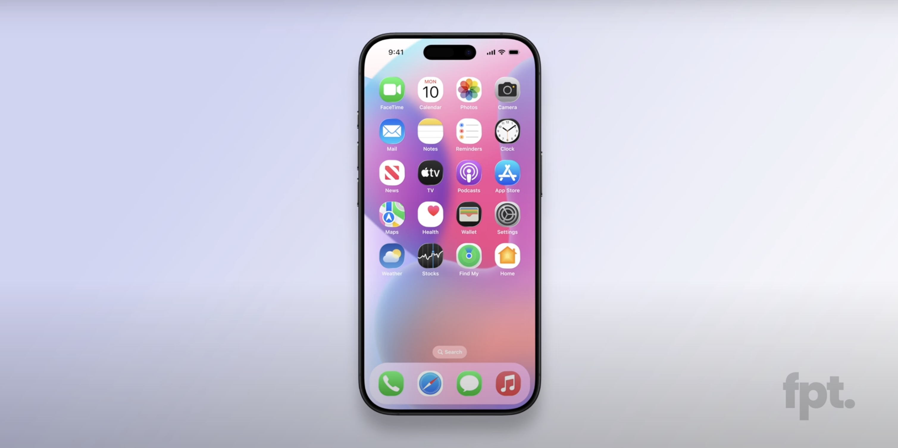
The video contains re-created renders of iOS 19, which are allegedly based on real footage of the software update, provided by sources within Apple. Overall, iOS 19 is expected to have a more glass-like, visionOS-inspired design, with added translucency for user interface elements like buttons, menus, notifications, and more.
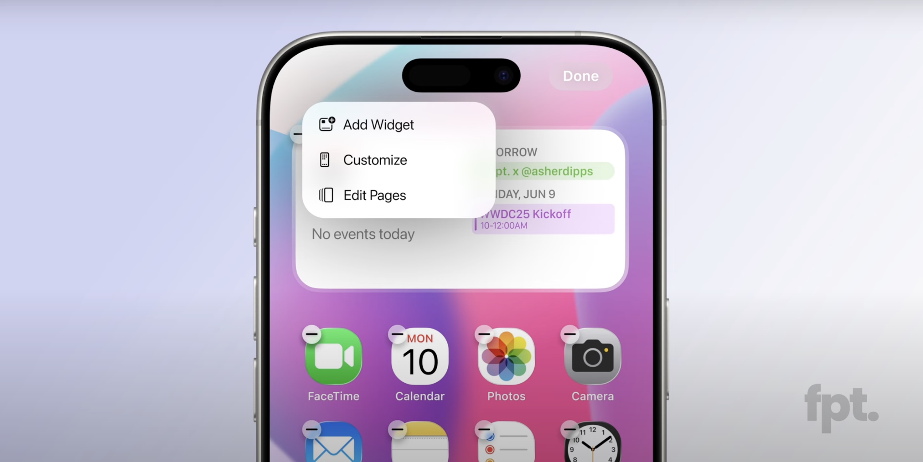
The most notable new detail in today's video is that Front Page Tech host Jon Prosser now believes that iOS 19 will feature rounder app icons, although he is not sure if they will be entirely circular like they are on visionOS.
Prosser said the rounder app icons are hidden by default on internal iOS 19 builds. Apparently, long pressing on a squircle app icon results in it switching to the rounder design, following a brief animation. It is possible that Apple is attempting to hide this obvious design change from onlookers until iOS 19 is announced at WWDC in June.
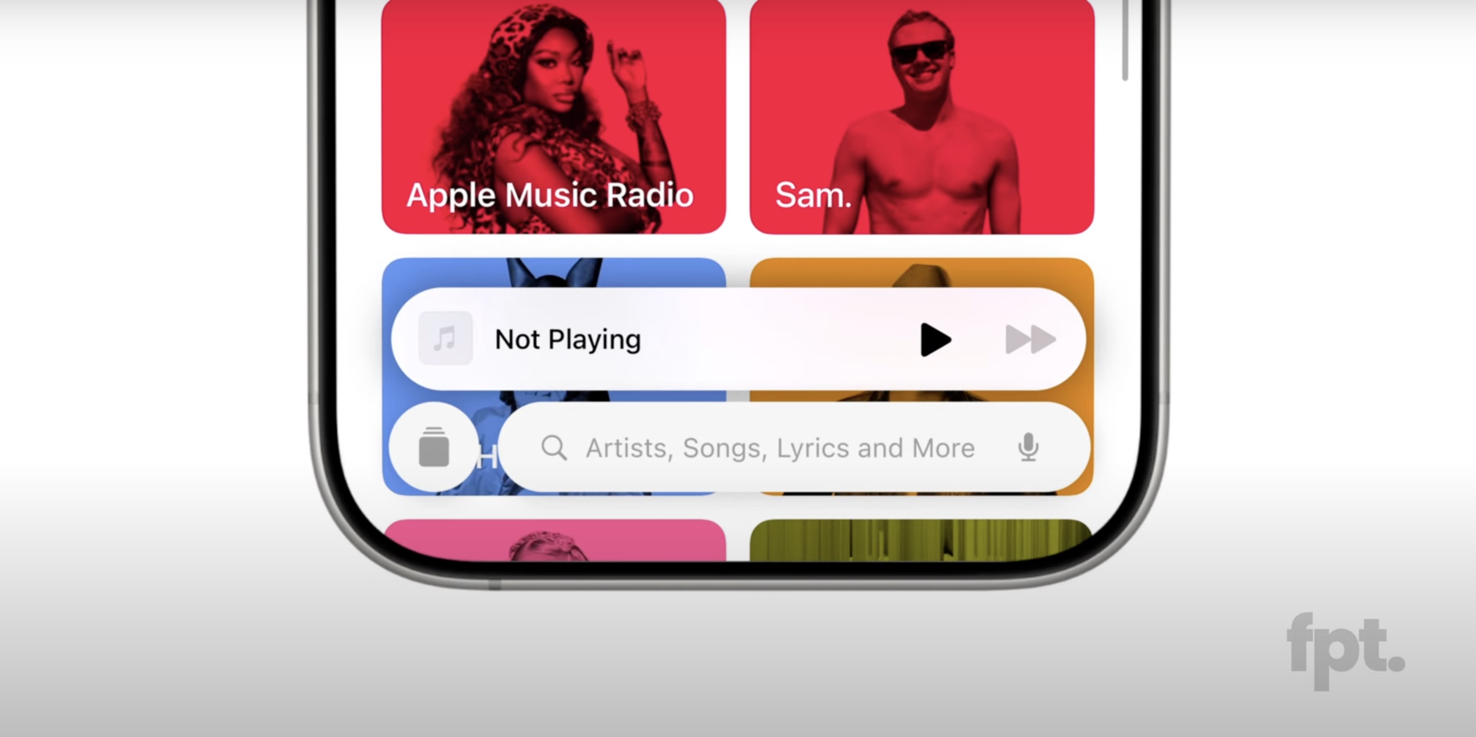
Another alleged change is the addition of a pill-shaped tab bar at the bottom of many built-in apps, including the App Store, Apple Music, Apple TV, Messages, and Phone apps, among others. On the search tab, there is an elongated search bar, with a circular button to the left of it that you can tap on to return to the expanded tab bar. The video shows off a new animation when you switch between tabs in the bar.
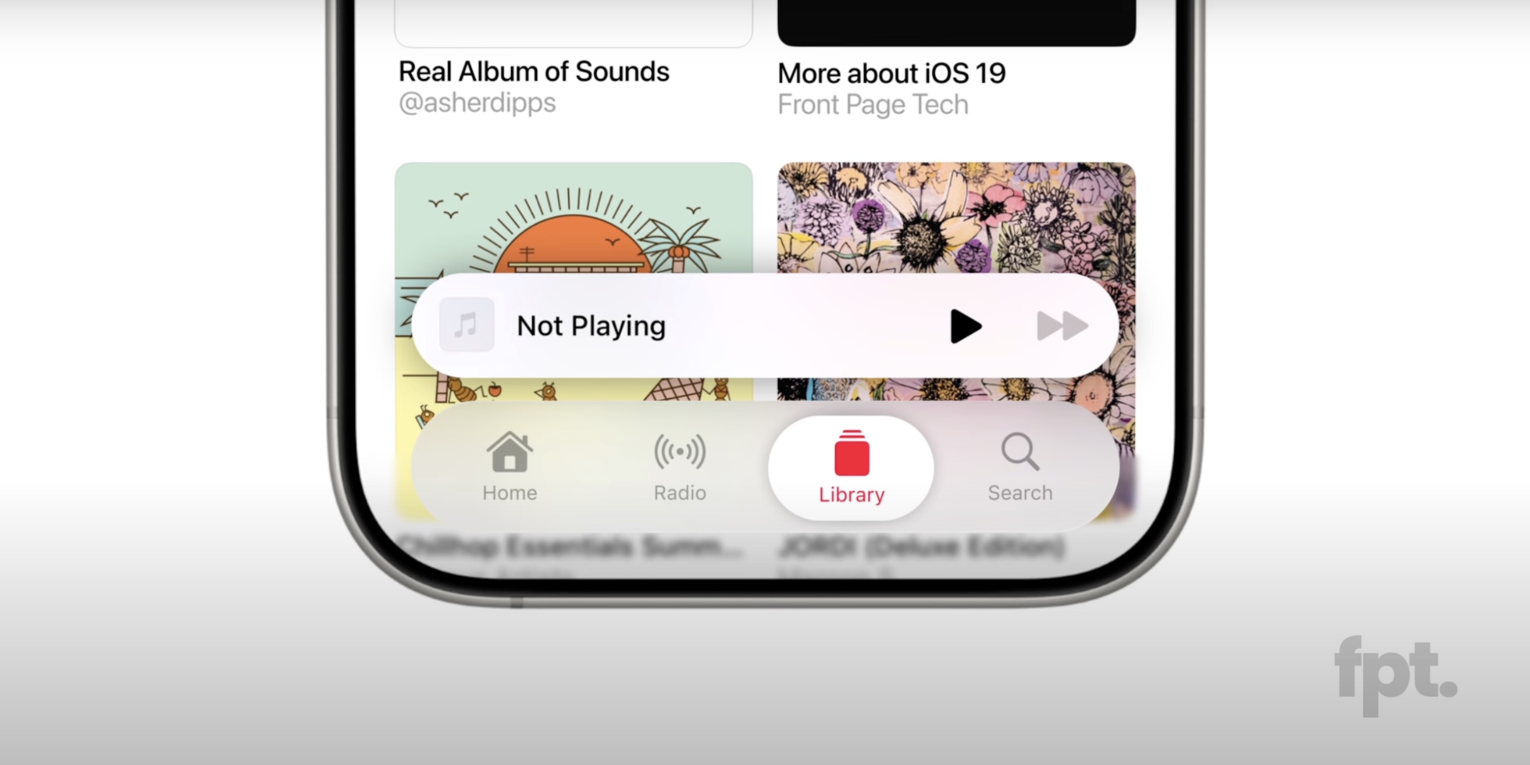
In the Messages app, the search bar appears to be persistent.
The renders also reveal that Apple has adopted more rounded corners for some elements, including the Haptic Touch menus that appear when you long press on an app icon, as well as the volume and display brightness sliders in Control Center. Permission prompts for camera and microphone access also have an updated appearance.
Prosser previously shared re-created mockups of iOS 19's alleged Camera app.
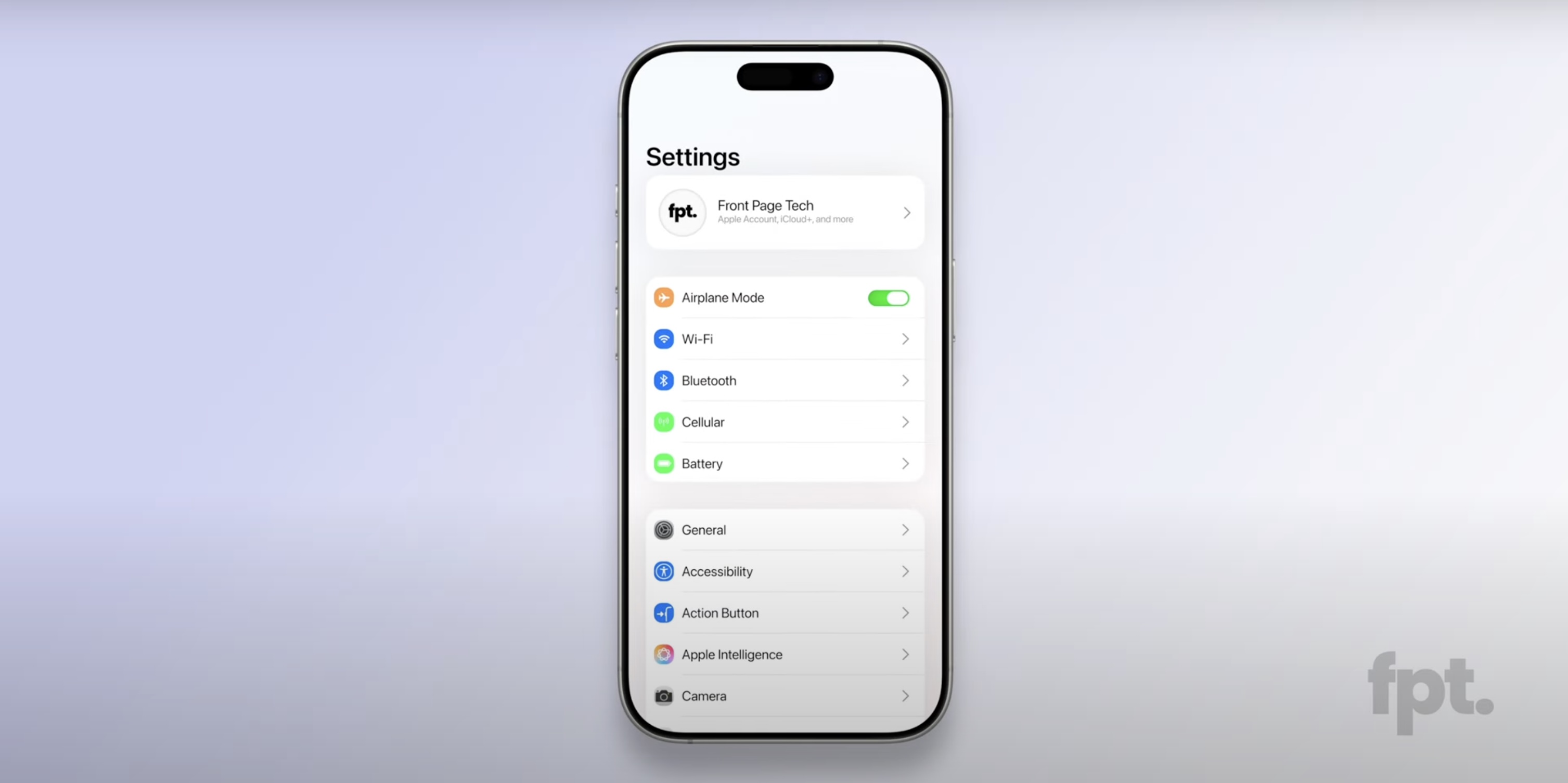
The alleged design changes extend to the Settings app, which appears to have slimmer toggles, and to the default keyboard.
Last, Prosser said iOS 19 adds a subtle lighting effect to some elements, which contributes to the rumored glass-like appearance. For example, he said the default Flashlight and Camera controls at the bottom of the Lock Screen shimmer as you move the iPhone.
The first iOS 19 beta should be available immediately following the WWDC keynote on June 9, and the update should be released in September.
Article Link: iOS 19 Leak Reveals Alleged New Design With Rounder App Icons, Floating Tab Bar, and More

Samsung has these icon shapes by default. It's the first thing I changed 😵💫
Literally this. Reading comments like "eww it looks like Android" is pretty embarrassing for the community. Is iOS so uninteresting that we are critiquing app icons now?Just offer a customization option for app border radius so the spectrum of circle to square ticks everyone’s boxes. Not rocket science ffs.
I just put an iPhone, iPad and Samsung side by side and just realized icon corners are slightly more round on the Samsung. Oh no the horror 😑
Why the obsession with lowering contrast? White "buttons" och light grey background. Great UI choice - not.
I really dislike how iOS is becoming more space inefficient with each iteration.
One of the main things that made me switch from android over a decade ago was how the tiny 4” screen of the iPhone could fit more information than my giant android at the time.
One of the main things that made me switch from android over a decade ago was how the tiny 4” screen of the iPhone could fit more information than my giant android at the time.
We are back to the iOS 4 shimmering metallic volume control button. Next up the Notes app will look like paper and the phone app will look like bakelite.For example, he said the default Flashlight and Camera controls at the bottom of the Lock Screen shimmer as you move the iPhone.
So we're stuck with white screens and neon colors for another decade I guess...great...
pparently, long pressing on a squircle app icon results in it switching to the rounder design, following a brief animation.
This ‘fpt.’ is surely a trolling operation. 👹
Round icons in a square space (the screen) is a stupid design!Hope they give us an option to keep the squared icons — circular icons look so bad on an iPhone.
And a great design choice.That would be a sea change if Apple abandons the squircle. It's been part of Apple's design language since I can remember.
I certainly hope these mockups aren't accurate of what's in store.
The new design just seems so sterile and seemingly offers no new functionality whatsoever.
FWIW, these comments come from someone who's settle for some depth and actual buttons in the UI design.
Alas doesn't look like it's going to happen.
The new design just seems so sterile and seemingly offers no new functionality whatsoever.
FWIW, these comments come from someone who's settle for some depth and actual buttons in the UI design.
Alas doesn't look like it's going to happen.
Strategically speaking, Apple faces quite a difficult dilemma with the iPhone.
The iPhone is the most successful product in history with over a billion users. That means that the product spans all sorts of users from beginner to expert, rural to urban, etc.
When you have that many users and so much success at stake, every attempt at new designs become all the more difficult.
Change too much and you end up alienating a proportion of your customers who are used to things working a certain way.
Don't change enough and you end up with a subset of users complaining that Apple's products have become stale and lack innovation.
It's a tricky balancing act for any company.
In this way, Apple is a victim of its own success, and it at least partly explains why they are so reluctant to make any major changes to their "winning formula".
Definitely looks more and more like android each yearAndroid app icons is crazy
If I were to decide (Hey Apple, call me) there would be a user setting where the user could set the corner radius of the app icons. From perfectly square to perfect circle and anything in between. Because, why not?
Register on MacRumors! This sidebar will go away, and you'll see fewer ads.