Jon Prosser again? Jeez Mark Gurman gon have to write a double entandre there tomorrow…
YouTube channel Front Page Tech is back today with another video that provides a closer look at iOS 19's alleged design changes.
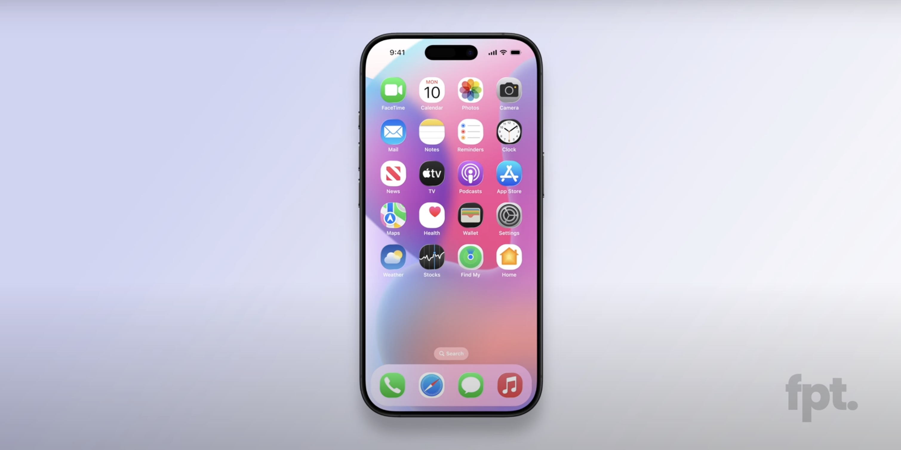
The video contains re-created renders of iOS 19, which are allegedly based on real footage of the software update, provided by sources within Apple. Overall, iOS 19 is expected to have a more glass-like, visionOS-inspired design, with added translucency for user interface elements like buttons, menus, notifications, and more.
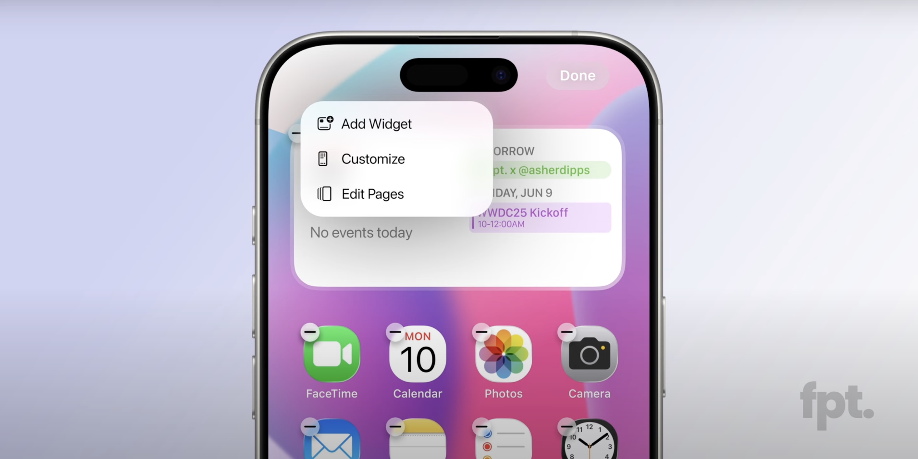
The most notable new detail in today's video is that Front Page Tech host Jon Prosser now believes that iOS 19 will feature rounder app icons, although he is not sure if they will be entirely circular like they are on visionOS.
Prosser said the rounder app icons are hidden by default on internal iOS 19 builds. Apparently, long pressing on a squircle app icon results in it switching to the rounder design, following a brief animation. It is possible that Apple is attempting to hide this obvious design change from onlookers until iOS 19 is announced at WWDC in June.
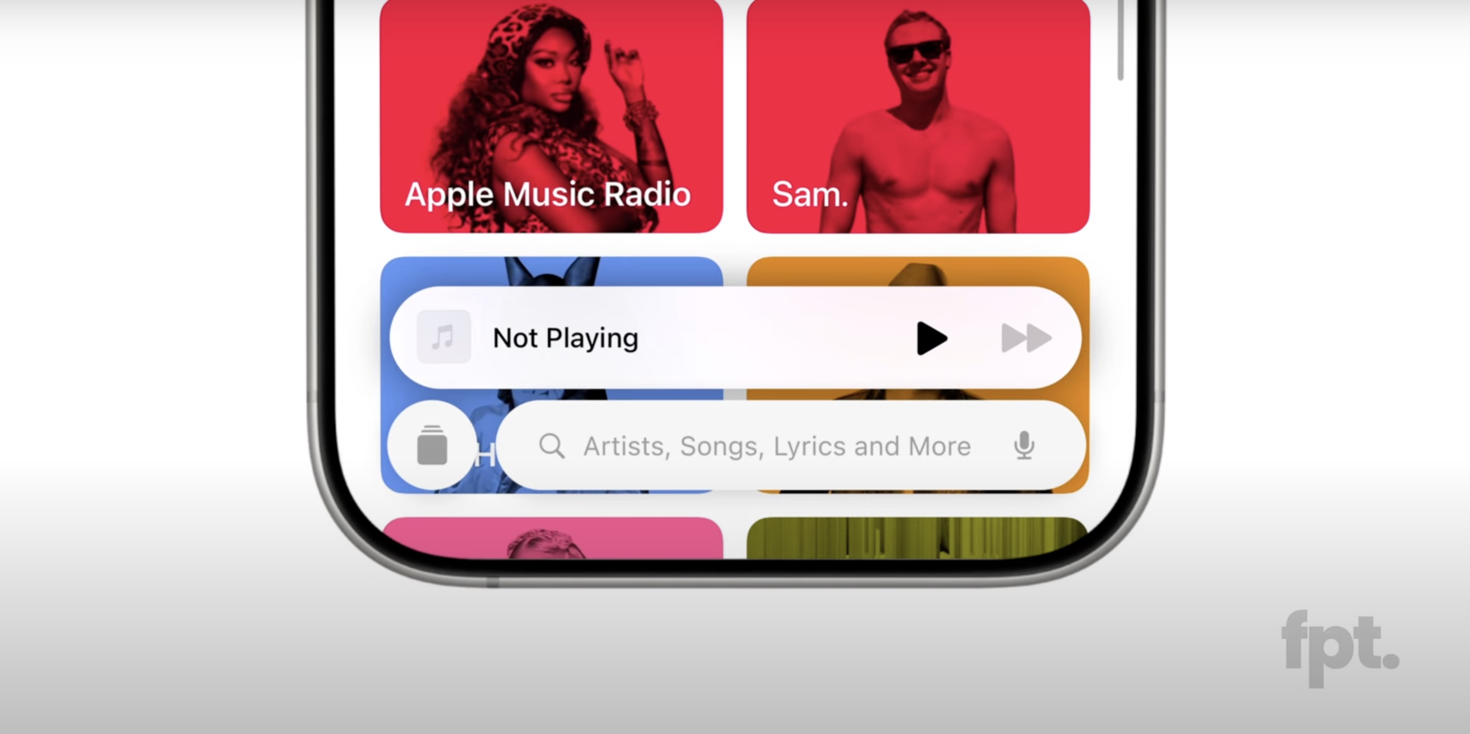
Another alleged change is the addition of a pill-shaped tab bar at the bottom of many built-in apps, including the App Store, Apple Music, Apple TV, Messages, and Phone apps, among others. On the search tab, there is an elongated search bar, with a circular button to the left of it that you can tap on to return to the expanded tab bar. The video shows off a new animation when you switch between tabs in the bar.
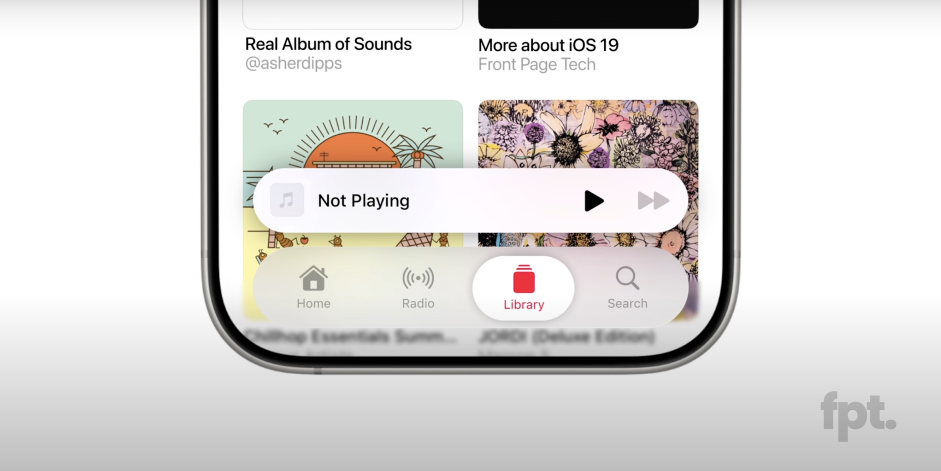
In the Messages app, the search bar appears to be persistent.
The renders also reveal that Apple has adopted more rounded corners for some elements, including the Haptic Touch menus that appear when you long press on an app icon, as well as the volume and display brightness sliders in Control Center. Permission prompts for camera and microphone access also have an updated appearance.
Prosser previously shared re-created mockups of iOS 19's alleged Camera app.
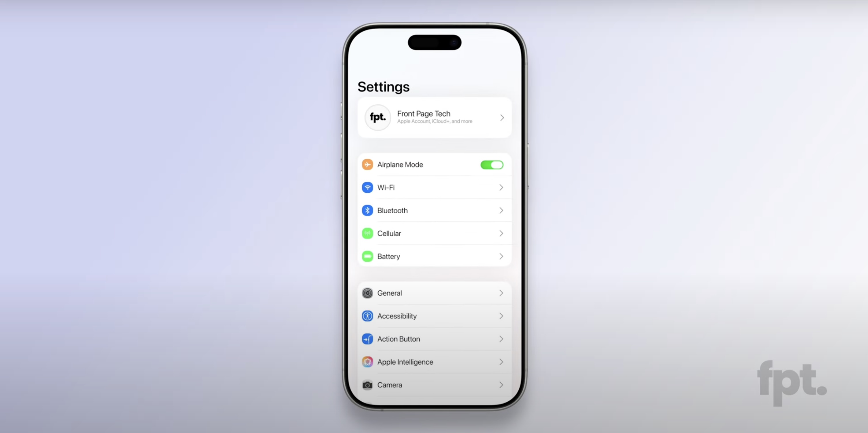
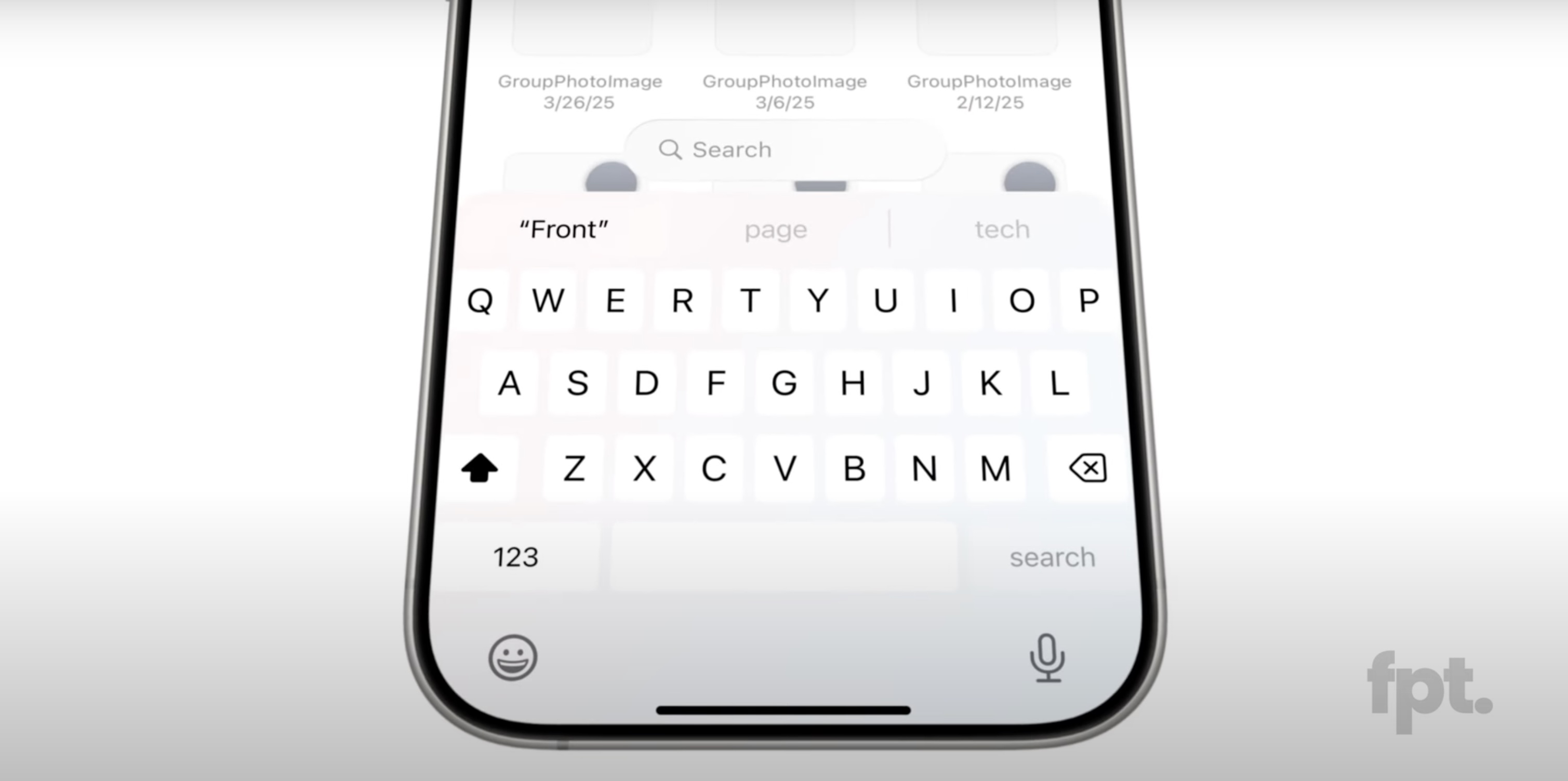
The alleged design changes extend to the Settings app, which appears to have slimmer toggles, and to the default keyboard.
Last, Prosser said iOS 19 adds a subtle lighting effect to some elements, which contributes to the rumored glass-like appearance. For example, he said the default Flashlight and Camera controls at the bottom of the Lock Screen shimmer as you move the iPhone.
The first iOS 19 beta should be available immediately following the WWDC keynote on June 9, and the update should be released in September.
Article Link: iOS 19 Leak Reveals Alleged New Design With Rounder App Icons, Floating Tab Bar, and More
Got a tip for us?
Let us know
Become a MacRumors Supporter for $50/year with no ads, ability to filter front page stories, and private forums.
iOS 19 Leak Reveals Alleged New Design With Rounder App Icons, Floating Tab Bar, and More
- Thread starter MacRumors
- Start date
- Sort by reaction score
You are using an out of date browser. It may not display this or other websites correctly.
You should upgrade or use an alternative browser.
You should upgrade or use an alternative browser.

Round icons? That's all they got? Yeah, I'll move right over to Android. A multi TRILLION dollar company and all they can manage is round icons? Yeah, beam me up, Scotty!

Please, for the love of god, finally remove the huge wasted space between the bottom of the keyboard and the bottom of the screen. We don’t need a massive emoji and voice dictation icon, and people are aware of the pill at the bottom of the screen. Take the training wheels off.
I use my iPhone in greyscale, so my hope is that there is good contrast for accessibility users.
So what do you want? Don't say 'something different', specify exactly what you want.Round icons? That's all they got? Yeah, I'll move right over to Android. A multi TRILLION dollar company and all they can manage is round icons? Yeah, beam me up, Scotty!
As I have a Snow Leopard system available to look at it dawns on me that those who wanted a Snow Leopard release may get the Return of Aqua but with New Rounded Buttons!
My mother has a Samsung phone with rounded icons and she loves it … I would personally advise Apple to give us the option to customize at will the look and feel of our iOS devices … some might prefer it round some don’t …
This is the problem though. People read rumors and then rumors discounting rumors and are constantly taking them subconsciously serious enough to change expectations, and the release happens and nobody is happy.so it is just a fresh coat of paint, not way beyond that mark said, disappointing
Reminder, Apple isn’t changing their design every week, so right there at least half of the rumors are complete BS. The other half, there are no actually leaked designs so people will start to build up excitement or disappointment depending on the new rumors. But people will react as if it’s Apple’s fault there is BS that people believe.
Psychology of why people complain and are never happy enough is so fascinating. Just like how people think there are so many advances in technology every year that Apple sucks when they do minor updates. At the end of the day, only they know what is going to happen. Only they know what is true or false. And they will always find the best balance for the masses - which means very few people are ever happy, but the compromises have been more successful than any other company in tech history. You will never get everything you want because it isn’t what the masses settle for the most, or costs too much to be feasible.
I’m not saying that to you in particular because I don’t know you. But this is a general feeling.
Last edited:
Does that mean we will get an archive button for iMessage… and how about dual app support and a true external display support…? Wouldn’t a functioning stage manager be time to be presented to the iphone?
Love the design in the middle… 3rd sucksThis is the best concept i've seen yet, Style A in this image courtesy of Aaron_Carpentr on X
YouTube channel Front Page Tech is back today with another video that provides a closer look at iOS 19's alleged design changes.
The video contains re-created renders of iOS 19, which are allegedly based on real footage of the software update, provided by sources within Apple. Overall, iOS 19 is expected to have a more glass-like, visionOS-inspired design, with added translucency for user interface elements like buttons, menus, notifications, and more.
The most notable new detail in today's video is that Front Page Tech host Jon Prosser now believes that iOS 19 will feature rounder app icons, although he is not sure if they will be entirely circular like they are on visionOS.
Prosser said the rounder app icons are hidden by default on internal iOS 19 builds. Apparently, long pressing on a squircle app icon results in it switching to the rounder design, following a brief animation. It is possible that Apple is attempting to hide this obvious design change from onlookers until iOS 19 is announced at WWDC in June.
Another alleged change is the addition of a pill-shaped tab bar at the bottom of many built-in apps, including the App Store, Apple Music, Apple TV, Messages, and Phone apps, among others. On the search tab, there is an elongated search bar, with a circular button to the left of it that you can tap on to return to the expanded tab bar. The video shows off a new animation when you switch between tabs in the bar.
In the Messages app, the search bar appears to be persistent.
The renders also reveal that Apple has adopted more rounded corners for some elements, including the Haptic Touch menus that appear when you long press on an app icon, as well as the volume and display brightness sliders in Control Center. Permission prompts for camera and microphone access also have an updated appearance.
Prosser previously shared re-created mockups of iOS 19's alleged Camera app.
The alleged design changes extend to the Settings app, which appears to have slimmer toggles, and to the default keyboard.
Last, Prosser said iOS 19 adds a subtle lighting effect to some elements, which contributes to the rumored glass-like appearance. For example, he said the default Flashlight and Camera controls at the bottom of the Lock Screen shimmer as you move the iPhone.
The first iOS 19 beta should be available immediately following the WWDC keynote on June 9, and the update should be released in September.
Article Link: iOS 19 Leak Reveals Alleged New Design With Rounder App Icons, Floating Tab Bar, and More
Rounder app icons looks terrible.
Ugh, is he the only YouTuber who posts iOS leaks or what? He is an utterly insufferable host; watching his videos is a bore fest and an exercise in agitation. I say this as someone who sat through two tedious videos about iOS, so I did give him a fair go. I don't care; I'll simply read the article and look at the screenshots. I do not care what that YouTuber has to say, and why is he always holding an iPad mini for no reason? Is he here to take my order??
Video is enhanced if audio muted and user clicks off video.Video is enhanced if audio is muted
I'd love an option for the round icons – to me they look fantastic. Apple should let you choose between squircle or circle in the Home Screen "Customize" panel. This "new, even-more-rounded squircles" icon mockup looks bad, though. I'm sure this won't be the design.
The idea for a more-omnipresent "Search" bar at the bottom that is also one tap away from all the different "tab views" is really neat too. I love the idea of being one tap away from searching my music library at all times, rather than multiple taps.
The idea for a more-omnipresent "Search" bar at the bottom that is also one tap away from all the different "tab views" is really neat too. I love the idea of being one tap away from searching my music library at all times, rather than multiple taps.
It’s rocket science because we would have icons that would look terrible with some customized radius. It won’t happen.Just offer a customization option for app border radius so the spectrum of circle to square ticks everyone’s boxes. Not rocket science ffs.
Register on MacRumors! This sidebar will go away, and you'll see fewer ads.