Flingers crossed!Maybe Beta 9 Tuesday. Then RC after event for another week.
Got a tip for us?
Let us know
Become a MacRumors Supporter for $50/year with no ads, ability to filter front page stories, and private forums.
iOS 26 Beta 8 ― Bug Fixes, Changes, and Improvements
- Thread starter Banglazed
- WikiPost WikiPost
- Start date
- Sort by reaction score
You are using an out of date browser. It may not display this or other websites correctly.
You should upgrade or use an alternative browser.
You should upgrade or use an alternative browser.
- Status
- The first post of this thread is a WikiPost and can be edited by anyone with the appropiate permissions. Your edits will be public.
Even the keyboard is terrible in this beta. At least on the 16 Plus. I’ve never made this many typos on any beta or iOS version. Laggy and doesn’t register keys correctly. They need to throw this beta in the dumpster and start over.
I am seeing this issue too - but only with the "old" keyboard (i.e. not the one with the A on the bottom right of the spacebar that shows in Spotlight etc). For example, if I type "Hey man how's it going man" the "n" in the second man will be skipped. I'm a fast typer so I thought it was just me, but I am very clearly tapping correctly on keys and it just skips them. Crazy stuff.
I accidentally posted this in the Beta 7 thread, so I’m posting it here.
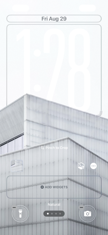
But anyway, these are what wallpaper controls look like when you’re editing a wallpaper with a light background. Those are supposed to say “cancel” and “done” lol. I’m speechless.

But anyway, these are what wallpaper controls look like when you’re editing a wallpaper with a light background. Those are supposed to say “cancel” and “done” lol. I’m speechless.
I accidentally posted this in the Beta 7 thread, so I’m posting it here.
But anyway, these are what wallpaper controls look like when you’re editing a wallpaper with a light background. Those are supposed to say “cancel” and “done” lol. I’m speechless.
View attachment 2541726
It should say "Cancel" and "Done" on gray background with white text. This is what it should look like. I tried to reproduce yours, but could not.

Last edited:
It looks like you have some type of accessibility setting enabled? Reduce transparency maybe? Or increase contrast?It should say "Cancel" and "Done" on gray background with white text. This is what it should look like. I tried to reproduce yours, but could not.

Talking of keyboards, I’ve started to have more and more instances of the keyboard coming up first in light mode then quickly changing to dark mode.
Yup, I’ve seen a lot of that lately, on both betas 7 and 8. Same with the Safari address bar/buttonsTalking of keyboards, I’ve started to have more and more instances of the keyboard coming up first in light mode then quickly changing to dark mode.
I accidentally posted this in the Beta 7 thread, so I’m posting it here.
But anyway, these are what wallpaper controls look like when you’re editing a wallpaper with a light background. Those are supposed to say “cancel” and “done” lol. I’m speechless.
It should say "Cancel" and "Done" on gray background with white text. This is what it should look like. I tried to reproduce yours, but could not.
HDR screen shots are also broken lol, when I take a screenshot and try to upload, it uploads in sdr, which makes it unreadable. I will say when actually editing it with the bright background, I can see it but it’s still very faint. You can tell it’s in HDR, which is a visual bug because the controls are ONLY supposed to go into HDR when they are tapped, not when they’re supposed to be static. But it’s not as bad as it’s appearing when seeing these screenshots.
Attachments
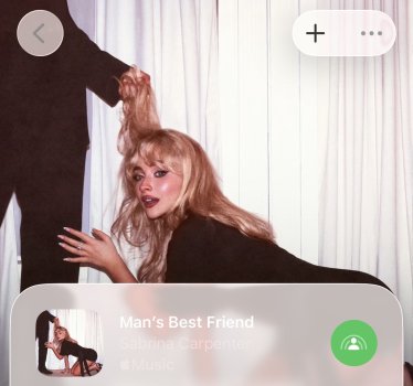
After saving the wallpaper, it completely changes. It’s not even dimming the screen for notifications and has black text instead. Even on dark mode. It’s adapting to the wallpaper.
Ps, sorry, don’t mind the random crazy PS party chat 😂😂
View attachment 2541757
View attachment 2541758
Ps, sorry, don’t mind the random crazy PS party chat 😂😂
View attachment 2541757
View attachment 2541758
Am I the only one missing the "Select" option in the Mail App on iPadOS? It's there on iOS, but on my iPad when I'm in the Junk folder or Trash folder, there's no more option to press Select so that you can tap and drag or select all to delete all items in the trash.. I'm left to just swipe swipe swipe away each and every individual email :-/
Here you goWhat does Books look like in current beta?
No changes other than a tab bar. We’ll have to wait for iOS 36 to get new fonts and reading time calculations.What does Books look like in current beta?
They are really going to ship this like this eh?
"Liquid Glass is fine, they said. I mean, we can agree and disagree all day on whether this is good design, but I don’t see how anyone can say this is in a good enough shape to ship."
https://files.mastodon.social/media...639/191/729/530/original/8f5bf07db469f5f2.mp4

 elk.zone
"Liquid Glass is fine, they said. I mean, we can agree and disagree all day on whether this is good design, but I don’t see how anyone can say this is in a good enough shape to ship."
https://files.mastodon.social/media...639/191/729/530/original/8f5bf07db469f5f2.mp4

Tuomas Hämäläinen 🇺🇦 (@tuomas_h@mastodon.social)
Attached: 1 video Liquid Glass is fine, they said. I mean, we can agree and disagree all day on whether this is good design, but I don’t see how anyone can say this is in a good enough shape to ship.
Didn’t noticed that - but yeah it’s kinda weird looking, but I guess its because of the German translation and the longer word that’s resulting from this
Here you go View attachment 2541871
How the “bubble” showing the selected tab starts to go over the word for the second tab (the top corner of the B in Bibliothek) looks sloppy to me and lacks attention to detail from Apple.
Although I don’t mind the look/premise of Liquid Glass when playing around with the betas on my spare iPhone 11, I don’t feel that it’s ready for prime time. Like others have said in this thread, I can’t see it all being ironed out for the public release of iOS 26.0.
It’s also because they chose a design where the “active” indication overlaps with adjacent controls. That’s just not good UI design, IMO.Didn’t noticed that - but yeah it’s kinda weird looking, but I guess its because of the German translation and the longer word that’s resulting from this
Me neither - but we will see in 11 days after the event with RC. Fingers crossed 🤞 for a better RC than the beta 8 right now in terms of visualsHow the “bubble” showing the selected tab starts to go over the word for the second tab (the top corner of the B in Bibliothek) looks sloppy to me and lacks attention to detail from Apple.
Although I don’t mind the look/premise of Liquid Glass when playing around with the betas on my spare iPhone 11, I don’t feel that it’s ready for prime time. Like others have said in this thread, I can’t see it all being ironed out for the public release of iOS 26.0.
There's a lot of "sloppy" in iOS 26 so far. Don't expect much to improve between now and launch.How the “bubble” showing the selected tab starts to go over the word for the second tab (the top corner of the B in Bibliothek) looks sloppy to me and lacks attention to detail from Apple.
Although I don’t mind the look/premise of Liquid Glass when playing around with the betas on my spare iPhone 11, I don’t feel that it’s ready for prime time. Like others have said in this thread, I can’t see it all being ironed out for the public release of iOS 26.0.
Am I the only one missing the "Select" option in the Mail App on iPadOS? It's there on iOS, but on my iPad when I'm in the Junk folder or Trash folder, there's no more option to press Select so that you can tap and drag or select all to delete all items in the trash.. I'm left to just swipe swipe swipe away each and every individual email :-/
For me it is there in the three dot menu option …
songs in apple music randomly skip to the next song.. i feel like this was a bug in ios18 a while ago too.
Register on MacRumors! This sidebar will go away, and you'll see fewer ads.


