Become a MacRumors Supporter for $50/year with no ads, ability to filter front page stories, and private forums.
Status
The first post of this thread is a WikiPost and can be edited by anyone with the appropiate permissions. Your edits will be public.
Also, the glass reflective parallax effect on the home screen app icons when tilting the phone side to side, seems toned down over past betas, like less glassy and less reflective. ugh.
Hmm don’t have the feeling. Probably toned done a tiny bit.
Not a huge fan of this. I got used to it over the weeks but in some way it still looks a bit cheap.
 
Release ready!

IMG_2229.png
 
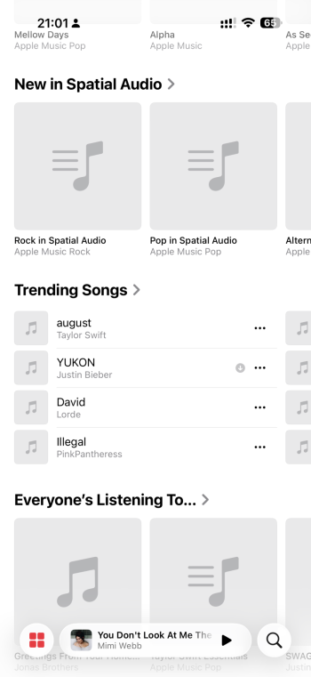
There are some issues but in terms of readability they made a noticeable progress during the beta process.
Again here: not everyone will be 100% satisfied with this new design. There are people who want the more transparent glass back from DB1, then there are others like you who want it more toned down to increase the readability.
Both is legit, but both won’t be possible at the same time. I think overall they found a solid solution now.
Some details and animations are still lacking, that’s where I fully agree.
Sure it’s possible. Just give us a slider that allows the user to adjust to more liquid glass or more frosted. Problem solved.
 
Interesting, I have 2.8GB on 15PM and 2.6GB on 14P. Hefty updates from Beta 7.
None of them have been that large. If you can get to storage quickly enough you’ll see the actual size. Very small compared to what’s shown in the update. It’s assumed to be a bug. Regardless each one downloads very quickly and installs just as fast. Only my initial 26 install took any time.
 
It just needs to never remove the Liquid Glass filter. It doesn’t when you long-press or single tap it. It’s always there. Until you are actually in the app and return to Home Screen… that’s the only time it’s not. Definitely a bug.
Man, you are absolutely right! Good catch!
When you long press an app-icon, the glassy outline stays, if you move the icon around it stays!
Just when closing the app, the closing animation itself is buggy and lets the outline pop in after the animation is done.

I cannot believe Apple is gonna ship iOS 26 with such a visible glitch. It’s bothering me like crazy. 😫
 
They can't seem to fix the 2 problems of the app popping back into the folder awkwardly and some icons showing correctly in an open folder as dark mode icons and then switching back to light when the folder is closed. These things are super annoying and show a lack of attention to detail that I would normally expect from Apple. And yes... I have reported these.
 
All these visual issues at this stage are kinda nuts. Like, where's their QA team?

Here's a theory.

Maybe they realized beta 6 was peak polish, BUT it was sucking up too much battery and as a compromise, they removed some of the liquid glass intensive effects and slowed down the way effects render, accounting for all these very clear visual bugs in order to save battery.

It's the only explanation that comes to mind.

Or they dropped the ball in their QA efforts...
 
After install did another reboot, it came back and said it couldn’t active cellular. T-Mobile / iPhone 16 Pro. Did a network and reset and seems to be back. Just documenting for a weird occurrence.
 
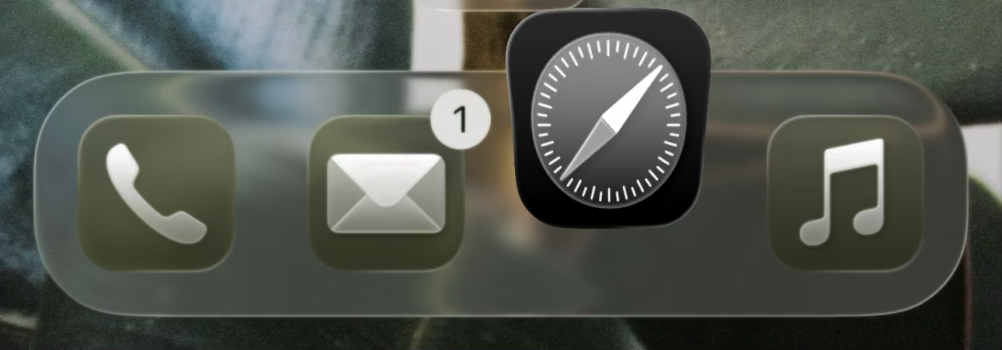
it really stresses me out how still on Beta 8 we only see an actual liquid glass dock for a split second when opening an app.
yeah this captures the issue I was talking about.

only way to not have glitchy app icons when opening and closing apps is to use the default homescreen bright theme or the default dark icons theme.

Any other combo (like clear icons theme or tinted icons theme) and it's glitch city.
 
Register on MacRumors! This sidebar will go away, and you'll see fewer ads.