dannyyankou
macrumors P6
It seems to only happen in light mode too.
It seems to only happen in light mode too.
You guys forgot that they changed the whole design language !
It’s most likely like back in times where they released iOS 7 !
And it’s way better than this !
So keep calm and live with it for a while - it will most likely get fixed.
Somewhere in the future!
As many said already in 26.1 or so.
Fixed for me. Went from dev b8 to public b6. iPhone 15 Pro phone.Downloading. Have they fixed the bug where when you hold your finger down on text in Spotlight to bring up the magnifying glass loupe to select, that it glows so you can't see what you're selecting?
Yep but RC will bring some changes that will be officially announced during the event (or maybe they just unlocking in RC some of them). This is especially common in the case of watchOS, where they just cannot add for example a new watch faces to the betas in advance, because someone could spot them before the official event. Once they announce the changes, they can officially put them in RC and all that remains to us is to wait a two-three weeks for the new hardware.the rc won’t have major design changes
I don’t think file size means they are wastefully pushing out betas with no changes.Also like I said, it seems they’re just releasing the same Buggy beta since beta 7. Same file size and no visual bugs fixed.
That doesn’t change the design tho; that’s final nowYep but RC will bring some changes that will be officially announced during the event (or maybe they just unlocking in RC some of them). This is especially common in the case of watchOS, where they just cannot add for example a new watch faces to the betas in advance, because someone could spot them before the official event. Once they announce the changes, they can officially put them in RC and all that remains to us is to wait a two-three weeks for the new hardware.
Do agree here. This is awful. Hopefully they found a solution in 26.1Mine too but the glassy outline popping in after app closure is driving me crazy and so killing all my good feelings about iOS 26 (like the speed-up app opening animations and the general look that I really like).
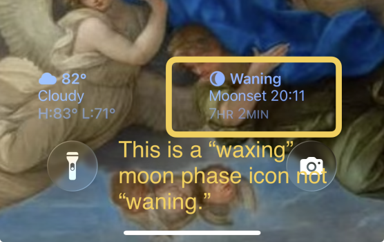
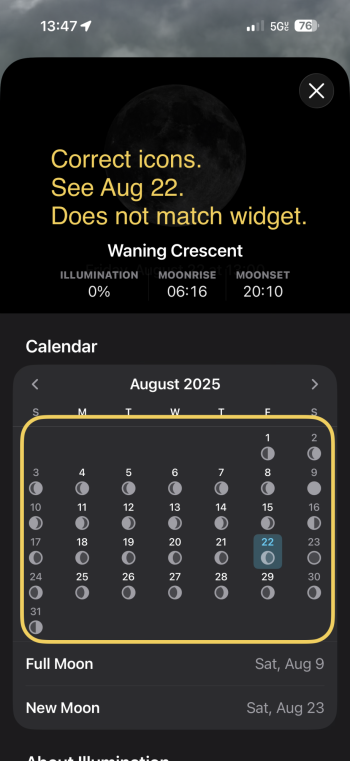
View attachment 2542927
How can everyone at Apple (exec-team?) not see that? I am 100% sure, that this ugly visual glitch will be exactly the same on aaaaaall shiny new 17-series out of the box.
That is exactly the lack of attention for detail that I hated for years on Android. Now Apple too seems to not give a single f*** about details. Woks somehow? Good to go! Looks like sh*t? Pfff, not wasting any time on it. Sad.
I will ask again: WHAT DID THEY CHANGE?I don’t think file size means they are wastefully pushing out betas with no changes.
I’m not having any issues on my 16 Pro Max
Well since iOS is closed source, there’s really no way to actually tell what’s been changed outside of visual bugs and general performance.I will ask again: WHAT DID THEY CHANGE?


Wait until 26.1. You'll be much happier3 months of beta testing and years of apple r and d and liquid glass ui the only real change of iOS 26 and it’s still buggy and not fully liquid glass everywhere. Apple messed up again and didn’t deliver, last 3 betas didn’t fix anything or change anything
Same hereMine is fast and smooth
I think that only happens when using the glass icons not the standard or dark ones. I actually like the dark icons myself and don't use the tinted or clear ones. So I don't experience that issue myself.Mine too (16 Pro). I can't reproduce this app icon redraw thing that some are complaining about. iOS 26 has felt pretty much like a release version since beta 8. No CarPlay issues, either.
I don't think that's a bug. More like the design they have chosen to look like glass icons. I actually like the effect myself. Its been that way from the start so I believe its intentional and will not be "fixed" since its not actually broken. SorryMine too but the glassy outline popping in after app closure is driving me crazy and so killing all my good feelings about iOS 26 (like the speed-up app opening animations and the general look that I really like).
View attachment 2542927
How can everyone at Apple (exec-team?) not see that? I am 100% sure, that this ugly visual glitch will be exactly the same on aaaaaall shiny new 17-series out of the box.
That is exactly the lack of attention for detail that I hated for years on Android. Now Apple too seems to not give a single f*** about details. Woks somehow? Good to go! Looks like sh*t? Pfff, not wasting any time on it. Sad.
LolI am surprised that many of you are surprised:
1- the real Apple, the Steve Jobs Apple, died with him
2- Tim is only milking the cow with no innovation in the last 10 years
3- Apple is 5 years behind OpenAi and Microsoft in AI (Real AI)
4- Liquid glass is just a poor distraction from their lack of creativity and innovation
That
I noticed my battery running low not even a full day chargeNice one, wasn't really happy with battery life of b8... something was off about it.