Become a MacRumors Supporter for $50/year with no ads, ability to filter front page stories, and private forums.
Upgraded earlier than I normally would because heard it was stable. I wasn't that drawn to it from the marketing but now it is on my phone (14PM) I think it looks great.

The icons pop and the glass theme is done just about right, it is a fresh new look but usability is not affected. I have had no legibility problems, the new animations are quite cool and well done, you notice them but they don't get in your way.

The keyboard buttons pop a bit more, I like the floating search bar in settings and its great to have the new call handling stuff.

Only negative so far is battery drain, but hoping this will sort itself out over the next few days.
 
Fortunately you can defeat most of the visual noise but not the coloured backgrounds in Contacts--for legibility the background ought to be white--and not the hairline white lines around icons, which catch the eye before the icons themselves.
 
It’s very much a work in progress and I see it as such. For me it’s perfectly usable and I largely enjoy using it.
 
The most annoying thing for me is the mail app not allowing full screen email in landscape mode. Whoever thought that was a good idea was wrong. As an option sure. But why take away something.
 
I haven't experienced the liquid glass look yet, but it looks like a pretty minor change compared to when they moved away from skeuomorphism, which I still miss.
Skeuomorphism in iOS was a more or less a product of necessity. You had this brand new device (iPhone) with no established paradigm. Skeuomorphism bridged the gap from real world tools to the new digital ones. But, as time and iPhone progressed, more and more the "old world" items were no longer directly analogous to the new digital tools being deployed. Hence, the need for a revamp to the flat interface.

Now, ask yourself : "What was the need for Liquid Glass"?" Well, Apple had to have something to distract from their HUGE AI fail.

I can hear the conference room meeting now:

Manager : "Now that our AI failure is publicly known… What can we do to revitalize the mundane iPhone product line?!?"
Developer : "Well, we could develop a new UI for the OS. We're Apple! We know how to do UIs!"
Manager: "Good. But make it glitzy and eye catching. We needs the eye candy."
Developer: "OK. What should we call it?!?"
Manager (looking around conference room in big circular glass building): "We'll call it Glass!"
Developer: "Too generic. (Takes sip of coffee but dribbles some on his Apple branded Polo shirt). How about Liquid Glass?"
Manager: Amazing. Yes, let's go with that!

I know I'm exaggerating for comedic effect. But, I wouldn't be surprised that parts of it kinda went down like that.
 
I put the beta on my iPad. Only a few boxes have a strong refraction effect along the edges. When it's strong, it's nice, but when it's weak it's basically pointless.

If they just applied frosting after a heavy edge refraction, it'd probably be the best of both worlds. I might write a shader to play with that.
 
I quite like it. For me it’s readable and the effects look good. It feels faster on my 15 Pro and battery life is about the same after a couple days.

There are certainly bugs but really we’re in the actual public beta phase of a software release so I expect them to get ironed out.
 
  • Like
Reactions: I7guy


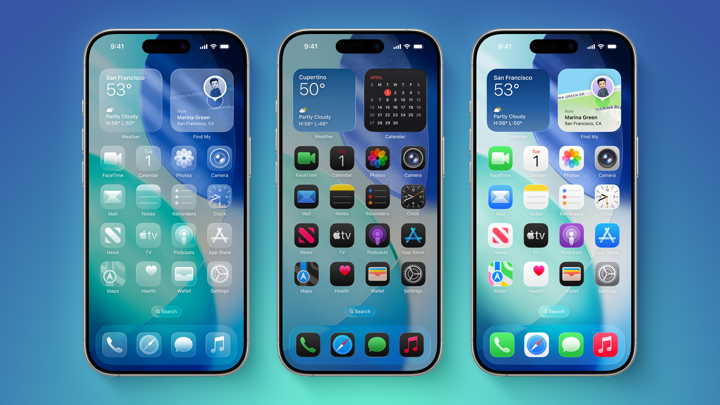
It's been two days since iOS 26 was released, and Apple's new Liquid Glass design is even more divisive than expected.

iOS-26-on-Three-iPhones.jpg

Any major design change can create controversy as people get used to the new look, but the MacRumors forums, Reddit, Apple Support Communities, and social media sites seem to feature more criticism than praise as people discuss the update.

Complaints

There are a long list of complaints about Liquid Glass, from the impact on readability to lag caused by animations. Here are some of the main critiques:
Some People Like It

On the MacRumors forums, complaints about Liquid Glass are interspersed with responses from people who have been using it during beta, and the consensus is "you'll get used to it."

It does always take time to get used to a new look, and Liquid Glass will become less jarring as people become accustomed to the new animations and the behavior of buttons and other interface elements.

Not everyone hates Liquid Glass, and there are also many positive comments from people who prefer the new design. Some of that sentiment:
Media Complaints

iOS 7

Everyone remembers iOS 7, because it was the first big design change that Apple made to iOS. Apple did away with skeuomorphism in favor of a "flat" design, and it was not a change that people were prepared for. A lot of the comments shared when iOS 7 came out mirror the comments we're seeing now about Liquid Glass.
Despite the complaints about iOS 7, Apple stuck with it. There were ongoing refinements to fix bugs and to tweak the overall design, but Apple didn't reverse course. Design updates in iOS 8, iOS 9, and iOS 10 didn't change the fundamentals, but it got better and bette... Click here to read rest of article

Article Link: iOS 26's Liquid Glass Design Draws Criticism From Users
It feels so cluttered, almost magnified. Things feel like they are floating around everywhere and when you actually interact with your phone there is less screen space for the actual output area
 
  • Like
Reactions: No_comment
For the record I love it but I know someone with the 13 and someone else with the 11 Pro and everything looks all messed up and everything has a white outline when it should be liquid and satisfying
 
I am om iphone 12 mini and really enjoy the glass UI.
it looks really cool and is not just a flat surface , UI looks more 3D and futuristic. It’s basically modern skeuomorphism done right. Glad it’s a step away from totally flat surfaces.
All apple has too do is continue to polish it. It’s so playful and looks beautiful.
 
  • Like
Reactions: Big_D and foggygray
I must admit, after installing the 26 beta on my iPad, I was wondering what all the fuss was about, I was disappointed that it wasn't "in your face", it was so subtle that I was actually opening and closing apps and looking in the settings, to see if it was turned off... It was, it was just so subtle I wasn't seeing it.

I've now upgraded everything and with the icons set to "standard", I hardly notice any difference.
 
  • Like
Reactions: gusmula
In general, I like it, it is a very cool and impressive design

But....

Closing tabs on iPhone Safari; it is an extra tap, useless
iPad and iPhone feel sluggish (iPad Pro M2 and iPhone 16 Pro Max)
I can't understand why every iOS is like starting from scratch in terms of bugs...
Animations are a bit too much in notifications

And in general, it is a change, but it is very, very minor.
All the noise about it, as it was a completely new experience, not true. You forget about it 2 days after, except the lag and bugs
 
I think it is a solid design and am happy with it. I have watched it mature since the early developer betas and I am sure it will continue to mature. I also appreciate that all of my devices moved to this design at the same time.
 
  • Like
Reactions: foggygray
The contest is a huge issue for me, and many icons do look blurry, especially in light mode, due to them having a light border at the edges. So the edges get an anti-aliasing effect for when you need something to blur into the background.
 
Aqua was extremely innovative and exciting back then, and set a whole design aesthetic that went far beyond the computer industry - liquid glass is just a cheap rehash that doesn’t go nowhere as far - please do not use today’s standards as a parameter to judge things in hindsight.
That’s like criticizing Humphrey Bogart for smoking in movies back in the 1940s.
I was more trying to draw attention to the fact that modern Apple has had a history of decisive UI redesigns.

I remember that era very clearly.

Many people really did not like what Apple unveiled at the time - 10.0 and the betas before that - along with how OS X discarded a lot of traditional macOS UI paradigms.

I remember clearly how in the first few years of the 00s, we gradually saw the pinstripes and translucency toned down, until by the time of leopard, the default UI was a kind of grey and the pinstripes, glowing glass buttons and scroll handles etc (and brushed metal!) had been shown the door.

I give this example as:

Firstly, Apple HAS gone down this route of using glass and translucency etc in their ui before

Obviously this time around it has been primarily applied to the touch paradigm (it’s obvious that Liquid Glass is mostly intended for the iPhone). Whereas aqua was applied to the traditional 80s/90s desktop UI.

Secondly, by now, perhaps it’s getting slightly tiresome that we all have to experience a divisive UI redesign which apple rapidly refines.

(Having said that, I was one of the people who loved the initial 7.0 release).

Like Apple did with 10.0, perhaps it would be good to have longer beta cycles than 3 months, to allow everyone to feed back properly - and for Apple to properly refine their work.
 
Skeuomorphism in iOS was a more or less a product of necessity. You had this brand new device (iPhone) with no established paradigm. Skeuomorphism bridged the gap from real world tools to the new digital ones. But, as time and iPhone progressed, more and more the "old world" items were no longer directly analogous to the new digital tools being deployed. Hence, the need for a revamp to the flat interface.

Now, ask yourself : "What was the need for Liquid Glass"?" Well, Apple had to have something to distract from their HUGE AI fail.

I can hear the conference room meeting now:

Manager : "Now that our AI failure is publicly known… What can we do to revitalize the mundane iPhone product line?!?"
Developer : "Well, we could develop a new UI for the OS. We're Apple! We know how to do UIs!"
Manager: "Good. But make it glitzy and eye catching. We needs the eye candy."
Developer: "OK. What should we call it?!?"
Manager (looking around conference room in big circular glass building): "We'll call it Glass!"
Developer: "Too generic. (Takes sip of coffee but dribbles some on his Apple branded Polo shirt). How about Liquid Glass?"
Manager: Amazing. Yes, let's go with that!

I know I'm exaggerating for comedic effect. But, I wouldn't be surprised that parts of it kinda went down like that.
Manager: "But deliver it on time without bugs. Make it perfect so as NO ONE complains. We don't need another flop after AI disaster. We're Apple, you know.".
Designer(panicky): " Sure boss, sure boss.".

The rest is history.
 
My #1 gripe is LEGIBILITY. And seems like LG (liquid glAss) is a step backwards in that respect.
I refuse to update. I bought a new old phone just last week with iOS 18 and will not update from that until Apple starts making changes to improve readability. I"m not even "that old" and I want to read my content, not marvel at ui chrome all day.
LG should have been a THEME that one could choose. Apple could have approved, or only Apple provided themes, like standard, glass, super flat, etc.
 
Register on MacRumors! This sidebar will go away, and you'll see fewer ads.