That's exactly what I was saying in the part that you quoted.You and I know VERY different people.
Just about everyone in my life, especially on the older side, can't stand the annual rearranging of the deck chairs that makes them have to figure out all over again "how to do things on their phone".
Got a tip for us?
Let us know
Become a MacRumors Supporter for $50/year with no ads, ability to filter front page stories, and private forums.
iOS 26's Liquid Glass Design Draws Criticism From Users
- Thread starter MacRumors
- Start date
- Sort by reaction score
You are using an out of date browser. It may not display this or other websites correctly.
You should upgrade or use an alternative browser.
You should upgrade or use an alternative browser.

That's exactly what I was saying in the part that you quoted.
My apologies for misunderstanding you -- I need more coffee ☕️ 😂
People will cry and complain software looks old, stale, boring...we want new things....until they get shiny new things. Then they complain again.
Really? That’s news to me. The standard clock has been default for as long as I can remember. With iOS 26 it looks like they made the now playing artwork standard. Which I think is terrible personally.I think I found this out by accident, but tapping on the album artwork on the lock screen is essentially a toggle between full screen now playing artwork or standard lock screen wallpaper with the small player widget. I can’t remember which iOS version this functionality was first introduced in but it’s been around for a good few years now.
well, its got a lot of bugs. I know there's issues with liquid glass, and I have them too, but the bugs are annoying. also design for the sake of it..... not a fan.
Call from an unknown number that ends up hidden in the submenu, and until it’s deleted/marked as known in the Phone app, the little blue number stays at the top right.
If you check the contact details, this shows up:

In real use, the text "Voicemail messages" is barely visible, and all the sections below are ridiculously oversized, wasting a ton of space.
And then, if you open the Photos app to view the screenshot...
 The bottom part is just RIDICULOUS!
and this is just one of countless example of this mess!
If you check the contact details, this shows up:
In real use, the text "Voicemail messages" is barely visible, and all the sections below are ridiculously oversized, wasting a ton of space.
And then, if you open the Photos app to view the screenshot...
and this is just one of countless example of this mess!
There are schools and texts that have studied and outlined user experience guidelines. There is no reason we should need to get used to an operating system engineered by a three trillion dollar company. There are established rules that, if followed, would turn your phone into a magically intuitive device. I'd argue that the people involved in the early years of the Macintosh helped establish some of these rules.“More divisive than expected.” Really? By who, Execs? The designer’s mom? Liquid Glass is a UI/UX nightmare. I’m shocked it made it past the first internal pitch - let alone to a shipping product for the masses. In so many instances across the entire OS, it makes using iPhone more difficult. That is very unApple to date. And the global inconsistencies are just bonkers.
I find the “you’ll get used to it” response pretty lame. Sure, we’ll “get used to it” - it’s what humans do. We tolerate. We adapt. We’ve been adapting to far more consequential atrocities all along. But mistaking adaptation for acceptance can be dangerous - they’re very different. For in the former lives a desire for something better. Left unchecked, can lead to motivation. Motivation can lead to change.
Having run the betas the past month, I’ve adapted. But I don’t like it. The experience already has me curious about iOS 27 - which has not usually been the case for me. Strange times.
It's evident that the people now responsible for the iPhone experience (the execs) are not well educated and care more about wow! factor than intelligent design. I'd venture to guess they're trying to reproduce the iMac / Aqua era that perhaps made them want to join the Apple team.
Every time Apple changes the interface, even just a minimal cosmetic styling change, lots of people don't like it. Oh well, anyway. I've been using it since the first developer beta and I like it. It's a nod back to skeuomorphism of the past, which many people also vocally complained about; both when it was new and again when Apple took it away. As usual, media like FastCompany are churning out rage bait and sloppy written non-articles as they continuously shovel their content diarrhea. I named them because I've seen at least three different write-ups from them complaining about Liquid Glass and a few more about other iOS and MacOS 26 changes. Apparently someone writing (prompting AI) for them thinks that removing Launch Pad from MacOS is some sort of travesty. Apple tracks metrics, almost nobody used Launch Pad.
Call from an unknown number that ends up hidden in the submenu, and until it’s deleted/marked as known in the Phone app, the little blue number stays at the top right.
If you check the contact details, this shows up:
View attachment 2551485
In real use, the text "Voicemail messages" is barely visible, and all the sections below are ridiculously oversized, wasting a ton of space.
And then, if you open the Photos app to view the screenshot...
View attachment 2551486The bottom part is just RIDICULOUS!
and this is just one of countless example of this mess!
Absolutely, 100%, totally unacceptable.
What is that there ... like THREE layers of overlapping semi translucent content?
I have no clue how Apple are going to solve stuff like this if they are going to insist on "glass".
There is a very good reason why signage in the real world isn't translucent.
So what do you feel has been altered that affects intuitiveness of the iPhone? Apple has the most consistent user interface experience there is and the most stringent UI guidelines out there for any consumer device. And almost none of that has changed with this new release.There are schools and texts that have studied and outlined user experience guidelines. There is no reason we should need to get used to an operating system engineered by a three trillion dollar company. There are established rules that, if followed, would turn your phone into a magically intuitive device. I'd argue that the people involved in the early years of the Macintosh helped establish some of these rules.
It's evident that the people now responsible for the iPhone experience (the execs) are not well educated and care more about wow! factor than intelligent design. I'd venture to guess they're trying to reproduce the iMac / Aqua era that perhaps made them want to join the Apple team.
Edit> One change I would suggest now that I've been using it since the first developer beta is to darken the Liquid Glass elements more and if they overlap the ones behind are darker and more obscured. I'm seeing people post glitchy interface examples here that I have not personally experience on my 15 Pro Max.
If you have to get used to something, it - by definition - is not good design. It may be attractive design or unique design or inventive design but it is not good from the perspective of a user interface. A good design would get out of the way and be effortlessly intuitive.It absolutely does require getting used to. iOS 6, according to some, the pinnacle of iOS with its over abundance of skeuomorphism required a lot of getting used to.
Apple is no longer the 'it just works' brand. It's the 'you're holding it wrong' brand.
Absolutely. As soon as my phone booted up I was able to:I love it, especially because they did something as minimally controversial as possible. A billion more people have Apple OS access than their last redesign, so they had to make it feel like the same OS, unlike with iOS 7. People are complaining it didn't change enough, but if it did all those OTHER (and more numerous) people would complain even more that they have to relearn everything. People are complaining it changed too much, which is obviously untrue, and if they changed less you'd have more people saying they changed way too little for a once-a-decade redesign. This is proof to me that this is what a modern redesign should be: clearly different but not requiring relearning. The fact that you have only moderate and temporary backlash from both sides (people who think it's too different vs too similar) is indicative that it's in that sweet spot, as opposed to unilateral and much louder backlash from more of one side, indicating they actually changed too much or too little.
1. Check emails
2. Check Facebook using safari
3. Take a picture
4. Make a phone call
No relearning necessary.
I don’t think we will agree on this. So I had to get used to iOS 6. Does that mean it wasn’t a good design? In fact I took an Apple class on how to use iOS.If you have to get used to something, it - by definition - is not good design. It may be attractive design or unique design or inventive design but it is not good from the perspective of a user interface. A good design would get out of the way and be effortlessly intuitive.
I don’t agree, but ymmv.Apple is no longer the 'it just works' brand. It's the 'you're holding it wrong' brand.
I like it but is buggy as hell. And janky. Macos also sucks. My mouse disappears if i try to use the visualizer in apple music. On the phone i get hiccups in animations all the time. Scrolling in safari gets stuck constantly. A bunch of first party apps dont work right. It’s a mess. They have so much work to do.
So what do you feel has been altered that affects intuitiveness of the iPhone? Apple has the most consistent user interface experience there is and the most stringent UI guidelines out there for any consumer device. And almost none of that has changed with this new release.
Read up one post (post 465).
How's the "intuitive" level there?
I like that it reminds me of OS X back in the day when they tried to make everything translucent. Seems like its the same issue 25 years later. Seems to slow down everything and there are lots of useless animations. More taps are required for many actions as well. Like closing tabs in safari (iPhone)...
This is not true. When one gets a new car they need to get used to it. Sure the new car has a steering wheel, brakes, pedal like the old car. But one has to get used to it. There was no hesitation for me to send and email, check Facebook, make a phone call or post on Macrumors.There are schools and texts that have studied and outlined user experience guidelines. There is no reason we should need to get used to an operating system engineered by a three trillion dollar company.
There are guiding principles sure, but Apple really has kept the same while introducing the new.There are established rules that, if followed, would turn your phone into a magically intuitive device. I'd argue that the people involved in the early years of the Macintosh helped establish some of these rules.
It’s not that wvident, but ymmv.It's evident that the people now responsible for the iPhone experience (the execs) are not well educated and care more about wow! factor than intelligent design. I'd venture to guess they're trying to reproduce the iMac / Aqua era that perhaps made them want to join the Apple team.
You're welcome - I would guess I learned about it through some review of iOS 16.A million thank you's. Can you tell me how you knew to do this?
That is indeed an issue. I personally have not experienced that on my 15 Pro Max... I'm seeing other people post elsewhere examples of 3 or even 4 layers of stacked elements, screen flickering, background color changes and more. All concerning and not normal for a production release.Read up one post (post 465).
How's the "intuitive" level there?
Manager: "But deliver it on time without bugs. Make it perfect so as NO ONE complains. We don't need another flop after AI disaster. We're Apple, you know.".
Designer(panicky): " Sure boss, sure boss.".
The rest is history.
A few months later (screenshot borrowed from other post)...
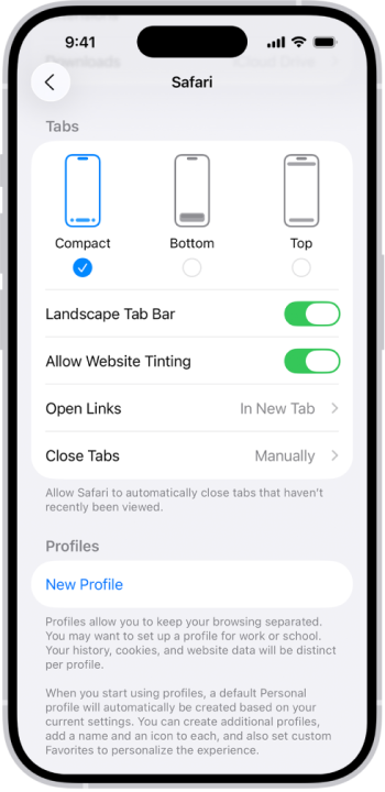
Not sure if anyone has mentioned this, but you can change that! If you go under "Safari" in the settings it gives you a few options. I am trying to get used the the compact design but I might switch it back. Change the layout in Safari on iPhone - iPhone GuideAfter reducing transparency on my 14 PM and on my watch, I like it. iOS was overdue a design change.
I don't, however, like the Safari changes which require additional clicks to get to Bookmarks and Tabs.
Attachments
I would not agree that Apple has had a consistent interface for many years now. Some apps are better than others but on the whole, they have been making overt UX choices that go against accepted guidelines as well as their own inherited guidelines (things they've typically done over time). As they've loaded more and more features into each application, they've struggled with where to put them. Sometimes a menu or action is found with a gesture, sometimes with a button on the top left or right, sometimes the main interaction is on the bottom, sometimes on the top.So what do you feel has been altered that affects intuitiveness of the iPhone? Apple has the most consistent user interface experience there is and the most stringent UI guidelines out there for any consumer device. And almost none of that has changed with this new release.
This would have been a perfect moment to re-establish consistency across the entire UX and publish guidelines for developers to follow. Incidentally, it would have been really nice to reinvent the "share" button where sharing is a small portion of what the thing does.
To be fair, I have not installed or used iOS26. I have watched videos of people using it and even claiming something to be good when it is obviously bad (notably, from this website). I'll quote myself here from another comment, "Whatever we're calling the pill-shaped-frame menu with items hidden behind it that requires multiple scrolling gestures should be trashed."
I'll add that this video in particular was one that convinced me not to upgrade: youtube.com/watch?v=DR7_vSPUYbA One example is search. After all that went down with moving Safari's url bar to the bottom and finally giving users the choice to put it where it belongs, they've planted this element at the bottom for some apps and hidden it for others. This is an indication of their awareness that phone screens are too large - and yet they also put some primary menus in the top corners (depending on the app).
They've backed themselves into a corner where no matter what they do it's going to be bad. The entire premise of the OS should be reinvented. Putting clear things on top of clear things is not solving a problem, it's creating more.
Register on MacRumors! This sidebar will go away, and you'll see fewer ads.