People complain about everything, that's fine and it's something never seen before on a phone, it's not perfect, it never will be, but they will improve it over time, come back for iOS 18 and stay there.
Got a tip for us?
Let us know
Become a MacRumors Supporter for $50/year with no ads, ability to filter front page stories, and private forums.
iOS 26's Liquid Glass Design Draws Criticism From Users
- Thread starter MacRumors
- Start date
- Sort by reaction score
You are using an out of date browser. It may not display this or other websites correctly.
You should upgrade or use an alternative browser.
You should upgrade or use an alternative browser.

I’ve noticed there is a small amount of lag occasionally, which I’m sure will get resolved. But yeah no real bugs that hamper my enjoyment. Everything else is a small amount of muscle memory.In general, I like it, it is a very cool and impressive design
But....
Closing tabs on iPhone Safari; it is an extra tap, useless
iPad and iPhone feel sluggish (iPad Pro M2 and iPhone 16 Pro Max)
I can't understand why every iOS is like starting from scratch in terms of bugs...
Animations are a bit too much in notifications
And in general, it is a change, but it is very, very minor.
All the noise about it, as it was a completely new experience, not true. You forget about it 2 days after, except the lag and bugs
Hey there haven’t been any. So…Staying on 18 for a while. I’ve learned many times to NEVER update for a week or so, because problems and issues.
It’s my guess this was in the planning long before AI. I’m not sure ai really failed here as the metric of ai success has not been defined.Skeuomorphism in iOS was a more or less a product of necessity. You had this brand new device (iPhone) with no established paradigm. Skeuomorphism bridged the gap from real world tools to the new digital ones. But, as time and iPhone progressed, more and more the "old world" items were no longer directly analogous to the new digital tools being deployed. Hence, the need for a revamp to the flat interface.
Now, ask yourself : "What was the need for Liquid Glass"?" Well, Apple had to have something to distract from their HUGE AI fail.
I can hear the conference room meeting now:
Manager : "Now that our AI failure is publicly known… What can we do to revitalize the mundane iPhone product line?!?"
Developer : "Well, we could develop a new UI for the OS. We're Apple! We know how to do UIs!"
Manager: "Good. But make it glitzy and eye catching. We needs the eye candy."
Developer: "OK. What should we call it?!?"
Manager (looking around conference room in big circular glass building): "We'll call it Glass!"
Developer: "Too generic. (Takes sip of coffee but dribbles some on his Apple branded Polo shirt). How about Liquid Glass?"
Manager: Amazing. Yes, let's go with that!
I know I'm exaggerating for comedic effect. But, I wouldn't be surprised that parts of it kinda went down like that.
What bothers me is there's no clear answer to what the glass is?
Is it window chrome that buttons sit on? In which case we still have the iOS 7 problem of "how do I tell if this is a button"?
If it's window chrome or buttons, why is the time on the lock screen made of glass? Shouldn't that be text like everything else?
Overall I like the look but I think it needs refining.
It looks bad and runs slow even on my iphone 15 Pro Max.
People did complain a lot I remember!Did people complained this much when OS X v10.0 was released? That was the first major redesign for the OS from Mac OS 9. I thought it looked so beautiful, even better is that the iMac matched the OS look. Apple can come up with great design, but this time they didn't.
What OS X v10.0 looked like:
Wayback Machine
web.archive.org
10.0 did look exciting and cool at the time.
But I remember that a lot of people were upset that 10.0 discarded a lot of the classic MacOS doing things - cascading finder windows. Finder windows that remembered exactly where they should be opened on the desktop etc.
10.0 was essentially a lick of new and exciting paint on the nextstepos.
My main complaint is that it is finally the iOS update that makes my 12 Pro Max feel old. Dropped frames and significantly lower battery life. I am a light user and used to still be ending days at about 40% battery. Now I am plugging the phone in at bed time with 3-10%.
A million thank you's. Can you tell me how you knew to do this?Unlock the phone, then tap the podcast art on the lockscreen to switch to full-size clock element.
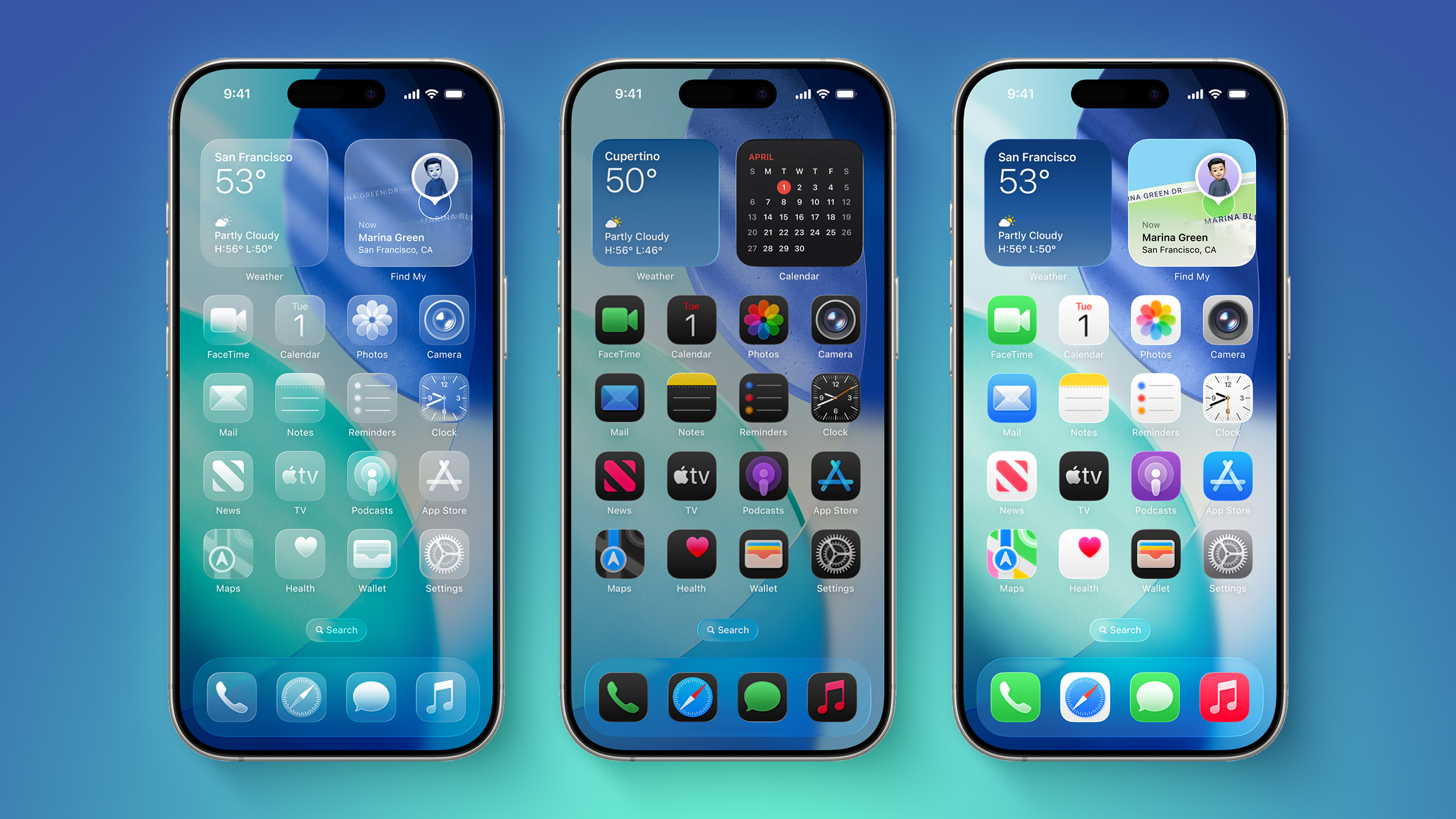
On a functional level, the new iOS is much improved - but the design has so many problematic parts.. just look at how nasty the blue bubbles in iMessage look while sending them, in that short moment when they transition from underneath the glass and get super bright..
Yes! Like what I call the "pill buttons". They used to have a round slider inside of a pill-shaped sliding area. You could easily tell if one was on or off. Now they are pill-shaped sliders that take up > 50% of the sliding space, and you now need more than a quick glance to tell how they're set. They also look bad (the alignment of the shadows makes the outer pill look uneven). But most of all, it was a completely unnecessary change.while this seems to be yet another case of "change for its own sake".
I think I found this out by accident, but tapping on the album artwork on the lock screen is essentially a toggle between full screen now playing artwork or standard lock screen wallpaper with the small player widget. I can’t remember which iOS version this functionality was first introduced in but it’s been around for a good few years now.A million thank you's. Can you tell me how you knew to do this?
There's a big difference between dimension and transparency. You can bring life to a user interface without having to put a transparent layer on top of a transparent layer.I absolutely love it. In fact I wish it was way more than it is. I have HATED the flat UI we have had since iOS 7. I hated it back then, and I never liked it. I got "used to it". I didn't start using an iPhone until I got an iPhone 7 CIRCA 2019-2020. Back when iOS 7 came out I had an HTC, and was able to keep it looking how I wanted. I did not update my iPod Touch to iOS 7.
macOS\iOS 26 brings back some of the character we had with Aqua, which shouldn't have ever left. Some people ignorantly compare liquid glass to Windows Aero, which while the comparison is incorrect, Windows Aero is another thing that shouldn't have ever left. It's like people don't have eyes. This is all a very welcome change, and I genuinely hope Apple doesn't let people bully them into going back to the horrendous flat UI I've been cursed at starring at for almost two decades.
Subjectively, I preferred the Skeuomorphism before iOS7 but have come around to what we have now (in iOS18). Bringing "tangible objects" into an unfamiliar operating system / device was brilliant. As people acclimated, it made sense to flatten the experience to utilize the free space on phone screens. Now that phones are getting larger, and processing is faster, they've rehashed old and borrowed ideas for no reasonable reason.
Meaning, sure, this might be a great time to breathe more life and space into the OS but the manner in which they've done it, by taking a three dimensional operating system and shoving it onto a sub seven inch 2D space, is fundamentally a flawed concept.
Vision Pro is a device that's used with intent while stationary. The user interface is transparent to provide the user stability in their three dimensional environment. Space is the screen so your eyes can shift focus in depth - something that's attempting to be mimicked with Liquid Glass. A phone is a mobile device that may often be used in short bursts while in motion. Its OS should should be static and provide a concise user experience for the user to accomplish a task without experiencing vertigo. The smaller the screen is, the more static the UX should be. As the experience gets bigger and the user is more often stationary, you may inherit more flexibility with the UX.
For those who like the freshness of Liquid Glass, I totally get that. It's fun. I don't know about others but this is not my concern. My concern is feeling nauseous while looking at my phone because they've shoehorned 3D space into a 2D object.
Even if they added a switch to turn transparent into frosted, seeing things move behind user interface elements is not something my brain is able to handle. Similarly, I also have a very big issue with videos / gifs that play automatically anywhere - website ads, YouTube, social feeds, Netflix, etc.
That's not even getting into the other really big concerns about what they've done by pushing interface elements around and hiding functions. Whatever we're calling the pill-shaped-frame menu with items hidden behind it that requires multiple scrolling gestures should be trashed. Everything about this OS indicates it has not been engineered by user experience professionals.
Really? It’s my experience so I thought I’d pass it on.Sounds like ads
if I push and hold on an app icon to then move it ..it disappears as I slide it around and then when I let go, it comes flying from the very bottom of the screen up to where I dropped it. ?????
You shouldn't have to get used to bad design.
And a good design doesn't require getting used to it.
In the first few days after the release of iOS 26 I've watched several YouTube videos where people talk about liquid glass and the other icon options. For the most part of these reviews come from the space "isn't this cool". There isn't a hint of criticism or even objective comment about any of it.
It's been two days since iOS 26 was released, and Apple's new Liquid Glass design is even more divisive than expected.
Any major design change can create controversy as people get used to the new look, but the MacRumors forums, Reddit, Apple Support Communities, and social media sites seem to feature more criticism than praise as people discuss the update.
Complaints
There are a long list of complaints about Liquid Glass, from the impact on readability to lag caused by animations. Here are some of the main critiques:
Some People Like It
- Animations run slow, and the interface feels sluggish on older iPhones.
- The constantly changing colors, shapes, and shading are distracting.
- The animations make no sense.
- It looks like a Barbie phone with battery wasting features.
- Basic actions require too many taps.
- The bubbles and floaty icons are cartoony.
- The contrast is awful.
- Some app icons look blurry.
- The design is inconsistent, and some things are flat while some are glass.
- Highlights on UI elements are inconsistent.
- It's hard to read things like notifications.
- The effects are too subtle for the system overhead costs.
On the MacRumors forums, complaints about Liquid Glass are interspersed with responses from people who have been using it during beta, and the consensus is "you'll get used to it."
It does always take time to get used to a new look, and Liquid Glass will become less jarring as people become accustomed to the new animations and the behavior of buttons and other interface elements.
Not everyone hates Liquid Glass, and there are also many positive comments from people who prefer the new design. Some of that sentiment:
Media Complaints
- It makes the iPhone feel faster.
- It feels modern and clean, and makes a boring smartphone a little more fun.
- It's bright, bouncy, and just plain cool to use.
- Getting notifications is satisfying, and the Lock Screen keypad is like bubbles.
- It's fresh and easy to get accustomed to.
- iOS 18's flat UI was depressing, so iOS 26 is an improvement.
- It's technologically impressive with the light refraction and diffusion of chromatic aberration.
- The icons are slick and it harkens back to the OG Apple UI design.
iOS 7
- The unbearable sameness of Liquid Glass
- Liquid Glass Could Be One of Apple's Most Divisive System Designs Yet
- This Liquid Glass Optical Illusion on iOS 26 Is Driving Me Insane
- Apple's Liquid Glass: The liquid works, but the glass is broken
Everyone remembers iOS 7, because it was the first big design change that Apple made to iOS. Apple did away with skeuomorphism in favor of a "flat" design, and it was not a change that people were prepared for. A lot of the comments shared when iOS 7 came out mirror the comments we're seeing now about Liquid Glass.
Despite the complaints about iOS 7, Apple stuck with it. There were ongoing refinements to fix bugs and to tweak the overall design, but Apple didn't reverse course. Design updates in iOS 8, iOS 9, and iOS 10 didn't change the fundamentals, but it got better and bette... Click here to read rest of article
- iOS 7 Interface Design is so UGLY!
- The real problem with iOS 7 Design
- Does anyone dislike IOS 7 as much as I do?
- iOS 7 Bugs: Will They Ever be Fixed
- The biggest complaints about iOS 7 so far
- The design of iOS 7: simply confusing
Article Link: iOS 26's Liquid Glass Design Draws Criticism From Users

The obvious thing that comes to mind it's how mind numbingly stupid the idea of deleting all colors from your icons or replacing all colors with a single color is to the UI. The first thing we noticed when we see any icon is its color. Ask any Apple user the colors of the icons for FaceTime, Messages, Safari and photos, and they will instantly tell you; green, green , blue and the color burst. This is the way our eyes work. We are drawn to the color now Apple has given us the choice to throw that away – to make it harder to find your icons. I can't understand what's happened to Apple? That's such a ridiculous idea. Would even make it out of the development shop. And here it is being touted as one of the cool things you can do with your icons in all the new versions of the operating systems.
Just proves two people with the same phone have subjectively different experiences. Runs as fast as iOS 18 on my 15PM and looks and works great. If I am being honest there are some oddities that need to be addressed, but we will get there. But yeah, launch day stuff and all.It looks bad and runs slow even on my iphone 15 Pro Max.
People don't like change -- a tale as old as time. I love the fresh, new look of iOS 26. There are some little things I need to get used to, especial on the iPad, but it'll be second nature in no time at all.
I'm not a fan so far. It would be nice if Apple would focus on functional improvements instead of visual gimmicks. There's so much room for improvement. Maybe consider optional themes instead of forced changes like this.
It absolutely does require getting used to. iOS 6, according to some, the pinnacle of iOS with its over abundance of skeuomorphism required a lot of getting used to.And a good design doesn't require getting used to it.
After killing the Mini and not updating Siri, the iOS 26 was the last spit in my face from Apple.
Switched to Android, because even Android is better than what Apple currently does to us.
What did you end up switching to? Unfortunately I'm refusing to use a big phone
I love it, especially because they did something as minimally controversial as possible. A billion more people have Apple OS access than their last redesign, so they had to make it feel like the same OS, unlike with iOS 7. People are complaining it didn't change enough, but if it did all those OTHER (and more numerous) people would complain even more that they have to relearn everything. People are complaining it changed too much, which is obviously untrue, and if they changed less you'd have more people saying they changed way too little for a once-a-decade redesign. This is proof to me that this is what a modern redesign should be: clearly different but not requiring relearning. The fact that you have only moderate and temporary backlash from both sides (people who think it's too different vs too similar) is indicative that it's in that sweet spot, as opposed to unilateral and much louder backlash from more of one side, indicating they actually changed too much or too little.
People are complaining it didn't change enough, but if it did all those OTHER (and more numerous) people would complain even more that they have to relearn everything.
You and I know VERY different people.
Just about everyone in my life, especially on the older side, can't stand the annual rearranging of the deck chairs that makes them have to figure out all over again "how to do things on their phone".
Apple unfortunately won't care. If they did, and changed things, they would have to admit their design was a dumb idea. (It was.) Apple will tell people they are "holding their phone wrong".
I'm convinced this would have never been released like this if Jobs were still here.
I'm convinced this would have never been released like this if Jobs were still here.
Register on MacRumors! This sidebar will go away, and you'll see fewer ads.