First time I’ve not wanted to upgrade to a new version of iOS. Give me a switch to turn off liquid glass altogether please. The reduce transparency thing doesn’t cut it.
Got a tip for us?
Let us know
Become a MacRumors Supporter for $50/year with no ads, ability to filter front page stories, and private forums.
iOS 26's Liquid Glass Design Draws Criticism From Users
- Thread starter MacRumors
- Start date
- Sort by reaction score
You are using an out of date browser. It may not display this or other websites correctly.
You should upgrade or use an alternative browser.
You should upgrade or use an alternative browser.

My bet to fix this broken miracle will take at least three years. This was a rush to please investors, it's absolutely the same story as with cyberpunk. The most important thing is how competitors will react, whether users have swallowed and so on... Because the final word is always the end user who votes with his wallet. My subjective opinion: this is a failure, a failed iPhone design, a failed OS launch, and a failed promise of AI functionality when was released iPhone 16...
Tim should take a walk
Much love!
Tim should take a walk
Much love!
Last edited:
Lifetime Apple user here. I’ve been through plenty of issues, but nothing like the garbage that is iOS 26. iOS 26 is the first Apple product that is making me seriously consider switching to Android. And I dislike Android and Google very, very much. Tim Cook has lost the entire vision of Apple and has to go. They’re making visual changes just to make changes, and they don’t even work. Apple can’t be bothered to do things correctly anymore. The OS is so buggy it’s embarrassing. It’s filled with dozens of bugs across virtually every app and “feature”. Jobs would have fired half the company for releasing this trash, and rightly so. Did Tim Cook fire the entire quality control department so he can buy an 18th yacht? WTF Apple?!! If I turned in work like this I would be fired. If one of my employees turned in work like this they would be fired. Why does Tim Cook approve this, does he not care? Then he holds a press conference and calls this beta level garbage AWE-inspiring? Awful.
For everyone saying the complaints are trolls, have you actually used iOS 26? Here is a list of just a few of the bugs. This is embarrassing.My issue is not with the design, it's with the sloppiness. Both iOS 26 and macOS 26 are full of visible bugs - ones which have been around, and well reported since the initial betas. There are gross inconsistencies everywhere, and basic legibility has gone out the window.
I am generally forgiving of a bug here and there, but what I am seeing is a complete disregard of any form of QC from Apple. For a trillion $ company their sheer inability to have a small team of developers focus on each official app to clean up very visible UI issues is appalling.
That is the main issue here.
Note: A simple example of well-reported bugs, which have been around since B1 and are unfixed:
- Spotlight: Swipe down... the search bar is a mess of overlapping text for a second until it fixes itself
- Home Screen: Each app icon undergoes some kind of redraw when it's minimized, making something 'pop' on the icon 1/2 second after it's finished minimizing.
- Spotlight: When you hold down on text in the search field to move the cursor, it glows so bright you cannot read the loupe at all
- Spotlight: Files content appears, despite being turned off.
- Keyboard: There are two versions of the keyboard, each which react differently to certain words. For example "Hey man how's it going man" will almost always drop the final "n" on the "old" keyboard.
Why does Tim Cook approve this, does he not care? Then he holds a press conference and calls this beta level garbage AWE-inspiring? Awful.
The gaslighting from Tim has become so loathsome and tiring.
I find it to be mostly OK on the iPhone. But some of the design elements, especially the huge rounded corners with thick borders look very cheap and cartoonish on the iPad, Mac and CarPlay. Makes me think of overzealous Android skins from 15 years ago.
It doesn’t help that the corners have different / inconsistent radii.
It doesn’t help that the corners have different / inconsistent radii.
Will not happen. Quite opposite I suppose. Actually for my app (personal use), I had to switch to customized controls as built-in just looked terribly bad in iOS26. I assume that developers had hard time lately to adapt its apps (usually based on custom GUI frameworks) to make them look at least acceptable in new Apple's GUI paradigm. I think they will ignore LiquidGlass in current state and just wait for future changes/improvements knowing that it's not worth investing in something that will change anyway as it's not ready for production use.This would have been a perfect moment to re-establish consistency across the entire UX and publish guidelines for developers to follow. Incidentally, it would have been really nice to reinvent the "share" button where sharing is a small portion of what the thing does.
Liquid Glass: a "Squirrel!" feature - have mitigated some of it by continuing to use a black wallpaper, setting icons to Dark and turning on Reduce Transparency. Setting Icons to Clear is an unmitigated disaster.
I've noted random flickering when typing in Messages. No idea - some one's idea of a "feature"?
Camera button still not required. Make it the Action Button, and make the other the on/off for sound only, as in earlier OSs.
Oh, and yeah - double-checked to ensure Siri and Apple Intelligence (ever the oxymoron) was still Off.
It's been two days since iOS 26 was released, and Apple's new Liquid Glass design is even more divisive than expected.
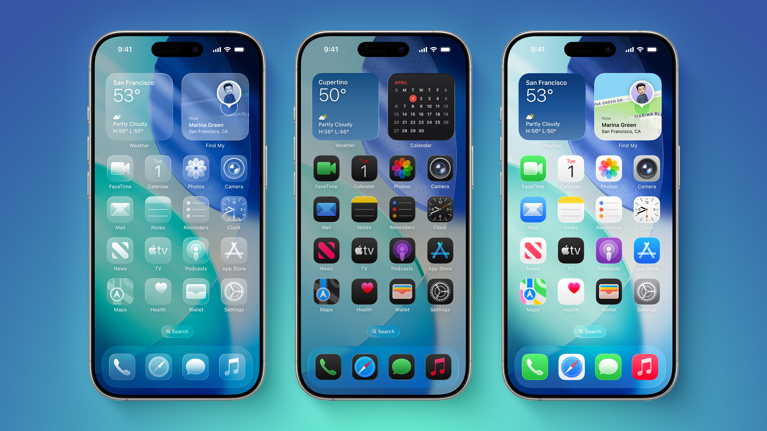
Any major design change can create controversy as people get used to the new look, but the MacRumors forums, Reddit, Apple Support Communities, and social media sites seem to feature more criticism than praise as people discuss the update.
Complaints
There are a long list of complaints about Liquid Glass, from the impact on readability to lag caused by animations. Here are some of the main critiques:
Some People Like It
- Animations run slow, and the interface feels sluggish on older iPhones.
- The constantly changing colors, shapes, and shading are distracting.
- The animations make no sense.
- It looks like a Barbie phone with battery wasting features.
- Basic actions require too many taps.
- The bubbles and floaty icons are cartoony.
- The contrast is awful.
- Some app icons look blurry.
- The design is inconsistent, and some things are flat while some are glass.
- Highlights on UI elements are inconsistent.
- It's hard to read things like notifications.
- The effects are too subtle for the system overhead costs.
On the MacRumors forums, complaints about Liquid Glass are interspersed with responses from people who have been using it during beta, and the consensus is "you'll get used to it."
It does always take time to get used to a new look, and Liquid Glass will become less jarring as people become accustomed to the new animations and the behavior of buttons and other interface elements.
Not everyone hates Liquid Glass, and there are also many positive comments from people who prefer the new design. Some of that sentiment:
Media Complaints
- It makes the iPhone feel faster.
- It feels modern and clean, and makes a boring smartphone a little more fun.
- It's bright, bouncy, and just plain cool to use.
- Getting notifications is satisfying, and the Lock Screen keypad is like bubbles.
- It's fresh and easy to get accustomed to.
- iOS 18's flat UI was depressing, so iOS 26 is an improvement.
- It's technologically impressive with the light refraction and diffusion of chromatic aberration.
- The icons are slick and it harkens back to the OG Apple UI design.
iOS 7
- The unbearable sameness of Liquid Glass
- Liquid Glass Could Be One of Apple's Most Divisive System Designs Yet
- This Liquid Glass Optical Illusion on iOS 26 Is Driving Me Insane
- Apple's Liquid Glass: The liquid works, but the glass is broken
Everyone remembers iOS 7, because it was the first big design change that Apple made to iOS. Apple did away with skeuomorphism in favor of a "flat" design, and it was not a change that people were prepared for. A lot of the comments shared when iOS 7 came out mirror the comments we're seeing now about Liquid Glass.
Despite the complaints about iOS 7, Apple stuck with it. There were ongoing refinements to fix bugs and to tweak the overall design, but Apple didn't reverse course. Design updates in iOS 8, iOS 9, and iOS 10 didn't change the fundamentals, but it got better and bette... Click here to read rest of article
- iOS 7 Interface Design is so UGLY!
- The real problem with iOS 7 Design
- Does anyone dislike IOS 7 as much as I do?
- iOS 7 Bugs: Will They Ever be Fixed
- The biggest complaints about iOS 7 so far
- The design of iOS 7: simply confusing
Article Link: iOS 26's Liquid Glass Design Draws Criticism From Users

Definitely too many taps to do basic things. Did the developers actually use any of this before sending it out the door? Sounds like changes were made for the sake of change and not necessity.
Actually, I used a few PC's at work with Vista and had zero issues. A different but not horrible interface...Apple windows Vista
Been using iPhones since the iPhone 4 and for the first time I think Apple managed a major update fairly well.
Major releases are always well opinionated with comments on all sides of the spectrum. Interesting the progression from skeuomorphic to flat to some type of 3D. Next stop 4D?
I haven’t had the issues reported here and am surprised that so many minor things and dislikes seem like showstoppers. Lots of imo, throwing the baby out with the bathwater.
There were smartphones and dial-capable PDAs well before the iPhone.Skeuomorphism in iOS was a more or less a product of necessity. You had this brand new device (iPhone) with no established paradigm. Skeuomorphism bridged the gap from real world tools to the new digital ones. But, as time and iPhone progressed, more and more the "old world" items were no longer directly analogous to the new digital tools being deployed. Hence, the need for a revamp to the flat interface.
Now, ask yourself : "What was the need for Liquid Glass"?" Well, Apple had to have something to distract from their HUGE AI fail.
I can hear the conference room meeting now:
Manager : "Now that our AI failure is publicly known… What can we do to revitalize the mundane iPhone product line?!?"
Developer : "Well, we could develop a new UI for the OS. We're Apple! We know how to do UIs!"
Manager: "Good. But make it glitzy and eye catching. We needs the eye candy."
Developer: "OK. What should we call it?!?"
Manager (looking around conference room in big circular glass building): "We'll call it Glass!"
Developer: "Too generic. (Takes sip of coffee but dribbles some on his Apple branded Polo shirt). How about Liquid Glass?"
Manager: Amazing. Yes, let's go with that!
I know I'm exaggerating for comedic effect. But, I wouldn't be surprised that parts of it kinda went down like that.
People tend to forget how much design complaints are really about familiarity. When Apple changes the look of iOS, the first reaction is often negative because the old design feels comfortable and the new one feels strange. Psychologists call this status quo bias: people prefer what they already know, even if the change is objectively better in usability or aesthetics. The same happened when iOS 7 dropped skeuomorphism, when macOS went flat, and when Safari moved its address bar. Each time, forums filled with frustration, and yet within a year most users accepted the new style as normal. (...)
On a daily basis I'm a BI architect and our team designs a lot of dashboards for our product team in a big boring multinational corp. So I'm quite aware of the UI design, so I thought this is my chance to give a professional opinion from my area of subject matter expertise.
Not about aesthetics, because de gustibus non est disputandum, but usability of these changes. And just to clarify - I don't mean the whole of it. There are many nice changes that I like, but by all means, the option to have colourless glass icons is just bad. It's like what Microsoft tried around Windows 8 (I'm not entirely sure) when they got rid of all the colours in Visual Studio and some other apps. That was bad and this is also unequivocally terrible. Why would anyone decide to remove one key component of human perception, i.e. the colour? It just makes things more difficult, it is detrimental to usability. Of course, fortunately, this is just one of the options and you can keep the icons about the same as they were in previous version of iOS. But the whole idea of glass icons is just bad for usability. This was nicely stated by others I'm not directly quoting.
My first reaction after installing beta 4 or 5 was - does Apple hate old people and others with visual impairments now? It got slightly better in later versions, but overall the legibility of the interface took a downward turn. You can turn if off using Accessibility settings, but I don't think that's a point of properly designed UI if you have to switch off one of its default main qualities.
On top of that there are many unresolved bugs where white light text is displayed on a light background (either by default or when you e.g. turn on bedtime mode, etc.) or similar usability issues, where bugs were not addressed before the release. I opened some 15 bugs myself to which I didn't received any reply, but 8 of them were solved by RC and 7 remain open.
I bought my own copy of Windows Vista, and I even tried to love Windows 8, so I assure you, I'm fine with change. But when we're trying to sell that poor contrast, disposal of colour and unresolved bugs which should have been fixed by delaying the release, is somehow new and people are just scared of new things, then I'd like to reply to it - that's just not the case and the crux of the issue being raised.
Apple invented human interface guidelines for the GUI. Each pixel was lovingly crafted by human hands employing sophisticated and consistent rules. The result was the legendarily intuitive Macintosh Operating System.
Then Ives decided that the hallmark of a good interface was making everything 1 pixel in width.
Then Ives decided that the hallmark of a good interface was making everything 1 pixel in width.
Actually I should reply with the same: get over yourself. I know it's extreme situation, but:Oh my god, this is a fringe example. Get over yourselves.
1/ It shouldn't happen anyway. Never. This is what we call bad design - when such situations are not covered by precise algorithm. Apple will fix it for sure soon (hopefully not in Apple Inteligence meaning of "soon" word).
2/ Don't treat it too seriously. Actually I expanded the story for fun more than to prove anything. I'm not dead serious fan nor hater of Apple.
I've owned various iPhones over the last 15 years and this is the first software update I've wanted to roll back.
Ahhhh, it's finally fall. As the leaves turn colors and fall so do all the criticisms of all things Apple. This is the first year in a long time that I really have no complaints about the newest iteration of Software. While dictation still blows, most everything else is quite nice. I like the new interface, but it took me several betas to fully become accustomed to it. I am quite pleased with this stability of the operating system, across all platforms. My device is all feel solid.
For some of the people using older iPhones, the problem isn’t the operating system, the problem is you haven’t updated. I plan on running my iPhone 15 Pro Max into the ground. By the time my phone is ready to end his life. I’m sure it will chug like a worn out. Steam engine on a high hill. That’s to be expected, but that’s not the operating system’s problem. You do have to keep up.
Should anyone have read my comments in the past you will know that I questioned whether we needed an upgrade this year because they essentially didn’t finish iOS 18 until a few months ago. I have to say now that I was wrong. We didn’t need this upgrade. iOS 18 was hideous and unstable, iOS 26 is now solid and ready for war. I’m happy to have devices now that I feel can keep up with me. I just hope before I die sometime in the next 30 years, that Apple will fix dictation. They broke it when they added auto punctuation, and I’ve never gotten it right since. It has a mind of its own and will rewrite anything that you wrote and make it complete gibberish. I will give it credit for being consistent.
Your loss. I’ve been using all of the operating system since June and they were more stable than the ones that they replaced.No iOS 26 for me until at least 26.2 - if at all. The same with macOS 26 Tahoe.
You can always move to android. I’m sure that somewhere there will be a user interface you like.I immediately downgraded back to iOS 18. I was embarrassed for how silly, cartoonish, and fruity my phone suddenly looked. And it ran super slow. Surprised they don’t even let you switch it off. Avoid the upgrade especially if on an older iPhone.
I will give credit where it's due - the UI has faster animations, feels like iOS actually runs at 60fps on non-promotion screens. Shame they made the OS hideous in the process of speeding things up.
Spotlight is nice with physical keyboard. On touch screen it is just faster to swipe and touch app. Just 2 steps.With that logic they wouldn't have scrapped Launchpad on macOS - but they did. Instead, they've left everyone with Spotlight. Perhaps, though, since Spotlight has so many fans, they should just scrap the iOS app icons altogether, and everyone can just search for the apps via Spotlight.
Actually, that might be kind of fun for a change. The upper system is only a few days old and people are losing their minds. That’s the one benefit of being a user of this offering since June. I’ve had a chance to grow with it and see how it matured to this first release. I was a skeptic that we even needed a new operating system since iOS 18 was not finished until earlier this year. I’m very happy with the new operating system, it has made my devices and phone feel much stronger and more capable. I’ve had less problems with a beta than I did with iOS 18 general release. Installing the bed that was a wonderful stability improvement.I don’t think it’s actually being that negatively received, I just simply think that no one wants to read a thread that’s “The New iOS Is Good, I Have No Problems, It Works Great”.
That’s not fun, that’s not interesting.
Complaints? Hyperbole? Anger? Now that’s fun, that’s interesting, that’s something to interact with.
If you go off of these forums and (especially) Reddit, every version of iOS, macOS, Windows, android, whichever OS is the worst ever, never been anything worse, the buggiest, the most inconsistent, the glitchiest.
And this goes back to the days of iPhone OS 1.1, which, yes, you can seriously find posts in the archives of people absolutely swearing up and down that 1.0 ran better than 1.1.
You are so right here. Maybe it’s for the better we will not have real AI on phonesWell this certainly took the conversation off of Apple Intelligence, so mission accomplished?
it looks like bubbles - not glass. they should introduce texture dots or fog into the glass itself. it needs to feel like a solid material, not soap.
There were, but they were very much tech niche items, most early "smartphones" were running Windows CE and were very much for hobbyists, not the general public. They were not "user-friendly" put of the box.There were smartphones and dial-capable PDAs well before the iPhone.
I don't include blackberries here, as they were a very specific device with a specific user base.
The iPhone wasn't the first smartphone, but it was the smartphone that normalized having and using a smartphone as your main device.
Last edited:
Register on MacRumors! This sidebar will go away, and you'll see fewer ads.