Got a tip for us?
Let us know
Become a MacRumors Supporter for $50/year with no ads, ability to filter front page stories, and private forums.
iOS 5 Music App... worst Apple software since OS9?
- Thread starter Trager
- Start date
- Sort by reaction score
You are using an out of date browser. It may not display this or other websites correctly.
You should upgrade or use an alternative browser.
You should upgrade or use an alternative browser.
Can you post a screenshot where you see the 30sec skip and speed control on your iPad? Most people seem to be saying its missing and on mine then im stuck at 1/2speed for podcastsYou scared the utter **** out of me. Luckily those things don't seem to be true in my case. I still have all those things.
Couldn't disagree more with you. In my opinion the iOS 4 music app was a complete failure, while the iOS 5 upgrade is everything I hoped for. It looks ten times nicer than the last one, which looked so premature with the side bar taking way to much space in portrait.
I agree that the sidebar was taking too much space in portrait mode, but why oh pleeeeease tell me why they didn't just change it to work as the mail app???? Just have a button to show the sidebar and then when you choose an element on the sidebar to go automatically away… Why did they have to redesign this whole thing to such low standards.
You can say that the person that designed it is not working a long time in Apple. Where are the small rounded corners that they are there on every single app on iPad and iPhone?? Where are the shades and the rounded buttons? Who the hell thought to make the tracking indicator look like a radio band indicator??? And why they have the buttons on top and bottom exactly the same colour as the middle part of the app? Everything I mean EVERYTHING has this immaturely shaded grey colour and looks two dimensional!!
I am getting so pissed off when I spend days and days when I design my apps, and doing so much effort just to find the appropriate shade of just a button, waking up at 4 am with an idea and working till midnight just to achieve a higher aesthetic and then seeing this obnoxious, ugly, premature thing coming out officially from apple. The person that designed the interface was either new on photoshop, or didn't want to spend more than a couple days to design all the elements of it. One is for sure. He lacks taste a big time… And the same goes to the person that actually approved it.
And don't tell me that Steve Jobs approved it because he was still alive when this came out so it conforms to his design standards and everything is fine. Steve jobs had more important things to spend his time and focus on the last months of his life. I am pretty sure that if he was seeing this thing five years ago he would punch the designer on the face.
Oh.. Im going to stop because I am getting pissed off again..
Last edited:
But isn't that the way that Apple's going with Lion? Out goes the older, chic GUI, say "hello" to gaudy faux leather iCal. Somebody call the style police!1) It looks ridiculous. Going away from the design aesthetic of iTunes or other native applications for a kind of faux old-time radio look? Really?
I went to http://www.apple.com/feedback to voice my opinion did anyone else? I bet not many did...Ever notice in keynotes where they say things like "We listened to what users wanted"...well thats how they find out.
I went to http://www.apple.com/feedback to voice my opinion did anyone else? I bet not many did...Ever notice in keynotes where they say things like "We listened to what users wanted"...well thats how they find out.
You are absolutely right. I just sent them one:
Hello
I am a PhD researcher specialised on augmented reality and rapid prototyping. I have a BA in Computer Science and an MRes in Human Computer Interaction from the University of Lancaster U.K. I am also a registered Apple developer. I founded AriadneWare and I am currently selling an app in the iTunes store.
I would like to highlight the inferiority of the UI element design on the Music app for the iPad on iOS5. The interface of the app has been poorly designed, with UI elements that are not on the same level as other apps for the iPad such as the "mail" app or the "find my friends" app.
All the elements have the same shade of grey, making the interface boring and two dimensional. One can question the experience the designer of the app as the interface represents a different design logic that does not comply to the standards of UI design, UX and HCI that Apple has set through time. The interface lacks contrast, the buttons are flat and small and look boring, and they also don't provide sufficient visual cues concerning their current state. There is a big inconsistency on the design of the elements between the full screen album view and the regular view. Elements that indicate the shuffle state or the repeat one are black when active on regular state and white on full screen. Also the shuffle and airplay indicators looks almost the same on it active and inactive state when in full screen album mode.
Also the time bar looks very clattered with many elements layered too close to each other. The seek element (represented by a red line) is small and it is difficult to track very long songs as the option to slow the tracking time by moving the finger to the bottom of the screen has been deprecated on the current version of the app.
One of the biggest inconsistencies is the placement of the search bar on the bottom. All the other standard apps for iPad and iPhone have the search bar on top (including the version of iTunes for MAC and PC). Putting the search bar on the bottom creates temporary confusion because even if a user gets acclimatised with this, he will get confused again when he try to use one of the other apps.
There are also several other problems beyond the UI design, like usability problems on playing podcasts such as the inability of rewind 30 seconds during the playback and not providing anymore an option for adjustable speed on tracking a song's playing position. It also doesn't provides the option to jump between chapters on audiobooks It also feels slower on the first version of iPad when the user is trying to access long playlists. Also the option to access lyrics has gone.
Many people that I know and have talked with have admit that they prefer not to use the new app in favour of third party music apps because of all the reasons mentioned above. The only complain I had from the previous version of the app was that the sidebar was occupying the whole screen in portrait mode, something that could have very easily solved by just adding an option to auto hide it, as it happens on the mail app. Other than that I find the UI design of the previous app of considerably higher standards than the one used on the current app. The previous app is consistent with the iTunes for Mac and looks professionally done.
I hope you take my comments into consideration . Thanks for your time and I am looking forward on seeing any improvements on future versions of the app.
Just for experimentation. It just took me 10 minutes to do this design in photoshop. It's not the perfect design of course and I tried just to work on the previous one, which means that it is still a representation of an old radio etc etc.And even if you don't like it, I just want to show that they could have done a lot better work than the thing they did in the end..
original:

modified:

original:

modified:

Thanks for the effort but that that doesn't improve a single one of the issues I have with the app.
Aesthetics are always going to be a matter of taste. What bugs me in the app is the huge number of lacking functions. And in terms of the display, I want to be able to switch away from the "cover art stack" view back to a text list in the previous version. And lose the wasted space, the stupid wood bars on the side and info that doesn't fully display because it's stuck within a little window instead of using the whole screen.
Just bring back the previous version and add some needed functionality to it. Star ratings visible and adjustable all the time. Sorting options. A simple way of adding songs to playlists. I was never happy with the old version but it's much closer to a decent app than this newer mess.
S'funny, but one of the only things I really didn't like about my iPad prior to iOS 5 was the iPod app. For me the new Music app is a huge improvement.
I hated the way the iPod app used to default to the "huge iPod touch" album art display, then make you switch to the app, touch the screen (to bring up the controls), then go back to the album list view, then click on another song to change tracks.
I hated the way the iPod app used to default to the "huge iPod touch" album art display, then make you switch to the app, touch the screen (to bring up the controls), then go back to the album list view, then click on another song to change tracks.
PLEASE TELL ME rating music doesn't require you to double-click and flip the album art every darn time? Is the rating of songs easily accessible?
Sadly, that's how it is. I hated how buried ratings were in the previous version but this is even a bit worse. I just can't imagine how anyone at Apple thought this version was a good thing.
anyone else confused by the shuffle and repeat buttons? i cant ever tell if theyre on or off.
where the hell did the lyrics go???
Artist List view?!?!?! at least give us the option?
what is with the line indicating where you are in a certain song? its impossible to grab with your finger and so small.
pretty huge fail. not sure why they completely re-wrote the app. it looked good in the last version. it could have used a few tweaks but this new app is a huge step backwards. its look is inconsistent with the entire rest of the Apple UI.
I haven't upgraded to 5 yet, but based on a screenshot I see one massive improvement which is you can access the loop and shuffle buttons without having fullscreen artwork. Can someone tell me if it forces full screen artwork automatically like iPod on 4?
The iPad app is an utter travesty. Anyone saying they like it (functionally - design is another matter) must barely use it beyond pressing play.
Aesthetics are always going to be a matter of taste.
Just bring back the previous version and add some needed functionality to it. Star ratings visible and adjustable all the time. Sorting options. A simple way of adding songs to playlists. I was never happy with the old version but it's much closer to a decent app than this newer mess.
I'd like to echo these two points. Design is absolutely a matter of personal taste - it's pot luck whether you'll like the look of something - but I'm baffled as to how some people can prefer the new app functionally and, like fatbar said, they must barely use it beyond pressing play. I only use my iPad for podcasts, I've never put a single music track on it, and the difference between the current version and the old version is like night and day. A constant reminder is the music app on my iphone which is as effective as it ever was.
It's a pity, because otherwise I'm delighted with iOS5 on my iPad 2 - Safari has truly seen a huge increase in page rendering, I can't believe we ever survived without notifications, and the whole experience seems swifter and slicker. Fingers crossed Apple get their act together with regards to the music app.
Star ratings visible and adjustable all the time.
...wait, people actually use star ratings?
I went through rating music the one day, then suddenly realized "If I'm giving this song 1 star, why is it on my computer at all?"
Then I just started pulling off songs I didn't like. Much easier than rating everything.
I've had lots of problems with iOS 5 that I can't believe are occurring on my obviously brand new 4S (settings app crashing, iPhoto on my Mac not recognizing my iPhone, iClould not properly working, Siri not connecting to network, Siri not understanding 75% of the things I say, Apple screwing me out of AppleCare+ and not caring because I pre-ordered through Verizon who didn't offer it, etc)...but the problems I've had with the music app have by far disappointed me the most.
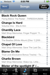
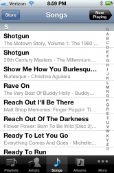
1. I got the 64gb 4S over the smaller models for one reason only - so I could finally put all of my music on an iPhone. I cannot even find the songs I have put on my phone through the music app. They are all jumbled up and are completely out of alphabetical order. Before coming on here, I literally just spent about 15 minutes trying to find a song and could not find it (at least where it should have been in alphabetical order) in the music app. I had to go into Spotlight and search for the song.
Examples:
No P's under P, but plenty of R's and N's
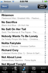
B's mixed in with C's under C
R's under S
2. I have a car radio with a USB connector made specifically for Apple products (and made in 2011). 4S plays through my radio fine, but shuffle randomly and automatically turns itself off after playing a few songs. I never had that problem with my 2nd gen iPod Touch, which I unfortunately sold when I got the 4S. Since my 4S gets stuck on the 'connected to dock' screen (even though a radio is definitely not a dock - shouldn't it be 'connected to accessory' screen?) when plugged into my radio (another problem that never occurred on my Touch), I have to then wait for a red light or stop sign with no one behind me, unplug it, turn shuffle back on, and then plug it back in.
3. Music app has crashed a bunch of times.
4. Music app very slow opening up and switching between playlists.
5 (Not necessarily a music app problem, but it's an issue with iTunes syncing I guess, so I'm including it). All the ringtones I have on my 4S, I also had on my iPhone 4, which I also unfortunately sold when I got the 4S. The ringtones work fine, but only when they decide to stay on my phone. I have no idea why, but they keep vanishing from my phone and I have to keep re-syncing them back on. How do I know this? I was with someone else who heard a phone ringing and asked if it was mine. I told the person it wasn't my phone because that wasn't my ringer. They insisted the ringing was coming from me, so I pulled my phone out of my pocket to prove to them that it wasn't my phone...only it was my phone. All my custom ringers were gone and my iPhone just selected a new standard ringtone for me. This has happened now three times since I got my phone.
1. I got the 64gb 4S over the smaller models for one reason only - so I could finally put all of my music on an iPhone. I cannot even find the songs I have put on my phone through the music app. They are all jumbled up and are completely out of alphabetical order. Before coming on here, I literally just spent about 15 minutes trying to find a song and could not find it (at least where it should have been in alphabetical order) in the music app. I had to go into Spotlight and search for the song.
Examples:
No P's under P, but plenty of R's and N's

B's mixed in with C's under C

R's under S

2. I have a car radio with a USB connector made specifically for Apple products (and made in 2011). 4S plays through my radio fine, but shuffle randomly and automatically turns itself off after playing a few songs. I never had that problem with my 2nd gen iPod Touch, which I unfortunately sold when I got the 4S. Since my 4S gets stuck on the 'connected to dock' screen (even though a radio is definitely not a dock - shouldn't it be 'connected to accessory' screen?) when plugged into my radio (another problem that never occurred on my Touch), I have to then wait for a red light or stop sign with no one behind me, unplug it, turn shuffle back on, and then plug it back in.
3. Music app has crashed a bunch of times.
4. Music app very slow opening up and switching between playlists.
5 (Not necessarily a music app problem, but it's an issue with iTunes syncing I guess, so I'm including it). All the ringtones I have on my 4S, I also had on my iPhone 4, which I also unfortunately sold when I got the 4S. The ringtones work fine, but only when they decide to stay on my phone. I have no idea why, but they keep vanishing from my phone and I have to keep re-syncing them back on. How do I know this? I was with someone else who heard a phone ringing and asked if it was mine. I told the person it wasn't my phone because that wasn't my ringer. They insisted the ringing was coming from me, so I pulled my phone out of my pocket to prove to them that it wasn't my phone...only it was my phone. All my custom ringers were gone and my iPhone just selected a new standard ringtone for me. This has happened now three times since I got my phone.
...wait, people actually use star ratings?
I went through rating music the one day, then suddenly realized "If I'm giving this song 1 star, why is it on my computer at all?"
Then I just started pulling off songs I didn't like. Much easier than rating everything.
Sorry, but your comment is ridiculous.
What puzzled me about the "Official Apps" supplied by Apple is, it's as if they were all made by different companies/different people who did not have an overall theme.
One would think Apple would want a consistent look and feel across all it's built in standard/default apps, but it does not seem this way.
It's a very odd thing to do IMHO for such a large company who pride themselves on a easy to use user experience.
One would think Apple would want a consistent look and feel across all it's built in standard/default apps, but it does not seem this way.
It's a very odd thing to do IMHO for such a large company who pride themselves on a easy to use user experience.
I've come here to complain more.
I hate the music app so much. It really has really ruined the iPad for me. Pre ios5, almost anytime I was on my iPad I was listening to podcasts, audiobooks or, occasionally music. I used my iPad a ton. It had replaced my laptop and desktop for most things. Unless I was writing or working, the iPad worked well, my laptop collected dust. I used it everyday. Probably al,pst everyday since it launched and I bought it.
With this broken music app, my iPad is collecting dust now. I might as well use the laptop and use it since I can listen to audio. I've never been this frustrated with a piece of software. If the ipad3 was announced tomorrow I wouldn't even think about getting it. Pre ios5, I would have been in line day 1.
Please apple, just give me the old ipod app back.
guys may I suggest you email scott forestahl at apple, to get your points across, they do listen to people.
Do they? Seems like lots of unpopular decisions from Apple go unfixed for extended periods of time.
...wait, people actually use star ratings?
Wait, people actually use the color grey? I thought everything looks just fine in either black or white...
1. I got the 64gb 4S over the smaller models for one reason only - so I could finally put all of my music on an iPhone. I cannot even find the songs I have put on my phone through the music app. They are all jumbled up and are completely out of alphabetical order. Before coming on here, I literally just spent about 15 minutes trying to find a song and could not find it (at least where it should have been in alphabetical order) in the music app. I had to go into Spotlight and search for the song.
Examples:
No P's under P, but plenty of R's and N's
View attachment 309767
B's mixed in with C's under C
View attachment 309768
R's under S
View attachment 309769
I know you have probably already checked this, but it looks like you have got some serious problems with the sort fields in iTunes. I assume that isn't the case is it?
Mine are all sorted correctly. I'd guess that you have got some sort of corruption somehow.
As an aside (and obviously you need to sort the issue out), you can use Siri to play specific songs (as long as it understands the title). Quicker than using spotlight if you can't find it.
guys may I suggest you email scott forestahl at apple, to get your points across, they do listen to people.
Can you share his email address?
An unsatisfactory solution...
As I had hundreds of videos neatly sorted in my playlists & smartlists I had to come up with a new solution.
I turned everything into TV Shows and set about filling in the metadata needed to get them to properly sort. Not as functional as the old playlists but at least they're not all in one giant lump.
A note to anyone who might repeat this. Do not change them podcasts. If you ever want to change them back to Movies that option is not there after the change.
Register on MacRumors! This sidebar will go away, and you'll see fewer ads.

